Willkommen bei den Top‑Schriften – hier treffen Beliebtheit und Qualität aufeinander. Das sind die in diesem Jahr am häufigsten heruntergeladenen und genutzten Fonts. Wenn Sie sichere Optionen für Logo, Web oder Social suchen, starten Sie hier.
Jeder Top‑Font überzeugt durch Balance, Lesbarkeit und Vielseitigkeit. Sie finden moderne Sans‑Serifs, elegante Scripts, Vintage‑Serifs und minimalistische Displays.
-
 Herunterladen 320 Downloads@WebFont
 -
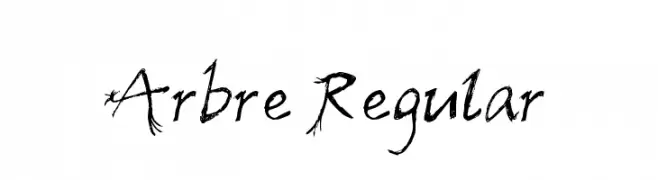
![Arbre Regular Frei Schriftart Herunterladen]() Herunterladen 320 Downloads@WebFont
Herunterladen 320 Downloads@WebFont -
( Copyright (c) 2012, Impallari Type (www.impallari.com), with Reserved Font Name Encode Sans. )
A modern, narrow, and light sans-serif font with a sleek and elegant appearance.
![Encode Sans Narrow Light Frei Schriftart Herunterladen]() Herunterladen 320 Downloads@WebFont
Herunterladen 320 Downloads@WebFont -
( Fonts by www.typodermicfonts.com - Ray Larabie )
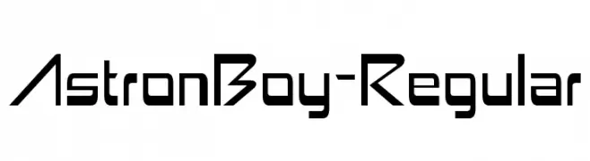
A futuristic, geometric font with sharp angles and clean lines.
![AstronBoy-Regular Frei Schriftart Herunterladen]() Herunterladen 320 Downloads@WebFont
Herunterladen 320 Downloads@WebFont -
( Muhammad Romzul Khoir )
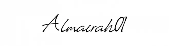
A classic, elegant script font with flowing, cursive letters.
![Almairah01 Frei Schriftart Herunterladen]() Herunterladen 320 Downloads@WebFont
Herunterladen 320 Downloads@WebFont -
-
( Fonts by www.fontalicious.com )
A futuristic, geometric font with a bold, digital aesthetic.
![Digit Cube Frei Schriftart Herunterladen]() Herunterladen 320 Downloads@WebFont
Herunterladen 320 Downloads@WebFont -
( Fonts by Jacob Fisher - www.pizzadude.dk )
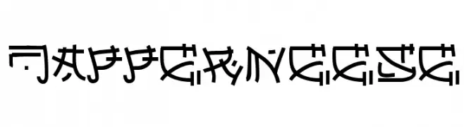
A bold, geometric font with a futuristic and tribal aesthetic.
![Japperneese Frei Schriftart Herunterladen]() Herunterladen 320 Downloads@WebFont
Herunterladen 320 Downloads@WebFont -
( Fonts by Manfred Klein. Free for private and charity use. Free for commercial with donation to organizations )
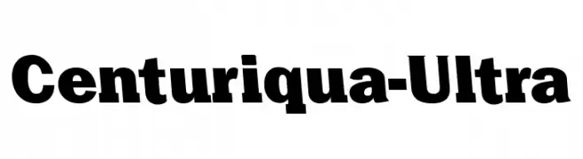
A bold, impactful font with strong, consistent characters.
![Centuriqua-Ultra Frei Schriftart Herunterladen]() Herunterladen 320 Downloads@WebFont
Herunterladen 320 Downloads@WebFont -
![Morning Font Frei Schriftart Herunterladen]() Herunterladen 320 Downloads@WebFont
Herunterladen 320 Downloads@WebFont -
![Fonesia Light Frei Schriftart Herunterladen]() Herunterladen 320 Downloads@WebFont
Herunterladen 320 Downloads@WebFont


Welche Schriften sind gerade am populärsten?
Poppins, Roboto, Montserrat, Open Sans und Lato sind wegen ihrer klaren Formen und breiten Einsetzbarkeit sehr gefragt – von Markenauftritt über Landingpages bis hin zu Postern.
Welche Fonts eignen sich für Logos?
Geometrische Sans‑Serifs (z. B. Poppins, Familien im Gotham‑Stil) sind ein häufiger Griff für sauberes, skalierbares Branding. Für eine persönlichere Note bleiben Scripts und Handschrift‑Stile beliebt. Kombinieren Sie einen prägnanten Headline‑Font mit einer neutralen Brotschrift für Wiedererkennung und Harmonie.
Wie oft wird die Top‑Liste aktualisiert?
Regelmäßig – basierend auf realen Downloads und Interaktionen. Schauen Sie öfter vorbei, um aufstrebende Favoriten früh zu entdecken.
💡 Tipp: Seite bookmarken – Trends wechseln schnell, und heutige Top‑Schriften inspirieren morgen vielleicht das Rebranding.