Willkommen bei den Top‑Schriften – hier treffen Beliebtheit und Qualität aufeinander. Das sind die in diesem Jahr am häufigsten heruntergeladenen und genutzten Fonts. Wenn Sie sichere Optionen für Logo, Web oder Social suchen, starten Sie hier.
Jeder Top‑Font überzeugt durch Balance, Lesbarkeit und Vielseitigkeit. Sie finden moderne Sans‑Serifs, elegante Scripts, Vintage‑Serifs und minimalistische Displays.
-
( Fonts by Ramli Setiadi - Personal-use only. For commercial use please contact owner. )
A lively handwritten font with fluid, dynamic strokes and a playful, informal style.
 Herunterladen 321 Downloads@WebFont
 -
( Fonts by Sorkin Type Co )
A bold, slab serif font with a strong and commanding presence.
![Gravitas One Frei Schriftart Herunterladen]() Herunterladen 321 Downloads@WebFont
Herunterladen 321 Downloads@WebFont -
( Fonts by Insanitype )
A playful, energetic font with tall, narrow letters and a slight slant.
![Shoestore Frei Schriftart Herunterladen]() Herunterladen 321 Downloads@WebFont
Herunterladen 321 Downloads@WebFont -
( Fonts by Andrew McCluskey - nalgames.com )
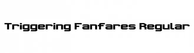
A bold, geometric font with a modern, futuristic style.
![Triggering Fanfares Regular Frei Schriftart Herunterladen]() Herunterladen 321 Downloads@WebFont
Herunterladen 321 Downloads@WebFont -
( Fonts by www.gliphmaker.com. Personal-use only. For commercial use please contact owner. )
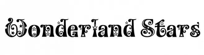
A whimsical, star-studded decorative font with bold, ornate characters.
![Wonderland Stars Frei Schriftart Herunterladen]() Herunterladen 321 Downloads@WebFont
Herunterladen 321 Downloads@WebFont -
-
![612KosheyLine-Bold Frei Schriftart Herunterladen]() Herunterladen 321 Downloads@WebFont
Herunterladen 321 Downloads@WebFont -
( Font by http://home.luna.nl/~xino/ )
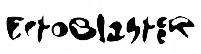
A bold, abstract font with fluid, imaginative shapes and a futuristic feel.
![EctoBlaster Frei Schriftart Herunterladen]() Herunterladen 321 Downloads@WebFont
Herunterladen 321 Downloads@WebFont -
( Fonts by Reguler Studio )
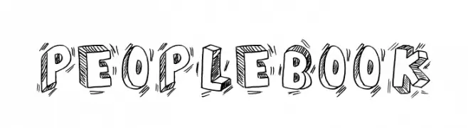
A playful, hand-drawn font with a sketch-like, three-dimensional appearance.
![PEOPLE BOOK Frei Schriftart Herunterladen]() Herunterladen 321 Downloads@WebFont
Herunterladen 321 Downloads@WebFont -
( Fonts by www.chank.com. Personal-use only. For commercial use please contact owner. )
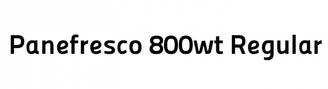
A modern, bold sans-serif font with a clean and uniform design.
![Panefresco 800wt Regular Frei Schriftart Herunterladen]() Herunterladen 321 Downloads@WebFont
Herunterladen 321 Downloads@WebFont -
( David Luis - davidluis.hol.es )
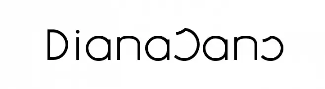
A modern, geometric sans-serif font with clean lines and uniform strokes.
![DianaSans Frei Schriftart Herunterladen]() Herunterladen 321 Downloads@WebFont
Herunterladen 321 Downloads@WebFont


Welche Schriften sind gerade am populärsten?
Poppins, Roboto, Montserrat, Open Sans und Lato sind wegen ihrer klaren Formen und breiten Einsetzbarkeit sehr gefragt – von Markenauftritt über Landingpages bis hin zu Postern.
Welche Fonts eignen sich für Logos?
Geometrische Sans‑Serifs (z. B. Poppins, Familien im Gotham‑Stil) sind ein häufiger Griff für sauberes, skalierbares Branding. Für eine persönlichere Note bleiben Scripts und Handschrift‑Stile beliebt. Kombinieren Sie einen prägnanten Headline‑Font mit einer neutralen Brotschrift für Wiedererkennung und Harmonie.
Wie oft wird die Top‑Liste aktualisiert?
Regelmäßig – basierend auf realen Downloads und Interaktionen. Schauen Sie öfter vorbei, um aufstrebende Favoriten früh zu entdecken.
💡 Tipp: Seite bookmarken – Trends wechseln schnell, und heutige Top‑Schriften inspirieren morgen vielleicht das Rebranding.