Willkommen bei den Top‑Schriften – hier treffen Beliebtheit und Qualität aufeinander. Das sind die in diesem Jahr am häufigsten heruntergeladenen und genutzten Fonts. Wenn Sie sichere Optionen für Logo, Web oder Social suchen, starten Sie hier.
Jeder Top‑Font überzeugt durch Balance, Lesbarkeit und Vielseitigkeit. Sie finden moderne Sans‑Serifs, elegante Scripts, Vintage‑Serifs und minimalistische Displays.
-
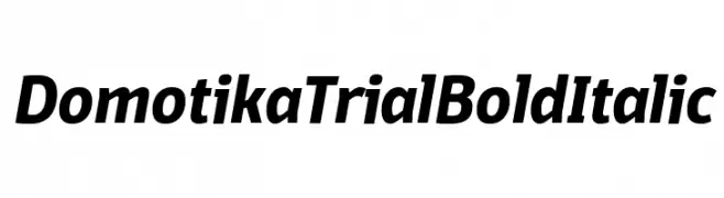
( Zetafonts - www.zetafonts.com )
A bold, italicized font with a modern and dynamic style.
 Herunterladen 317 Downloads@WebFont
 -
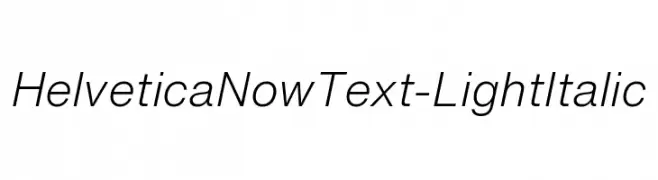
Schriftart von HammerBro101. For commercial use please contact the owner.
![HelveticaNowText-LightItalic Frei Schriftart Herunterladen]() Herunterladen 317 Downloads@WebFont
Herunterladen 317 Downloads@WebFont -
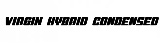
( Fonts by Daniel Zadorozny - www.iconian.com - Free for personal use )
A bold, condensed font with a dynamic slant and thick strokes.
![Virgin Hybrid Condensed Frei Schriftart Herunterladen]() Herunterladen 317 Downloads@WebFont
Herunterladen 317 Downloads@WebFont -
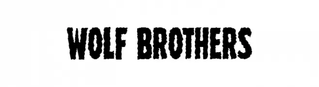
( Fonts by Iconian Fonts )
A bold, distressed font with a rugged, textured appearance.
![Wolf Brothers Frei Schriftart Herunterladen]() Herunterladen 317 Downloads@WebFont
Herunterladen 317 Downloads@WebFont -
( Fonts by Daniel Zadorozny - www.iconian.com )
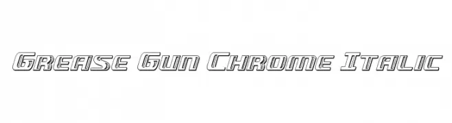
A bold, italicized font with a chrome-like, three-dimensional appearance.
![Grease Gun Chrome Italic Frei Schriftart Herunterladen]() Herunterladen 317 Downloads@WebFont
Herunterladen 317 Downloads@WebFont -
-
( Fonts by a Neale Davidson - www.pixelsagas.com. Personal-use only. For commercial use please contact owner. )
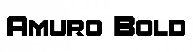
A bold, geometric font with a futuristic and industrial style.
![Amuro Bold Frei Schriftart Herunterladen]() Herunterladen 317 Downloads@WebFont
Herunterladen 317 Downloads@WebFont -
( Fonts by www.gliphmaker.com. Personal-use only. For commercial use please contact owner. )
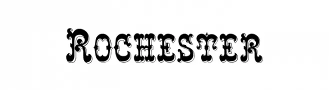
A bold, decorative font with vintage, ornate detailing.
![Rochester Frei Schriftart Herunterladen]() Herunterladen 317 Downloads@WebFont
Herunterladen 317 Downloads@WebFont -
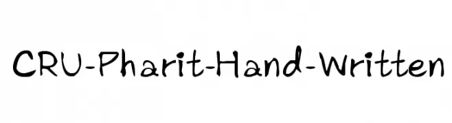
![CRU-Pharit-Hand-Written Frei Schriftart Herunterladen]() Herunterladen 317 Downloads@WebFont
Herunterladen 317 Downloads@WebFont -
( Fonts by Velvetyne Type Foundry - Personal-use only. For commercial use please contact owner. )
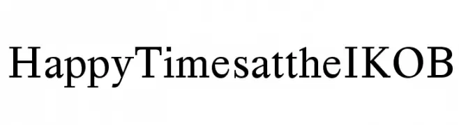
A classic serif font with balanced structure and moderate contrast.
![Happy Times at the IKOB Frei Schriftart Herunterladen]() Herunterladen 317 Downloads@WebFont
Herunterladen 317 Downloads@WebFont -
![Notarized Openly Script St Frei Schriftart Herunterladen]() Herunterladen 317 Downloads@WebFont
Herunterladen 317 Downloads@WebFont
Welche Schriften sind gerade am populärsten?
Poppins, Roboto, Montserrat, Open Sans und Lato sind wegen ihrer klaren Formen und breiten Einsetzbarkeit sehr gefragt – von Markenauftritt über Landingpages bis hin zu Postern.
Welche Fonts eignen sich für Logos?
Geometrische Sans‑Serifs (z. B. Poppins, Familien im Gotham‑Stil) sind ein häufiger Griff für sauberes, skalierbares Branding. Für eine persönlichere Note bleiben Scripts und Handschrift‑Stile beliebt. Kombinieren Sie einen prägnanten Headline‑Font mit einer neutralen Brotschrift für Wiedererkennung und Harmonie.
Wie oft wird die Top‑Liste aktualisiert?
Regelmäßig – basierend auf realen Downloads und Interaktionen. Schauen Sie öfter vorbei, um aufstrebende Favoriten früh zu entdecken.
💡 Tipp: Seite bookmarken – Trends wechseln schnell, und heutige Top‑Schriften inspirieren morgen vielleicht das Rebranding.