Willkommen bei den Top‑Schriften – hier treffen Beliebtheit und Qualität aufeinander. Das sind die in diesem Jahr am häufigsten heruntergeladenen und genutzten Fonts. Wenn Sie sichere Optionen für Logo, Web oder Social suchen, starten Sie hier.
Jeder Top‑Font überzeugt durch Balance, Lesbarkeit und Vielseitigkeit. Sie finden moderne Sans‑Serifs, elegante Scripts, Vintage‑Serifs und minimalistische Displays.
-
 Herunterladen 318 Downloads@WebFont
 -
( Fonts by Manfred Klein. Free for private and charity use. Free for commercial with donation to organizations )
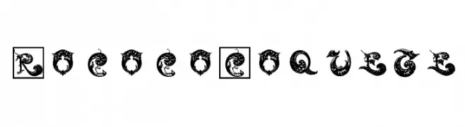
An ornate and decorative font with intricate Rococo-inspired flourishes.
![RococoCoquete Frei Schriftart Herunterladen]() Herunterladen 318 Downloads@WebFont
Herunterladen 318 Downloads@WebFont -
![Paper Punch Frei Schriftart Herunterladen]() Herunterladen 318 Downloads@WebFont
Herunterladen 318 Downloads@WebFont -
( Fonts by Thomas Ledin - tomledin.com )
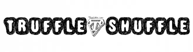
A playful, hand-drawn font with bold, doodle-like characters enclosed in rounded outlines.
![Truffle-Shuffle Frei Schriftart Herunterladen]() Herunterladen 318 Downloads@WebFont
Herunterladen 318 Downloads@WebFont -
( Fonts by Wolve Fonts - https://www.deviantart.com/wolves-fonts - Personal-use only. For commercial use please contact owner. )
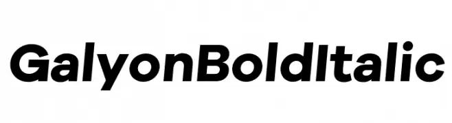
A bold, italicized sans-serif font with a modern and impactful style.
![Galyon Bold Italic Frei Schriftart Herunterladen]() Herunterladen 318 Downloads@WebFont
Herunterladen 318 Downloads@WebFont -
-
( Fonts by Press Gang Studios - Andeh Pinkard - www.pressgang-studios.com )
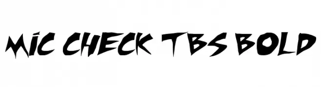
A bold, angular font with sharp edges and dynamic style.
![Mic Check TBS Bold Frei Schriftart Herunterladen]() Herunterladen 317 Downloads@WebFont
Herunterladen 317 Downloads@WebFont -
( Fonts by wep )
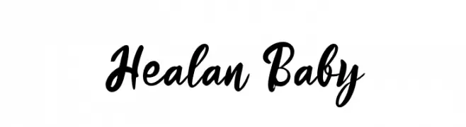
A bold, flowing script font with a playful and energetic style.
![Healan Baby Frei Schriftart Herunterladen]() Herunterladen 317 Downloads@WebFont
Herunterladen 317 Downloads@WebFont -
( Fonts by Dumadi Studios )
A playful, bold font with rounded, thick strokes and a comic book style.
![Comiccomoc Frei Schriftart Herunterladen]() Herunterladen 317 Downloads@WebFont
Herunterladen 317 Downloads@WebFont -
( Fonts by The Font Emporium )
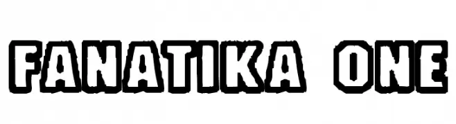
Bold, outlined font with a three-dimensional effect.
![Fanatika One Frei Schriftart Herunterladen]() Herunterladen 317 Downloads@WebFont
Herunterladen 317 Downloads@WebFont -
( Fonts by Impallari Type )
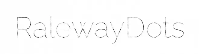
A modern dotted font with geometric shapes and consistent spacing.
![Raleway Dots Frei Schriftart Herunterladen]() Herunterladen 317 Downloads@WebFont
Herunterladen 317 Downloads@WebFont


Welche Schriften sind gerade am populärsten?
Poppins, Roboto, Montserrat, Open Sans und Lato sind wegen ihrer klaren Formen und breiten Einsetzbarkeit sehr gefragt – von Markenauftritt über Landingpages bis hin zu Postern.
Welche Fonts eignen sich für Logos?
Geometrische Sans‑Serifs (z. B. Poppins, Familien im Gotham‑Stil) sind ein häufiger Griff für sauberes, skalierbares Branding. Für eine persönlichere Note bleiben Scripts und Handschrift‑Stile beliebt. Kombinieren Sie einen prägnanten Headline‑Font mit einer neutralen Brotschrift für Wiedererkennung und Harmonie.
Wie oft wird die Top‑Liste aktualisiert?
Regelmäßig – basierend auf realen Downloads und Interaktionen. Schauen Sie öfter vorbei, um aufstrebende Favoriten früh zu entdecken.
💡 Tipp: Seite bookmarken – Trends wechseln schnell, und heutige Top‑Schriften inspirieren morgen vielleicht das Rebranding.