Willkommen bei den Top‑Schriften – hier treffen Beliebtheit und Qualität aufeinander. Das sind die in diesem Jahr am häufigsten heruntergeladenen und genutzten Fonts. Wenn Sie sichere Optionen für Logo, Web oder Social suchen, starten Sie hier.
Jeder Top‑Font überzeugt durch Balance, Lesbarkeit und Vielseitigkeit. Sie finden moderne Sans‑Serifs, elegante Scripts, Vintage‑Serifs und minimalistische Displays.
-
( Fonts by Paul Lloyd )
A classic, light serif font with a condensed width and medium contrast.
 Herunterladen 317 Downloads
 -
![Klepon Scone Frei Schriftart Herunterladen]() Herunterladen 317 Downloads@WebFont
Herunterladen 317 Downloads@WebFont -
( Thor Christopher Arisland - www.tcarisland.com )
A whimsical, hand-drawn font with playful and artistic characters.
![Salome Frei Schriftart Herunterladen]() Herunterladen 317 Downloads@WebFont
Herunterladen 317 Downloads@WebFont -
( Fonts by ShyFonts )
A playful, italicized handwritten font with smooth, rounded strokes.
![SF Arch Rival Extended Italic Frei Schriftart Herunterladen]() Herunterladen 317 Downloads@WebFont
Herunterladen 317 Downloads@WebFont -
( Fonts by Iconian Fonts - Daniel Zadorozny )
A bold, geometric font with angular lines and a blocky appearance.
![Nyet Extra Bold Frei Schriftart Herunterladen]() Herunterladen 317 Downloads@WebFont
Herunterladen 317 Downloads@WebFont -
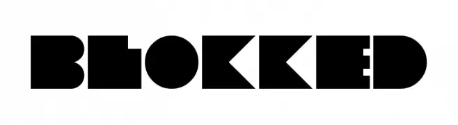
-
![Blokked Frei Schriftart Herunterladen]() Herunterladen 317 Downloads@WebFont
Herunterladen 317 Downloads@WebFont -
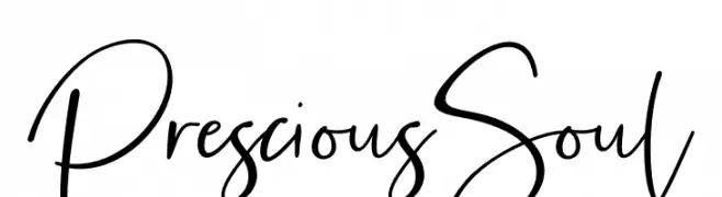
( Fonts by Fikry Alif - Fikryal studio - https://www.creativefabrica.com/designer/mfikryalif/ref/222304/ - Personal-use only. For commercial use please contact owner. )
A casual, handwritten font with fluid, cursive strokes and a playful style.
![Prescious Soul Frei Schriftart Herunterladen]() Herunterladen 317 Downloads@WebFont
Herunterladen 317 Downloads@WebFont -
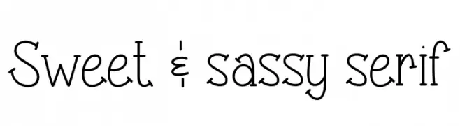
( Fonts by Vanessa Bays - bythebutterfly.com )
A playful serif font with script-like elements, offering elegance and approachability.
![Sweet & sassy serif Frei Schriftart Herunterladen]() Herunterladen 317 Downloads@WebFont
Herunterladen 317 Downloads@WebFont -
( Fonts by a Max Infeld - XEROGRAPHER FONTS - xerographer.blogspot.com . Personal-use only. For commercial use please contact owner. )
A bold, distressed font with a grunge, fragmented appearance.
![CrashSite Frei Schriftart Herunterladen]() Herunterladen 317 Downloads@WebFont
Herunterladen 317 Downloads@WebFont -
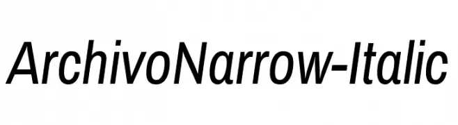
( Fonts by www.omnibus-type.com )
A sleek, narrow, and italic font with a modern design.
![ArchivoNarrow-Italic Frei Schriftart Herunterladen]() Herunterladen 317 Downloads@WebFont
Herunterladen 317 Downloads@WebFont


Welche Schriften sind gerade am populärsten?
Poppins, Roboto, Montserrat, Open Sans und Lato sind wegen ihrer klaren Formen und breiten Einsetzbarkeit sehr gefragt – von Markenauftritt über Landingpages bis hin zu Postern.
Welche Fonts eignen sich für Logos?
Geometrische Sans‑Serifs (z. B. Poppins, Familien im Gotham‑Stil) sind ein häufiger Griff für sauberes, skalierbares Branding. Für eine persönlichere Note bleiben Scripts und Handschrift‑Stile beliebt. Kombinieren Sie einen prägnanten Headline‑Font mit einer neutralen Brotschrift für Wiedererkennung und Harmonie.
Wie oft wird die Top‑Liste aktualisiert?
Regelmäßig – basierend auf realen Downloads und Interaktionen. Schauen Sie öfter vorbei, um aufstrebende Favoriten früh zu entdecken.
💡 Tipp: Seite bookmarken – Trends wechseln schnell, und heutige Top‑Schriften inspirieren morgen vielleicht das Rebranding.