Willkommen bei den Top‑Schriften – hier treffen Beliebtheit und Qualität aufeinander. Das sind die in diesem Jahr am häufigsten heruntergeladenen und genutzten Fonts. Wenn Sie sichere Optionen für Logo, Web oder Social suchen, starten Sie hier.
Jeder Top‑Font überzeugt durch Balance, Lesbarkeit und Vielseitigkeit. Sie finden moderne Sans‑Serifs, elegante Scripts, Vintage‑Serifs und minimalistische Displays.
-
( Fonts by www.aenigmafonts.com )
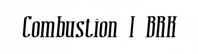
A bold, dynamic font with a slant and sharp serifs, ideal for impactful designs.
 Herunterladen 316 Downloads@WebFont
 -
![Angelow Frei Schriftart Herunterladen]() Herunterladen 316 Downloads@WebFont
Herunterladen 316 Downloads@WebFont -
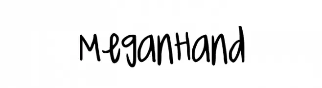
![MeganHand Frei Schriftart Herunterladen]() Herunterladen 316 Downloads@WebFont
Herunterladen 316 Downloads@WebFont -
( Fonts by Arkandis Digital Foundry )
A classic serif font with elegant italic styling and moderate contrast.
![AccanthisADFStdNo2-BoldItalic Frei Schriftart Herunterladen]() Herunterladen 316 Downloads@WebFont
Herunterladen 316 Downloads@WebFont -
( Fonts by Gatonegro - www.ekkiicat.com Sponsoren Schriftart )
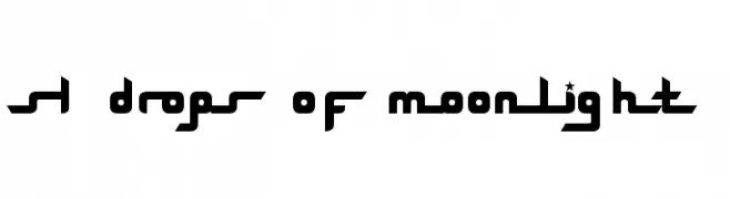
A futuristic, geometric font with bold, stylized characters and star accents.
![SL Drops Of Moonlight Frei Schriftart Herunterladen]() Herunterladen 316 Downloads
Herunterladen 316 Downloads -
-
( Fonts by Geronimo Fonts - Personal-use only. For commercial use please contact owner. )
A bold, playful font with a hand-drawn, irregular style.
![Chuck Frei Schriftart Herunterladen]() Herunterladen 316 Downloads@WebFont
Herunterladen 316 Downloads@WebFont -
( Fonts by Daniel Zadorozny - www.iconian.com )
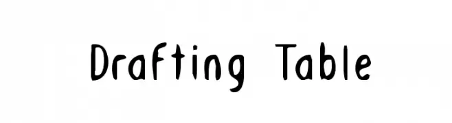
A playful, hand-drawn style font with whimsical and artistic flair.
![Drafting Table Frei Schriftart Herunterladen]() Herunterladen 316 Downloads@WebFont
Herunterladen 316 Downloads@WebFont -
( Khoe Roni )
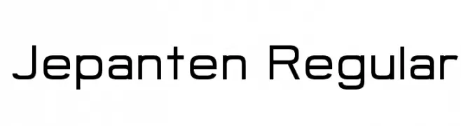
A modern, geometric sans-serif font with a clean and professional look.
![Jepanten Regular Frei Schriftart Herunterladen]() Herunterladen 316 Downloads@WebFont
Herunterladen 316 Downloads@WebFont -
( Fonts by Chequered Ink - chequered.ink - Personal-use only. For commercial use please contact owner. )
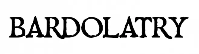
A bold, vintage-style font with distressed, hand-crafted characters.
![Bardolatry Frei Schriftart Herunterladen]() Herunterladen 316 Downloads@WebFont
Herunterladen 316 Downloads@WebFont -
( Fonts by lemoncraft - Personal-use only. For commercial use please contact owner. )
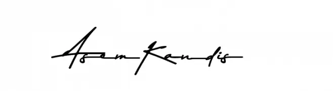
A bold, expressive script font with fluid, interconnected strokes.
![Asem Kandis Frei Schriftart Herunterladen]() Herunterladen 316 Downloads@WebFont
Herunterladen 316 Downloads@WebFont


Welche Schriften sind gerade am populärsten?
Poppins, Roboto, Montserrat, Open Sans und Lato sind wegen ihrer klaren Formen und breiten Einsetzbarkeit sehr gefragt – von Markenauftritt über Landingpages bis hin zu Postern.
Welche Fonts eignen sich für Logos?
Geometrische Sans‑Serifs (z. B. Poppins, Familien im Gotham‑Stil) sind ein häufiger Griff für sauberes, skalierbares Branding. Für eine persönlichere Note bleiben Scripts und Handschrift‑Stile beliebt. Kombinieren Sie einen prägnanten Headline‑Font mit einer neutralen Brotschrift für Wiedererkennung und Harmonie.
Wie oft wird die Top‑Liste aktualisiert?
Regelmäßig – basierend auf realen Downloads und Interaktionen. Schauen Sie öfter vorbei, um aufstrebende Favoriten früh zu entdecken.
💡 Tipp: Seite bookmarken – Trends wechseln schnell, und heutige Top‑Schriften inspirieren morgen vielleicht das Rebranding.