Willkommen bei den Top‑Schriften – hier treffen Beliebtheit und Qualität aufeinander. Das sind die in diesem Jahr am häufigsten heruntergeladenen und genutzten Fonts. Wenn Sie sichere Optionen für Logo, Web oder Social suchen, starten Sie hier.
Jeder Top‑Font überzeugt durch Balance, Lesbarkeit und Vielseitigkeit. Sie finden moderne Sans‑Serifs, elegante Scripts, Vintage‑Serifs und minimalistische Displays.
-
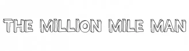
( Fonts by Geronimo )
A bold, three-dimensional font with a playful and dynamic style.
 Herunterladen 316 Downloads@WebFont
 -
( Fonts by Utopiafonts )
A dynamic, angular font with a modern, handwritten feel.
![Dael Neu Frei Schriftart Herunterladen]() Herunterladen 316 Downloads@WebFont
Herunterladen 316 Downloads@WebFont -
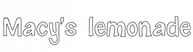
( monkeyroodlesfonts.weebly.com/ )
A playful, hand-drawn font with a whimsical and casual style.
![Macy's lemonade Frei Schriftart Herunterladen]() Herunterladen 316 Downloads@WebFont
Herunterladen 316 Downloads@WebFont -
![Teereks Frei Schriftart Herunterladen]() Herunterladen 316 Downloads@WebFont
Herunterladen 316 Downloads@WebFont -
![Novgorod Plain Frei Schriftart Herunterladen]() Herunterladen 316 Downloads@WebFont
Herunterladen 316 Downloads@WebFont -
-
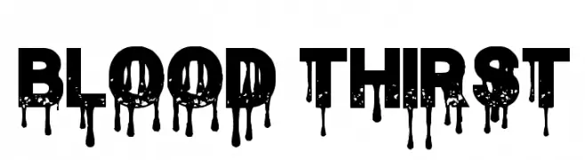
( Fonts by Chris Vile - fontmonger.com - Personal-use only. For commercial use please contact owner. )
A bold, dripping font ideal for horror and spooky themes.
![Blood Thirst Frei Schriftart Herunterladen]() Herunterladen 316 Downloads@WebFont
Herunterladen 316 Downloads@WebFont -
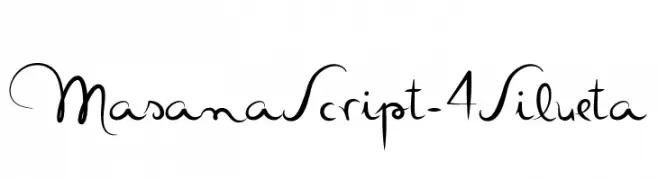
( Fonts by Mario Arturo - www.marioarturo.com )
An elegant, flowing script font with graceful curves and loops.
![MasanaScript-4Silueta Frei Schriftart Herunterladen]() Herunterladen 316 Downloads@WebFont
Herunterladen 316 Downloads@WebFont -
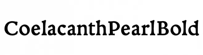
( Personal-use only. For commercial use please contact owner. )
A bold serif font with a handcrafted, slightly irregular style.
![Coelacanth Pearl Bold Frei Schriftart Herunterladen]() Herunterladen 316 Downloads@WebFont
Herunterladen 316 Downloads@WebFont -
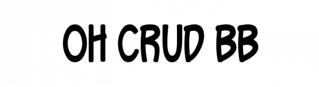
( Blambot - www.blambot.com )
A playful, bold font with rounded edges and a hand-drawn style.
![Oh Crud BB Frei Schriftart Herunterladen]() Herunterladen 316 Downloads@WebFont
Herunterladen 316 Downloads@WebFont -
( Fonts by Letter Art Studio )
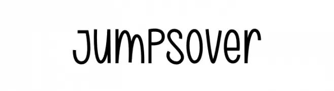
A playful, hand-drawn font with a whimsical and quirky style.
![Jumps Over Frei Schriftart Herunterladen]() Herunterladen 316 Downloads@WebFont
Herunterladen 316 Downloads@WebFont

Welche Schriften sind gerade am populärsten?
Poppins, Roboto, Montserrat, Open Sans und Lato sind wegen ihrer klaren Formen und breiten Einsetzbarkeit sehr gefragt – von Markenauftritt über Landingpages bis hin zu Postern.
Welche Fonts eignen sich für Logos?
Geometrische Sans‑Serifs (z. B. Poppins, Familien im Gotham‑Stil) sind ein häufiger Griff für sauberes, skalierbares Branding. Für eine persönlichere Note bleiben Scripts und Handschrift‑Stile beliebt. Kombinieren Sie einen prägnanten Headline‑Font mit einer neutralen Brotschrift für Wiedererkennung und Harmonie.
Wie oft wird die Top‑Liste aktualisiert?
Regelmäßig – basierend auf realen Downloads und Interaktionen. Schauen Sie öfter vorbei, um aufstrebende Favoriten früh zu entdecken.
💡 Tipp: Seite bookmarken – Trends wechseln schnell, und heutige Top‑Schriften inspirieren morgen vielleicht das Rebranding.