Willkommen bei den Top‑Schriften – hier treffen Beliebtheit und Qualität aufeinander. Das sind die in diesem Jahr am häufigsten heruntergeladenen und genutzten Fonts. Wenn Sie sichere Optionen für Logo, Web oder Social suchen, starten Sie hier.
Jeder Top‑Font überzeugt durch Balance, Lesbarkeit und Vielseitigkeit. Sie finden moderne Sans‑Serifs, elegante Scripts, Vintage‑Serifs und minimalistische Displays.
-
 Herunterladen 232 Downloads@WebFont
 -
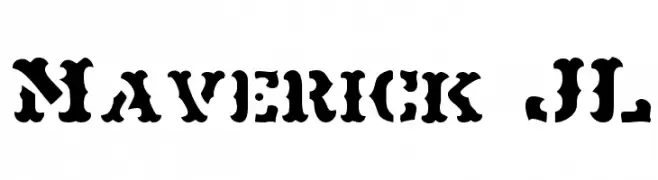
( Iconian Fonts - Daniel Zadorozny - www.iconian.com )
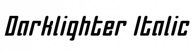
A bold, italicized font with a modern and dynamic style.
![Darklighter Italic Frei Schriftart Herunterladen]() Herunterladen 232 Downloads@WebFont
Herunterladen 232 Downloads@WebFont -
( Fonts by Daniel Zadorozny - www.iconian.com - Free for personal use )
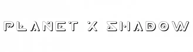
A futuristic, geometric font with bold, rounded shapes and shadow effects.
![Planet X Shadow Frei Schriftart Herunterladen]() Herunterladen 232 Downloads@WebFont
Herunterladen 232 Downloads@WebFont -
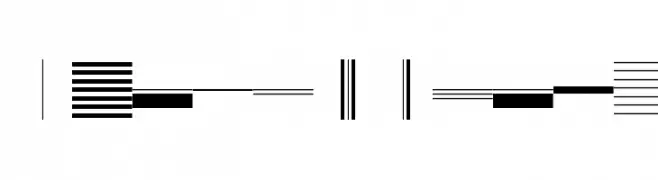
![BunchOLines Frei Schriftart Herunterladen]() Herunterladen 232 Downloads
Herunterladen 232 Downloads -
( Fonts by Andika )
A playful, casual handwritten font with smooth, rounded strokes.
![Malliboro Frei Schriftart Herunterladen]() Herunterladen 232 Downloads@WebFont
Herunterladen 232 Downloads@WebFont -
-
( Fonts by madeDeduk )
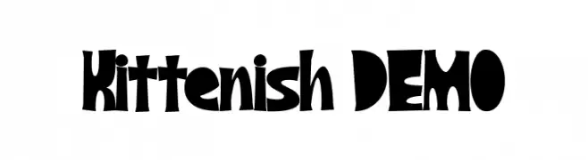
A playful, bold font with exaggerated curves and thick strokes, ideal for creative projects.
![Kittenish DEMO Frei Schriftart Herunterladen]() Herunterladen 232 Downloads@WebFont
Herunterladen 232 Downloads@WebFont -
( Fonts by Daniel Zadorozny - www.iconian.com - Free for personal use )
A bold, geometric font with unique angular cuts and curves.
![Lionheart Bold Frei Schriftart Herunterladen]() Herunterladen 232 Downloads@WebFont
Herunterladen 232 Downloads@WebFont -
( Fonts by Febryl Arully - Personal-use only. For commercial use please contact owner. )
An elegant, cursive script font with a fluid, handwritten style.
![Eclat Frei Schriftart Herunterladen]() Herunterladen 232 Downloads@WebFont
Herunterladen 232 Downloads@WebFont -
( Fonts by Woodcutter Manero - http://www.woodcutter.es - Personal-use only. For commercial use please contact owner. )
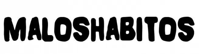
A bold, rounded, and playful font with a hand-drawn feel.
![Malos Habitos Frei Schriftart Herunterladen]() Herunterladen 232 Downloads@WebFont
Herunterladen 232 Downloads@WebFont -
( Fonts by Skiiller Studio )
A bold, handwritten font with a playful and energetic style.
![Apmonse Frei Schriftart Herunterladen]() Herunterladen 232 Downloads@WebFont
Herunterladen 232 Downloads@WebFont


Welche Schriften sind gerade am populärsten?
Poppins, Roboto, Montserrat, Open Sans und Lato sind wegen ihrer klaren Formen und breiten Einsetzbarkeit sehr gefragt – von Markenauftritt über Landingpages bis hin zu Postern.
Welche Fonts eignen sich für Logos?
Geometrische Sans‑Serifs (z. B. Poppins, Familien im Gotham‑Stil) sind ein häufiger Griff für sauberes, skalierbares Branding. Für eine persönlichere Note bleiben Scripts und Handschrift‑Stile beliebt. Kombinieren Sie einen prägnanten Headline‑Font mit einer neutralen Brotschrift für Wiedererkennung und Harmonie.
Wie oft wird die Top‑Liste aktualisiert?
Regelmäßig – basierend auf realen Downloads und Interaktionen. Schauen Sie öfter vorbei, um aufstrebende Favoriten früh zu entdecken.
💡 Tipp: Seite bookmarken – Trends wechseln schnell, und heutige Top‑Schriften inspirieren morgen vielleicht das Rebranding.