Willkommen bei den Top‑Schriften – hier treffen Beliebtheit und Qualität aufeinander. Das sind die in diesem Jahr am häufigsten heruntergeladenen und genutzten Fonts. Wenn Sie sichere Optionen für Logo, Web oder Social suchen, starten Sie hier.
Jeder Top‑Font überzeugt durch Balance, Lesbarkeit und Vielseitigkeit. Sie finden moderne Sans‑Serifs, elegante Scripts, Vintage‑Serifs und minimalistische Displays.
-
 Herunterladen 233 Downloads@WebFont
 -
( Fonts by Daniel Zadorozny - www.iconian.com - Personal-use only. For commercial use please contact owner. )
A bold, italic, and futuristic font with angular, geometric characters.
![Pilot Command Super-Italic Frei Schriftart Herunterladen]() Herunterladen 233 Downloads@WebFont
Herunterladen 233 Downloads@WebFont -
![CalabarFirewood Frei Schriftart Herunterladen]() Herunterladen 233 Downloads@WebFont
Herunterladen 233 Downloads@WebFont -
( Fonts by Daniel Zadorozny - www.iconian.com )
A bold, rugged font with a distressed texture and commanding presence.
![King Commando Rotate Regular Frei Schriftart Herunterladen]() Herunterladen 233 Downloads@WebFont
Herunterladen 233 Downloads@WebFont -
![Blahh Frei Schriftart Herunterladen]() Herunterladen 233 Downloads@WebFont
Herunterladen 233 Downloads@WebFont -
-
( www.facebook.com/diciganteng )
A geometric, modern font with a blocky, digital appearance.
![Enlatique Regular Frei Schriftart Herunterladen]() Herunterladen 233 Downloads@WebFont
Herunterladen 233 Downloads@WebFont -
( Fonts by Apostrophic Lab )
A futuristic, embossed font with bold, geometric letterforms.
![Futurex Embossed Frei Schriftart Herunterladen]() Herunterladen 233 Downloads@WebFont
Herunterladen 233 Downloads@WebFont -
( Fonts by weknow - Wino S Kadir )
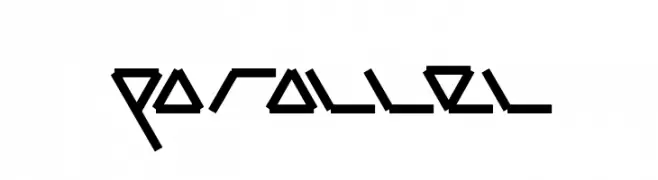
A futuristic, angular font with sharp lines and a geometric style.
![parallel Frei Schriftart Herunterladen]() Herunterladen 233 Downloads@WebFont
Herunterladen 233 Downloads@WebFont -
![DOLANAN Frei Schriftart Herunterladen]() Herunterladen 233 Downloads@WebFont
Herunterladen 233 Downloads@WebFont -
( Fonts by Andini Endah Pratiwi )
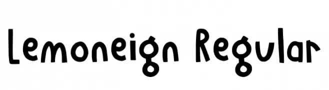
A playful, hand-drawn font with a whimsical and informal style.
![Lemoneign Regular Frei Schriftart Herunterladen]() Herunterladen 233 Downloads@WebFont
Herunterladen 233 Downloads@WebFont


Welche Schriften sind gerade am populärsten?
Poppins, Roboto, Montserrat, Open Sans und Lato sind wegen ihrer klaren Formen und breiten Einsetzbarkeit sehr gefragt – von Markenauftritt über Landingpages bis hin zu Postern.
Welche Fonts eignen sich für Logos?
Geometrische Sans‑Serifs (z. B. Poppins, Familien im Gotham‑Stil) sind ein häufiger Griff für sauberes, skalierbares Branding. Für eine persönlichere Note bleiben Scripts und Handschrift‑Stile beliebt. Kombinieren Sie einen prägnanten Headline‑Font mit einer neutralen Brotschrift für Wiedererkennung und Harmonie.
Wie oft wird die Top‑Liste aktualisiert?
Regelmäßig – basierend auf realen Downloads und Interaktionen. Schauen Sie öfter vorbei, um aufstrebende Favoriten früh zu entdecken.
💡 Tipp: Seite bookmarken – Trends wechseln schnell, und heutige Top‑Schriften inspirieren morgen vielleicht das Rebranding.