Willkommen bei den Top‑Schriften – hier treffen Beliebtheit und Qualität aufeinander. Das sind die in diesem Jahr am häufigsten heruntergeladenen und genutzten Fonts. Wenn Sie sichere Optionen für Logo, Web oder Social suchen, starten Sie hier.
Jeder Top‑Font überzeugt durch Balance, Lesbarkeit und Vielseitigkeit. Sie finden moderne Sans‑Serifs, elegante Scripts, Vintage‑Serifs und minimalistische Displays.
-
( Fonts by a Zaffar Ansari - Zansari . Personal-use only. For commercial use please contact owner. )
A casual, handwritten font with smooth, flowing strokes and a friendly appearance.
 Herunterladen 851 Downloads@WebFont
 -
( Fonts by Woodcutter )
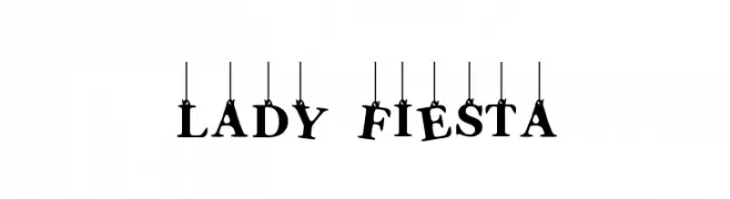
A playful, decorative font with characters hanging from strings, ideal for festive designs.
![Lady Fiesta Frei Schriftart Herunterladen]() Herunterladen 851 Downloads@WebFont
Herunterladen 851 Downloads@WebFont -
( Fonts by Dan P. Lyons - Personal-use only. For commercial use please contact owner. )
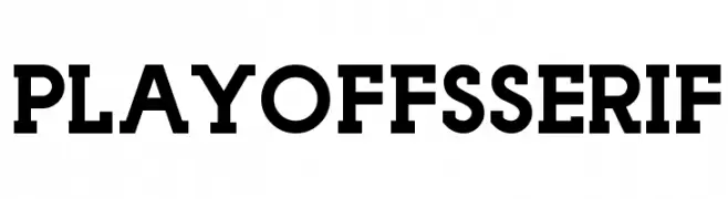
A bold, robust serif font with strong strokes and commanding presence.
![Playoffs Serif Frei Schriftart Herunterladen]() Herunterladen 851 Downloads@WebFont
Herunterladen 851 Downloads@WebFont -
( melpc.blogspot.com )
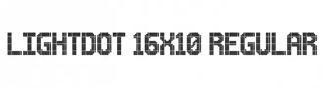
A dot matrix font with a retro digital display style.
![Lightdot 16x10 Regular Frei Schriftart Herunterladen]() Herunterladen 851 Downloads@WebFont
Herunterladen 851 Downloads@WebFont -
( leolapasset.ultra-book.com/ )
A playful, handwritten-style font with smooth, rounded edges.
![Comic Note Smooth Frei Schriftart Herunterladen]() Herunterladen 851 Downloads@WebFont
Herunterladen 851 Downloads@WebFont -
( Fonts by Lauren Thompson - www.nymfont.com )
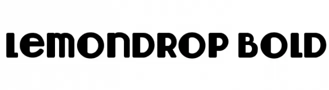
A bold, rounded typeface with a playful and whimsical style.
![Lemondrop Bold Frei Schriftart Herunterladen]() Herunterladen 851 Downloads@WebFont
Herunterladen 851 Downloads@WebFont -
( - www.matiescanalesgonzalez.com )
An organic, tree bark-inspired font with intricate, hand-carved details.
![Gill Tree Frei Schriftart Herunterladen]() Herunterladen 851 Downloads@WebFont
Herunterladen 851 Downloads@WebFont -
![Best font ever Frei Schriftart Herunterladen]() Herunterladen 851 Downloads@WebFont
Herunterladen 851 Downloads@WebFont -
![AntPoltCond-Bold Frei Schriftart Herunterladen]() Herunterladen 851 Downloads@WebFont
Herunterladen 851 Downloads@WebFont -
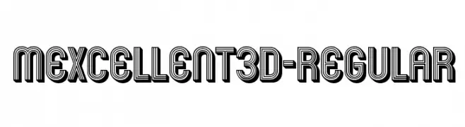
( Fonts by www.typodermicfonts.com - Ray Larabie )
A bold, three-dimensional font with a layered, geometric design.
![Mexcellent3D-Regular Frei Schriftart Herunterladen]() Herunterladen 851 Downloads@WebFont
Herunterladen 851 Downloads@WebFont -
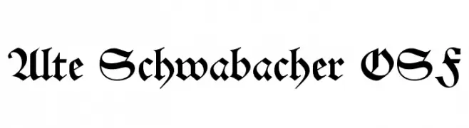
( Fonts by Dieter Steffmann )
A traditional blackletter font with intricate, angular letterforms and a medieval aesthetic.
![Alte Schwabacher OSF Frei Schriftart Herunterladen]() Herunterladen 851 Downloads@WebFont
Herunterladen 851 Downloads@WebFont -
![jaune d'oeuf Bold Frei Schriftart Herunterladen]() Herunterladen 851 Downloads@WebFont
Herunterladen 851 Downloads@WebFont -
![BV_Rondes_Boite Frei Schriftart Herunterladen]() Herunterladen 851 Downloads@WebFont
Herunterladen 851 Downloads@WebFont -
![SERIESB Frei Schriftart Herunterladen]() Herunterladen 851 Downloads@WebFont
Herunterladen 851 Downloads@WebFont -
![Charterwell No5 Frei Schriftart Herunterladen]() Herunterladen 851 Downloads@WebFont
Herunterladen 851 Downloads@WebFont -
( Fonts by Nate Piekos - www.blambot.com )
A bold, playful handwritten font with rounded, irregular characters.
![Enchilada Frei Schriftart Herunterladen]() Herunterladen 851 Downloads@WebFont
Herunterladen 851 Downloads@WebFont -
( Fonts by Kong Font )
A playful, bold font with rounded, thick strokes and a whimsical, casual style.
![Funny PERSONAL USE ONLY! Frei Schriftart Herunterladen]() Herunterladen 850 Downloads@WebFont
Herunterladen 850 Downloads@WebFont -
( Fonts by Fontfabric - Svetoslav Simov - Personal-use only. For commercial use please contact owner. )
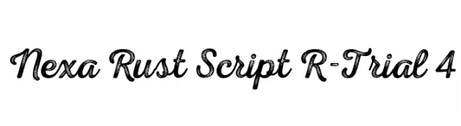
A bold, textured script font with a rustic, hand-drawn appearance.
![Nexa Rust Script R-Trial 4 Frei Schriftart Herunterladen]() Herunterladen 850 Downloads@WebFont
Herunterladen 850 Downloads@WebFont -
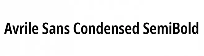
( Fonts by Monotype Design Team - Personal-use only. For commercial use please contact owner. )
A modern, bold, and condensed sans-serif font with clean lines.
![Avrile Sans Condensed SemiBold Frei Schriftart Herunterladen]() Herunterladen 850 Downloads@WebFont
Herunterladen 850 Downloads@WebFont -
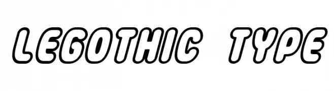
![LEGothic Type Frei Schriftart Herunterladen]() Herunterladen 850 Downloads@WebFont
Herunterladen 850 Downloads@WebFont -
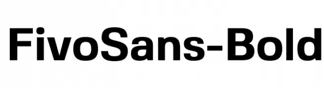
( Fonts by Alex Slobzheninov - Personal-use only. For commercial use please contact owner. )
A bold, modern sans-serif font with clean lines and excellent readability.
![FivoSans-Bold Frei Schriftart Herunterladen]() Herunterladen 850 Downloads@WebFont
Herunterladen 850 Downloads@WebFont -
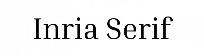
( Fonts by Black[Foundry] - Personal-use only. For commercial use please contact owner. )
A modern serif font with elegant strokes and clear readability.
![Inria Serif Frei Schriftart Herunterladen]() Herunterladen 850 Downloads@WebFont
Herunterladen 850 Downloads@WebFont -
( Skyhaven Fonts - fonts.plph.co )
A handwritten font with a casual, organic style and tall, narrow uppercase letters.
![Anitype Redwood 2 Frei Schriftart Herunterladen]() Herunterladen 850 Downloads@WebFont
Herunterladen 850 Downloads@WebFont -
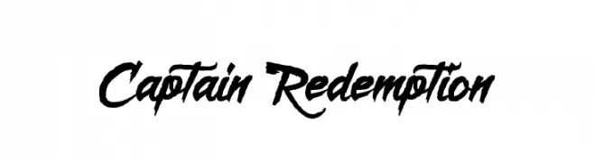
( Fonts by Octotype )
A bold, dynamic cursive font with sharp, angular strokes and a sense of movement.
![Captain Redemption Frei Schriftart Herunterladen]() Herunterladen 850 Downloads@WebFont
Herunterladen 850 Downloads@WebFont -
![Yeah Papa Frei Schriftart Herunterladen]() Herunterladen 850 Downloads@WebFont
Herunterladen 850 Downloads@WebFont -
( Fonts by a Situjuh Nazara - c7n1.wordpress.com. Personal-use only. For commercial use please contact owner. )
A playful handwritten font with rounded, consistent strokes and a casual vibe.
![Anysome Frei Schriftart Herunterladen]() Herunterladen 850 Downloads@WebFont
Herunterladen 850 Downloads@WebFont -
( jaydegarrow.wix.com/jaydefonts )
A bold, distressed stencil font with an industrial warning sign aesthetic.
![CAUTION Frei Schriftart Herunterladen]() Herunterladen 850 Downloads@WebFont
Herunterladen 850 Downloads@WebFont -
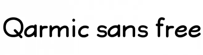
![Qarmic sans free Frei Schriftart Herunterladen]() Herunterladen 850 Downloads@WebFont
Herunterladen 850 Downloads@WebFont -
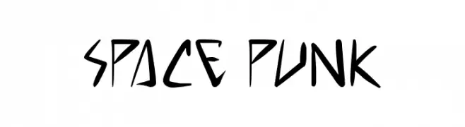
( Free for personal use - www.pressgang-studios.com )
A dynamic, angular font with a futuristic and edgy design.
![space punk Frei Schriftart Herunterladen]() Herunterladen 850 Downloads@WebFont
Herunterladen 850 Downloads@WebFont -
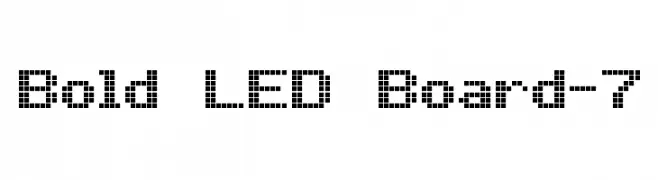
( www.styleseven.com/ )
A pixelated, LED-inspired font with a retro digital aesthetic.
![Bold LED Board-7 Frei Schriftart Herunterladen]() Herunterladen 850 Downloads@WebFont
Herunterladen 850 Downloads@WebFont -
( Fonts by Have Fun with Fonts )
A decorative script font with a ribbon-like, flowing style and high contrast strokes.
![HFF Ribbon Frei Schriftart Herunterladen]() Herunterladen 850 Downloads@WebFont
Herunterladen 850 Downloads@WebFont -
( Fonts by Aleksander Shevchuk - www.aleksandershevchuk.ru )
A bold, playful font with rounded shapes and decorative curls.
![FatC Frei Schriftart Herunterladen]() Herunterladen 850 Downloads@WebFont
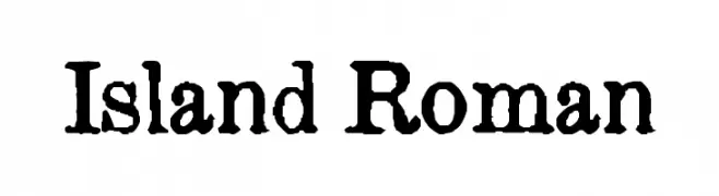
Herunterladen 850 Downloads@WebFont -
![Island Roman Frei Schriftart Herunterladen]() Herunterladen 850 Downloads@WebFont
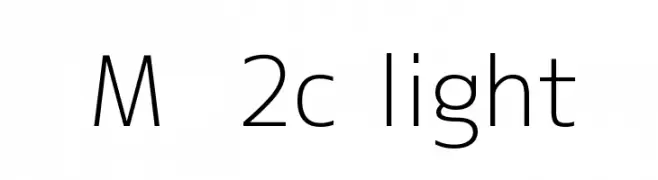
Herunterladen 850 Downloads@WebFont -
![M+ 2c light Frei Schriftart Herunterladen]() Herunterladen 850 Downloads@WebFont
Herunterladen 850 Downloads@WebFont -
( Fonts by Kimberly Geswein - kimberlygeswein.com )
A lively, fluid handwritten font with cursive, connected letterforms and moderate stroke contrast.
![Never Let Go Frei Schriftart Herunterladen]() Herunterladen 850 Downloads@WebFont
Herunterladen 850 Downloads@WebFont


Welche Schriften sind gerade am populärsten?
Poppins, Roboto, Montserrat, Open Sans und Lato sind wegen ihrer klaren Formen und breiten Einsetzbarkeit sehr gefragt – von Markenauftritt über Landingpages bis hin zu Postern.
Welche Fonts eignen sich für Logos?
Geometrische Sans‑Serifs (z. B. Poppins, Familien im Gotham‑Stil) sind ein häufiger Griff für sauberes, skalierbares Branding. Für eine persönlichere Note bleiben Scripts und Handschrift‑Stile beliebt. Kombinieren Sie einen prägnanten Headline‑Font mit einer neutralen Brotschrift für Wiedererkennung und Harmonie.
Wie oft wird die Top‑Liste aktualisiert?
Regelmäßig – basierend auf realen Downloads und Interaktionen. Schauen Sie öfter vorbei, um aufstrebende Favoriten früh zu entdecken.
💡 Tipp: Seite bookmarken – Trends wechseln schnell, und heutige Top‑Schriften inspirieren morgen vielleicht das Rebranding.