Willkommen bei den Top‑Schriften – hier treffen Beliebtheit und Qualität aufeinander. Das sind die in diesem Jahr am häufigsten heruntergeladenen und genutzten Fonts. Wenn Sie sichere Optionen für Logo, Web oder Social suchen, starten Sie hier.
Jeder Top‑Font überzeugt durch Balance, Lesbarkeit und Vielseitigkeit. Sie finden moderne Sans‑Serifs, elegante Scripts, Vintage‑Serifs und minimalistische Displays.
-
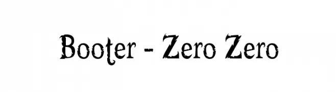
( Fonts by Apostrophic Lab )
A bold, distressed serif font with a rugged, grunge-like appearance.
 Herunterladen 852 Downloads@WebFont
 -
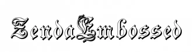
( Fonts by Paul Lloyd )
An ornate, embossed blackletter font with intricate details and a historical feel.
![ZendaEmbossed Frei Schriftart Herunterladen]() Herunterladen 852 Downloads@WebFont
Herunterladen 852 Downloads@WebFont -
![RSLaserLondon Frei Schriftart Herunterladen]() Herunterladen 852 Downloads
Herunterladen 852 Downloads -
![LumineSign Bold Frei Schriftart Herunterladen]() Herunterladen 852 Downloads@WebFont
Herunterladen 852 Downloads@WebFont -
![Astron Boy Frei Schriftart Herunterladen]() Herunterladen 852 Downloads@WebFont
Herunterladen 852 Downloads@WebFont -
![Reanimator DEMO Frei Schriftart Herunterladen]() Herunterladen 852 Downloads@WebFont
Herunterladen 852 Downloads@WebFont -
( Fonts by Kong Font )
A playful, bold font with rounded, thick strokes and a whimsical, casual style.
![Funny PERSONAL USE ONLY! Frei Schriftart Herunterladen]() Herunterladen 851 Downloads@WebFont
Herunterladen 851 Downloads@WebFont -
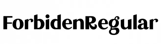
Schriftart von glyphstyle. For commercial use please contact the owner.
( NOTE: This demo font is for PERSONAL USE ONLY! But any donation are very appreciated. Paypal account for donation : https://www.paypal.me/dimasardhi full version: https://www.glyphstyle.net/forbiden-classy-sans-serif/ contact us at styleglyph@gmail.co )
A bold, modern font with thick strokes and high readability.
![Forbiden Regular Frei Schriftart Herunterladen]() Herunterladen 851 Downloads@WebFont
Herunterladen 851 Downloads@WebFont -
( Fonts by Wojciech Kalinowski )
A clean, monospaced font perfect for coding and technical documents.
![Consola Mono Book Frei Schriftart Herunterladen]() Herunterladen 851 Downloads@WebFont
Herunterladen 851 Downloads@WebFont -
( Fonts by Julieta Ulanovsky - Personal-use only. For commercial use please contact owner. )
A modern, geometric sans-serif font with a clean and professional look.
![Montserrat Ace SemiBold Frei Schriftart Herunterladen]() Herunterladen 851 Downloads@WebFont
Herunterladen 851 Downloads@WebFont -
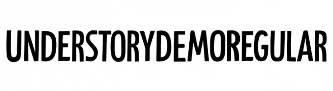
( Fonts by Hanoded )
A bold, playful font with decorative elements and a modern style.
![Understory DEMO Regular Frei Schriftart Herunterladen]() Herunterladen 851 Downloads@WebFont
Herunterladen 851 Downloads@WebFont -
( Fonts by Alex Slobzheninov - Personal-use only. For commercial use please contact owner. )
A bold, modern sans-serif font with clean lines and excellent readability.
![FivoSans-Bold Frei Schriftart Herunterladen]() Herunterladen 851 Downloads@WebFont
Herunterladen 851 Downloads@WebFont -
( Roman Paslavskiy - creativemarket.com/seveniwe )
A bold, modern sans-serif font with a slightly condensed style.
![Searocks-Regular Frei Schriftart Herunterladen]() Herunterladen 851 Downloads@WebFont
Herunterladen 851 Downloads@WebFont -
Schriftart von joorgemoron. For commercial use please contact the owner.
( Free for personal use. )
A bold, italicized serif font with playful serifs and dynamic slant.
![JMHCajita-BoldItalic Frei Schriftart Herunterladen]() Herunterladen 851 Downloads@WebFont
Herunterladen 851 Downloads@WebFont -
( Fonts by Octotype - www.foundmyfont.com - Personal-use only. For commercial use please contact owner. )
An elegant, cursive font with a sophisticated, handwritten style.
![Gentlemanly Frei Schriftart Herunterladen]() Herunterladen 851 Downloads@WebFont
Herunterladen 851 Downloads@WebFont -
![Sztylet Bold Oblique Frei Schriftart Herunterladen]() Herunterladen 851 Downloads@WebFont
Herunterladen 851 Downloads@WebFont -
( Fonts by a Neale Davidson - www.pixelsagas.com. Personal-use only. For commercial use please contact owner. )
A bold, geometric font with a modern and futuristic design.
![Plavsky Bold Frei Schriftart Herunterladen]() Herunterladen 851 Downloads@WebFont
Herunterladen 851 Downloads@WebFont -
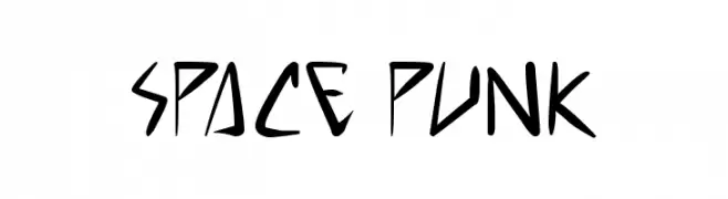
( Free for personal use - www.pressgang-studios.com )
A dynamic, angular font with a futuristic and edgy design.
![space punk Frei Schriftart Herunterladen]() Herunterladen 851 Downloads@WebFont
Herunterladen 851 Downloads@WebFont -
( leolapasset.ultra-book.com/ )
A playful, handwritten-style font with smooth, rounded edges.
![Comic Note Smooth Frei Schriftart Herunterladen]() Herunterladen 851 Downloads@WebFont
Herunterladen 851 Downloads@WebFont -
( - www.matiescanalesgonzalez.com )
An organic, tree bark-inspired font with intricate, hand-carved details.
![Gill Tree Frei Schriftart Herunterladen]() Herunterladen 851 Downloads@WebFont
Herunterladen 851 Downloads@WebFont -
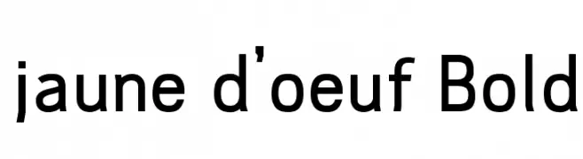
![jaune d'oeuf Bold Frei Schriftart Herunterladen]() Herunterladen 851 Downloads@WebFont
Herunterladen 851 Downloads@WebFont -
( Fonts by Apostrophic Lab )
A modern, expanded font with smooth, rounded characters and consistent stroke thickness.
![Street - Expanded Semi Frei Schriftart Herunterladen]() Herunterladen 851 Downloads@WebFont
Herunterladen 851 Downloads@WebFont -
![Cosmoscandy Frei Schriftart Herunterladen]() Herunterladen 851 Downloads@WebFont
Herunterladen 851 Downloads@WebFont -
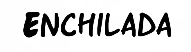
( Fonts by Nate Piekos - www.blambot.com )
A bold, playful handwritten font with rounded, irregular characters.
![Enchilada Frei Schriftart Herunterladen]() Herunterladen 851 Downloads@WebFont
Herunterladen 851 Downloads@WebFont -
( Fonts by Daymarius - www.creativefabrica.com/designer/daymarius - Personal-use only. For commercial use please contact owner. )
A pixelated, retro-style font inspired by classic video games.
![Retro Gaming Frei Schriftart Herunterladen]() Herunterladen 850 Downloads@WebFont
Herunterladen 850 Downloads@WebFont -
![Navy Ballad - Personal Use Frei Schriftart Herunterladen]() Herunterladen 850 Downloads@WebFont
Herunterladen 850 Downloads@WebFont -
( https://creativemarket.com/vast )
A bold, slanted script font with dynamic and fluid letterforms.
![ABOVEADEMOVERSION Frei Schriftart Herunterladen]() Herunterladen 850 Downloads@WebFont
Herunterladen 850 Downloads@WebFont -
( Fonts by www.studiotypo.com - Personal-use only. For commercial use please contact owner. )
A clean, modern sans-serif font with a light weight and rounded edges.
![Early Times Light Demo Frei Schriftart Herunterladen]() Herunterladen 850 Downloads@WebFont
Herunterladen 850 Downloads@WebFont -
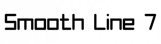
( Fonts by Style-7 - www.styleseven.com - Personal-use only. For commercial use please contact owner. )
A modern, geometric font with rounded edges and a clean, uniform appearance.
![Smooth Line 7 Frei Schriftart Herunterladen]() Herunterladen 850 Downloads@WebFont
Herunterladen 850 Downloads@WebFont -
( Fonts by www.kimberlygeswein.com - Kimberly Geswein )
A playful, hand-drawn font with tall, narrow letters and a whimsical style.
![KG One More Night Frei Schriftart Herunterladen]() Herunterladen 850 Downloads@WebFont
Herunterladen 850 Downloads@WebFont -
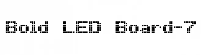
( www.styleseven.com/ )
A pixelated, LED-inspired font with a retro digital aesthetic.
![Bold LED Board-7 Frei Schriftart Herunterladen]() Herunterladen 850 Downloads@WebFont
Herunterladen 850 Downloads@WebFont -
( Fonts by Have Fun with Fonts )
A decorative script font with a ribbon-like, flowing style and high contrast strokes.
![HFF Ribbon Frei Schriftart Herunterladen]() Herunterladen 850 Downloads@WebFont
Herunterladen 850 Downloads@WebFont -
( Fonts by Aleksander Shevchuk - www.aleksandershevchuk.ru )
A bold, playful font with rounded shapes and decorative curls.
![FatC Frei Schriftart Herunterladen]() Herunterladen 850 Downloads@WebFont
Herunterladen 850 Downloads@WebFont -
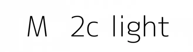
![M+ 2c light Frei Schriftart Herunterladen]() Herunterladen 850 Downloads@WebFont
Herunterladen 850 Downloads@WebFont -
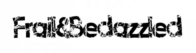
( Fonts by Lauren Thompson - www.nymfont.com )
A bold, distressed font with a grunge, textured style.
![Frail&Bedazzled Frei Schriftart Herunterladen]() Herunterladen 850 Downloads@WebFont
Herunterladen 850 Downloads@WebFont


Welche Schriften sind gerade am populärsten?
Poppins, Roboto, Montserrat, Open Sans und Lato sind wegen ihrer klaren Formen und breiten Einsetzbarkeit sehr gefragt – von Markenauftritt über Landingpages bis hin zu Postern.
Welche Fonts eignen sich für Logos?
Geometrische Sans‑Serifs (z. B. Poppins, Familien im Gotham‑Stil) sind ein häufiger Griff für sauberes, skalierbares Branding. Für eine persönlichere Note bleiben Scripts und Handschrift‑Stile beliebt. Kombinieren Sie einen prägnanten Headline‑Font mit einer neutralen Brotschrift für Wiedererkennung und Harmonie.
Wie oft wird die Top‑Liste aktualisiert?
Regelmäßig – basierend auf realen Downloads und Interaktionen. Schauen Sie öfter vorbei, um aufstrebende Favoriten früh zu entdecken.
💡 Tipp: Seite bookmarken – Trends wechseln schnell, und heutige Top‑Schriften inspirieren morgen vielleicht das Rebranding.