Willkommen bei den Top‑Schriften – hier treffen Beliebtheit und Qualität aufeinander. Das sind die in diesem Jahr am häufigsten heruntergeladenen und genutzten Fonts. Wenn Sie sichere Optionen für Logo, Web oder Social suchen, starten Sie hier.
Jeder Top‑Font überzeugt durch Balance, Lesbarkeit und Vielseitigkeit. Sie finden moderne Sans‑Serifs, elegante Scripts, Vintage‑Serifs und minimalistische Displays.
-
( Fonts by wep )
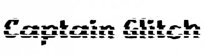
A bold, glitch-style font with a fragmented, digital appearance.
 Herunterladen 186 Downloads@WebFont
 -
( Fonts by Rich Gast - www.greywolfwebworks.com Sponsoren Schriftart )
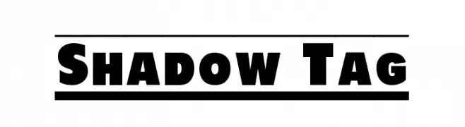
A bold, shadowed font with a strong, three-dimensional effect.
![Shadow Tag Frei Schriftart Herunterladen]() Herunterladen 186 Downloads
Herunterladen 186 Downloads -
![AntykwaTorunskaLight-Italic Frei Schriftart Herunterladen]() Herunterladen 186 Downloads@WebFont
Herunterladen 186 Downloads@WebFont -
( 7NTypes - Situjuh Nazara - 7ntypes.com )
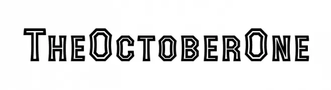
A bold, geometric font with angular shapes and a double-line effect.
![The October One Frei Schriftart Herunterladen]() Herunterladen 186 Downloads@WebFont
Herunterladen 186 Downloads@WebFont -
( Fonts by surotype - Adil Budianto - Personal-use only. For commercial use please contact owner. )
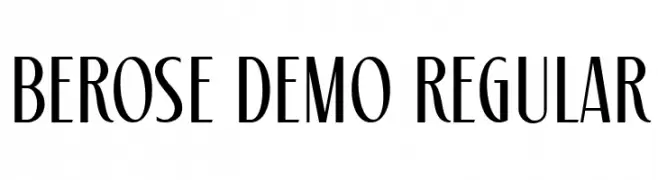
A refined and elegant font with high contrast and slender, elongated characters.
![Berose Demo Regular Frei Schriftart Herunterladen]() Herunterladen 186 Downloads@WebFont
Herunterladen 186 Downloads@WebFont -
-
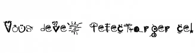
![Vous devez télécharger ce! Frei Schriftart Herunterladen]() Herunterladen 186 Downloads@WebFont
Herunterladen 186 Downloads@WebFont -
( Fonts by Gilar Studio )
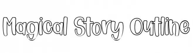
A playful, outlined font with a hand-drawn, whimsical style.
![Magical Story Outline Frei Schriftart Herunterladen]() Herunterladen 186 Downloads@WebFont
Herunterladen 186 Downloads@WebFont -
( Fonts by Manfred Klein - manfred-klein.ina-mar.com )
A modern, decorative font with bold, shadowed outlines for a 3D effect.
![TschicholdsShades Frei Schriftart Herunterladen]() Herunterladen 186 Downloads@WebFont
Herunterladen 186 Downloads@WebFont -
( Fonts by Fenotype - Personal-use only. For commercial use please contact owner. )
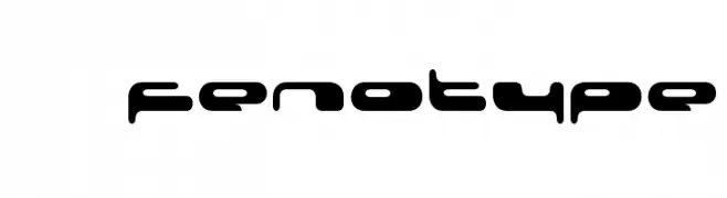
A futuristic, bold font with rounded, geometric letterforms and low contrast.
![08 02 03 Fenotype Frei Schriftart Herunterladen]() Herunterladen 186 Downloads@WebFont
Herunterladen 186 Downloads@WebFont -
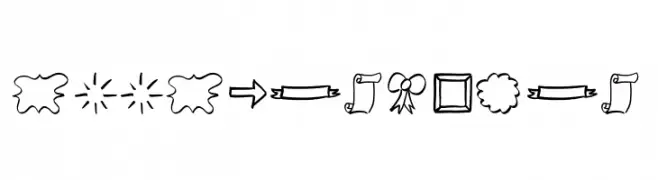
( Fonts by Jonathan S. Harris )
Hand-drawn doodle shapes and symbols with a whimsical, sketchy style.
![Doodle Shapes Frei Schriftart Herunterladen]() Herunterladen 186 Downloads@WebFont
Herunterladen 186 Downloads@WebFont

Welche Schriften sind gerade am populärsten?
Poppins, Roboto, Montserrat, Open Sans und Lato sind wegen ihrer klaren Formen und breiten Einsetzbarkeit sehr gefragt – von Markenauftritt über Landingpages bis hin zu Postern.
Welche Fonts eignen sich für Logos?
Geometrische Sans‑Serifs (z. B. Poppins, Familien im Gotham‑Stil) sind ein häufiger Griff für sauberes, skalierbares Branding. Für eine persönlichere Note bleiben Scripts und Handschrift‑Stile beliebt. Kombinieren Sie einen prägnanten Headline‑Font mit einer neutralen Brotschrift für Wiedererkennung und Harmonie.
Wie oft wird die Top‑Liste aktualisiert?
Regelmäßig – basierend auf realen Downloads und Interaktionen. Schauen Sie öfter vorbei, um aufstrebende Favoriten früh zu entdecken.
💡 Tipp: Seite bookmarken – Trends wechseln schnell, und heutige Top‑Schriften inspirieren morgen vielleicht das Rebranding.