Willkommen bei den Top‑Schriften – hier treffen Beliebtheit und Qualität aufeinander. Das sind die in diesem Jahr am häufigsten heruntergeladenen und genutzten Fonts. Wenn Sie sichere Optionen für Logo, Web oder Social suchen, starten Sie hier.
Jeder Top‑Font überzeugt durch Balance, Lesbarkeit und Vielseitigkeit. Sie finden moderne Sans‑Serifs, elegante Scripts, Vintage‑Serifs und minimalistische Displays.
-
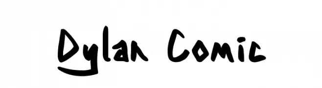
( Fonts by Dylan Culhane )
A bold, hand-drawn font with a playful, comic-like style.
 Herunterladen 184 Downloads@WebFont
 -
![BjBj-TOO Frei Schriftart Herunterladen]() Herunterladen 184 Downloads@WebFont
Herunterladen 184 Downloads@WebFont -
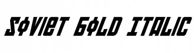
( Fonts by Daniel Zadorozny - www.iconian.com )
A bold, italicized font with geometric, angular design and strong diagonal emphasis.
![Soviet Bold Italic Frei Schriftart Herunterladen]() Herunterladen 184 Downloads@WebFont
Herunterladen 184 Downloads@WebFont -
( www.indernik.com )
A playful, bold, hand-drawn uppercase font with a cartoonish style.
![IndernikGold Frei Schriftart Herunterladen]() Herunterladen 184 Downloads@WebFont
Herunterladen 184 Downloads@WebFont -
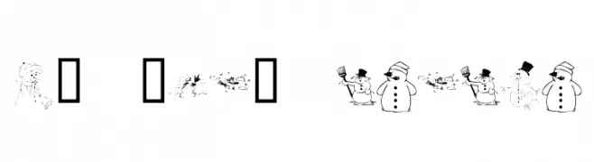
![KR Snow People Frei Schriftart Herunterladen]() Herunterladen 184 Downloads@WebFont
Herunterladen 184 Downloads@WebFont -
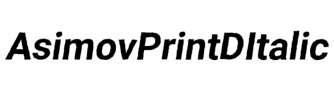
( Fonts by CannotIntoSpaceFonts - KineticPlasma Fonts - Personal-use only. For commercial use please contact owner. )
A bold, italic font with a modern and dynamic style.
![Asimov Print D Italic Frei Schriftart Herunterladen]() Herunterladen 184 Downloads@WebFont
Herunterladen 184 Downloads@WebFont -
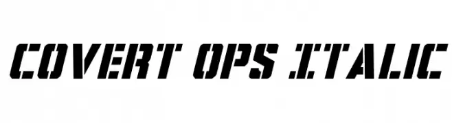
( Fonts by Daniel Zadorozny - www.iconian.com - Free for personal use )
A bold, italic, and angular font with a futuristic style.
![Covert Ops Italic Frei Schriftart Herunterladen]() Herunterladen 184 Downloads@WebFont
Herunterladen 184 Downloads@WebFont -
( Fonts by Edric Studio www.creativefabrica.com/designer/edricstudio/ - Personal-use only. For commercial use please contact owner. )
A modern, sans-serif font with a clean and slightly condensed style.
![Rowland Frei Schriftart Herunterladen]() Herunterladen 184 Downloads@WebFont
Herunterladen 184 Downloads@WebFont -
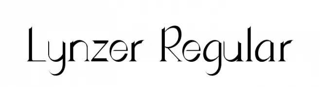
( Fonts by Eva Barabas - www.etsy.com/ie/shop/digitaltypefaces - Personal-use only. For commercial use please contact owner. )
A modern and elegant font with elongated letterforms and striking visual contrast.
![Lynzer Regular Frei Schriftart Herunterladen]() Herunterladen 184 Downloads@WebFont
Herunterladen 184 Downloads@WebFont -
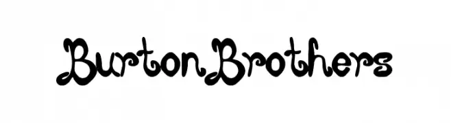
( Fonts by Woodcutter )
A playful, decorative font with bold, curvy lines and artistic flair.
![Burton Brothers Frei Schriftart Herunterladen]() Herunterladen 184 Downloads@WebFont
Herunterladen 184 Downloads@WebFont


Welche Schriften sind gerade am populärsten?
Poppins, Roboto, Montserrat, Open Sans und Lato sind wegen ihrer klaren Formen und breiten Einsetzbarkeit sehr gefragt – von Markenauftritt über Landingpages bis hin zu Postern.
Welche Fonts eignen sich für Logos?
Geometrische Sans‑Serifs (z. B. Poppins, Familien im Gotham‑Stil) sind ein häufiger Griff für sauberes, skalierbares Branding. Für eine persönlichere Note bleiben Scripts und Handschrift‑Stile beliebt. Kombinieren Sie einen prägnanten Headline‑Font mit einer neutralen Brotschrift für Wiedererkennung und Harmonie.
Wie oft wird die Top‑Liste aktualisiert?
Regelmäßig – basierend auf realen Downloads und Interaktionen. Schauen Sie öfter vorbei, um aufstrebende Favoriten früh zu entdecken.
💡 Tipp: Seite bookmarken – Trends wechseln schnell, und heutige Top‑Schriften inspirieren morgen vielleicht das Rebranding.