Willkommen bei den Top‑Schriften – hier treffen Beliebtheit und Qualität aufeinander. Das sind die in diesem Jahr am häufigsten heruntergeladenen und genutzten Fonts. Wenn Sie sichere Optionen für Logo, Web oder Social suchen, starten Sie hier.
Jeder Top‑Font überzeugt durch Balance, Lesbarkeit und Vielseitigkeit. Sie finden moderne Sans‑Serifs, elegante Scripts, Vintage‑Serifs und minimalistische Displays.
-
( Out of Step Font Company - Dan Steinbok - outofstepfontco.com )
A tall, narrow font with clean lines and a modern, minimalist style.
 Herunterladen 186 Downloads@WebFont
 -
( Fonts by Manfred Klein - manfred-klein.ina-mar.com )
Ornamental dingbat font with Greek art motifs and classical illustrations.
![GreekArt Frei Schriftart Herunterladen]() Herunterladen 186 Downloads@WebFont
Herunterladen 186 Downloads@WebFont -
( Fonts by www.chequered.ink - Chequered Ink - Personal-use only. For commercial use please contact owner. )
A bold, angular font with a futuristic and edgy design.
![Enter the Harbinger Frei Schriftart Herunterladen]() Herunterladen 186 Downloads@WebFont
Herunterladen 186 Downloads@WebFont -
( Fonts by AminMario - Amin Mario - Personal-use only. For commercial use please contact owner. )
A playful, cursive font with a romantic and handwritten style.
![love heart Frei Schriftart Herunterladen]() Herunterladen 186 Downloads@WebFont
Herunterladen 186 Downloads@WebFont -
( Fonts by NJ Studio - Personal-use only. For commercial use please contact owner. )
A bold, energetic script font with smooth, flowing curves and a handwritten feel.
![CITCAT Frei Schriftart Herunterladen]() Herunterladen 186 Downloads@WebFont
Herunterladen 186 Downloads@WebFont -
-
( Richard Khuptong - khuptong.com )
A dynamic brushstroke font with bold, expressive characters.
![The Dolbak Brush Frei Schriftart Herunterladen]() Herunterladen 186 Downloads@WebFont
Herunterladen 186 Downloads@WebFont -
( Fonts by Adiljan Abliz (Uchqur) - Personal-use only. For commercial use please contact owner. )
A bold, 3D serif font with a strong, embossed appearance.
![UKIJ Kawak 3D Bold Frei Schriftart Herunterladen]() Herunterladen 186 Downloads@WebFont
Herunterladen 186 Downloads@WebFont -
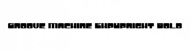
![Groove Machine ExpUpright Bold Frei Schriftart Herunterladen]() Herunterladen 186 Downloads@WebFont
Herunterladen 186 Downloads@WebFont -
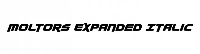
( Iconian Fonts - Daniel Zadorozny - www.iconian.com )
A bold, italicized, and expanded font with a futuristic and dynamic style.
![Moltors Expanded Italic Frei Schriftart Herunterladen]() Herunterladen 186 Downloads@WebFont
Herunterladen 186 Downloads@WebFont -
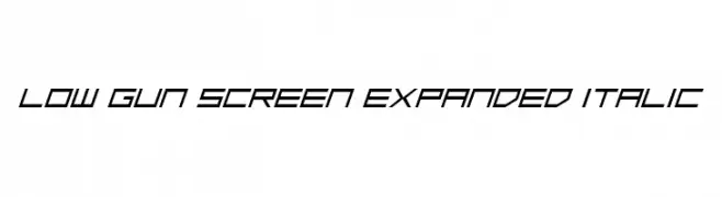
( Fonts by Daniel Zadorozny - www.iconian.com - Free for personal use )
A futuristic, expanded, and italicized font with sharp, geometric lines.
![Low Gun Screen Expanded Italic Frei Schriftart Herunterladen]() Herunterladen 186 Downloads@WebFont
Herunterladen 186 Downloads@WebFont


Welche Schriften sind gerade am populärsten?
Poppins, Roboto, Montserrat, Open Sans und Lato sind wegen ihrer klaren Formen und breiten Einsetzbarkeit sehr gefragt – von Markenauftritt über Landingpages bis hin zu Postern.
Welche Fonts eignen sich für Logos?
Geometrische Sans‑Serifs (z. B. Poppins, Familien im Gotham‑Stil) sind ein häufiger Griff für sauberes, skalierbares Branding. Für eine persönlichere Note bleiben Scripts und Handschrift‑Stile beliebt. Kombinieren Sie einen prägnanten Headline‑Font mit einer neutralen Brotschrift für Wiedererkennung und Harmonie.
Wie oft wird die Top‑Liste aktualisiert?
Regelmäßig – basierend auf realen Downloads und Interaktionen. Schauen Sie öfter vorbei, um aufstrebende Favoriten früh zu entdecken.
💡 Tipp: Seite bookmarken – Trends wechseln schnell, und heutige Top‑Schriften inspirieren morgen vielleicht das Rebranding.