Willkommen bei den Top‑Schriften – hier treffen Beliebtheit und Qualität aufeinander. Das sind die in diesem Jahr am häufigsten heruntergeladenen und genutzten Fonts. Wenn Sie sichere Optionen für Logo, Web oder Social suchen, starten Sie hier.
Jeder Top‑Font überzeugt durch Balance, Lesbarkeit und Vielseitigkeit. Sie finden moderne Sans‑Serifs, elegante Scripts, Vintage‑Serifs und minimalistische Displays.
-
( Copyright (c) 2010-2011, Rubén Prol (ipanemagrafica@gmail.com|www.ipanemagrafica.com) )
A clean, modern sans-serif font with balanced proportions and consistent stroke width.
 Herunterladen 792 Downloads@WebFont
 -
( Copyright (c) 2011 by Brenda Gallo (gbrenda1987@gmail.com) )
A modern, geometric sans-serif font with consistent stroke width and balanced spacing.
![BubblerOne-Regular Frei Schriftart Herunterladen]() Herunterladen 792 Downloads@WebFont
Herunterladen 792 Downloads@WebFont -
![Tuamach Regular Frei Schriftart Herunterladen]() Herunterladen 792 Downloads@WebFont
Herunterladen 792 Downloads@WebFont -
![Tempo Esperanto Kursiva Frei Schriftart Herunterladen]() Herunterladen 792 Downloads
Herunterladen 792 Downloads -
![DiddleTheMouse Frei Schriftart Herunterladen]() Herunterladen 792 Downloads@WebFont
Herunterladen 792 Downloads@WebFont -
![pencilPete FONT Frei Schriftart Herunterladen]() Herunterladen 792 Downloads@WebFont
Herunterladen 792 Downloads@WebFont -
![Floralis Frei Schriftart Herunterladen]() Herunterladen 792 Downloads@WebFont
Herunterladen 792 Downloads@WebFont -
( Fonts by Eyecue Design - Chris Brown )
A bold, playful font with rounded edges and whimsical characters.
![North point Frei Schriftart Herunterladen]() Herunterladen 792 Downloads@WebFont
Herunterladen 792 Downloads@WebFont -
( Fonts by Jacob Fisher - www.pizzadude.dk )
A bold, outlined, and slightly italicized font with a modern, dynamic style.
![Nonstop italic Frei Schriftart Herunterladen]() Herunterladen 792 Downloads@WebFont
Herunterladen 792 Downloads@WebFont -
( Fonts by wep - Wahyu Eka Prasetya - Personal-use only. For commercial use please contact owner. )
A bold, modern sans-serif font with clean lines and strong presence.
![Diam Frei Schriftart Herunterladen]() Herunterladen 791 Downloads@WebFont
Herunterladen 791 Downloads@WebFont -
( Fonts by DigitypeStudio - Personal-use only. For commercial use please contact owner. )
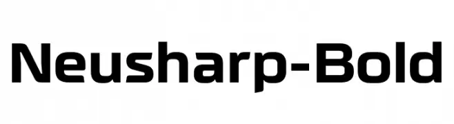
A bold, modern font with geometric shapes and sharp edges.
![Neusharp-Bold Frei Schriftart Herunterladen]() Herunterladen 791 Downloads@WebFont
Herunterladen 791 Downloads@WebFont -
( Fonts by Regulerstudio )
A playful, hand-drawn font with bold, rounded characters and a textured, artistic style.
![ART HISTORY BOOK Frei Schriftart Herunterladen]() Herunterladen 791 Downloads@WebFont
Herunterladen 791 Downloads@WebFont -
( Fonts by Situjuh Nazara - 7ntypes.com - Personal-use only. For commercial use please contact owner. )
A playful, handwritten font with rounded, smooth letterforms.
![Lady Nature Frei Schriftart Herunterladen]() Herunterladen 791 Downloads@WebFont
Herunterladen 791 Downloads@WebFont -
( Copyright 2018 The Krub Project Authors (https://github.com/cadsondemak/Krub) )
A bold, modern sans-serif typeface with clean lines and uniform strokes.
![Krub Bold Frei Schriftart Herunterladen]() Herunterladen 791 Downloads@WebFont
Herunterladen 791 Downloads@WebFont -
( Vladimir Fedotov )
A modern, sleek font with tall, narrow characters and a vertical emphasis.
![Fancy Frei Schriftart Herunterladen]() Herunterladen 791 Downloads@WebFont
Herunterladen 791 Downloads@WebFont -
( Maulana Creative - Gilang Maulana - maulanacreative.net/ )
An elegant script font with graceful, flowing lines and high contrast.
![Love Hewits Frei Schriftart Herunterladen]() Herunterladen 791 Downloads@WebFont
Herunterladen 791 Downloads@WebFont -
( Chung-Deh Tien - www.redbubble.com/people/Kaiju )
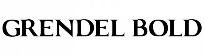
A bold serif font with strong strokes and elegant serifs, perfect for impactful designs.
![GRENDEL BOLD Frei Schriftart Herunterladen]() Herunterladen 791 Downloads@WebFont
Herunterladen 791 Downloads@WebFont -
( Fonts by Saridezra )
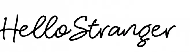
A lively, expressive handwritten font with fluid, connected letters.
![HelloStranger Frei Schriftart Herunterladen]() Herunterladen 791 Downloads@WebFont
Herunterladen 791 Downloads@WebFont -
( Fonts by Jovanny Lemonad - typetype.ru - Personal-use only. For commercial use please contact owner. )
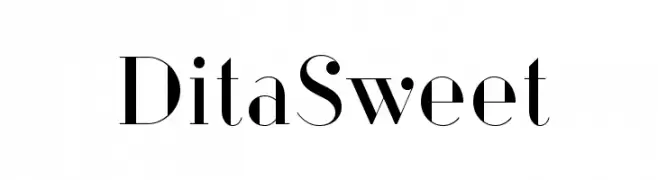
A modern, high-contrast serif font with elegant, geometric forms.
![DitaSweet Frei Schriftart Herunterladen]() Herunterladen 791 Downloads@WebFont
Herunterladen 791 Downloads@WebFont -
( Fonts by Anne Elster )
A playful, casual handwritten font with rounded, uniform strokes.
![PicasProperHand Frei Schriftart Herunterladen]() Herunterladen 791 Downloads@WebFont
Herunterladen 791 Downloads@WebFont -
( Fonts by junkohanhero )
A bold, textured font with a hand-crafted, artistic style.
![Feelings On / Off Frei Schriftart Herunterladen]() Herunterladen 791 Downloads@WebFont
Herunterladen 791 Downloads@WebFont -
( Fonts by Daniel Zadorozny - www.iconian.com )
A futuristic, angular font with sharp edges and geometric shapes.
![Drive Frei Schriftart Herunterladen]() Herunterladen 791 Downloads@WebFont
Herunterladen 791 Downloads@WebFont -
( Fonts by junkohanhero )
A bold, distressed font with a vintage, rugged look.
![Walk with me now Frei Schriftart Herunterladen]() Herunterladen 791 Downloads@WebFont
Herunterladen 791 Downloads@WebFont -
( Fonts by Typodermic Fonts )
A bold, monospaced font with a clean and structured design, ideal for technical and professional use.
![NK57MonospaceScRg-Bold Frei Schriftart Herunterladen]() Herunterladen 791 Downloads@WebFont
Herunterladen 791 Downloads@WebFont -
( Fonts by Castcraft Software - opti.netii.net - check the website before use )
A bold, classic serif font with medium contrast and elegant serifs.
![OPTIMagnaCarta-DemiBold Frei Schriftart Herunterladen]() Herunterladen 791 Downloads@WebFont
Herunterladen 791 Downloads@WebFont -
![Typeface Frei Schriftart Herunterladen]() Herunterladen 791 Downloads@WebFont
Herunterladen 791 Downloads@WebFont -
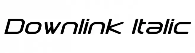
( Fonts by a Neale Davidson - www.pixelsagas.com. Personal-use only. For commercial use please contact owner. )
A modern, italic font with geometric precision and a futuristic aesthetic.
![Downlink Italic Frei Schriftart Herunterladen]() Herunterladen 791 Downloads@WebFont
Herunterladen 791 Downloads@WebFont -
![DavidEurofanEurovision-Bold Frei Schriftart Herunterladen]() Herunterladen 791 Downloads@WebFont
Herunterladen 791 Downloads@WebFont -
( Fonts by www.kimberlygeswein.com - Kimberly Geswein )
A playful, hand-drawn style with a textured, chalk-like appearance.
![KG Ten Thousand Reasons Frei Schriftart Herunterladen]() Herunterladen 791 Downloads@WebFont
Herunterladen 791 Downloads@WebFont -
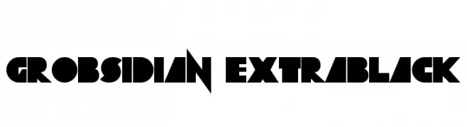
![Grobsidian ExtraBlack Frei Schriftart Herunterladen]() Herunterladen 791 Downloads@WebFont
Herunterladen 791 Downloads@WebFont -
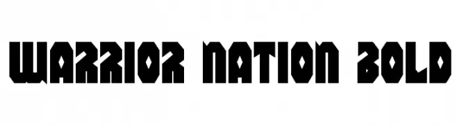
( Fonts by Daniel Zadorozny - www.iconian.com - Free for personal use )
A bold, geometric font with sharp, angular lines and a strong presence.
![Warrior Nation Bold Frei Schriftart Herunterladen]() Herunterladen 791 Downloads@WebFont
Herunterladen 791 Downloads@WebFont -
( Fonts by www.gust.org.pl )
An elegant italic serif font with smooth, flowing curves and a classic style.
![LMRoman10-Italic Frei Schriftart Herunterladen]() Herunterladen 791 Downloads@WebFont
Herunterladen 791 Downloads@WebFont -
( Copyright (c) 2010, Danh Hong (khmertype.blogspot.com) )
A modern, geometric sans-serif font with uniform stroke width.
![Battambang Frei Schriftart Herunterladen]() Herunterladen 791 Downloads@WebFont
Herunterladen 791 Downloads@WebFont -
( Free for a personal use. For a commercial use please visit www.kevinandamanda.com )
A whimsical and flowing handwritten font with elegant, fluid strokes.
![Pea Bhea's Words Frei Schriftart Herunterladen]() Herunterladen 791 Downloads@WebFont
Herunterladen 791 Downloads@WebFont -
( Font by kingthingsfonts.co.uk )
A bold, medieval-inspired font with sharp serifs and dramatic angles.
![Kingthings Foundation Frei Schriftart Herunterladen]() Herunterladen 791 Downloads@WebFont
Herunterladen 791 Downloads@WebFont


Welche Schriften sind gerade am populärsten?
Poppins, Roboto, Montserrat, Open Sans und Lato sind wegen ihrer klaren Formen und breiten Einsetzbarkeit sehr gefragt – von Markenauftritt über Landingpages bis hin zu Postern.
Welche Fonts eignen sich für Logos?
Geometrische Sans‑Serifs (z. B. Poppins, Familien im Gotham‑Stil) sind ein häufiger Griff für sauberes, skalierbares Branding. Für eine persönlichere Note bleiben Scripts und Handschrift‑Stile beliebt. Kombinieren Sie einen prägnanten Headline‑Font mit einer neutralen Brotschrift für Wiedererkennung und Harmonie.
Wie oft wird die Top‑Liste aktualisiert?
Regelmäßig – basierend auf realen Downloads und Interaktionen. Schauen Sie öfter vorbei, um aufstrebende Favoriten früh zu entdecken.
💡 Tipp: Seite bookmarken – Trends wechseln schnell, und heutige Top‑Schriften inspirieren morgen vielleicht das Rebranding.