Willkommen bei den Top‑Schriften – hier treffen Beliebtheit und Qualität aufeinander. Das sind die in diesem Jahr am häufigsten heruntergeladenen und genutzten Fonts. Wenn Sie sichere Optionen für Logo, Web oder Social suchen, starten Sie hier.
Jeder Top‑Font überzeugt durch Balance, Lesbarkeit und Vielseitigkeit. Sie finden moderne Sans‑Serifs, elegante Scripts, Vintage‑Serifs und minimalistische Displays.
-
( Fonts by weknow - Wino S Kadir )
A modern, geometric font with sleek lines and rounded edges.
 Herunterladen 660 Downloads@WebFont
 -
![Byzantium Frei Schriftart Herunterladen]() Herunterladen 660 Downloads@WebFont
Herunterladen 660 Downloads@WebFont -
![Fugit Frei Schriftart Herunterladen]() Herunterladen 660 Downloads
Herunterladen 660 Downloads -
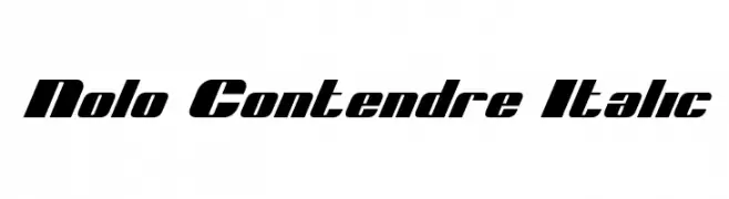
( Fonts by Daniel Zadorozny - www.iconian.com - Free for personal use )
A bold, italicized font with wide, dynamic characters.
![Nolo Contendre Italic Frei Schriftart Herunterladen]() Herunterladen 660 Downloads@WebFont
Herunterladen 660 Downloads@WebFont -
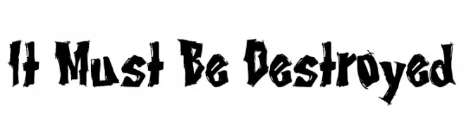
( Fonts by Tony O`Farrell )
A bold, jagged, and aggressive font with a distressed, rebellious style.
![It Must Be Destroyed Frei Schriftart Herunterladen]() Herunterladen 660 Downloads@WebFont
Herunterladen 660 Downloads@WebFont -
-
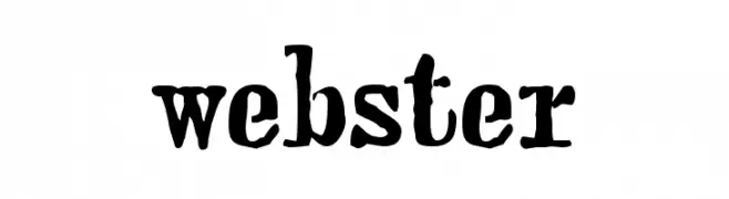
( Fonts by Emerald City Fontwerks )
A bold, textured font with a vintage, handcrafted appearance.
![webster Frei Schriftart Herunterladen]() Herunterladen 660 Downloads@WebFont
Herunterladen 660 Downloads@WebFont -
( Fonts by www.varian.net )
A bold, dynamic brush script font with expressive strokes and lively movement.
![Yes:Union Frei Schriftart Herunterladen]() Herunterladen 660 Downloads@WebFont
Herunterladen 660 Downloads@WebFont -
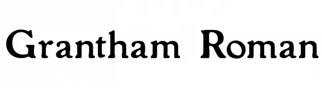
( Fonts by Paul Lloyd )
A classic serif font with elegant, bold characters and traditional serifs.
![Grantham Roman Frei Schriftart Herunterladen]() Herunterladen 660 Downloads
Herunterladen 660 Downloads -
![Zippo Frei Schriftart Herunterladen]() Herunterladen 660 Downloads@WebFont
Herunterladen 660 Downloads@WebFont -
( Fonts by John David www.easywriter.com/fonts/ )
A playful, handwritten font with fluid, irregular strokes and a casual vibe.
![BudHand Regular Frei Schriftart Herunterladen]() Herunterladen 660 Downloads@WebFont
Herunterladen 660 Downloads@WebFont -
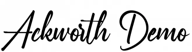
( Fonts by Noah Type - noahtype.com - Personal-use only. For commercial use please contact owner. )
A dynamic and flowing script font with elegant, connected letterforms.
![Ackworth Demo Frei Schriftart Herunterladen]() Herunterladen 659 Downloads@WebFont
Herunterladen 659 Downloads@WebFont -
( Fonts by Chloe - clofont.free.fr - Personal-use only. For commercial use please contact owner. )
A rugged, distressed font with a hand-drawn, vintage style.
![[Moving_Carton] Frei Schriftart Herunterladen]() Herunterladen 659 Downloads@WebFont
Herunterladen 659 Downloads@WebFont -
Schriftart von HammerBro101. For commercial use please contact the owner.
![LubalinGraphStd-BoldOblique Frei Schriftart Herunterladen]() Herunterladen 659 Downloads@WebFont
Herunterladen 659 Downloads@WebFont -
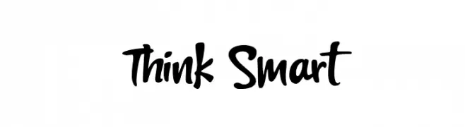
( Fonts by Lettersiro Studio )
A bold, playful script font with flowing strokes and dynamic curves.
![Think Smart Frei Schriftart Herunterladen]() Herunterladen 659 Downloads@WebFont
Herunterladen 659 Downloads@WebFont -
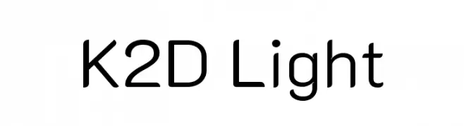
( Copyright 2018 The K2D Project Authors (https://github.com/cadsondemak/K2D) )
A modern, light sans-serif font with clean lines and balanced proportions.
![K2D Light Frei Schriftart Herunterladen]() Herunterladen 659 Downloads@WebFont
Herunterladen 659 Downloads@WebFont -
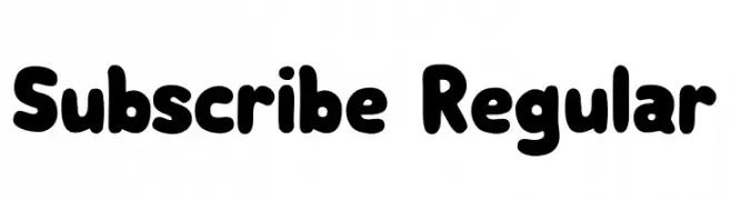
( Fonts by Vladimir Nikolic )
A playful, bold font with rounded, thick letterforms.
![Subscribe Regular Frei Schriftart Herunterladen]() Herunterladen 659 Downloads@WebFont
Herunterladen 659 Downloads@WebFont -
![Traviata Normal Frei Schriftart Herunterladen]() Herunterladen 659 Downloads@WebFont
Herunterladen 659 Downloads@WebFont -
( mightype - creativemarket.com/mightype )
An elegant and sophisticated cursive script font with flowing, intricate designs.
![FiolenitaScript Frei Schriftart Herunterladen]() Herunterladen 659 Downloads@WebFont
Herunterladen 659 Downloads@WebFont -
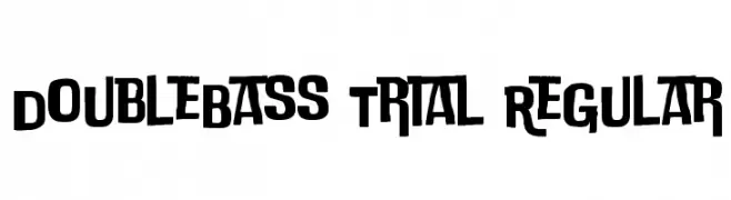
( Zetafonts - www.zetafonts.com )
A bold, dynamic font with sharp angles and smooth curves for a striking appearance.
![DoubleBass Trial Regular Frei Schriftart Herunterladen]() Herunterladen 659 Downloads@WebFont
Herunterladen 659 Downloads@WebFont -
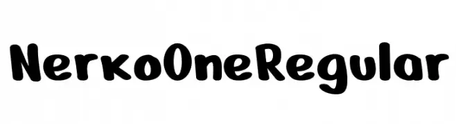
( Nermin Kahrimanovic - www.behance.net/nermink )
A playful, bold font with rounded edges and a hand-drawn feel.
![Nerko One Regular Frei Schriftart Herunterladen]() Herunterladen 659 Downloads@WebFont
Herunterladen 659 Downloads@WebFont -
( Fakhrul Razi - creativemarket.com/Naqsya.Co )
A refined script font with elegant, flowing cursive letterforms.
![Wetting Frei Schriftart Herunterladen]() Herunterladen 659 Downloads@WebFont
Herunterladen 659 Downloads@WebFont -
( Amar Lettering - creativemarket.com/Amarlettering )
An elegant script font with fluid, cursive strokes and sophisticated design.
![Challista Frei Schriftart Herunterladen]() Herunterladen 659 Downloads@WebFont
Herunterladen 659 Downloads@WebFont -
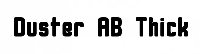
( Alex Banks - www.alex-banks.com )
A bold, rounded font with a modern and playful style.
![Duster AB Thick Frei Schriftart Herunterladen]() Herunterladen 659 Downloads@WebFont
Herunterladen 659 Downloads@WebFont -
( Fonts by Måns Grebäck )
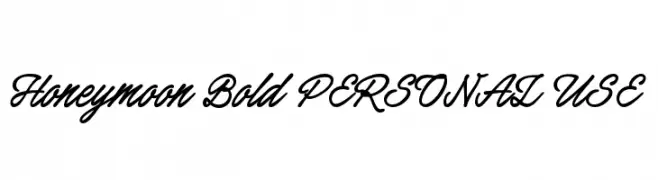
A bold, flowing script font with elegant cursive letterforms.
![Honeymoon Bold PERSONAL USE Frei Schriftart Herunterladen]() Herunterladen 659 Downloads@WebFont
Herunterladen 659 Downloads@WebFont -
( Fonts by Chris Vile )
A bold, jagged font with sharp edges and an aggressive, chaotic style.
![The Defiler Frei Schriftart Herunterladen]() Herunterladen 659 Downloads@WebFont
Herunterladen 659 Downloads@WebFont -
( Fonts by Docallisme HAS )
A playful, bold font with a hand-drawn style and dotted outlines.
![BADUY Frei Schriftart Herunterladen]() Herunterladen 659 Downloads@WebFont
Herunterladen 659 Downloads@WebFont -
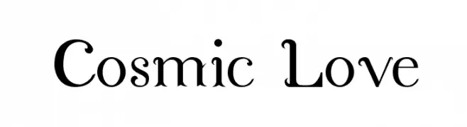
![Cosmic Love Frei Schriftart Herunterladen]() Herunterladen 659 Downloads@WebFont
Herunterladen 659 Downloads@WebFont -
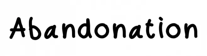
![Abandonation Frei Schriftart Herunterladen]() Herunterladen 659 Downloads@WebFont
Herunterladen 659 Downloads@WebFont -
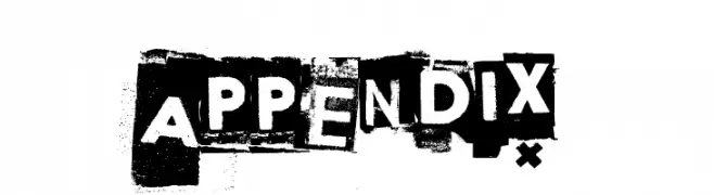
( www.junkohanhero.com )
A bold, distressed font with a cut-out, grunge style.
![Appendix Frei Schriftart Herunterladen]() Herunterladen 659 Downloads@WebFont
Herunterladen 659 Downloads@WebFont -
( Fonts by www.kimberlygeswein.com - Kimberly Geswein )
A playful, hand-drawn font with a 3D sketch effect and diagonal hatching.
![KG Summer Sunshine Frei Schriftart Herunterladen]() Herunterladen 659 Downloads@WebFont
Herunterladen 659 Downloads@WebFont -
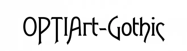
( Fonts by Castcraft Software - opti.netii.net - check the website before use )
A gothic-inspired font with sharp, angular lines and artistic flair.
![OPTIArt-Gothic Frei Schriftart Herunterladen]() Herunterladen 659 Downloads@WebFont
Herunterladen 659 Downloads@WebFont -
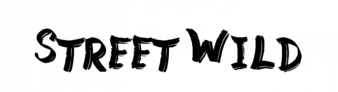
( www.tattoowoo.com )
A bold, brush-style font with dynamic, hand-painted strokes.
![Street Wild Frei Schriftart Herunterladen]() Herunterladen 659 Downloads@WebFont
Herunterladen 659 Downloads@WebFont -
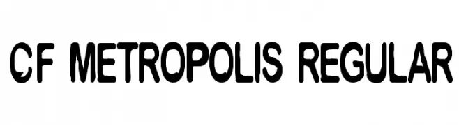
( Fonts by Steve Cloutier - www.cloutierfontes.ca )
A bold, rounded font with a playful and structured style.
![CF Metropolis Regular Frei Schriftart Herunterladen]() Herunterladen 659 Downloads@WebFont
Herunterladen 659 Downloads@WebFont -
( Free )
A bold, distressed font with a rugged, vintage texture.
![DubTone Frei Schriftart Herunterladen]() Herunterladen 659 Downloads@WebFont
Herunterladen 659 Downloads@WebFont -
![THE PRINCE Frei Schriftart Herunterladen]() Herunterladen 659 Downloads@WebFont
Herunterladen 659 Downloads@WebFont


![[Moving_Carton] Frei Schriftart Herunterladen](https://d144mzi0q5mijx.cloudfront.net/img/0/M/Moving_Carton.webp)


Welche Schriften sind gerade am populärsten?
Poppins, Roboto, Montserrat, Open Sans und Lato sind wegen ihrer klaren Formen und breiten Einsetzbarkeit sehr gefragt – von Markenauftritt über Landingpages bis hin zu Postern.
Welche Fonts eignen sich für Logos?
Geometrische Sans‑Serifs (z. B. Poppins, Familien im Gotham‑Stil) sind ein häufiger Griff für sauberes, skalierbares Branding. Für eine persönlichere Note bleiben Scripts und Handschrift‑Stile beliebt. Kombinieren Sie einen prägnanten Headline‑Font mit einer neutralen Brotschrift für Wiedererkennung und Harmonie.
Wie oft wird die Top‑Liste aktualisiert?
Regelmäßig – basierend auf realen Downloads und Interaktionen. Schauen Sie öfter vorbei, um aufstrebende Favoriten früh zu entdecken.
💡 Tipp: Seite bookmarken – Trends wechseln schnell, und heutige Top‑Schriften inspirieren morgen vielleicht das Rebranding.