Willkommen bei den Top‑Schriften – hier treffen Beliebtheit und Qualität aufeinander. Das sind die in diesem Jahr am häufigsten heruntergeladenen und genutzten Fonts. Wenn Sie sichere Optionen für Logo, Web oder Social suchen, starten Sie hier.
Jeder Top‑Font überzeugt durch Balance, Lesbarkeit und Vielseitigkeit. Sie finden moderne Sans‑Serifs, elegante Scripts, Vintage‑Serifs und minimalistische Displays.
-
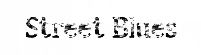
( Fonts by Barry Bujol - theoriginal19.blogspot.com )
A distressed, grunge-style font with a textured, urban appearance.
 Herunterladen 594 Downloads@WebFont
 -
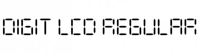
![DIGIT LCD Regular Frei Schriftart Herunterladen]() Herunterladen 594 Downloads@WebFont
Herunterladen 594 Downloads@WebFont -
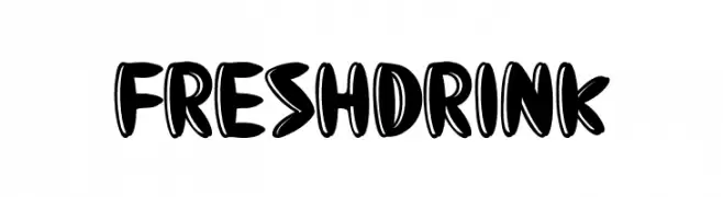
( Fonts by Eddy Goodboy )
A playful, bold font with a bubbly and whimsical design.
![Fresh Drink Frei Schriftart Herunterladen]() Herunterladen 594 Downloads@WebFont
Herunterladen 594 Downloads@WebFont -
( Fonts by Benoit Sjoholm - www.benoitsjoholm.com - All my fonts are for sale )
A bold, geometric font with a modern and futuristic style.
![Nioubes bold Frei Schriftart Herunterladen]() Herunterladen 594 Downloads@WebFont
Herunterladen 594 Downloads@WebFont -
![Passion Frei Schriftart Herunterladen]() Herunterladen 594 Downloads@WebFont
Herunterladen 594 Downloads@WebFont -
-
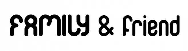
( Fonts by weknow - Wino S Kadir )
A playful, rounded font with bold, smooth curves and a friendly appearance.
![FAMILY & friend Frei Schriftart Herunterladen]() Herunterladen 594 Downloads@WebFont
Herunterladen 594 Downloads@WebFont -
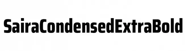
( Fonts by Omnibus Type )
A bold, condensed typeface perfect for impactful headlines.
![Saira Condensed ExtraBold Frei Schriftart Herunterladen]() Herunterladen 594 Downloads@WebFont
Herunterladen 594 Downloads@WebFont -
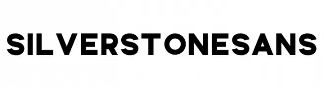
( Fonts by Ghuroba Studio - Personal-use only. For commercial use please contact owner. )
A bold, modern sans-serif font with high contrast and clean lines.
![Silverstone Sans Frei Schriftart Herunterladen]() Herunterladen 594 Downloads@WebFont
Herunterladen 594 Downloads@WebFont -
( Fonts by RantautypeStudio )
Bold, playful handwritten script font.
![The Jhony Frei Schriftart Herunterladen]() Herunterladen 594 Downloads@WebFont
Herunterladen 594 Downloads@WebFont -
( Fonts by weknow - Wino S Kadir )
A whimsical, decorative font with floral-inspired, intertwining uppercase letters.
![Flower In The Window Frei Schriftart Herunterladen]() Herunterladen 594 Downloads@WebFont
Herunterladen 594 Downloads@WebFont -
( Fonts by ShyFonts )
A bold, italicized, and playful handwritten font with a strong visual impact.
![SF Arch Rival Bold Italic Frei Schriftart Herunterladen]() Herunterladen 594 Downloads@WebFont
Herunterladen 594 Downloads@WebFont -
( Fonts by Andrew Hart - dirt2.com )
A whimsical, cursive font with playful loops and swirls.
![Little Bliss Frei Schriftart Herunterladen]() Herunterladen 594 Downloads@WebFont
Herunterladen 594 Downloads@WebFont -
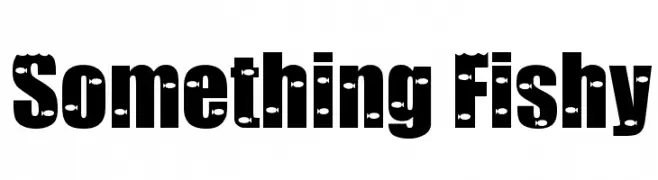
( Fonts by www.stimuleyefonts.com )
A bold, playful font with integrated fish motifs for a whimsical touch.
![Something Fishy Frei Schriftart Herunterladen]() Herunterladen 594 Downloads@WebFont
Herunterladen 594 Downloads@WebFont -
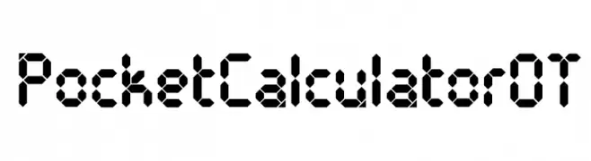
( Free for Personal Use. To use commercially please visit the www.bvfonts.com )
A segmented, geometric font inspired by classic calculator displays.
![PocketCalculatorOT Frei Schriftart Herunterladen]() Herunterladen 594 Downloads@WebFont
Herunterladen 594 Downloads@WebFont -
Schriftart von spideraysfonts. For commercial use please contact the owner.
( THE DESPICABLE DEADPOOL )
A bold, comic-inspired font with unique graphic elements.
![THE DESPICABLE DEADPOOL Frei Schriftart Herunterladen]() Herunterladen 594 Downloads@WebFont
Herunterladen 594 Downloads@WebFont -
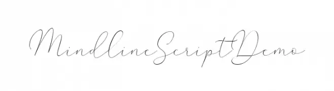
( Creative.Lafont - fontbundles.net/creative-lafont/rel=l3cLSy )
A delicate and flowing script font with elegant, continuous strokes.
![MindlineScriptDemo Frei Schriftart Herunterladen]() Herunterladen 594 Downloads@WebFont
Herunterladen 594 Downloads@WebFont -
( Fonts by Docallisme HAS )
A bold, hand-drawn font with rough, textured edges and dynamic strokes.
![A Voice Liberty Frei Schriftart Herunterladen]() Herunterladen 594 Downloads@WebFont
Herunterladen 594 Downloads@WebFont -
( Dean Machala - www.designminefirst.co.uk )
A modern, rounded sans-serif font with a friendly and approachable style.
![Machala Sans Frei Schriftart Herunterladen]() Herunterladen 594 Downloads@WebFont
Herunterladen 594 Downloads@WebFont -
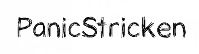
( Fonts by Vanessa Bays - bythebutterfly.com )
A sketch-like, hand-drawn font with dynamic, jagged strokes.
![PanicStricken Frei Schriftart Herunterladen]() Herunterladen 594 Downloads@WebFont
Herunterladen 594 Downloads@WebFont -
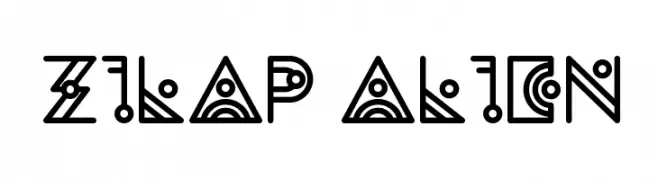
![Zilap Alien Frei Schriftart Herunterladen]() Herunterladen 594 Downloads@WebFont
Herunterladen 594 Downloads@WebFont -
( Fonts by Wino S Kadir - weknow - www.revolge.com/shop/weknow/ - Personal-use only. For commercial use please contact owner. )
A bold, geometric font with a blocky, digital appearance.
![Block Frei Schriftart Herunterladen]() Herunterladen 594 Downloads@WebFont
Herunterladen 594 Downloads@WebFont -
( Fonts by a Max Infeld - XEROGRAPHER FONTS - xerographer.blogspot.com . Personal-use only. For commercial use please contact owner. )
A bold, 3D font with a vintage-inspired, shadowed design.
![HardLine Frei Schriftart Herunterladen]() Herunterladen 594 Downloads@WebFont
Herunterladen 594 Downloads@WebFont -
( Fonts by Syaf Rizal - https://creativemarket.com/khurasan - Personal-use only. For commercial use please contact owner. )
An elegant serif font with decorative swirls and flourishes.
![Lefina Frei Schriftart Herunterladen]() Herunterladen 594 Downloads@WebFont
Herunterladen 594 Downloads@WebFont -
( Fonts by a Neale Davidson - www.pixelsagas.com. Personal-use only. For commercial use please contact owner. )
Bold, italic font with a dynamic and energetic style.
![Erte Italic Frei Schriftart Herunterladen]() Herunterladen 594 Downloads@WebFont
Herunterladen 594 Downloads@WebFont -
( Fonts by M LaPorte )
A bold, playful handwritten font with a dynamic and informal style.
![Mr_Marcoozie_MEDIUM Frei Schriftart Herunterladen]() Herunterladen 594 Downloads@WebFont
Herunterladen 594 Downloads@WebFont -
![NightWindSentSample Frei Schriftart Herunterladen]() Herunterladen 594 Downloads@WebFont
Herunterladen 594 Downloads@WebFont -
( illustrateddaydreams.tumblr.com/ )
A playful, handwritten font with a casual and whimsical style.
![AlphabetSoup Frei Schriftart Herunterladen]() Herunterladen 594 Downloads@WebFont
Herunterladen 594 Downloads@WebFont -
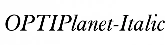
( Fonts by Castcraft Software - OPTI Fonts Archive - opti.netii.net - Personal-use only. For commercial use please contact owner. )
An elegant italic serif font with a classic and sophisticated style.
![OPTIPlanet-Italic Frei Schriftart Herunterladen]() Herunterladen 594 Downloads@WebFont
Herunterladen 594 Downloads@WebFont -
( Fonts by Dieter Steffmann )
A bold, decorative font with intricate detailing and slab-like serifs.
![Toskanische Egyptienne Initialen Frei Schriftart Herunterladen]() Herunterladen 594 Downloads@WebFont
Herunterladen 594 Downloads@WebFont -
( Fonts by www.impallari.com )
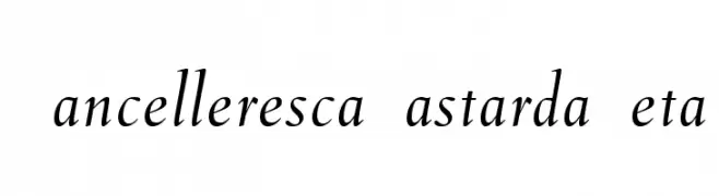
A classic, elegant cursive font with smooth, flowing strokes and moderate contrast.
![CancellerescaBastardaBeta Frei Schriftart Herunterladen]() Herunterladen 593 Downloads@WebFont
Herunterladen 593 Downloads@WebFont -
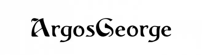
( Fonts by Dieter Steffmann )
A bold, Gothic-inspired font with sharp serifs and dramatic flair.
![ArgosGeorge Frei Schriftart Herunterladen]() Herunterladen 593 Downloads@WebFont
Herunterladen 593 Downloads@WebFont -
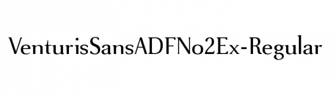
( Fonts by Arkandis Digital Foundry )
A refined serif typeface with balanced proportions and classic elegance.
![VenturisSansADFNo2Ex-Regular Frei Schriftart Herunterladen]() Herunterladen 593 Downloads@WebFont
Herunterladen 593 Downloads@WebFont -
( Fonts by Pi Luo Chiu - thisisallenchiu.tumblr.com )
A bold, Gothic-inspired font with sharp, angular edges and a vintage feel.
![Clarisse~ Frei Schriftart Herunterladen]() Herunterladen 593 Downloads@WebFont
Herunterladen 593 Downloads@WebFont -
![I am Monotonous 1 Frei Schriftart Herunterladen]() Herunterladen 593 Downloads@WebFont
Herunterladen 593 Downloads@WebFont -
![Constantin Bold Frei Schriftart Herunterladen]() Herunterladen 593 Downloads@WebFont
Herunterladen 593 Downloads@WebFont


Welche Schriften sind gerade am populärsten?
Poppins, Roboto, Montserrat, Open Sans und Lato sind wegen ihrer klaren Formen und breiten Einsetzbarkeit sehr gefragt – von Markenauftritt über Landingpages bis hin zu Postern.
Welche Fonts eignen sich für Logos?
Geometrische Sans‑Serifs (z. B. Poppins, Familien im Gotham‑Stil) sind ein häufiger Griff für sauberes, skalierbares Branding. Für eine persönlichere Note bleiben Scripts und Handschrift‑Stile beliebt. Kombinieren Sie einen prägnanten Headline‑Font mit einer neutralen Brotschrift für Wiedererkennung und Harmonie.
Wie oft wird die Top‑Liste aktualisiert?
Regelmäßig – basierend auf realen Downloads und Interaktionen. Schauen Sie öfter vorbei, um aufstrebende Favoriten früh zu entdecken.
💡 Tipp: Seite bookmarken – Trends wechseln schnell, und heutige Top‑Schriften inspirieren morgen vielleicht das Rebranding.