Willkommen bei den Top‑Schriften – hier treffen Beliebtheit und Qualität aufeinander. Das sind die in diesem Jahr am häufigsten heruntergeladenen und genutzten Fonts. Wenn Sie sichere Optionen für Logo, Web oder Social suchen, starten Sie hier.
Jeder Top‑Font überzeugt durch Balance, Lesbarkeit und Vielseitigkeit. Sie finden moderne Sans‑Serifs, elegante Scripts, Vintage‑Serifs und minimalistische Displays.
-
 Herunterladen 592 Downloads@WebFont
 -
( Fonts by M LaPorte )
A bold, playful handwritten font with a dynamic and informal style.
![Mr_Marcoozie_MEDIUM Frei Schriftart Herunterladen]() Herunterladen 592 Downloads@WebFont
Herunterladen 592 Downloads@WebFont -
Schriftart von firevectors. For commercial use please contact the owner.
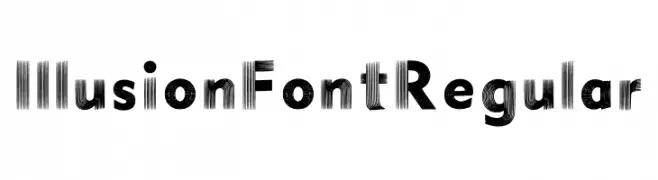
( Illusion )
A visually striking font with an illusionary effect created by parallel lines.
![Illusion Font Regular Frei Schriftart Herunterladen]() Herunterladen 592 Downloads@WebFont
Herunterladen 592 Downloads@WebFont -
( Cat.B - Agathe M.Joyce - www.foundmyfont.com )
An elegant, flowing script font with a handwritten style.
![Strikeyour Path Frei Schriftart Herunterladen]() Herunterladen 592 Downloads@WebFont
Herunterladen 592 Downloads@WebFont -
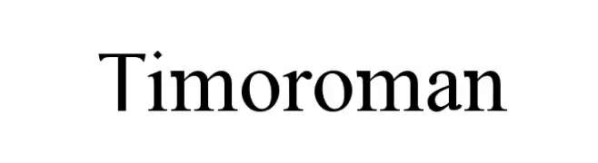
![Timoroman Frei Schriftart Herunterladen]() Herunterladen 591 Downloads@WebFont
Herunterladen 591 Downloads@WebFont -
-
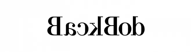
![BackBod Frei Schriftart Herunterladen]() Herunterladen 591 Downloads
Herunterladen 591 Downloads -
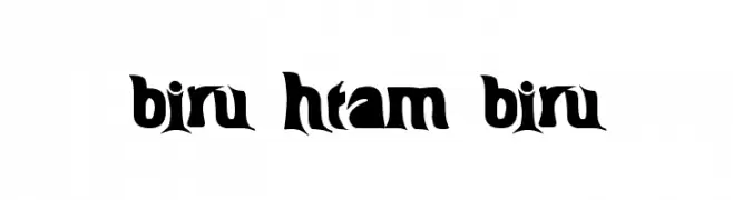
( Fonts by Ihsan Hasanudin - Sanz Font - Personal-use only. For commercial use please contact owner. )
A bold, dynamic font with sharp edges and a vintage-modern style.
![BIRU-HTAM-BIRU Frei Schriftart Herunterladen]() Herunterladen 591 Downloads@WebFont
Herunterladen 591 Downloads@WebFont -
( Fonts by Daniel Zadorozny - www.iconian.com - Free for personal use )
A bold, playful font with rounded edges and a whimsical style.
![Lionel Frei Schriftart Herunterladen]() Herunterladen 591 Downloads@WebFont
Herunterladen 591 Downloads@WebFont -
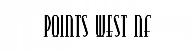
( Fonts by Nick Curtis - www.nicksfonts.com )
A bold, elongated serif font with a modern and elegant style.
![Points West NF Frei Schriftart Herunterladen]() Herunterladen 591 Downloads@WebFont
Herunterladen 591 Downloads@WebFont -
( Fonts by Callie Hegstrom - www.makemediaco.com - Personal-use only. For commercial use please contact owner. )
A playful, bold handwritten font with thick, uneven strokes and a casual style.
![Texas Toast Frei Schriftart Herunterladen]() Herunterladen 591 Downloads@WebFont
Herunterladen 591 Downloads@WebFont -
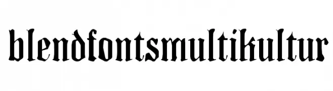
( Fonts by www.floodfonts.com )
A bold blackletter font with sharp, angular lines and a gothic aesthetic.
![BlendfontsMultikultur Frei Schriftart Herunterladen]() Herunterladen 591 Downloads@WebFont
Herunterladen 591 Downloads@WebFont -
( Free for a personal use. For a commercial use please visit www.kevinandamanda.com )
A casual, handwritten font with a playful and informal style.
![Pea Court Frei Schriftart Herunterladen]() Herunterladen 591 Downloads@WebFont
Herunterladen 591 Downloads@WebFont -
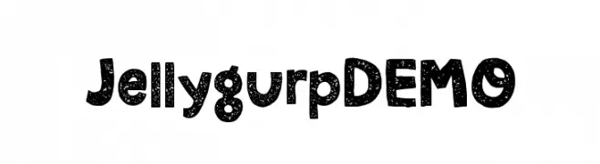
( Fonts by Pizzadude )
A playful, bold font with a speckled texture and rounded, cartoonish characters.
![JellygurpDEMO Frei Schriftart Herunterladen]() Herunterladen 591 Downloads@WebFont
Herunterladen 591 Downloads@WebFont -
( Fonts by ShyFonts )
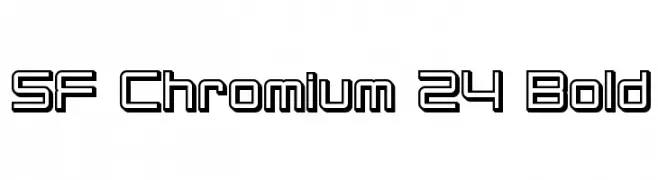
A bold, futuristic outline font with geometric shapes and a modern aesthetic.
![SF Chromium 24 Bold Frei Schriftart Herunterladen]() Herunterladen 591 Downloads@WebFont
Herunterladen 591 Downloads@WebFont -
![SeeYourPoint Frei Schriftart Herunterladen]() Herunterladen 591 Downloads@WebFont
Herunterladen 591 Downloads@WebFont -
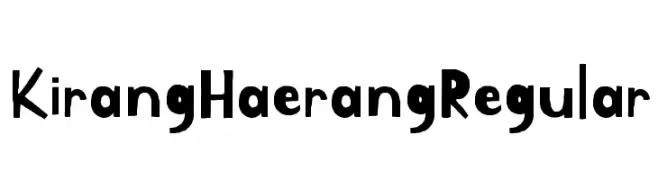
( Copyright 2018 The Kirang Haerang Project Authors )
A playful, hand-drawn font with irregular strokes and a whimsical style.
![Kirang Haerang Regular Frei Schriftart Herunterladen]() Herunterladen 591 Downloads@WebFont
Herunterladen 591 Downloads@WebFont -
( Fonts by Manfred Klein. Free for private and charity use. Free for commercial with donation to organizations )
A modern, geometric sans-serif font with uniform strokes and balanced spacing.
![DeconStruct Frei Schriftart Herunterladen]() Herunterladen 591 Downloads@WebFont
Herunterladen 591 Downloads@WebFont -
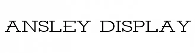
( Fonts by Kady Jesko - Personal-use only. For commercial use please contact owner. )
A bold, decorative font with a double-line outline and geometric structure.
![Ansley Display Frei Schriftart Herunterladen]() Herunterladen 591 Downloads@WebFont
Herunterladen 591 Downloads@WebFont -
( David Engelby )
A modern, elegant font with clean lines and a sophisticated appearance.
![OnO Frei Schriftart Herunterladen]() Herunterladen 591 Downloads@WebFont
Herunterladen 591 Downloads@WebFont -
( Fonts by Iconian Fonts )
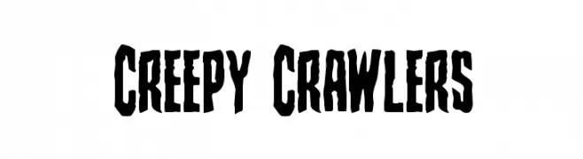
A bold, jagged font with a spooky, hand-drawn appearance.
![Creepy Crawlers Frei Schriftart Herunterladen]() Herunterladen 591 Downloads@WebFont
Herunterladen 591 Downloads@WebFont -
( Copyright (c) 2009-2011 by Accademia di Belle Arti di Urbino and students of MA course of Visual design. Some rights reserved. )
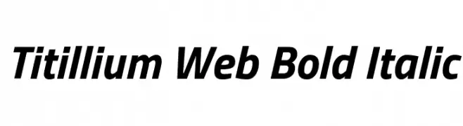
A modern, bold, and italicized font with medium contrast and smooth strokes.
![Titillium Web Bold Italic Frei Schriftart Herunterladen]() Herunterladen 591 Downloads@WebFont
Herunterladen 591 Downloads@WebFont -
![Z-Most Diva Frei Schriftart Herunterladen]() Herunterladen 591 Downloads@WebFont
Herunterladen 591 Downloads@WebFont -
( Fonts by Ramli Setiadi - Personal-use only. For commercial use please contact owner. )
A playful, whimsical handwritten font with tall, narrow letters and irregular strokes.
![Stay Wonderland Frei Schriftart Herunterladen]() Herunterladen 591 Downloads@WebFont
Herunterladen 591 Downloads@WebFont -
![Charity Frei Schriftart Herunterladen]() Herunterladen 591 Downloads@WebFont
Herunterladen 591 Downloads@WebFont -
( Fonts by Alphabet & Type: Typography & Graphic - Paolo Vannucci - www.alphabetype.it )
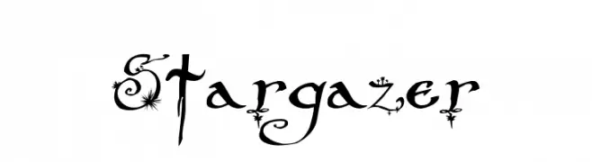
A whimsical and decorative font with celestial embellishments and swirling accents.
![Stargazer Frei Schriftart Herunterladen]() Herunterladen 591 Downloads@WebFont
Herunterladen 591 Downloads@WebFont -
( Fonts by dustBUST - Andreas Nylin )
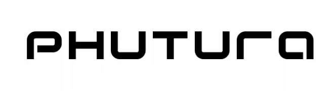
A futuristic, geometric font with rounded edges and uniform line thickness.
![Phutura Frei Schriftart Herunterladen]() Herunterladen 591 Downloads@WebFont
Herunterladen 591 Downloads@WebFont -
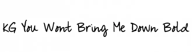
( Fonts by www.kimberlygeswein.com - Kimberly Geswein )
A bold, handwritten font with a casual and playful style.
![KG You Wont Bring Me Down Bold Frei Schriftart Herunterladen]() Herunterladen 591 Downloads@WebFont
Herunterladen 591 Downloads@WebFont -
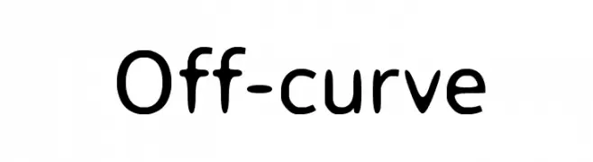
![Off-curve Frei Schriftart Herunterladen]() Herunterladen 591 Downloads@WebFont
Herunterladen 591 Downloads@WebFont -
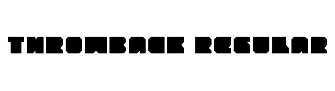
( Fonts by Gyom Seguin - last-soundtrack.daportfolio.com )
A bold, geometric font with a blocky and modern design.
![throwback Regular Frei Schriftart Herunterladen]() Herunterladen 591 Downloads@WebFont
Herunterladen 591 Downloads@WebFont -
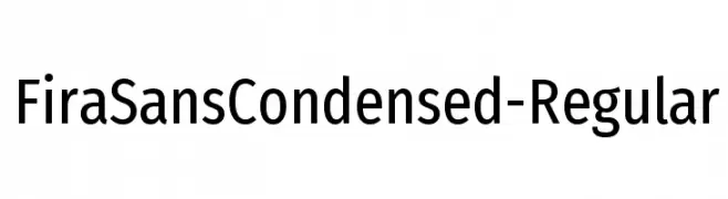
( Fonts by Mozilla Foundation - Personal-use only. For commercial use please contact owner. )
A modern, condensed sans-serif font with excellent legibility and balance.
![FiraSansCondensed-Regular Frei Schriftart Herunterladen]() Herunterladen 591 Downloads@WebFont
Herunterladen 591 Downloads@WebFont -
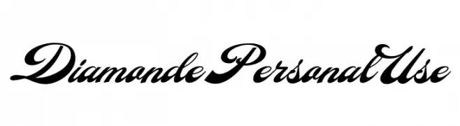
( Fonts by Billy Argel - www.billyargel.com - Personal-use only. For commercial use please contact owner. )
A bold, high-contrast script font with elegant, flowing characters.
![Diamonde Personal Use Frei Schriftart Herunterladen]() Herunterladen 591 Downloads@WebFont
Herunterladen 591 Downloads@WebFont -
( Fonts by Dvoklik - Personal-use only. For commercial use please contact owner. )
A bold, playful, and bubbly font with a cartoonish, balloon-like appearance.
![Blow Frei Schriftart Herunterladen]() Herunterladen 591 Downloads@WebFont
Herunterladen 591 Downloads@WebFont -
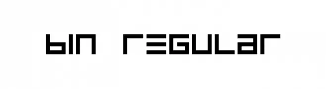
![BIN Regular Frei Schriftart Herunterladen]() Herunterladen 591 Downloads@WebFont
Herunterladen 591 Downloads@WebFont -
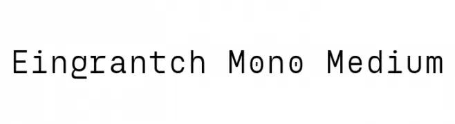
( Fonts by Harmnessless Type )
A clean, modern monospaced font with uniform character spacing.
![Eingrantch Mono Medium Frei Schriftart Herunterladen]() Herunterladen 591 Downloads@WebFont
Herunterladen 591 Downloads@WebFont -
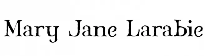
( Fonts by Apostrophic Lab )
A hand-drawn, rustic font with uneven strokes and a whimsical style.
![Mary Jane Larabie Frei Schriftart Herunterladen]() Herunterladen 591 Downloads@WebFont
Herunterladen 591 Downloads@WebFont


Welche Schriften sind gerade am populärsten?
Poppins, Roboto, Montserrat, Open Sans und Lato sind wegen ihrer klaren Formen und breiten Einsetzbarkeit sehr gefragt – von Markenauftritt über Landingpages bis hin zu Postern.
Welche Fonts eignen sich für Logos?
Geometrische Sans‑Serifs (z. B. Poppins, Familien im Gotham‑Stil) sind ein häufiger Griff für sauberes, skalierbares Branding. Für eine persönlichere Note bleiben Scripts und Handschrift‑Stile beliebt. Kombinieren Sie einen prägnanten Headline‑Font mit einer neutralen Brotschrift für Wiedererkennung und Harmonie.
Wie oft wird die Top‑Liste aktualisiert?
Regelmäßig – basierend auf realen Downloads und Interaktionen. Schauen Sie öfter vorbei, um aufstrebende Favoriten früh zu entdecken.
💡 Tipp: Seite bookmarken – Trends wechseln schnell, und heutige Top‑Schriften inspirieren morgen vielleicht das Rebranding.