Willkommen bei den Top‑Schriften – hier treffen Beliebtheit und Qualität aufeinander. Das sind die in diesem Jahr am häufigsten heruntergeladenen und genutzten Fonts. Wenn Sie sichere Optionen für Logo, Web oder Social suchen, starten Sie hier.
Jeder Top‑Font überzeugt durch Balance, Lesbarkeit und Vielseitigkeit. Sie finden moderne Sans‑Serifs, elegante Scripts, Vintage‑Serifs und minimalistische Displays.
-
( Fonts by Darrell Flood - Personal-use only. For commercial use please contact owner. )
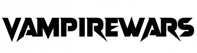
A bold, angular font with sharp edges and a dramatic style.
 Herunterladen 593 Downloads@WebFont
 -
( Fonts by The League of Moveable Type - theleagueofmoveabletype.com )
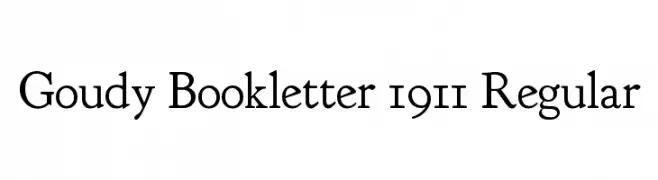
A classic serif typeface with moderate contrast and elegant proportions.
![Goudy Bookletter 1911 Regular Frei Schriftart Herunterladen]() Herunterladen 593 Downloads@WebFont
Herunterladen 593 Downloads@WebFont -
( Fonts by Billy Argel - www.billyargel.com - Personal-use only. For commercial use please contact owner. )
A bold, expressive script font with flowing, cursive letterforms and high contrast.
![Shave the Whales Personal Use Frei Schriftart Herunterladen]() Herunterladen 593 Downloads@WebFont
Herunterladen 593 Downloads@WebFont -
( Alexander Pravdin )
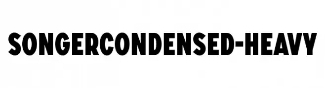
A bold, condensed font with heavy strokes for impactful designs.
![SONGERCondensed-Heavy Frei Schriftart Herunterladen]() Herunterladen 593 Downloads@WebFont
Herunterladen 593 Downloads@WebFont -
( Fonts by Cumberland Fontworks - http://www222.pair.com/sjohn/fonts.htm - S. John Ross )
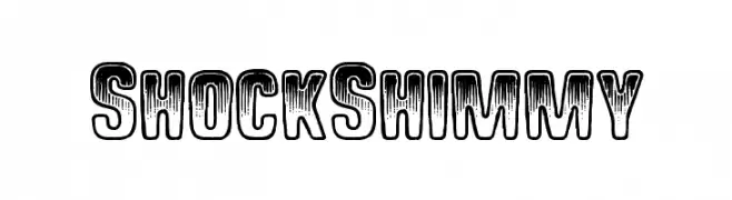
A bold, distressed font with a vintage, textured appearance.
![Shock Shimmy Frei Schriftart Herunterladen]() Herunterladen 593 Downloads@WebFont
Herunterladen 593 Downloads@WebFont -
-
( www.jawgatefilms.com )
A bold, modern sans-serif font with geometric lines and uniform width.
![Perdido Frei Schriftart Herunterladen]() Herunterladen 593 Downloads@WebFont
Herunterladen 593 Downloads@WebFont -
![Chrobot Frei Schriftart Herunterladen]() Herunterladen 593 Downloads@WebFont
Herunterladen 593 Downloads@WebFont -
( Fonts by Paul Lloyd )
A decorative blackletter font with intricate, ornate designs and a medieval manuscript feel.
![Minster No 5 Frei Schriftart Herunterladen]() Herunterladen 593 Downloads@WebFont
Herunterladen 593 Downloads@WebFont -
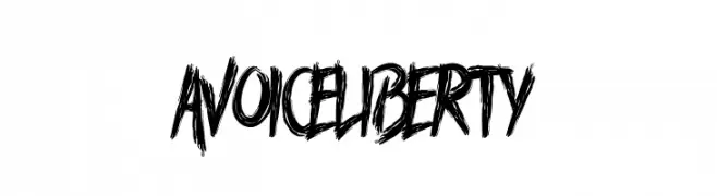
( Fonts by Docallisme HAS )
A bold, hand-drawn font with rough, textured edges and dynamic strokes.
![A Voice Liberty Frei Schriftart Herunterladen]() Herunterladen 593 Downloads@WebFont
Herunterladen 593 Downloads@WebFont -
( Fonts by a cenz qobbal - www.facebook.com/cenzqobbalfonts. Personal-use only. For commercial use please contact owner. )
A playful, textured font with a hand-drawn, crayon-like appearance.
![Afro Frei Schriftart Herunterladen]() Herunterladen 593 Downloads@WebFont
Herunterladen 593 Downloads@WebFont -
![mimi Frei Schriftart Herunterladen]() Herunterladen 593 Downloads@WebFont
Herunterladen 593 Downloads@WebFont -
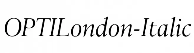
( Fonts by Castcraft Software - opti.netii.net - check the website before use )
An elegant serif italic font with graceful curves and sharp serifs.
![OPTILondon-Italic Frei Schriftart Herunterladen]() Herunterladen 593 Downloads@WebFont
Herunterladen 593 Downloads@WebFont -
( Free for a personal use. For a commercial use please visit www.kevinandamanda.com )
A whimsical, hand-drawn script font with playful curves and artistic flair.
![Want You Back Frei Schriftart Herunterladen]() Herunterladen 593 Downloads@WebFont
Herunterladen 593 Downloads@WebFont -
( Fonts by Apostrophic Lab )
A bold slab serif font with strong, block-like serifs and a modern, assertive style.
![Street Corner Slab Bold Frei Schriftart Herunterladen]() Herunterladen 593 Downloads@WebFont
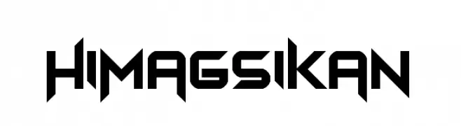
Herunterladen 593 Downloads@WebFont -
![Himagsikan Frei Schriftart Herunterladen]() Herunterladen 593 Downloads@WebFont
Herunterladen 593 Downloads@WebFont -
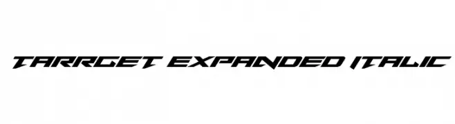
( Fonts by Daniel Zadorozny - www.iconian.com - Free for personal use )
A bold, italicized, and expanded font with a futuristic and dynamic style.
![Tarrget Expanded Italic Frei Schriftart Herunterladen]() Herunterladen 593 Downloads@WebFont
Herunterladen 593 Downloads@WebFont -
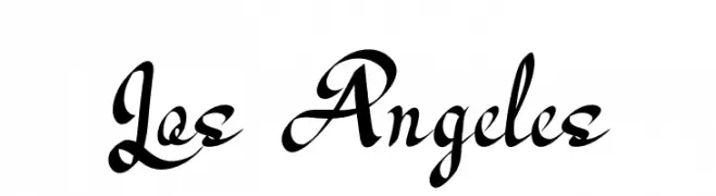
Schriftart von Naharstd. For commercial use please contact the owner.
( NOTE: This demo font is for PERSONAL USE ONLY! But any donation are very appreciated. Please contact me before any commercial use. My fonts for free use allowed only in personal project , non-profit and charity use. If you make money from using my fonts )
A dynamic and elegant script font with flowing, cursive letterforms.
![Los Angeles Frei Schriftart Herunterladen]() Herunterladen 593 Downloads@WebFont
Herunterladen 593 Downloads@WebFont -
( www.itrydiy.me )
A playful, hand-drawn font with bold, rounded strokes and a whimsical style.
![MixNarrow Frei Schriftart Herunterladen]() Herunterladen 593 Downloads@WebFont
Herunterladen 593 Downloads@WebFont -
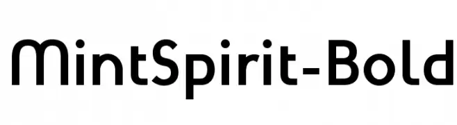
( Fonts by Arkandis Digital Foundry )
A bold, modern sans-serif font with geometric influences and excellent readability.
![MintSpirit-Bold Frei Schriftart Herunterladen]() Herunterladen 593 Downloads@WebFont
Herunterladen 593 Downloads@WebFont -
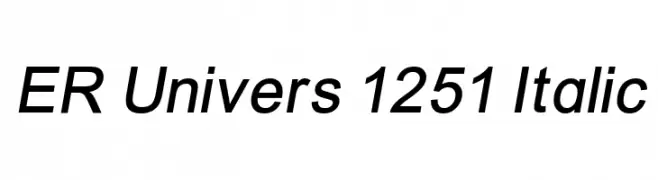
![ER Univers 1251 Italic Frei Schriftart Herunterladen]() Herunterladen 593 Downloads
Herunterladen 593 Downloads -
![Melodya Chatrina Italic Frei Schriftart Herunterladen]() Herunterladen 593 Downloads@WebFont
Herunterladen 593 Downloads@WebFont -
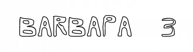
![Barbapa 3 Frei Schriftart Herunterladen]() Herunterladen 593 Downloads@WebFont
Herunterladen 593 Downloads@WebFont -
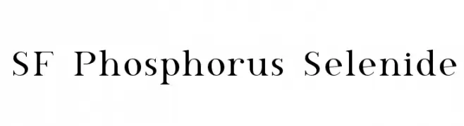
![SF Phosphorus Selenide Frei Schriftart Herunterladen]() Herunterladen 593 Downloads@WebFont
Herunterladen 593 Downloads@WebFont -
( Fonts by Gunawan )
A playful, hand-drawn font with bold, rounded strokes and quirky character shapes.
![Kangaroo Frei Schriftart Herunterladen]() Herunterladen 593 Downloads@WebFont
Herunterladen 593 Downloads@WebFont -
( Fonts by Daniel Zadorozny - www.iconian.com )
A futuristic, geometric font with a condensed and sleek design.
![Radio Space Condensed Frei Schriftart Herunterladen]() Herunterladen 593 Downloads@WebFont
Herunterladen 593 Downloads@WebFont -
( Fonts by Julieta Ulanovsky (font) & Cristiano Sobral (main changes) - Personal-use only. For commercial use please contact owner. )
A bold and italic font with a modern, dynamic style.
![Argentum Novus Bold Italic Frei Schriftart Herunterladen]() Herunterladen 593 Downloads@WebFont
Herunterladen 593 Downloads@WebFont -
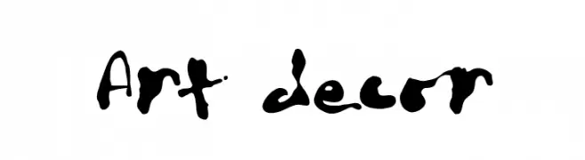
![Art decor Frei Schriftart Herunterladen]() Herunterladen 593 Downloads@WebFont
Herunterladen 593 Downloads@WebFont -
( Fonts by www.impallari.com )
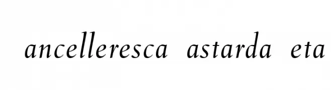
A classic, elegant cursive font with smooth, flowing strokes and moderate contrast.
![CancellerescaBastardaBeta Frei Schriftart Herunterladen]() Herunterladen 592 Downloads@WebFont
Herunterladen 592 Downloads@WebFont -
( Fonts by Dieter Steffmann )
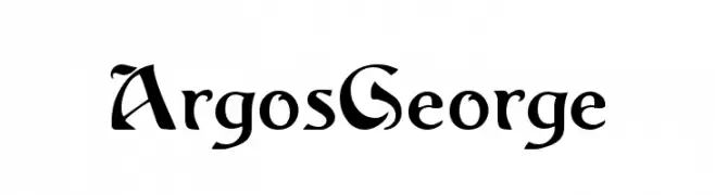
A bold, Gothic-inspired font with sharp serifs and dramatic flair.
![ArgosGeorge Frei Schriftart Herunterladen]() Herunterladen 592 Downloads@WebFont
Herunterladen 592 Downloads@WebFont -
( Fonts by Uwe Borchert - Personal-use only. For commercial use please contact owner. )
A tall, narrow, and modern font with a sleek, condensed design.
![BStyle-Regular Frei Schriftart Herunterladen]() Herunterladen 592 Downloads@WebFont
Herunterladen 592 Downloads@WebFont -
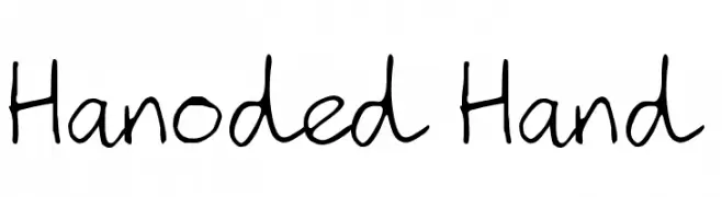
( Fonts by David Kerkhoff - www.hanodedphotography.com )
A playful, handwritten font with a casual and informal style.
![Hanoded Hand Frei Schriftart Herunterladen]() Herunterladen 592 Downloads@WebFont
Herunterladen 592 Downloads@WebFont -
( Linux Libertine - www.linuxlibertine.org )
A classic serif font with a slight slant, offering elegance and readability.
![Linux Libertine Slanted Frei Schriftart Herunterladen]() Herunterladen 592 Downloads@WebFont
Herunterladen 592 Downloads@WebFont -
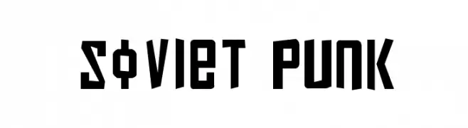
( Fonts by Daniel Zadorozny - www.iconian.com )
A bold, angular font with a Soviet-industrial and punk rock aesthetic.
![Soviet Punk Frei Schriftart Herunterladen]() Herunterladen 592 Downloads@WebFont
Herunterladen 592 Downloads@WebFont -
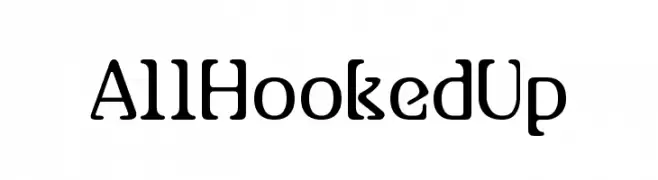
( Fonts by dartcanada.tripod.com - Darren Rigby )
A modern serif font with unique hook-like serifs and smooth curves.
![AllHookedUp Frei Schriftart Herunterladen]() Herunterladen 592 Downloads
Herunterladen 592 Downloads -
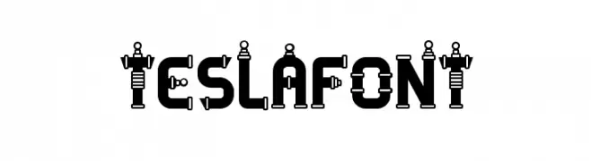
![TESLAFONT Frei Schriftart Herunterladen]() Herunterladen 592 Downloads@WebFont
Herunterladen 592 Downloads@WebFont


Welche Schriften sind gerade am populärsten?
Poppins, Roboto, Montserrat, Open Sans und Lato sind wegen ihrer klaren Formen und breiten Einsetzbarkeit sehr gefragt – von Markenauftritt über Landingpages bis hin zu Postern.
Welche Fonts eignen sich für Logos?
Geometrische Sans‑Serifs (z. B. Poppins, Familien im Gotham‑Stil) sind ein häufiger Griff für sauberes, skalierbares Branding. Für eine persönlichere Note bleiben Scripts und Handschrift‑Stile beliebt. Kombinieren Sie einen prägnanten Headline‑Font mit einer neutralen Brotschrift für Wiedererkennung und Harmonie.
Wie oft wird die Top‑Liste aktualisiert?
Regelmäßig – basierend auf realen Downloads und Interaktionen. Schauen Sie öfter vorbei, um aufstrebende Favoriten früh zu entdecken.
💡 Tipp: Seite bookmarken – Trends wechseln schnell, und heutige Top‑Schriften inspirieren morgen vielleicht das Rebranding.