Willkommen bei den Top‑Schriften – hier treffen Beliebtheit und Qualität aufeinander. Das sind die in diesem Jahr am häufigsten heruntergeladenen und genutzten Fonts. Wenn Sie sichere Optionen für Logo, Web oder Social suchen, starten Sie hier.
Jeder Top‑Font überzeugt durch Balance, Lesbarkeit und Vielseitigkeit. Sie finden moderne Sans‑Serifs, elegante Scripts, Vintage‑Serifs und minimalistische Displays.
-
( Fonts by a kmzero font foundry - www.zetafonts.com. Personal-use only. For commercial use please contact owner. )
A bold, italicized sans-serif font with a dynamic and modern style.
 Herunterladen 588 Downloads@WebFont
 -
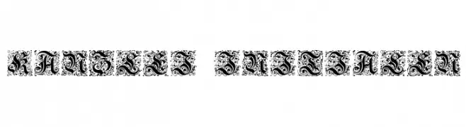
![Kanzlei-Initialen Frei Schriftart Herunterladen]() Herunterladen 588 Downloads@WebFont
Herunterladen 588 Downloads@WebFont -
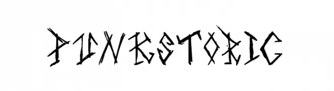
![Punkstoric Frei Schriftart Herunterladen]() Herunterladen 588 Downloads@WebFont
Herunterladen 588 Downloads@WebFont -
( Fonts by Mr Letters - https://www.creativefabrica.com/designer/mrletters/ - Personal-use only. For commercial use please contact owner. )
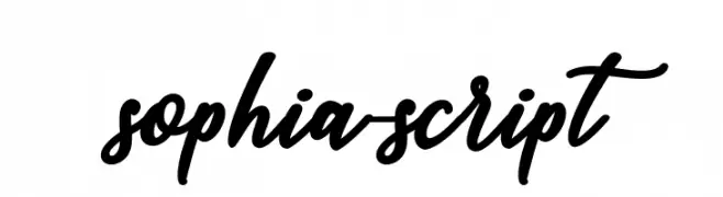
A graceful and elegant script font with fluid, cursive strokes.
![sophia-script Frei Schriftart Herunterladen]() Herunterladen 588 Downloads@WebFont
Herunterladen 588 Downloads@WebFont -
( Fonts by Geronimo Fonts - Personal-use only. For commercial use please contact owner. )
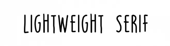
A playful, handwritten font with tall, narrow letterforms and smooth strokes.
![LIGHTWEIGHT SERIF Frei Schriftart Herunterladen]() Herunterladen 588 Downloads@WebFont
Herunterladen 588 Downloads@WebFont -
-
( Fonts by Daisy Mason )
A playful, handwritten font with tall, narrow, and uniform strokes.
![bkobiii Frei Schriftart Herunterladen]() Herunterladen 588 Downloads@WebFont
Herunterladen 588 Downloads@WebFont -
![Fabian Frei Schriftart Herunterladen]() Herunterladen 588 Downloads@WebFont
Herunterladen 588 Downloads@WebFont -
( Fonts by Vanessa Bays - bythebutterfly.com )
A playful, hand-drawn font with curly, rounded letterforms.
![You Make Me Smile Frei Schriftart Herunterladen]() Herunterladen 588 Downloads@WebFont
Herunterladen 588 Downloads@WebFont -
( Fonts by Darcy Baldwin - darcybaldwin.com. Free for personal use only )
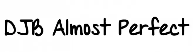
A playful, handwritten font with bold strokes and a casual, whimsical style.
![DJB Almost Perfect Frei Schriftart Herunterladen]() Herunterladen 588 Downloads@WebFont
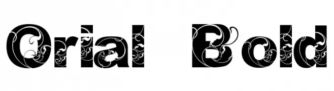
Herunterladen 588 Downloads@WebFont -
![Orial_ Bold Frei Schriftart Herunterladen]() Herunterladen 588 Downloads@WebFont
Herunterladen 588 Downloads@WebFont -
( Fonts by Kimberly Geswein )
A modern, playful font with tall, narrow characters and a monoline appearance.
![KG Rise UP Frei Schriftart Herunterladen]() Herunterladen 588 Downloads@WebFont
Herunterladen 588 Downloads@WebFont -
( 100% Free )
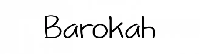
A playful, handwritten font with a casual and friendly style.
![Barokah Frei Schriftart Herunterladen]() Herunterladen 588 Downloads@WebFont
Herunterladen 588 Downloads@WebFont -
( Fonts by Graphix Line Studio - Personal-use only. For commercial use please contact owner. )
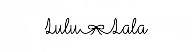
A playful, handwritten script font with flowing, connected strokes.
![Lulu-Lala Frei Schriftart Herunterladen]() Herunterladen 588 Downloads@WebFont
Herunterladen 588 Downloads@WebFont -
( Fonts by Zetafonts - Personal-use only. For commercial use please contact owner. )
A tall, narrow, and modern font with consistent stroke width and geometric influence.
![Heading Now Trial 04 Regular Frei Schriftart Herunterladen]() Herunterladen 588 Downloads@WebFont
Herunterladen 588 Downloads@WebFont -
( Fonts by Paul Lloyd )
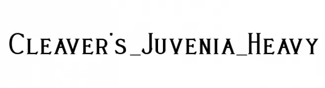
A bold, heavy serif font with a classic and authoritative style.
![Cleaver's_Juvenia_Heavy Frei Schriftart Herunterladen]() Herunterladen 588 Downloads
Herunterladen 588 Downloads -
( Fonts by Graham Meade - GemFonts )
A bold, oblique sans-serif font with a modern and dynamic style.
![Walkway Oblique Bold Frei Schriftart Herunterladen]() Herunterladen 588 Downloads@WebFont
Herunterladen 588 Downloads@WebFont -
( Fonts by a Neale Davidson - www.pixelsagas.com. Personal-use only. For commercial use please contact owner. )
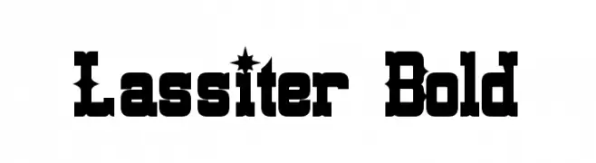
A bold, vintage-style font with Western-inspired serifs and decorative elements.
![Lassiter Bold Frei Schriftart Herunterladen]() Herunterladen 588 Downloads@WebFont
Herunterladen 588 Downloads@WebFont -
( Free for a personal use. For a commercial use please visit www.kevinandamanda.com )
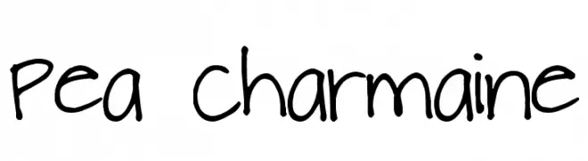
A playful, handwritten font with a casual and dynamic style.
![Pea Charmaine Frei Schriftart Herunterladen]() Herunterladen 588 Downloads@WebFont
Herunterladen 588 Downloads@WebFont -
( Fonts by David Rakowski )
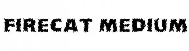
A bold, flame-inspired font with jagged edges and strong visual impact.
![Firecat Medium Frei Schriftart Herunterladen]() Herunterladen 588 Downloads
Herunterladen 588 Downloads -
( Fonts by Modestype Studio )
A bold, playful font with rounded, bubbly characters.
![Bowzer Frei Schriftart Herunterladen]() Herunterladen 588 Downloads@WebFont
Herunterladen 588 Downloads@WebFont -
( Fonts by Situjuh Nazara - 7ntypes.com - Personal-use only. For commercial use please contact owner. )
A playful and flowing script font with a charming, handwritten quality.
![Ginta Frei Schriftart Herunterladen]() Herunterladen 588 Downloads@WebFont
Herunterladen 588 Downloads@WebFont -
( Fonts by Darrell Flood )
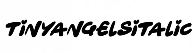
A bold, italicized script font with a playful, handwritten style.
![Tiny Angels Italic Frei Schriftart Herunterladen]() Herunterladen 588 Downloads@WebFont
Herunterladen 588 Downloads@WebFont -
( Fonts by www.fugit-tempus.de )
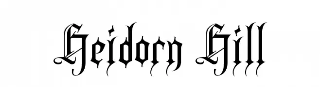
A dramatic blackletter font with ornate, gothic-inspired details.
![Heidorn Hill Frei Schriftart Herunterladen]() Herunterladen 588 Downloads@WebFont
Herunterladen 588 Downloads@WebFont -
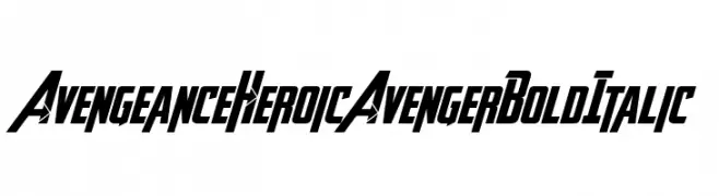
( Fontry - M.G. Adkins - www.thefontry.com/ )
A bold, italicized font with a dynamic, heroic style.
![Avengeance Heroic Avenger Bold Italic Frei Schriftart Herunterladen]() Herunterladen 588 Downloads@WebFont
Herunterladen 588 Downloads@WebFont -
( Fonts by www.someshinzz.com )
A bold, italicized font with a modern and dynamic style.
![J-Phont Frei Schriftart Herunterladen]() Herunterladen 588 Downloads@WebFont
Herunterladen 588 Downloads@WebFont -
( Fonts by Paul - viciousink.net )
A decorative Celtic-inspired font with intricate patterns and knotwork.
![Pauls Celtic Font 3 Frei Schriftart Herunterladen]() Herunterladen 588 Downloads@WebFont
Herunterladen 588 Downloads@WebFont -
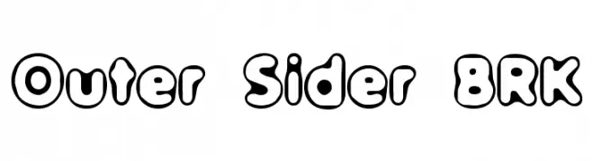
( Fonts by www.aenigmafonts.com )
A playful, bubble-like font with thick outlines and a cartoonish style.
![Outer Sider BRK Frei Schriftart Herunterladen]() Herunterladen 588 Downloads@WebFont
Herunterladen 588 Downloads@WebFont -
( Fonts by 7NTypes )
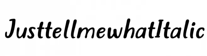
A dynamic, italicized handwritten font with smooth, flowing strokes.
![Just tell me what Italic Frei Schriftart Herunterladen]() Herunterladen 588 Downloads@WebFont
Herunterladen 588 Downloads@WebFont -
( Fonts by Gyom Seguin - last-soundtrack.daportfolio.com )
A bold, distressed font with a rugged, grunge appearance.
![Mohawk Frei Schriftart Herunterladen]() Herunterladen 588 Downloads@WebFont
Herunterladen 588 Downloads@WebFont -
( Fonts by Alessio D`Ellena - alessiodellena.com - Personal-use only. For commercial use please contact owner. )
A bold, inline font with a geometric and modern design.
![Juventus Fans Bold inline Frei Schriftart Herunterladen]() Herunterladen 588 Downloads@WebFont
Herunterladen 588 Downloads@WebFont -
( Fonts by Apostrophic Lab )
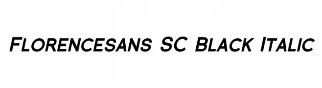
A bold, italicized sans-serif font with a modern and dynamic style.
![Florencesans SC Black Italic Frei Schriftart Herunterladen]() Herunterladen 588 Downloads@WebFont
Herunterladen 588 Downloads@WebFont -
( Copyright 2019 The Tomorrow Project Authors (github.com/MonicaRizzolli/Tomorrow) )
A bold, italic font with a dynamic and modern design, perfect for impactful headlines.
![Tomorrow Black Italic Frei Schriftart Herunterladen]() Herunterladen 588 Downloads@WebFont
Herunterladen 588 Downloads@WebFont -
( Fonts by allsuperfont.com - Personal-use only. For commercial use please contact owner. )
A bold, playful font with strong, slightly condensed characters.
![Super Toast Frei Schriftart Herunterladen]() Herunterladen 588 Downloads@WebFont
Herunterladen 588 Downloads@WebFont -
( Fonts by CannotIntoSpaceFonts - KineticPlasma Fonts - Personal-use only. For commercial use please contact owner. )
A playful, hand-drawn font with irregular strokes and a whimsical style.
![Vapor Frei Schriftart Herunterladen]() Herunterladen 588 Downloads@WebFont
Herunterladen 588 Downloads@WebFont -
( Fonts by Arwan Sutanto www.locomotype.com - Personal-use only. For commercial use please contact owner. )
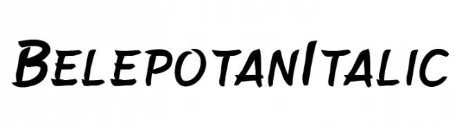
A bold, italic script font with a playful, handwritten style.
![BelepotanItalic Frei Schriftart Herunterladen]() Herunterladen 588 Downloads@WebFont
Herunterladen 588 Downloads@WebFont


Welche Schriften sind gerade am populärsten?
Poppins, Roboto, Montserrat, Open Sans und Lato sind wegen ihrer klaren Formen und breiten Einsetzbarkeit sehr gefragt – von Markenauftritt über Landingpages bis hin zu Postern.
Welche Fonts eignen sich für Logos?
Geometrische Sans‑Serifs (z. B. Poppins, Familien im Gotham‑Stil) sind ein häufiger Griff für sauberes, skalierbares Branding. Für eine persönlichere Note bleiben Scripts und Handschrift‑Stile beliebt. Kombinieren Sie einen prägnanten Headline‑Font mit einer neutralen Brotschrift für Wiedererkennung und Harmonie.
Wie oft wird die Top‑Liste aktualisiert?
Regelmäßig – basierend auf realen Downloads und Interaktionen. Schauen Sie öfter vorbei, um aufstrebende Favoriten früh zu entdecken.
💡 Tipp: Seite bookmarken – Trends wechseln schnell, und heutige Top‑Schriften inspirieren morgen vielleicht das Rebranding.