Willkommen bei den Top‑Schriften – hier treffen Beliebtheit und Qualität aufeinander. Das sind die in diesem Jahr am häufigsten heruntergeladenen und genutzten Fonts. Wenn Sie sichere Optionen für Logo, Web oder Social suchen, starten Sie hier.
Jeder Top‑Font überzeugt durch Balance, Lesbarkeit und Vielseitigkeit. Sie finden moderne Sans‑Serifs, elegante Scripts, Vintage‑Serifs und minimalistische Displays.
-
( Fonts by Ramli Setiadi - Personal-use only. For commercial use please contact owner. )
A playful, whimsical handwritten font with tall, narrow letters and irregular strokes.
 Herunterladen 591 Downloads@WebFont
 -
( Fonts by Gyom Seguin - last-soundtrack.daportfolio.com )
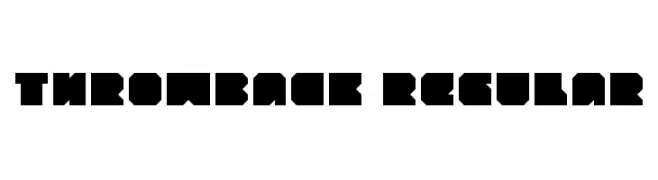
A bold, geometric font with a blocky and modern design.
![throwback Regular Frei Schriftart Herunterladen]() Herunterladen 591 Downloads@WebFont
Herunterladen 591 Downloads@WebFont -
( Fonts by Steve Cloutier - www.cloutierfontes.ca )
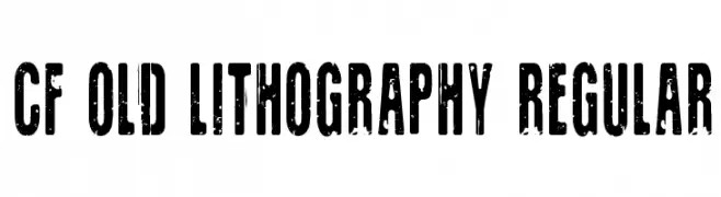
A bold, distressed font with a vintage, industrial aesthetic.
![CF Old Lithography Regular Frei Schriftart Herunterladen]() Herunterladen 591 Downloads@WebFont
Herunterladen 591 Downloads@WebFont -
( Fontry - M.G. Adkins - www.thefontry.com/ )
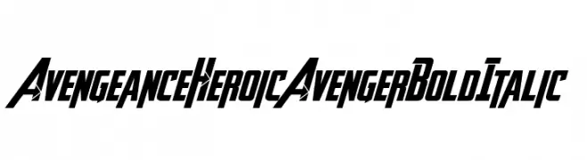
A bold, italicized font with a dynamic, heroic style.
![Avengeance Heroic Avenger Bold Italic Frei Schriftart Herunterladen]() Herunterladen 591 Downloads@WebFont
Herunterladen 591 Downloads@WebFont -
( Trame - Jessica Goodwin - www.trame.ch )
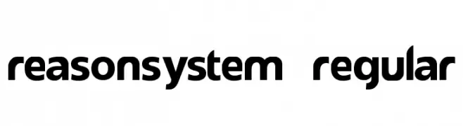
A bold, modern sans-serif font with geometric shapes and rounded edges.
![reasonSystem Regular Frei Schriftart Herunterladen]() Herunterladen 591 Downloads@WebFont
Herunterladen 591 Downloads@WebFont -
-
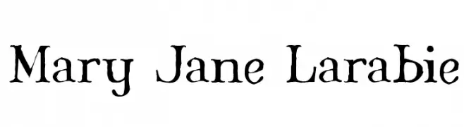
( Fonts by Apostrophic Lab )
A hand-drawn, rustic font with uneven strokes and a whimsical style.
![Mary Jane Larabie Frei Schriftart Herunterladen]() Herunterladen 591 Downloads@WebFont
Herunterladen 591 Downloads@WebFont -
( Fonts by Woodcutter )
A bold, decorative font with playful dot patterns and a whimsical style.
![Barrio Chino Frei Schriftart Herunterladen]() Herunterladen 591 Downloads@WebFont
Herunterladen 591 Downloads@WebFont -
( Fonts by www.woodcutter.es - woodcutter Manero - Personal-use only. For commercial use please contact owner. )
Bold winter icon set with solid black silhouettes.
![Winter Icons Frei Schriftart Herunterladen]() Herunterladen 591 Downloads@WebFont
Herunterladen 591 Downloads@WebFont -
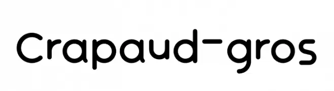
( Fonts by Émile Byeongsu Kim - Personal-use only. For commercial use please contact owner. )
A playful, rounded font with smooth curves and uniform strokes.
![Crapaud-gros Frei Schriftart Herunterladen]() Herunterladen 591 Downloads@WebFont
Herunterladen 591 Downloads@WebFont -
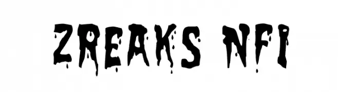
( Fonts by www.norfok.com - Norfok® Incredible Font Design - Thomas W. Otto )
A bold, dripping font perfect for horror and Halloween themes.
![Zreaks NFI Frei Schriftart Herunterladen]() Herunterladen 591 Downloads@WebFont
Herunterladen 591 Downloads@WebFont -
( Fonts by Dan P. Lyons - Personal-use only. For commercial use please contact owner. )
A playful, rounded font with smooth curves and a friendly vibe.
![Memories Round Frei Schriftart Herunterladen]() Herunterladen 591 Downloads@WebFont
Herunterladen 591 Downloads@WebFont -
( Fonts by Kong Font )
A bold, rounded font with a playful and friendly appearance.
![Moulin Frei Schriftart Herunterladen]() Herunterladen 591 Downloads@WebFont
Herunterladen 591 Downloads@WebFont -
![Digizen Frei Schriftart Herunterladen]() Herunterladen 591 Downloads@WebFont
Herunterladen 591 Downloads@WebFont -
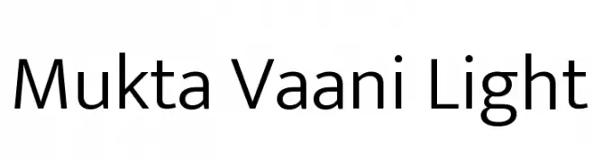
( Copyright (c) 2016, Ek Type. All rights reserved. )
A modern, light sans-serif font with clean lines and excellent readability.
![Mukta Vaani Light Frei Schriftart Herunterladen]() Herunterladen 591 Downloads@WebFont
Herunterladen 591 Downloads@WebFont -
( Fonts by Apostrophic Lab )
A modern, geometric font with a tall, narrow design and consistent stroke width.
![Lady Ice Frei Schriftart Herunterladen]() Herunterladen 591 Downloads@WebFont
Herunterladen 591 Downloads@WebFont -
( www.itrydiy.me )
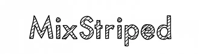
A bold, striped font with a playful and dynamic appearance.
![MixStriped Frei Schriftart Herunterladen]() Herunterladen 591 Downloads@WebFont
Herunterladen 591 Downloads@WebFont -
( Cultivated Mind Type - www.cultivatedmindtype.com/ )
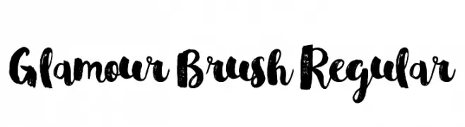
A bold, brush-style font with expressive, hand-painted strokes.
![Glamour Brush Regular Frei Schriftart Herunterladen]() Herunterladen 591 Downloads@WebFont
Herunterladen 591 Downloads@WebFont -
( Fonts by Herofonts - Personal-use only. For commercial use please contact owner. )
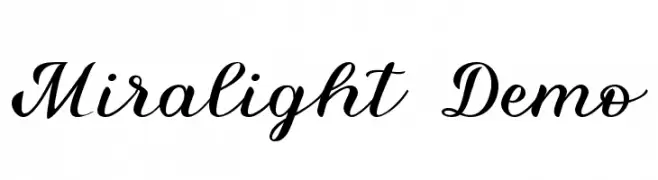
A graceful and flowing script font with elegant curves and consistent stroke width.
![Miralight Demo Frei Schriftart Herunterladen]() Herunterladen 591 Downloads@WebFont
Herunterladen 591 Downloads@WebFont -
( Fonts by Jonathan Pinhorn (font) & Cristiano Sobral (main changes) - Personal-use only. For commercial use please contact owner. )
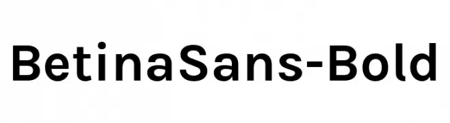
A bold, modern sans-serif font with clean lines and excellent readability.
![BetinaSans-Bold Frei Schriftart Herunterladen]() Herunterladen 591 Downloads@WebFont
Herunterladen 591 Downloads@WebFont -
( Fonts by junkohanhero )
A bold, rugged font with a hand-crafted, expressive style.
![Good And Evil Night Frei Schriftart Herunterladen]() Herunterladen 591 Downloads@WebFont
Herunterladen 591 Downloads@WebFont -
( Fonts by Octotype - www.foundmyfont.com - Personal-use only. For commercial use please contact owner. )
A bold, elegant script font with flowing curves and ornate flourishes.
![EnlightenyourDestiny Frei Schriftart Herunterladen]() Herunterladen 591 Downloads@WebFont
Herunterladen 591 Downloads@WebFont -
( Fonts by junkohanhero )
A distressed, vintage-style font with a textured, hand-crafted appearance.
![3 Times Recycled Old Newspaper Frei Schriftart Herunterladen]() Herunterladen 591 Downloads@WebFont
Herunterladen 591 Downloads@WebFont -
( Fonts by www.movefont .com - Personal-use only. For commercial use please contact owner. )
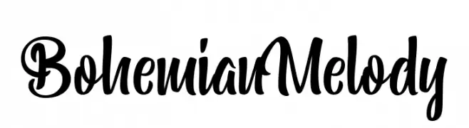
A bold, cursive font with flowing, artistic strokes and elegant curves.
![Bohemian Melody Frei Schriftart Herunterladen]() Herunterladen 590 Downloads@WebFont
Herunterladen 590 Downloads@WebFont -
( Free for personal use - www.chrisvile.com/ )
A bold, distressed font with a grunge aesthetic.
![Malevolent z Frei Schriftart Herunterladen]() Herunterladen 590 Downloads@WebFont
Herunterladen 590 Downloads@WebFont -
( Fonts by Din Studio - Donis Miftahudin - Personal-use only. For commercial use please contact owner. )
A bold, handwritten font with dynamic strokes and a brush-like texture.
![Brightwall Personal Use Frei Schriftart Herunterladen]() Herunterladen 590 Downloads@WebFont
Herunterladen 590 Downloads@WebFont -
![gothic Frei Schriftart Herunterladen]() Herunterladen 590 Downloads@WebFont
Herunterladen 590 Downloads@WebFont -
( Fonts by www.vicfieger.com )
A bold, condensed, and slanted font ideal for dynamic designs.
![Jam Pact Frei Schriftart Herunterladen]() Herunterladen 590 Downloads@WebFont
Herunterladen 590 Downloads@WebFont -
( Fonts by AM Designs )
A playful and whimsical font with bold, rounded letterforms and unique character details.
![Garlic Bread Frei Schriftart Herunterladen]() Herunterladen 590 Downloads@WebFont
Herunterladen 590 Downloads@WebFont -
( Fonts by www.fenotype.com )
A bold, rounded geometric font with high visibility.
![222 03 Frei Schriftart Herunterladen]() Herunterladen 590 Downloads@WebFont
Herunterladen 590 Downloads@WebFont -
( Fonts by typedepot - Personal-use only. For commercial use please contact owner. )
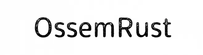
A textured, bold font with a rustic, vintage appeal.
![Ossem Rust Frei Schriftart Herunterladen]() Herunterladen 590 Downloads@WebFont
Herunterladen 590 Downloads@WebFont -
( Fonts by Levi Halmos )
A bold, geometric font with a modern and structured appearance.
![Licenz Plate Frei Schriftart Herunterladen]() Herunterladen 590 Downloads@WebFont
Herunterladen 590 Downloads@WebFont -
![Iphegenia!]() Herunterladen 590 Downloads@WebFont
Herunterladen 590 Downloads@WebFont -
![PixelBoy Frei Schriftart Herunterladen]() Herunterladen 590 Downloads@WebFont
Herunterladen 590 Downloads@WebFont -
Schriftart von JamboFonts. For commercial use please contact the owner.
![Jambetica-Light Frei Schriftart Herunterladen]() Herunterladen 590 Downloads@WebFont
Herunterladen 590 Downloads@WebFont -
![Gather Gapped BRK Frei Schriftart Herunterladen]() Herunterladen 590 Downloads@WebFont
Herunterladen 590 Downloads@WebFont


Welche Schriften sind gerade am populärsten?
Poppins, Roboto, Montserrat, Open Sans und Lato sind wegen ihrer klaren Formen und breiten Einsetzbarkeit sehr gefragt – von Markenauftritt über Landingpages bis hin zu Postern.
Welche Fonts eignen sich für Logos?
Geometrische Sans‑Serifs (z. B. Poppins, Familien im Gotham‑Stil) sind ein häufiger Griff für sauberes, skalierbares Branding. Für eine persönlichere Note bleiben Scripts und Handschrift‑Stile beliebt. Kombinieren Sie einen prägnanten Headline‑Font mit einer neutralen Brotschrift für Wiedererkennung und Harmonie.
Wie oft wird die Top‑Liste aktualisiert?
Regelmäßig – basierend auf realen Downloads und Interaktionen. Schauen Sie öfter vorbei, um aufstrebende Favoriten früh zu entdecken.
💡 Tipp: Seite bookmarken – Trends wechseln schnell, und heutige Top‑Schriften inspirieren morgen vielleicht das Rebranding.