Willkommen bei den Top‑Schriften – hier treffen Beliebtheit und Qualität aufeinander. Das sind die in diesem Jahr am häufigsten heruntergeladenen und genutzten Fonts. Wenn Sie sichere Optionen für Logo, Web oder Social suchen, starten Sie hier.
Jeder Top‑Font überzeugt durch Balance, Lesbarkeit und Vielseitigkeit. Sie finden moderne Sans‑Serifs, elegante Scripts, Vintage‑Serifs und minimalistische Displays.
-
( Fonts by cove703 - 703 Type ( Cundrawan ) - Personal-use only. For commercial use please contact owner. )
A bold, modern font with a dynamic slant and high contrast strokes.
 Herunterladen 112 Downloads@WebFont
 -
( Fonts by Graphics Bam )
A bold, expressive handwritten font with dynamic strokes.
![DrownedWorld Frei Schriftart Herunterladen]() Herunterladen 112 Downloads@WebFont
Herunterladen 112 Downloads@WebFont -
![KarolinaTkalcevic RukopisniF Frei Schriftart Herunterladen]() Herunterladen 112 Downloads@WebFont
Herunterladen 112 Downloads@WebFont -
![Fugacious Elixir Frei Schriftart Herunterladen]() Herunterladen 112 Downloads@WebFont
Herunterladen 112 Downloads@WebFont -
( Fonts by createshaa - Personal-use only. For commercial use please contact owner. )
A playful, bold font with rounded, bubbly characters.
![Charmy Regular Frei Schriftart Herunterladen]() Herunterladen 112 Downloads@WebFont
Herunterladen 112 Downloads@WebFont -
-
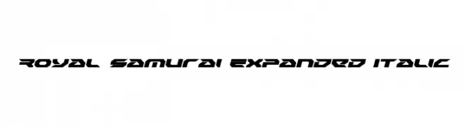
( Iconian Fonts - Daniel Zadorozny - www.iconian.com )
A bold, expanded, and italicized font with a futuristic, angular design.
![Royal Samurai Expanded Italic Frei Schriftart Herunterladen]() Herunterladen 112 Downloads@WebFont
Herunterladen 112 Downloads@WebFont -
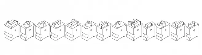
( Fonts by Daniel Gauthier )
A decorative, 3D block-style font with a vintage, industrial feel.
![LeadTypeRight Frei Schriftart Herunterladen]() Herunterladen 112 Downloads@WebFont
Herunterladen 112 Downloads@WebFont -
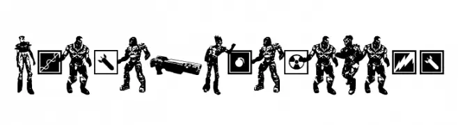
( Fonts by Daniel Gauthier )
A detailed, game-themed dingbat font with character and weapon silhouettes.
![Quake3ArenaBats Frei Schriftart Herunterladen]() Herunterladen 112 Downloads@WebFont
Herunterladen 112 Downloads@WebFont -
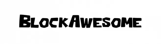
( Fonts by Han Lee )
A bold, playful, and blocky font with rounded edges.
![Block_Awesome Frei Schriftart Herunterladen]() Herunterladen 112 Downloads@WebFont
Herunterladen 112 Downloads@WebFont -
( Fonts by www.blambot.com )
A bold, playful font with a futuristic and quirky design.
![LifeFormBB Frei Schriftart Herunterladen]() Herunterladen 112 Downloads@WebFont
Herunterladen 112 Downloads@WebFont


Welche Schriften sind gerade am populärsten?
Poppins, Roboto, Montserrat, Open Sans und Lato sind wegen ihrer klaren Formen und breiten Einsetzbarkeit sehr gefragt – von Markenauftritt über Landingpages bis hin zu Postern.
Welche Fonts eignen sich für Logos?
Geometrische Sans‑Serifs (z. B. Poppins, Familien im Gotham‑Stil) sind ein häufiger Griff für sauberes, skalierbares Branding. Für eine persönlichere Note bleiben Scripts und Handschrift‑Stile beliebt. Kombinieren Sie einen prägnanten Headline‑Font mit einer neutralen Brotschrift für Wiedererkennung und Harmonie.
Wie oft wird die Top‑Liste aktualisiert?
Regelmäßig – basierend auf realen Downloads und Interaktionen. Schauen Sie öfter vorbei, um aufstrebende Favoriten früh zu entdecken.
💡 Tipp: Seite bookmarken – Trends wechseln schnell, und heutige Top‑Schriften inspirieren morgen vielleicht das Rebranding.