Willkommen bei den Top‑Schriften – hier treffen Beliebtheit und Qualität aufeinander. Das sind die in diesem Jahr am häufigsten heruntergeladenen und genutzten Fonts. Wenn Sie sichere Optionen für Logo, Web oder Social suchen, starten Sie hier.
Jeder Top‑Font überzeugt durch Balance, Lesbarkeit und Vielseitigkeit. Sie finden moderne Sans‑Serifs, elegante Scripts, Vintage‑Serifs und minimalistische Displays.
-
 Herunterladen 111 Downloads@WebFont
 -
( Fonts by Daniel Zadorozny - www.iconian.com )
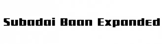
A bold, geometric font with expanded width and strong visual impact.
![Subadai Baan Expanded Frei Schriftart Herunterladen]() Herunterladen 111 Downloads@WebFont
Herunterladen 111 Downloads@WebFont -
( Fonts by Darrell Flood - Personal-use only. For commercial use please contact owner. )
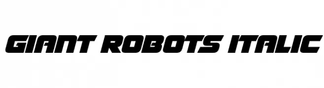
A bold, futuristic italic font with sharp angles and a dynamic style.
![Giant Robots Italic Frei Schriftart Herunterladen]() Herunterladen 111 Downloads@WebFont
Herunterladen 111 Downloads@WebFont -
( Fonts by Wingsart Studio - Christopher King - Personal-use only. For commercial use please contact owner. )
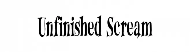
A dramatic, hand-drawn font with sharp, uneven edges and a unique, eerie aesthetic.
![Unfinished Scream Frei Schriftart Herunterladen]() Herunterladen 111 Downloads@WebFont
Herunterladen 111 Downloads@WebFont -
( Fonts by Syaf Rizal - Khurasan - Personal-use only. For commercial use please contact owner. )
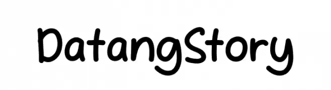
A playful, casual handwritten font with rounded, smooth letterforms.
![Datang Story Frei Schriftart Herunterladen]() Herunterladen 111 Downloads@WebFont
Herunterladen 111 Downloads@WebFont -
-
( Fonts by Vladimir Nikolic )
A whimsical and playful font with cartoonish creature-like characters.
![Skepping Regular Frei Schriftart Herunterladen]() Herunterladen 111 Downloads@WebFont
Herunterladen 111 Downloads@WebFont -
( Iconian Fonts - Daniel Zadorozny - www.iconian.com )
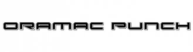
A bold, futuristic font with geometric outlines and a tech-inspired look.
![Oramac Punch Frei Schriftart Herunterladen]() Herunterladen 111 Downloads@WebFont
Herunterladen 111 Downloads@WebFont -
( Fonts by Des Gomez )
A playful, hand-drawn font with tall, narrow letters and a quirky style.
![Dessushi Frei Schriftart Herunterladen]() Herunterladen 111 Downloads@WebFont
Herunterladen 111 Downloads@WebFont -
( Typodermic Fonts - Ray Larabie - www.typodermicfonts.com/ )
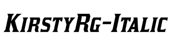
A bold, italic font with sharp angles and strong presence.
![KirstyRg-Italic Frei Schriftart Herunterladen]() Herunterladen 111 Downloads@WebFont
Herunterladen 111 Downloads@WebFont -
( Fonts by www.peter-wiegel.de. Personal-use only. For commercial use please contact owner. )
A dynamic, italic font with sharp, angular strokes and high contrast.
![cbe Italic Frei Schriftart Herunterladen]() Herunterladen 111 Downloads@WebFont
Herunterladen 111 Downloads@WebFont


Welche Schriften sind gerade am populärsten?
Poppins, Roboto, Montserrat, Open Sans und Lato sind wegen ihrer klaren Formen und breiten Einsetzbarkeit sehr gefragt – von Markenauftritt über Landingpages bis hin zu Postern.
Welche Fonts eignen sich für Logos?
Geometrische Sans‑Serifs (z. B. Poppins, Familien im Gotham‑Stil) sind ein häufiger Griff für sauberes, skalierbares Branding. Für eine persönlichere Note bleiben Scripts und Handschrift‑Stile beliebt. Kombinieren Sie einen prägnanten Headline‑Font mit einer neutralen Brotschrift für Wiedererkennung und Harmonie.
Wie oft wird die Top‑Liste aktualisiert?
Regelmäßig – basierend auf realen Downloads und Interaktionen. Schauen Sie öfter vorbei, um aufstrebende Favoriten früh zu entdecken.
💡 Tipp: Seite bookmarken – Trends wechseln schnell, und heutige Top‑Schriften inspirieren morgen vielleicht das Rebranding.