Willkommen bei den Top‑Schriften – hier treffen Beliebtheit und Qualität aufeinander. Das sind die in diesem Jahr am häufigsten heruntergeladenen und genutzten Fonts. Wenn Sie sichere Optionen für Logo, Web oder Social suchen, starten Sie hier.
Jeder Top‑Font überzeugt durch Balance, Lesbarkeit und Vielseitigkeit. Sie finden moderne Sans‑Serifs, elegante Scripts, Vintage‑Serifs und minimalistische Displays.
-
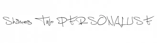
( Fonts by Måns Grebäck )
A dynamic and expressive handwritten font with fluid strokes.
 Herunterladen 500 Downloads@WebFont
 -
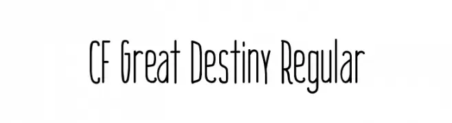
![CF Great Destiny Regular Frei Schriftart Herunterladen]() Herunterladen 500 Downloads@WebFont
Herunterladen 500 Downloads@WebFont -
( Fonts by www.peter-wiegel.de. Personal-use only. For commercial use please contact owner. )
A bold, geometric sans-serif font with clean lines and modern appeal.
![Quirkus Frei Schriftart Herunterladen]() Herunterladen 500 Downloads@WebFont
Herunterladen 500 Downloads@WebFont -
( Free for personal use - www.facebook.com/wolfbainx )
A bold, playful font with a hand-drawn, cartoonish style.
![VTC-GarageSale Frei Schriftart Herunterladen]() Herunterladen 500 Downloads@WebFont
Herunterladen 500 Downloads@WebFont -
( Fonts by B85 - Personal-use only. For commercial use please contact owner. )
A sharp, graffiti-inspired font with elongated, edgy characters.
![Ozone Original Frei Schriftart Herunterladen]() Herunterladen 500 Downloads@WebFont
Herunterladen 500 Downloads@WebFont -
-
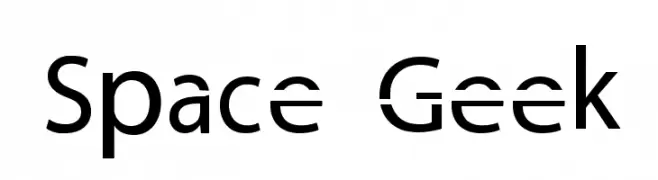
![Space Geek Frei Schriftart Herunterladen]() Herunterladen 500 Downloads@WebFont
Herunterladen 500 Downloads@WebFont -
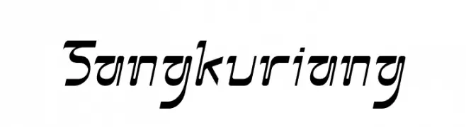
![Sangkuriang Frei Schriftart Herunterladen]() Herunterladen 500 Downloads@WebFont
Herunterladen 500 Downloads@WebFont -
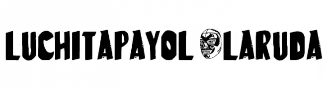
![LuchitaPayol-LaRuda Frei Schriftart Herunterladen]() Herunterladen 500 Downloads@WebFont
Herunterladen 500 Downloads@WebFont -
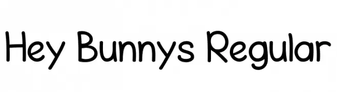
( Fonts by Achmad Yani )
A playful, rounded font with a friendly and approachable style.
![Hey Bunnys Regular Frei Schriftart Herunterladen]() Herunterladen 500 Downloads@WebFont
Herunterladen 500 Downloads@WebFont -
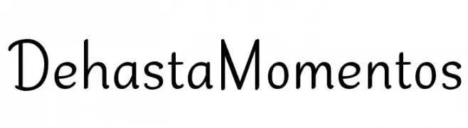
( Fonts by Situjuh Nazara - 7ntypes.com - Personal-use only. For commercial use please contact owner. )
A playful, handwritten font with smooth curves and a casual style.
![Dehasta Momentos Frei Schriftart Herunterladen]() Herunterladen 500 Downloads@WebFont
Herunterladen 500 Downloads@WebFont -
( Fonts by Billy Argel Fonts - www.billyargel.com - Personal-use only. For commercial use please contact owner. )
A bold, cursive font with elegant curves and decorative flourishes.
![Worldwide Frei Schriftart Herunterladen]() Herunterladen 500 Downloads@WebFont
Herunterladen 500 Downloads@WebFont -
![Titania Shadow Frei Schriftart Herunterladen]() Herunterladen 500 Downloads@WebFont
Herunterladen 500 Downloads@WebFont -
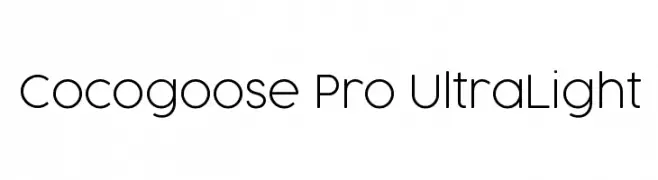
( Fonts by Zetafonts - Personal-use only. For commercial use please contact owner. )
A modern, ultra-light sans-serif font with a sleek and minimalist design.
![Cocogoose Pro UltraLight Frei Schriftart Herunterladen]() Herunterladen 500 Downloads@WebFont
Herunterladen 500 Downloads@WebFont -
![Marvelous Personal Use Regular Frei Schriftart Herunterladen]() Herunterladen 500 Downloads@WebFont
Herunterladen 500 Downloads@WebFont -
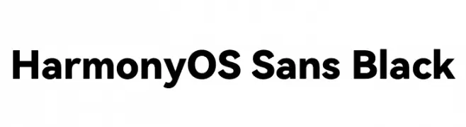
( Fonts by huawei.com - Personal-use only. For commercial use please contact owner. )
A bold, modern sans-serif font with clean lines and uniform strokes.
![HarmonyOS Sans Black Frei Schriftart Herunterladen]() Herunterladen 500 Downloads@WebFont
Herunterladen 500 Downloads@WebFont -
![VINTAGE COLLEGE DEPT_DEMO_outline Frei Schriftart Herunterladen]() Herunterladen 500 Downloads@WebFont
Herunterladen 500 Downloads@WebFont -
( Fonts by Nur Solikh )
A bold, playful script font with a handwritten feel.
![Gembulla Frei Schriftart Herunterladen]() Herunterladen 500 Downloads@WebFont
Herunterladen 500 Downloads@WebFont -
( Fonts by Iconian Fonts - Daniel Zadorozny - Personal-use only. For commercial use please contact owner. )
A bold, condensed, and italicized font with strong visual impact.
![Punch Condensed Italic Frei Schriftart Herunterladen]() Herunterladen 500 Downloads@WebFont
Herunterladen 500 Downloads@WebFont -
( Fonts by Daniel Zadorozny - www.iconian.com - Personal-use only. For commercial use please contact owner. )
A bold, angular font with a modern, geometric style.
![Sleigher Frei Schriftart Herunterladen]() Herunterladen 500 Downloads@WebFont
Herunterladen 500 Downloads@WebFont -
( Fonts by a Max Infeld - XEROGRAPHER FONTS - xerographer.blogspot.com . Personal-use only. For commercial use please contact owner. )
A bold, textured font with a distressed, hand-drawn appearance.
![MicroBrew Frei Schriftart Herunterladen]() Herunterladen 500 Downloads@WebFont
Herunterladen 500 Downloads@WebFont -
Schriftart von JamboFonts. For commercial use please contact the owner.
![Jambetica-Bold Frei Schriftart Herunterladen]() Herunterladen 500 Downloads@WebFont
Herunterladen 500 Downloads@WebFont -
( Fonts by Flava Fonts - Leigh Taylor )
A modern, playful font with quirky letterforms and subtle stroke variations.
![Blurmix Frei Schriftart Herunterladen]() Herunterladen 500 Downloads@WebFont
Herunterladen 500 Downloads@WebFont -
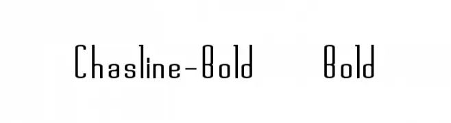
![Chasline-Bold Bold Frei Schriftart Herunterladen]() Herunterladen 500 Downloads@WebFont
Herunterladen 500 Downloads@WebFont -
( Fonts by Shara Weber )
A playful, handwritten font with smooth, rounded characters and a casual feel.
![GelPenUprightLight Frei Schriftart Herunterladen]() Herunterladen 500 Downloads@WebFont
Herunterladen 500 Downloads@WebFont -
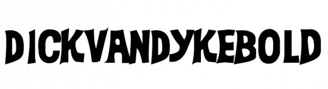
( Fonts by Daniel Gauthier )
A bold, playful font with exaggerated curves and a whimsical style.
![DickVanDykeBold Frei Schriftart Herunterladen]() Herunterladen 500 Downloads@WebFont
Herunterladen 500 Downloads@WebFont -
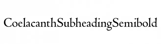
( Personal-use only. For commercial use please contact owner. )
A classic serif font with elegant curves and a semi-bold weight.
![Coelacanth Subheading Semibold Frei Schriftart Herunterladen]() Herunterladen 500 Downloads@WebFont
Herunterladen 500 Downloads@WebFont -
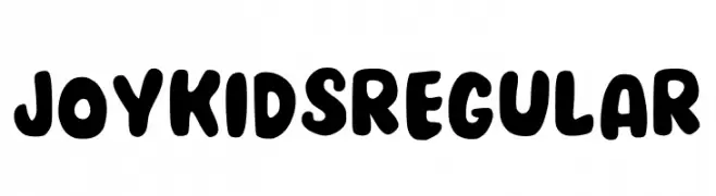
( Fonts by Novita Maria )
A playful, bold font with rounded, bubbly characters perfect for fun projects.
![Joykids Regular Frei Schriftart Herunterladen]() Herunterladen 500 Downloads@WebFont
Herunterladen 500 Downloads@WebFont -
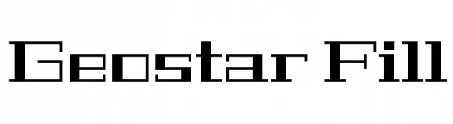
( Copyright (c) 2011, Joe Prince, Admix Designs (http://www.admixdesigns.com/) )
A geometric, futuristic font with sharp angles and a modular structure.
![Geostar Fill Frei Schriftart Herunterladen]() Herunterladen 500 Downloads@WebFont
Herunterladen 500 Downloads@WebFont -
![Deities Frei Schriftart Herunterladen]() Herunterladen 500 Downloads@WebFont
Herunterladen 500 Downloads@WebFont -
( Haksen Letters - Sarwo Edhi Prayitno )
A modern, handwritten script font with elegant, flowing strokes.
![Katty Pretty 2 Frei Schriftart Herunterladen]() Herunterladen 500 Downloads@WebFont
Herunterladen 500 Downloads@WebFont -
Schriftart von HydricDesign. For commercial use please contact the owner.
( Thank you for downloading Sweet Jenny’s font by HYDRIC DESIGN full version for commercial use available at https://bit.ly/30MfxtS email: hydricdesignco@gmail.com any donation is very appreciated! https://www.paypal.me/hydricdesign Enjoy and Thank You! )
A playful, handwritten font with smooth curves and a casual style.
![Sweet Jennys Demo Regular Frei Schriftart Herunterladen]() Herunterladen 500 Downloads@WebFont
Herunterladen 500 Downloads@WebFont -
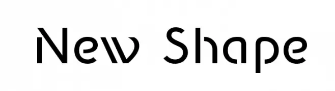
![New Shape Frei Schriftart Herunterladen]() Herunterladen 500 Downloads@WebFont
Herunterladen 500 Downloads@WebFont -
( Fonts by Marty Bee - www.martybee.com )
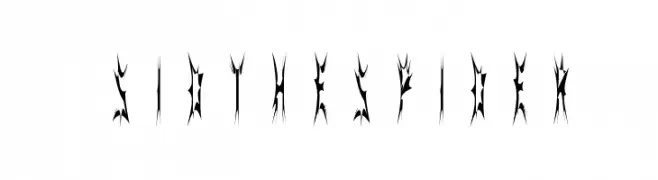
A gothic, spider web-inspired decorative font with sharp, jagged edges.
![SidTheSpider Frei Schriftart Herunterladen]() Herunterladen 500 Downloads@WebFont
Herunterladen 500 Downloads@WebFont -
( Fonts by PutraCetol Studio )
A bold, geometric font with a cracked, fragmented design.
![Rock Pile Crack Frei Schriftart Herunterladen]() Herunterladen 500 Downloads@WebFont
Herunterladen 500 Downloads@WebFont -
( 7NTypes - Situjuh Nazara - 7ntypes.com )
A dynamic, flowing script font with elegant cursive letterforms.
![Hettas Frei Schriftart Herunterladen]() Herunterladen 500 Downloads@WebFont
Herunterladen 500 Downloads@WebFont


Welche Schriften sind gerade am populärsten?
Poppins, Roboto, Montserrat, Open Sans und Lato sind wegen ihrer klaren Formen und breiten Einsetzbarkeit sehr gefragt – von Markenauftritt über Landingpages bis hin zu Postern.
Welche Fonts eignen sich für Logos?
Geometrische Sans‑Serifs (z. B. Poppins, Familien im Gotham‑Stil) sind ein häufiger Griff für sauberes, skalierbares Branding. Für eine persönlichere Note bleiben Scripts und Handschrift‑Stile beliebt. Kombinieren Sie einen prägnanten Headline‑Font mit einer neutralen Brotschrift für Wiedererkennung und Harmonie.
Wie oft wird die Top‑Liste aktualisiert?
Regelmäßig – basierend auf realen Downloads und Interaktionen. Schauen Sie öfter vorbei, um aufstrebende Favoriten früh zu entdecken.
💡 Tipp: Seite bookmarken – Trends wechseln schnell, und heutige Top‑Schriften inspirieren morgen vielleicht das Rebranding.