Willkommen bei den Top‑Schriften – hier treffen Beliebtheit und Qualität aufeinander. Das sind die in diesem Jahr am häufigsten heruntergeladenen und genutzten Fonts. Wenn Sie sichere Optionen für Logo, Web oder Social suchen, starten Sie hier.
Jeder Top‑Font überzeugt durch Balance, Lesbarkeit und Vielseitigkeit. Sie finden moderne Sans‑Serifs, elegante Scripts, Vintage‑Serifs und minimalistische Displays.
-
 Herunterladen 500 Downloads@WebFont
 -
( Fonts by dcoxy )
A dynamic and flowing script font with elegant, cursive letterforms.
![Stardust Frei Schriftart Herunterladen]() Herunterladen 500 Downloads@WebFont
Herunterladen 500 Downloads@WebFont -
( Fonts by Apostrophic Lab )
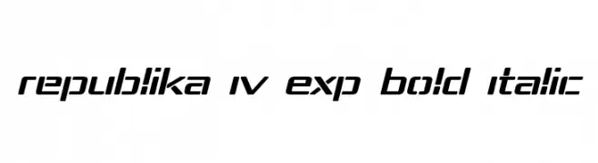
A bold, italicized font with a futuristic and dynamic design.
![Republika IV Exp Bold Italic Frei Schriftart Herunterladen]() Herunterladen 500 Downloads@WebFont
Herunterladen 500 Downloads@WebFont -
![Textbook Math Frei Schriftart Herunterladen]() Herunterladen 500 Downloads@WebFont
Herunterladen 500 Downloads@WebFont -
( Fonts by Press Gang Studios - Andeh Pinkard - www.pressgang-studios.com )
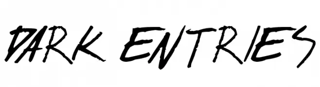
A bold, hand-drawn font with sharp, angular strokes and a dynamic, graffiti-like style.
![dark entries Frei Schriftart Herunterladen]() Herunterladen 500 Downloads@WebFont
Herunterladen 500 Downloads@WebFont -
-
![michelle digital handwritten Frei Schriftart Herunterladen]() Herunterladen 500 Downloads@WebFont
Herunterladen 500 Downloads@WebFont -
![CF Revenge Regular Frei Schriftart Herunterladen]() Herunterladen 500 Downloads@WebFont
Herunterladen 500 Downloads@WebFont -
![Gent Frei Schriftart Herunterladen]() Herunterladen 500 Downloads@WebFont
Herunterladen 500 Downloads@WebFont -
( Fonts by Leonard Posavec - leosupply.co - Personal-use only. For commercial use please contact owner. )
A bold, playful font with rounded edges and a hand-drawn style.
![Acids Frei Schriftart Herunterladen]() Herunterladen 500 Downloads@WebFont
Herunterladen 500 Downloads@WebFont -
( Fonts by Manfred Klein. Free for private and charity use. Free for commercial with donation to organizations )
A bold, striped sans-serif font with a modern, textured look.
![StripedSansBlack Frei Schriftart Herunterladen]() Herunterladen 500 Downloads@WebFont
Herunterladen 500 Downloads@WebFont -
![Duped Frei Schriftart Herunterladen]() Herunterladen 500 Downloads@WebFont
Herunterladen 500 Downloads@WebFont -
![Long Night Demo Regular Frei Schriftart Herunterladen]() Herunterladen 500 Downloads@WebFont
Herunterladen 500 Downloads@WebFont -
![Amature Circus Frei Schriftart Herunterladen]() Herunterladen 500 Downloads@WebFont
Herunterladen 500 Downloads@WebFont -
( Fonts by www.DigitalDreamDesign.net )
A bold, geometric font with block-like shapes and uniform thickness.
![D3 Blockism Frei Schriftart Herunterladen]() Herunterladen 500 Downloads@WebFont
Herunterladen 500 Downloads@WebFont -
( Fonts by Forberas Club )
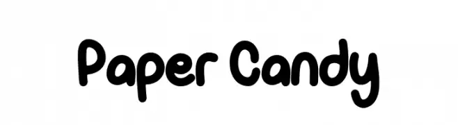
A playful, bold, and rounded font with a bubbly, whimsical style.
![Paper Candy Frei Schriftart Herunterladen]() Herunterladen 500 Downloads@WebFont
Herunterladen 500 Downloads@WebFont -
( Fonts by www.kimberlygeswein.com - Kimberly Geswein )
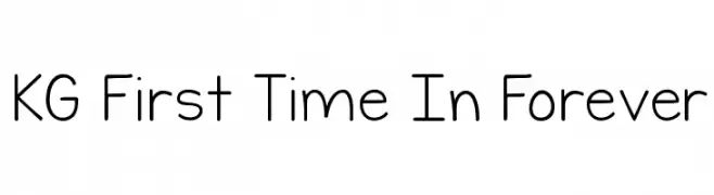
A playful, rounded font with a whimsical and friendly style.
![KG First Time In Forever Frei Schriftart Herunterladen]() Herunterladen 500 Downloads@WebFont
Herunterladen 500 Downloads@WebFont -
( Fonts by Levi Halmos )
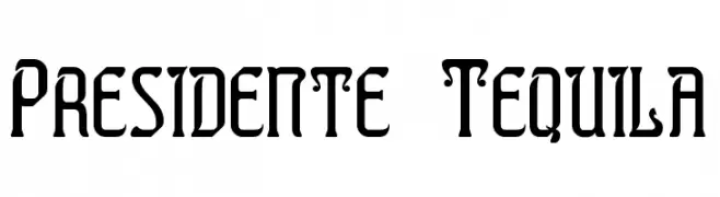
A bold, modern serif font with sharp, angular edges and unique cutouts.
![Presidente Tequila Frei Schriftart Herunterladen]() Herunterladen 500 Downloads@WebFont
Herunterladen 500 Downloads@WebFont -
( Fonts by Vladimir Nikolic - www.creativefabrica.com/designer/vladimirnikolic/ - Personal-use only. For commercial use please contact owner. )
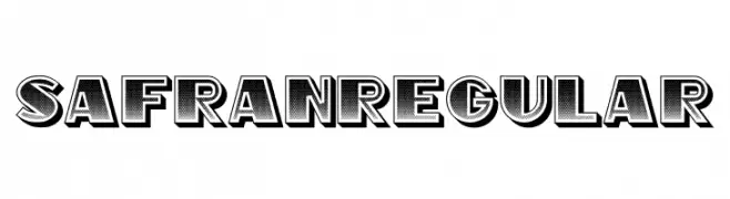
A bold, decorative font with a 3D shadow effect and dotted texture.
![Safran Regular Frei Schriftart Herunterladen]() Herunterladen 500 Downloads@WebFont
Herunterladen 500 Downloads@WebFont -
( Copyright 2010 The Cuprum Project Authors (lemonad@jovanny.ru), with Reserved Font Name "Cuprum". )
A modern italic font with clean lines and a dynamic slant.
![Cuprum Italic Frei Schriftart Herunterladen]() Herunterladen 500 Downloads@WebFont
Herunterladen 500 Downloads@WebFont -
( Fonts by www.chequered.ink - Chequered Ink - Personal-use only. For commercial use please contact owner. )
A dynamic, angular font with a futuristic and oblique style.
![Smack Laideth Down 2016 Oblique Frei Schriftart Herunterladen]() Herunterladen 500 Downloads@WebFont
Herunterladen 500 Downloads@WebFont -
( Fonts by Castcraft Software - opti.netii.net - check the website before use )
A bold, playful font with rounded, cartoonish characters.
![OPTIKartoon-Bold Frei Schriftart Herunterladen]() Herunterladen 500 Downloads@WebFont
Herunterladen 500 Downloads@WebFont -
( Fonts by Wino S Kadir - weknow - www.revolge.com/shop/weknow/ - Personal-use only. For commercial use please contact owner. )
A bold, modern font with thick, slanted characters and tight spacing.
![black mamba Frei Schriftart Herunterladen]() Herunterladen 500 Downloads@WebFont
Herunterladen 500 Downloads@WebFont -
( Fonts by The Docallisme )
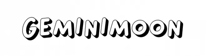
A playful, bold font with a 3D effect and rounded, bubble-like letters.
![Gemini Moon Frei Schriftart Herunterladen]() Herunterladen 499 Downloads@WebFont
Herunterladen 499 Downloads@WebFont -
( Fonts by Jester Font Studio )
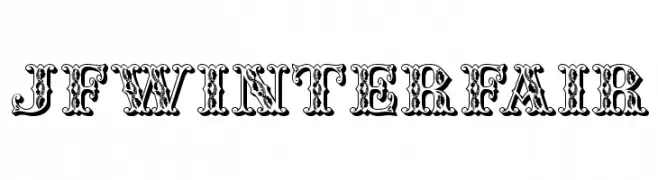
An ornate, vintage-style decorative font with intricate detailing.
![JFWinterFair Frei Schriftart Herunterladen]() Herunterladen 499 Downloads@WebFont
Herunterladen 499 Downloads@WebFont -
( Fonts by Denise Bentulan - douxiegirl.com. Personal-use only. For commercial use please contact owner. )
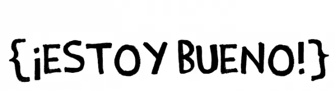
A bold, playful handwritten font with thick strokes and a casual feel.
![{¡Estoy Bueno!} Frei Schriftart Herunterladen]() Herunterladen 499 Downloads@WebFont
Herunterladen 499 Downloads@WebFont -
( Fonts by Ahmad Syarif Afandi - https://delapan.studio - Personal-use only. For commercial use please contact owner. )
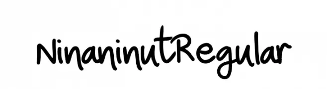
A playful handwritten font with smooth, rounded letterforms.
![NinaninutRegular Frei Schriftart Herunterladen]() Herunterladen 499 Downloads@WebFont
Herunterladen 499 Downloads@WebFont -
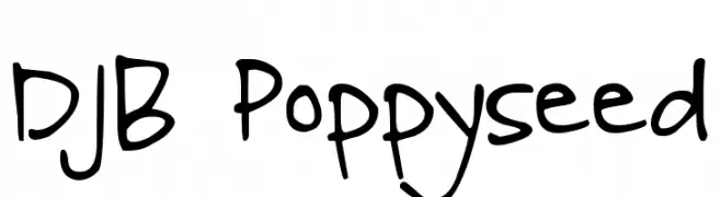
( Fonts by Darcy Baldwin - darcybaldwin.com. Free for personal use only )
A playful, handwritten font with a casual and friendly vibe.
![DJB Poppyseed Frei Schriftart Herunterladen]() Herunterladen 499 Downloads@WebFont
Herunterladen 499 Downloads@WebFont -
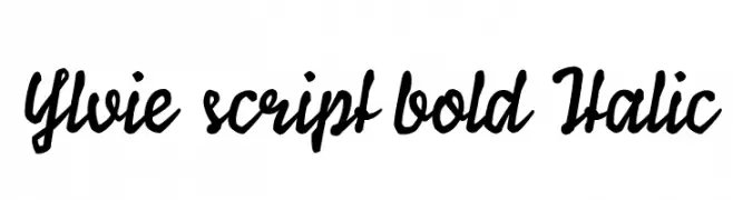
( Anja Pöchhacker )
A bold, italic script font with a flowing, cursive style.
![Ylvie script bold Italic Frei Schriftart Herunterladen]() Herunterladen 499 Downloads@WebFont
Herunterladen 499 Downloads@WebFont -
( Fonts by Graham Meade - GemFonts )
A bold, outlined font with a modern, industrial feel and three-dimensional appearance.
![Impressed Metal Frei Schriftart Herunterladen]() Herunterladen 499 Downloads@WebFont
Herunterladen 499 Downloads@WebFont -
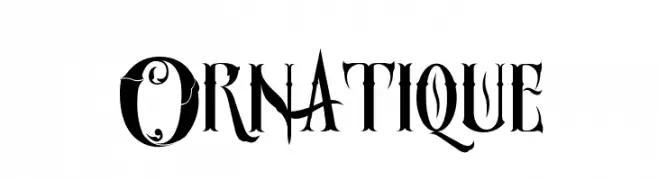
( Fonts by DesignStation - designstation.deviantart.com - Personal-use only. For commercial use please contact owner. )
An ornate and decorative font with intricate swirls and flourishes.
![Ornatique Frei Schriftart Herunterladen]() Herunterladen 499 Downloads@WebFont
Herunterladen 499 Downloads@WebFont -
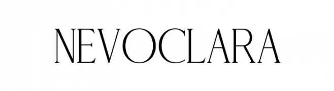
( Fonts by mlkwsn - www.mlkwsn.com - Personal-use only. For commercial use please contact owner. )
An elegant serif font with high contrast and refined details.
![NEVOCLARA Frei Schriftart Herunterladen]() Herunterladen 499 Downloads@WebFont
Herunterladen 499 Downloads@WebFont -
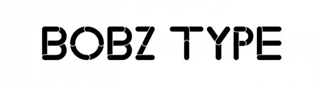
( Fonts by Bobz Type )
A modern, segmented geometric font with bold, rounded shapes.
![Bobz Type Frei Schriftart Herunterladen]() Herunterladen 499 Downloads@WebFont
Herunterladen 499 Downloads@WebFont -
![Space Geek Frei Schriftart Herunterladen]() Herunterladen 499 Downloads@WebFont
Herunterladen 499 Downloads@WebFont -
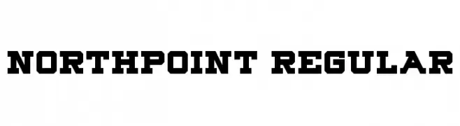
( Fonts by Geronimo Fonts - Personal-use only. For commercial use please contact owner. )
A bold, geometric font with strong, angular lines and a robust, industrial feel.
![Northpoint Regular Frei Schriftart Herunterladen]() Herunterladen 499 Downloads@WebFont
Herunterladen 499 Downloads@WebFont -
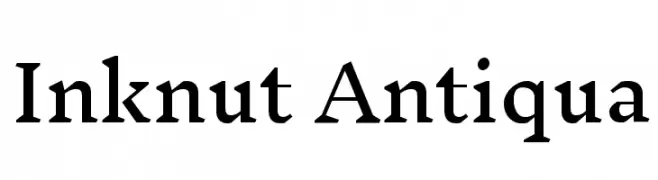
( Copyright (c) 2014 Claus Eggers Sørensen (es@forthehearts.net) )
A classic serif typeface with sharp serifs and high contrast, exuding elegance and tradition.
![Inknut Antiqua Frei Schriftart Herunterladen]() Herunterladen 499 Downloads@WebFont
Herunterladen 499 Downloads@WebFont


Welche Schriften sind gerade am populärsten?
Poppins, Roboto, Montserrat, Open Sans und Lato sind wegen ihrer klaren Formen und breiten Einsetzbarkeit sehr gefragt – von Markenauftritt über Landingpages bis hin zu Postern.
Welche Fonts eignen sich für Logos?
Geometrische Sans‑Serifs (z. B. Poppins, Familien im Gotham‑Stil) sind ein häufiger Griff für sauberes, skalierbares Branding. Für eine persönlichere Note bleiben Scripts und Handschrift‑Stile beliebt. Kombinieren Sie einen prägnanten Headline‑Font mit einer neutralen Brotschrift für Wiedererkennung und Harmonie.
Wie oft wird die Top‑Liste aktualisiert?
Regelmäßig – basierend auf realen Downloads und Interaktionen. Schauen Sie öfter vorbei, um aufstrebende Favoriten früh zu entdecken.
💡 Tipp: Seite bookmarken – Trends wechseln schnell, und heutige Top‑Schriften inspirieren morgen vielleicht das Rebranding.