Willkommen bei den Top‑Schriften – hier treffen Beliebtheit und Qualität aufeinander. Das sind die in diesem Jahr am häufigsten heruntergeladenen und genutzten Fonts. Wenn Sie sichere Optionen für Logo, Web oder Social suchen, starten Sie hier.
Jeder Top‑Font überzeugt durch Balance, Lesbarkeit und Vielseitigkeit. Sie finden moderne Sans‑Serifs, elegante Scripts, Vintage‑Serifs und minimalistische Displays.
-
 Herunterladen 222 Downloads@WebFont
 -
( Fonts by wep - Wahyu Eka Prasetya - Personal-use only. For commercial use please contact owner. )
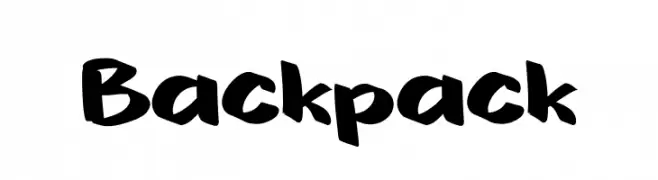
A bold, hand-drawn font with a playful and dynamic style.
![Backpack Frei Schriftart Herunterladen]() Herunterladen 222 Downloads@WebFont
Herunterladen 222 Downloads@WebFont -
( Fonts by David Rakowski )
A bold, decorative font with a three-dimensional, shadowed effect.
![Tejaratchi Th Bold Frei Schriftart Herunterladen]() Herunterladen 222 Downloads@WebFont
Herunterladen 222 Downloads@WebFont -
( Fonts by Fontfabric - Svetoslav Simov - Personal-use only. For commercial use please contact owner. )
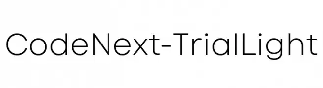
A modern, geometric sans-serif font with clean lines and uniform stroke width.
![Code Next-Trial Light Frei Schriftart Herunterladen]() Herunterladen 222 Downloads@WebFont
Herunterladen 222 Downloads@WebFont -
( Fonts by Manfred Klein. Free for private and charity use. Free for commercial with donation to organizations )
Sketch-style font featuring ballet dancer illustrations as characters.
![BalletSketches Frei Schriftart Herunterladen]() Herunterladen 222 Downloads@WebFont
Herunterladen 222 Downloads@WebFont -
( Fonts by a Max Infeld - XEROGRAPHER FONTS - xerographer.blogspot.com . Personal-use only. For commercial use please contact owner. )
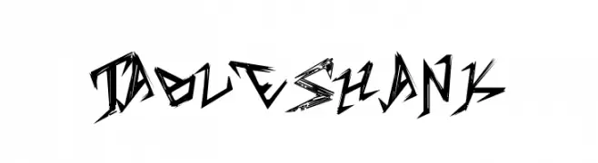
A bold, jagged font with sharp angles and an edgy, dynamic appearance.
![TableShank Frei Schriftart Herunterladen]() Herunterladen 222 Downloads@WebFont
Herunterladen 222 Downloads@WebFont -
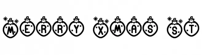
![Merry Xmas St Frei Schriftart Herunterladen]() Herunterladen 222 Downloads@WebFont
Herunterladen 222 Downloads@WebFont -
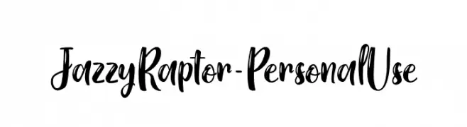
( Fonts by Typhoon Type - Suthi Srisopha - www.typhoontype.net - Personal-use only. For commercial use please contact owner. )
A lively, handwritten script font with bold, expressive characters.
![Jazzy Raptor - Personal Use Frei Schriftart Herunterladen]() Herunterladen 222 Downloads@WebFont
Herunterladen 222 Downloads@WebFont -
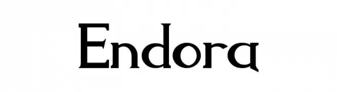
![Endora Frei Schriftart Herunterladen]() Herunterladen 222 Downloads@WebFont
Herunterladen 222 Downloads@WebFont -
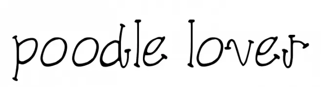
( Fonts by SnailFonts )
A playful, hand-drawn font with a whimsical and quirky style.
![poodle lover Frei Schriftart Herunterladen]() Herunterladen 222 Downloads@WebFont
Herunterladen 222 Downloads@WebFont -
( Fonts by Pizzadude - Personal-use only. For commercial use please contact owner. )
A playful, hand-cut style font with bold, irregular characters.
![Cut it out DEMO Soft Frei Schriftart Herunterladen]() Herunterladen 222 Downloads@WebFont
Herunterladen 222 Downloads@WebFont -
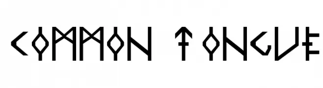
![Common Tongue Frei Schriftart Herunterladen]() Herunterladen 222 Downloads
Herunterladen 222 Downloads -
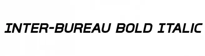
![Inter-Bureau Bold Italic Frei Schriftart Herunterladen]() Herunterladen 222 Downloads@WebFont
Herunterladen 222 Downloads@WebFont -
( Free for a personal use. For a commercial use please visit www.kevinandamanda.com )
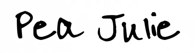
A playful and informal handwritten font with a casual, dynamic style.
![Pea Julie Frei Schriftart Herunterladen]() Herunterladen 222 Downloads@WebFont
Herunterladen 222 Downloads@WebFont -
( Fonts by Daniel Zadorozny - www.iconian.com )
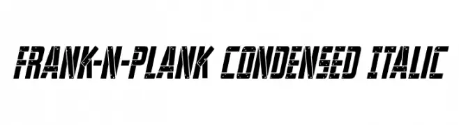
A bold, condensed, and italic font with industrial decorative elements.
![Frank-n-Plank Condensed Italic Frei Schriftart Herunterladen]() Herunterladen 222 Downloads@WebFont
Herunterladen 222 Downloads@WebFont -
( Vladimir Nikolic - www.coroflot.com/vladimirnikolic )
A bold, 3D neon-style font with layered outlines for a striking effect.
![Chicago Bright Neon 3D Regular Frei Schriftart Herunterladen]() Herunterladen 222 Downloads@WebFont
Herunterladen 222 Downloads@WebFont -
( Fonts by Md Shohail Bhuian )
Playful and rounded sans-serif font.
![Simply Happy Frei Schriftart Herunterladen]() Herunterladen 222 Downloads@WebFont
Herunterladen 222 Downloads@WebFont -
![Consolidated Frei Schriftart Herunterladen]() Herunterladen 222 Downloads@WebFont
Herunterladen 222 Downloads@WebFont -
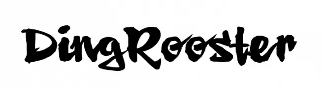
![Ding Rooster Frei Schriftart Herunterladen]() Herunterladen 222 Downloads@WebFont
Herunterladen 222 Downloads@WebFont -
( Fonts by Neapolitan )
A bold, playful font with a hand-drawn, whimsical style.
![Skranji Bold Frei Schriftart Herunterladen]() Herunterladen 222 Downloads@WebFont
Herunterladen 222 Downloads@WebFont -
![VaigaiAA Frei Schriftart Herunterladen]() Herunterladen 222 Downloads@WebFont
Herunterladen 222 Downloads@WebFont -
( Fonts by Good Java Studio - www.creativefabrica.com/designer/goodjavastudio/ref/236564 - Personal-use only. For commercial use please contact owner. )
A sophisticated, cursive script font with elegant, flowing strokes.
![Simanice-Demo Frei Schriftart Herunterladen]() Herunterladen 222 Downloads@WebFont
Herunterladen 222 Downloads@WebFont -
( Fonts by Darrell Flood )
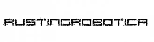
A distressed, futuristic font with a bold, industrial aesthetic.
![Rusting Robotica Frei Schriftart Herunterladen]() Herunterladen 222 Downloads@WebFont
Herunterladen 222 Downloads@WebFont -
![DJB Speak Softly Bold Frei Schriftart Herunterladen]() Herunterladen 222 Downloads@WebFont
Herunterladen 222 Downloads@WebFont -
![xspiralmental Frei Schriftart Herunterladen]() Herunterladen 222 Downloads@WebFont
Herunterladen 222 Downloads@WebFont -
( Fonts by Kong Font - fontkong.com - Personal-use only. For commercial use please contact owner. )
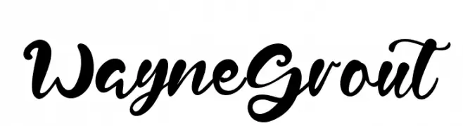
A bold, flowing script font with a modern, handwritten style.
![Wayne Grout Frei Schriftart Herunterladen]() Herunterladen 222 Downloads@WebFont
Herunterladen 222 Downloads@WebFont -
( Noto is a trademark of Google Inc. Noto fonts are open source. All Noto fonts are published under the SIL Open Font License, Version 1.1 )
A bold, clean, and modern font with excellent readability.
![Noto Sans Kannada UI Bold Frei Schriftart Herunterladen]() Herunterladen 222 Downloads@WebFont
Herunterladen 222 Downloads@WebFont -
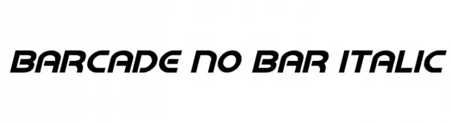
![Barcade No Bar Italic Frei Schriftart Herunterladen]() Herunterladen 222 Downloads@WebFont
Herunterladen 222 Downloads@WebFont -
![JamminBaby Frei Schriftart Herunterladen]() Herunterladen 222 Downloads@WebFont
Herunterladen 222 Downloads@WebFont -
( Fonts by Daniel Zadorozny - www.iconian.com - Free for personal use )
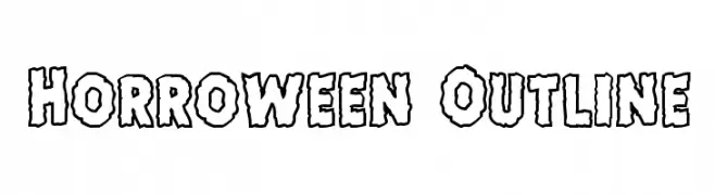
A playful, spooky outline font with jagged, irregular edges.
![Horroween Outline Frei Schriftart Herunterladen]() Herunterladen 222 Downloads@WebFont
Herunterladen 222 Downloads@WebFont -
( Free for personal use - www.TommWarham.com )
A bold, playful font with a hand-drawn, textured style.
![Lost in the fontrest Bold Frei Schriftart Herunterladen]() Herunterladen 222 Downloads@WebFont
Herunterladen 222 Downloads@WebFont -
( Free for personal use - www.vnbc.fr )
A bold, retro-style font with thick, exaggerated curves.
![Flea Market Plain Frei Schriftart Herunterladen]() Herunterladen 222 Downloads@WebFont
Herunterladen 222 Downloads@WebFont -
![Michigan Outline Italic Frei Schriftart Herunterladen]() Herunterladen 222 Downloads@WebFont
Herunterladen 222 Downloads@WebFont -
( Fonts by Steve Ferrera )
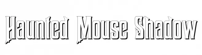
A bold, shadowed font with jagged edges, perfect for spooky themes.
![Haunted Mouse Shadow Frei Schriftart Herunterladen]() Herunterladen 222 Downloads@WebFont
Herunterladen 222 Downloads@WebFont -
( Fonts by Steve Gardner - www.explogos.com. Personal-use only. For commercial use please contact owner. )
A modern, semi-bold font with clean lines and a strong presence.
![Baqacents Semi Bold Frei Schriftart Herunterladen]() Herunterladen 222 Downloads@WebFont
Herunterladen 222 Downloads@WebFont


Welche Schriften sind gerade am populärsten?
Poppins, Roboto, Montserrat, Open Sans und Lato sind wegen ihrer klaren Formen und breiten Einsetzbarkeit sehr gefragt – von Markenauftritt über Landingpages bis hin zu Postern.
Welche Fonts eignen sich für Logos?
Geometrische Sans‑Serifs (z. B. Poppins, Familien im Gotham‑Stil) sind ein häufiger Griff für sauberes, skalierbares Branding. Für eine persönlichere Note bleiben Scripts und Handschrift‑Stile beliebt. Kombinieren Sie einen prägnanten Headline‑Font mit einer neutralen Brotschrift für Wiedererkennung und Harmonie.
Wie oft wird die Top‑Liste aktualisiert?
Regelmäßig – basierend auf realen Downloads und Interaktionen. Schauen Sie öfter vorbei, um aufstrebende Favoriten früh zu entdecken.
💡 Tipp: Seite bookmarken – Trends wechseln schnell, und heutige Top‑Schriften inspirieren morgen vielleicht das Rebranding.