Willkommen bei den Top‑Schriften – hier treffen Beliebtheit und Qualität aufeinander. Das sind die in diesem Jahr am häufigsten heruntergeladenen und genutzten Fonts. Wenn Sie sichere Optionen für Logo, Web oder Social suchen, starten Sie hier.
Jeder Top‑Font überzeugt durch Balance, Lesbarkeit und Vielseitigkeit. Sie finden moderne Sans‑Serifs, elegante Scripts, Vintage‑Serifs und minimalistische Displays.
-
( Fonts by ShyFonts )
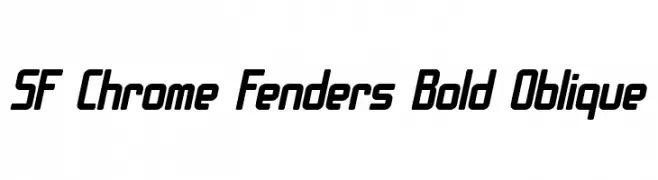
A bold, oblique font with a futuristic and modern design.
 Herunterladen 820 Downloads@WebFont
 -
( Fonts by Thomas O`Callaghan - www.tomocallaghan.co.uk )
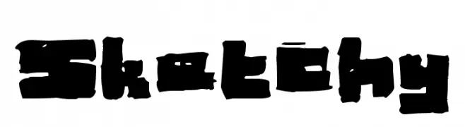
A bold, sketch-like font with uneven, hand-drawn strokes.
![Sketchy Frei Schriftart Herunterladen]() Herunterladen 820 Downloads@WebFont
Herunterladen 820 Downloads@WebFont -
( Fonts by Levi Halmos )
A modern, geometric font with elongated, narrow characters and a stylish appearance.
![Smart and Sexy Frei Schriftart Herunterladen]() Herunterladen 820 Downloads@WebFont
Herunterladen 820 Downloads@WebFont -
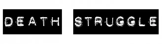
![DEATH STRUGGLE Frei Schriftart Herunterladen]() Herunterladen 820 Downloads@WebFont
Herunterladen 820 Downloads@WebFont -
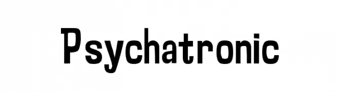
![Psychatronic Frei Schriftart Herunterladen]() Herunterladen 820 Downloads@WebFont
Herunterladen 820 Downloads@WebFont -
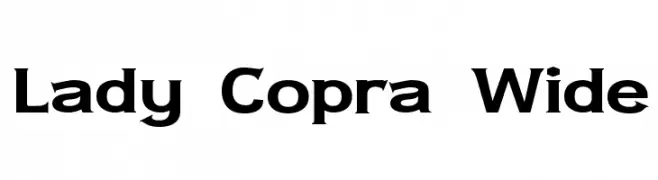
( Fonts by Apostrophic Lab )
A bold, wide font with geometric structure and strong presence.
![Lady Copra Wide Frei Schriftart Herunterladen]() Herunterladen 820 Downloads@WebFont
Herunterladen 820 Downloads@WebFont -
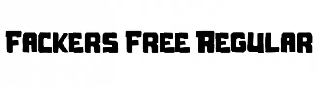
( Fonts by Maulana Creative )
A bold, hand-drawn font with a rugged and organic style.
![Fackers Free Regular Frei Schriftart Herunterladen]() Herunterladen 819 Downloads@WebFont
Herunterladen 819 Downloads@WebFont -
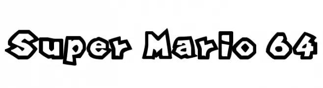
( Fonts by Alex Solis )
A bold, cartoonish font with thick outlines and playful character shapes.
![Super Mario 64 Frei Schriftart Herunterladen]() Herunterladen 819 Downloads@WebFont
Herunterladen 819 Downloads@WebFont -
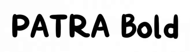
( Fonts by Yukita Creative )
A bold, playful font with rounded edges and a friendly appearance.
![PATRA Bold Frei Schriftart Herunterladen]() Herunterladen 819 Downloads@WebFont
Herunterladen 819 Downloads@WebFont -
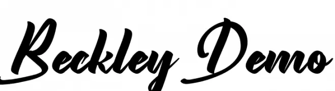
( Fonts by Edric Studio - Personal-use only. For commercial use please contact owner. )
A bold, flowing script font with interconnected letters and a dynamic style.
![Beckley Demo Frei Schriftart Herunterladen]() Herunterladen 819 Downloads@WebFont
Herunterladen 819 Downloads@WebFont

Welche Schriften sind gerade am populärsten?
Poppins, Roboto, Montserrat, Open Sans und Lato sind wegen ihrer klaren Formen und breiten Einsetzbarkeit sehr gefragt – von Markenauftritt über Landingpages bis hin zu Postern.
Welche Fonts eignen sich für Logos?
Geometrische Sans‑Serifs (z. B. Poppins, Familien im Gotham‑Stil) sind ein häufiger Griff für sauberes, skalierbares Branding. Für eine persönlichere Note bleiben Scripts und Handschrift‑Stile beliebt. Kombinieren Sie einen prägnanten Headline‑Font mit einer neutralen Brotschrift für Wiedererkennung und Harmonie.
Wie oft wird die Top‑Liste aktualisiert?
Regelmäßig – basierend auf realen Downloads und Interaktionen. Schauen Sie öfter vorbei, um aufstrebende Favoriten früh zu entdecken.
💡 Tipp: Seite bookmarken – Trends wechseln schnell, und heutige Top‑Schriften inspirieren morgen vielleicht das Rebranding.