Willkommen bei den Top‑Schriften – hier treffen Beliebtheit und Qualität aufeinander. Das sind die in diesem Jahr am häufigsten heruntergeladenen und genutzten Fonts. Wenn Sie sichere Optionen für Logo, Web oder Social suchen, starten Sie hier.
Jeder Top‑Font überzeugt durch Balance, Lesbarkeit und Vielseitigkeit. Sie finden moderne Sans‑Serifs, elegante Scripts, Vintage‑Serifs und minimalistische Displays.
-
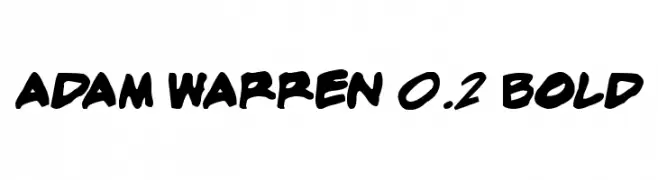
( Fonts by Press Gang Studios - Andeh Pinkard - www.pressgang-studios.com )
A bold, handwritten font with dynamic strokes and a playful style.
 Herunterladen 753 Downloads@WebFont
 -
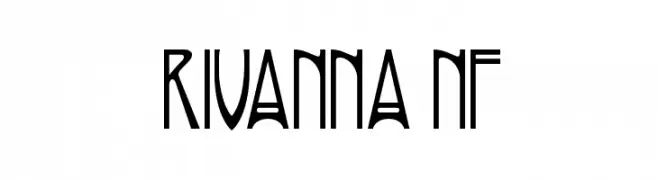
( Fonts by Nick Curtis - www.nicksfonts.com )
A modern, artistic font with elongated, narrow letterforms and sharp angles.
![Rivanna NF Frei Schriftart Herunterladen]() Herunterladen 753 Downloads@WebFont
Herunterladen 753 Downloads@WebFont -
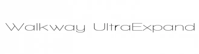
( Fonts by Graham Meade - GemFonts )
A geometric, ultra-expanded sans-serif font with a modern and minimalistic design.
![Walkway UltraExpand Frei Schriftart Herunterladen]() Herunterladen 753 Downloads@WebFont
Herunterladen 753 Downloads@WebFont -
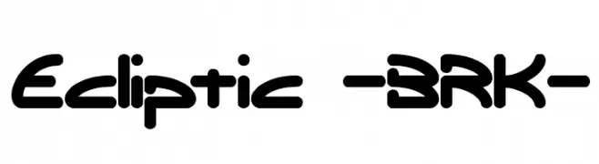
![Ecliptic -BRK- Frei Schriftart Herunterladen]() Herunterladen 753 Downloads@WebFont
Herunterladen 753 Downloads@WebFont -
![JayCons Frei Schriftart Herunterladen]() Herunterladen 753 Downloads@WebFont
Herunterladen 753 Downloads@WebFont -
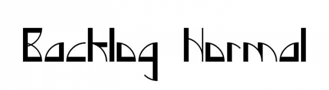
-
![Backlog Normal Frei Schriftart Herunterladen]() Herunterladen 753 Downloads@WebFont
Herunterladen 753 Downloads@WebFont -
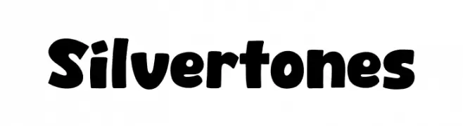
( Fonts by Khurasan )
A bold, playful font with rounded, hand-drawn characters.
![Silvertones Frei Schriftart Herunterladen]() Herunterladen 752 Downloads@WebFont
Herunterladen 752 Downloads@WebFont -
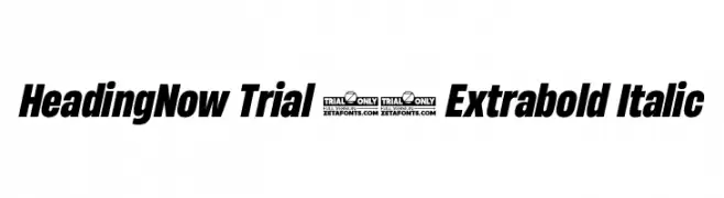
( Fonts by Zetafonts - Personal-use only. For commercial use please contact owner. )
A bold, italicized font with a strong, modern presence.
![HeadingNow Trial 57 Extrabold Italic Frei Schriftart Herunterladen]() Herunterladen 752 Downloads@WebFont
Herunterladen 752 Downloads@WebFont -
( Fonts by Gesine Todt )
A modern sans-serif font with geometric and elegant curves.
![Snippet Frei Schriftart Herunterladen]() Herunterladen 752 Downloads@WebFont
Herunterladen 752 Downloads@WebFont -
( Fonts by Alit Suarnegara - Alit Design - www.alitdesign.net - Personal-use only. For commercial use please contact owner. )
An elegant, cursive font with flowing, sophisticated strokes.
![Beautiful Lovina Regular Frei Schriftart Herunterladen]() Herunterladen 752 Downloads@WebFont
Herunterladen 752 Downloads@WebFont


Welche Schriften sind gerade am populärsten?
Poppins, Roboto, Montserrat, Open Sans und Lato sind wegen ihrer klaren Formen und breiten Einsetzbarkeit sehr gefragt – von Markenauftritt über Landingpages bis hin zu Postern.
Welche Fonts eignen sich für Logos?
Geometrische Sans‑Serifs (z. B. Poppins, Familien im Gotham‑Stil) sind ein häufiger Griff für sauberes, skalierbares Branding. Für eine persönlichere Note bleiben Scripts und Handschrift‑Stile beliebt. Kombinieren Sie einen prägnanten Headline‑Font mit einer neutralen Brotschrift für Wiedererkennung und Harmonie.
Wie oft wird die Top‑Liste aktualisiert?
Regelmäßig – basierend auf realen Downloads und Interaktionen. Schauen Sie öfter vorbei, um aufstrebende Favoriten früh zu entdecken.
💡 Tipp: Seite bookmarken – Trends wechseln schnell, und heutige Top‑Schriften inspirieren morgen vielleicht das Rebranding.