Willkommen bei den Top‑Schriften – hier treffen Beliebtheit und Qualität aufeinander. Das sind die in diesem Jahr am häufigsten heruntergeladenen und genutzten Fonts. Wenn Sie sichere Optionen für Logo, Web oder Social suchen, starten Sie hier.
Jeder Top‑Font überzeugt durch Balance, Lesbarkeit und Vielseitigkeit. Sie finden moderne Sans‑Serifs, elegante Scripts, Vintage‑Serifs und minimalistische Displays.
-
 Herunterladen 752 Downloads@WebFont
 -
( Fonts by www.fugit-tempus.de )
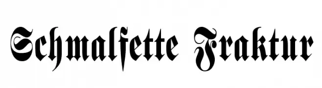
A bold, ornate Blackletter font with intricate detailing and sharp, angular lines.
![Schmalfette Fraktur Frei Schriftart Herunterladen]() Herunterladen 752 Downloads@WebFont
Herunterladen 752 Downloads@WebFont -
( Free for a personal use. For a commercial use please visit www.kevinandamanda.com )
A playful, dotted font with bold, rounded characters.
![Tonight's the Night Frei Schriftart Herunterladen]() Herunterladen 752 Downloads@WebFont
Herunterladen 752 Downloads@WebFont -
( Free for a personal use. For a commercial use please visit www.kevinandamanda.com )
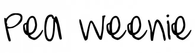
A playful, casual handwritten font with a youthful and energetic vibe.
![Pea Weenie Frei Schriftart Herunterladen]() Herunterladen 752 Downloads@WebFont
Herunterladen 752 Downloads@WebFont -
( Fonts by Apostrophic Lab )
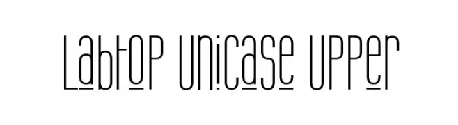
A modern, tall, and narrow unicase font with a sleek design.
![Labtop Unicase Upper Frei Schriftart Herunterladen]() Herunterladen 752 Downloads@WebFont
Herunterladen 752 Downloads@WebFont -
-
( Fonts by Astigmatic One Eye Typographic Institute - Brian J. Bonislawsky - astigmatic.com )
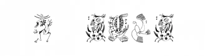
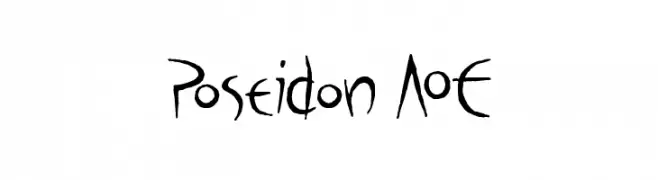
A hand-drawn, artistic font with elongated strokes and whimsical character shapes.
![Poseidon AOE Frei Schriftart Herunterladen]() Herunterladen 752 Downloads@WebFont
Herunterladen 752 Downloads@WebFont -
![Car Frei Schriftart Herunterladen]() Herunterladen 752 Downloads@WebFont
Herunterladen 752 Downloads@WebFont -
( Fonts by Graham Meade - GemFonts )
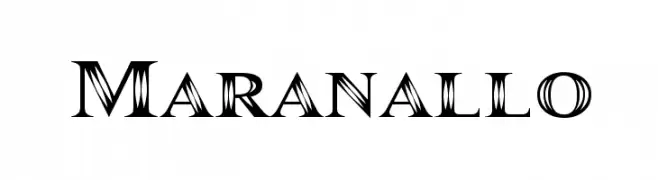
A bold, decorative font with high contrast and intricate details.
![Maranallo Frei Schriftart Herunterladen]() Herunterladen 752 Downloads@WebFont
Herunterladen 752 Downloads@WebFont -
( Fonts by www.fenotype.com )
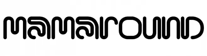
A modern, rounded font with geometric shapes and a playful, futuristic style.
![MamaRound Frei Schriftart Herunterladen]() Herunterladen 752 Downloads@WebFont
Herunterladen 752 Downloads@WebFont -
( Fonts by AEnigma - www.aenigmafonts.com )
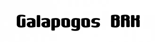
A bold, rounded font with a playful and modern style.
![Galapogos BRK Frei Schriftart Herunterladen]() Herunterladen 752 Downloads@WebFont
Herunterladen 752 Downloads@WebFont


Welche Schriften sind gerade am populärsten?
Poppins, Roboto, Montserrat, Open Sans und Lato sind wegen ihrer klaren Formen und breiten Einsetzbarkeit sehr gefragt – von Markenauftritt über Landingpages bis hin zu Postern.
Welche Fonts eignen sich für Logos?
Geometrische Sans‑Serifs (z. B. Poppins, Familien im Gotham‑Stil) sind ein häufiger Griff für sauberes, skalierbares Branding. Für eine persönlichere Note bleiben Scripts und Handschrift‑Stile beliebt. Kombinieren Sie einen prägnanten Headline‑Font mit einer neutralen Brotschrift für Wiedererkennung und Harmonie.
Wie oft wird die Top‑Liste aktualisiert?
Regelmäßig – basierend auf realen Downloads und Interaktionen. Schauen Sie öfter vorbei, um aufstrebende Favoriten früh zu entdecken.
💡 Tipp: Seite bookmarken – Trends wechseln schnell, und heutige Top‑Schriften inspirieren morgen vielleicht das Rebranding.