Willkommen bei den Top‑Schriften – hier treffen Beliebtheit und Qualität aufeinander. Das sind die in diesem Jahr am häufigsten heruntergeladenen und genutzten Fonts. Wenn Sie sichere Optionen für Logo, Web oder Social suchen, starten Sie hier.
Jeder Top‑Font überzeugt durch Balance, Lesbarkeit und Vielseitigkeit. Sie finden moderne Sans‑Serifs, elegante Scripts, Vintage‑Serifs und minimalistische Displays.
-
 Herunterladen 750 Downloads@WebFont
 -
![GE HandyScript Frei Schriftart Herunterladen]() Herunterladen 750 Downloads@WebFont
Herunterladen 750 Downloads@WebFont -
( Fonts by a Neale Davidson - www.pixelsagas.com. Personal-use only. For commercial use please contact owner. )
A bold, italicized font with a modern, dynamic style.
![Gotham Nights Bold Italic Frei Schriftart Herunterladen]() Herunterladen 750 Downloads@WebFont
Herunterladen 750 Downloads@WebFont -
![Boziene Frei Schriftart Herunterladen]() Herunterladen 750 Downloads@WebFont
Herunterladen 750 Downloads@WebFont -
![Heavy Equipment Frei Schriftart Herunterladen]() Herunterladen 750 Downloads@WebFont
Herunterladen 750 Downloads@WebFont -
-
( Fonts by Mans Greback - www.mawns.com )
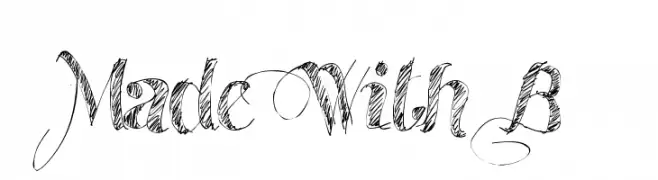
An ornate script font with decorative swirls and elegant flourishes.
![Made With B Frei Schriftart Herunterladen]() Herunterladen 750 Downloads@WebFont
Herunterladen 750 Downloads@WebFont -
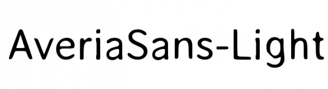
![AveriaSans-Light Frei Schriftart Herunterladen]() Herunterladen 750 Downloads@WebFont
Herunterladen 750 Downloads@WebFont -
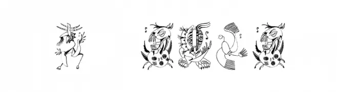
![Z-Most Critter Frei Schriftart Herunterladen]() Herunterladen 750 Downloads@WebFont
Herunterladen 750 Downloads@WebFont -
( Copyright (c) 2011, Barry Schwartz (chemoelectric@chemoelectric.org) )
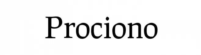
A classic serif font with medium contrast and elegant, traditional elements.
![Prociono Frei Schriftart Herunterladen]() Herunterladen 750 Downloads@WebFont
Herunterladen 750 Downloads@WebFont -
![ST Moviehead Ultra-condensed UltraLight Frei Schriftart Herunterladen]() Herunterladen 750 Downloads@WebFont
Herunterladen 750 Downloads@WebFont

Welche Schriften sind gerade am populärsten?
Poppins, Roboto, Montserrat, Open Sans und Lato sind wegen ihrer klaren Formen und breiten Einsetzbarkeit sehr gefragt – von Markenauftritt über Landingpages bis hin zu Postern.
Welche Fonts eignen sich für Logos?
Geometrische Sans‑Serifs (z. B. Poppins, Familien im Gotham‑Stil) sind ein häufiger Griff für sauberes, skalierbares Branding. Für eine persönlichere Note bleiben Scripts und Handschrift‑Stile beliebt. Kombinieren Sie einen prägnanten Headline‑Font mit einer neutralen Brotschrift für Wiedererkennung und Harmonie.
Wie oft wird die Top‑Liste aktualisiert?
Regelmäßig – basierend auf realen Downloads und Interaktionen. Schauen Sie öfter vorbei, um aufstrebende Favoriten früh zu entdecken.
💡 Tipp: Seite bookmarken – Trends wechseln schnell, und heutige Top‑Schriften inspirieren morgen vielleicht das Rebranding.