Willkommen bei den Top‑Schriften – hier treffen Beliebtheit und Qualität aufeinander. Das sind die in diesem Jahr am häufigsten heruntergeladenen und genutzten Fonts. Wenn Sie sichere Optionen für Logo, Web oder Social suchen, starten Sie hier.
Jeder Top‑Font überzeugt durch Balance, Lesbarkeit und Vielseitigkeit. Sie finden moderne Sans‑Serifs, elegante Scripts, Vintage‑Serifs und minimalistische Displays.
-
( Typodermic Fonts - Ray Larabie - www.typodermicfonts.com/ )
A bold, condensed font with a modern and clean style.
 Herunterladen 496 Downloads@WebFont
 -
( Fonts by Perspectype Studio - Letterena.com - Personal-use only. For commercial use please contact owner. )
A dynamic, handwritten-style font with elongated, expressive characters.
![Dark Triad Frei Schriftart Herunterladen]() Herunterladen 496 Downloads@WebFont
Herunterladen 496 Downloads@WebFont -
( Amal elMourabet )
A bold, geometric font with a futuristic and modern style.
![Amal Regular Frei Schriftart Herunterladen]() Herunterladen 496 Downloads@WebFont
Herunterladen 496 Downloads@WebFont -
![Cobalt Alien Condensed Italic Frei Schriftart Herunterladen]() Herunterladen 496 Downloads@WebFont
Herunterladen 496 Downloads@WebFont -
( Fonts by Adam Jagosz - Personal-use only. For commercial use please contact owner. )
A bold, geometric font with a modern and futuristic design.
![Tektur Bold Frei Schriftart Herunterladen]() Herunterladen 496 Downloads@WebFont
Herunterladen 496 Downloads@WebFont -
-
( Copyright (c) 2010-2012, TipoType (produccion.taller@gmail.com www.tipotype.com), with Reserved Font Name "Chau Philomene" )
A modern, bold, and slightly italic font with medium contrast and a dynamic style.
![Chau Philomene One Italic Frei Schriftart Herunterladen]() Herunterladen 496 Downloads@WebFont
Herunterladen 496 Downloads@WebFont -
( Fonts by Don Marciano - Personal-use only. For commercial use please contact owner. )
A bold, sans-serif font with a strong, modern look.
![Soria Bold Frei Schriftart Herunterladen]() Herunterladen 496 Downloads@WebFont
Herunterladen 496 Downloads@WebFont -
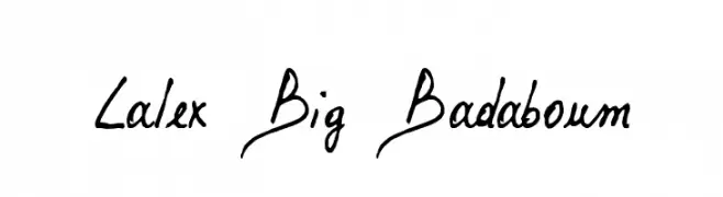
( Fonts by www.philing.net )
A dynamic, handwritten font with bold, energetic strokes and a playful aesthetic.
![Lalex Big Badaboum Frei Schriftart Herunterladen]() Herunterladen 496 Downloads@WebFont
Herunterladen 496 Downloads@WebFont -
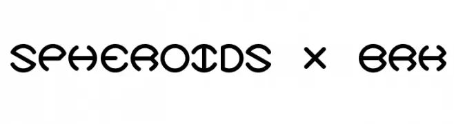
( Fonts by AEnigma - www.aenigmafonts.com )
A futuristic, geometric font with rounded, interconnected letterforms.
![Spheroids X BRK Frei Schriftart Herunterladen]() Herunterladen 496 Downloads@WebFont
Herunterladen 496 Downloads@WebFont -
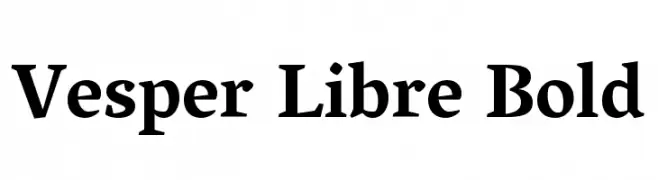
( Copyright (c) 2007, Robert Keller (www.motaitalic.com) )
A bold serif font with strong strokes and a classic, versatile style.
![Vesper Libre Bold Frei Schriftart Herunterladen]() Herunterladen 496 Downloads@WebFont
Herunterladen 496 Downloads@WebFont


Welche Schriften sind gerade am populärsten?
Poppins, Roboto, Montserrat, Open Sans und Lato sind wegen ihrer klaren Formen und breiten Einsetzbarkeit sehr gefragt – von Markenauftritt über Landingpages bis hin zu Postern.
Welche Fonts eignen sich für Logos?
Geometrische Sans‑Serifs (z. B. Poppins, Familien im Gotham‑Stil) sind ein häufiger Griff für sauberes, skalierbares Branding. Für eine persönlichere Note bleiben Scripts und Handschrift‑Stile beliebt. Kombinieren Sie einen prägnanten Headline‑Font mit einer neutralen Brotschrift für Wiedererkennung und Harmonie.
Wie oft wird die Top‑Liste aktualisiert?
Regelmäßig – basierend auf realen Downloads und Interaktionen. Schauen Sie öfter vorbei, um aufstrebende Favoriten früh zu entdecken.
💡 Tipp: Seite bookmarken – Trends wechseln schnell, und heutige Top‑Schriften inspirieren morgen vielleicht das Rebranding.