Willkommen bei den Top‑Schriften – hier treffen Beliebtheit und Qualität aufeinander. Das sind die in diesem Jahr am häufigsten heruntergeladenen und genutzten Fonts. Wenn Sie sichere Optionen für Logo, Web oder Social suchen, starten Sie hier.
Jeder Top‑Font überzeugt durch Balance, Lesbarkeit und Vielseitigkeit. Sie finden moderne Sans‑Serifs, elegante Scripts, Vintage‑Serifs und minimalistische Displays.
-
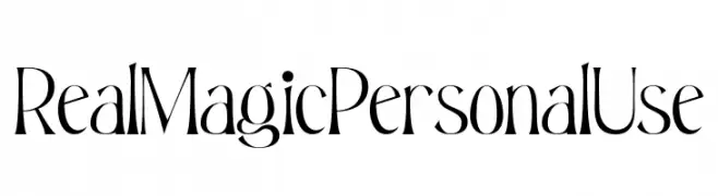
( Fonts by Din Studio - Donis Miftahudin - Personal-use only. For commercial use please contact owner. )
A whimsical and playful font with tall, narrow characters and dynamic stroke variations.
 Herunterladen 45 Downloads@WebFont
 -
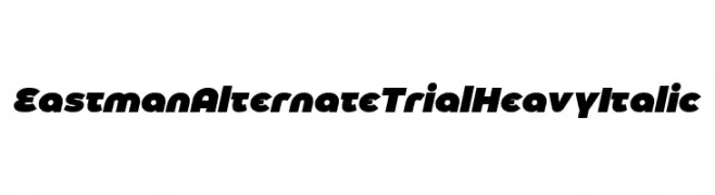
( Fonts by Zetafonts - Personal-use only. For commercial use please contact owner. )
A bold, heavy italic font with a modern and dynamic style.
![Eastman Alternate Trial Heavy Italic Frei Schriftart Herunterladen]() Herunterladen 45 Downloads@WebFont
Herunterladen 45 Downloads@WebFont -
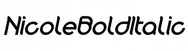
( Fonts by weknow - Wino S Kadir - Personal-use only. For commercial use please contact owner. )
A bold, italicized font with a modern and dynamic style.
![Nicole Bold Italic Frei Schriftart Herunterladen]() Herunterladen 45 Downloads@WebFont
Herunterladen 45 Downloads@WebFont -
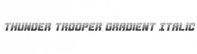
( Iconian Fonts - Daniel Zadorozny - www.iconian.com )
A bold, italicized font with a futuristic gradient and striped design.
![Thunder Trooper Gradient Italic Frei Schriftart Herunterladen]() Herunterladen 45 Downloads@WebFont
Herunterladen 45 Downloads@WebFont -
( Liz Lawson - janepedia.com )
A bold, pixelated font inspired by retro digital displays and video games.
![kollectionbitmap Frei Schriftart Herunterladen]() Herunterladen 45 Downloads@WebFont
Herunterladen 45 Downloads@WebFont -
-
( Fonts by Typodermic Fonts - Raymond Larabie - Personal-use only. For commercial use please contact owner. )
A modern, italicized font with a sleek and dynamic style.
![Teen-Italic Frei Schriftart Herunterladen]() Herunterladen 45 Downloads@WebFont
Herunterladen 45 Downloads@WebFont -
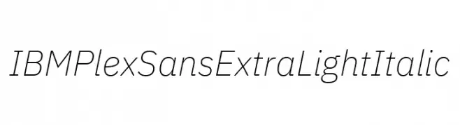
( Fonts by IBM )
A sleek, modern sans-serif font with an extra light weight and italic style.
![IBM Plex Sans ExtraLight Italic Frei Schriftart Herunterladen]() Herunterladen 45 Downloads@WebFont
Herunterladen 45 Downloads@WebFont -
( Fonts by Vladimir Nikolic - www.creativefabrica.com/designer/vladimirnikolic/ - Personal-use only. For commercial use please contact owner. )
A bold, decorative font with a 3D effect and intricate patterns.
![Shine Framed Regular Frei Schriftart Herunterladen]() Herunterladen 45 Downloads@WebFont
Herunterladen 45 Downloads@WebFont -
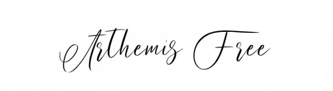
( Fonts by Maulana Creative - Gilang Maulana - Personal-use only. For commercial use please contact owner. )
An elegant script font with flowing, cursive style and intricate swashes.
![Arthemis Free Frei Schriftart Herunterladen]() Herunterladen 45 Downloads@WebFont
Herunterladen 45 Downloads@WebFont -
( Fonts by Niskala Huruf - Personal-use only. For commercial use please contact owner. )
A bold, rugged font with blocky, hand-cut style letters.
![Safety Goggles Regular Frei Schriftart Herunterladen]() Herunterladen 45 Downloads@WebFont
Herunterladen 45 Downloads@WebFont -
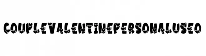
( Fonts by Kong Font - fontkong.com - Personal-use only. For commercial use please contact owner. )
A bold, heart-adorned decorative font ideal for romantic themes.
![Couple Valentine PERSONAL USE O Frei Schriftart Herunterladen]() Herunterladen 45 Downloads@WebFont
Herunterladen 45 Downloads@WebFont -
( Noto is a trademark of Google Inc. Noto fonts are open source. All Noto fonts are published under the SIL Open Font License, Version 1.1 )
A highly condensed, extra bold font with a modern and clean design.
![Noto Sans Lao ExtraCondensed ExtraBold Frei Schriftart Herunterladen]() Herunterladen 45 Downloads@WebFont
Herunterladen 45 Downloads@WebFont -
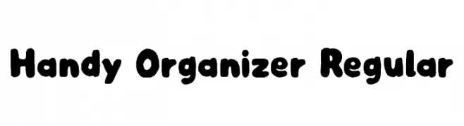
( Fonts by Niskala Huruf - Personal-use only. For commercial use please contact owner. )
A playful, bold font with rounded edges and a hand-drawn style.
![Handy Organizer Regular Frei Schriftart Herunterladen]() Herunterladen 45 Downloads@WebFont
Herunterladen 45 Downloads@WebFont -
( Fonts by cheerdash co - Personal-use only. For commercial use please contact owner. )
An artistic and dynamic font with flowing, interconnected strokes.
![Hallagh Frei Schriftart Herunterladen]() Herunterladen 45 Downloads@WebFont
Herunterladen 45 Downloads@WebFont -
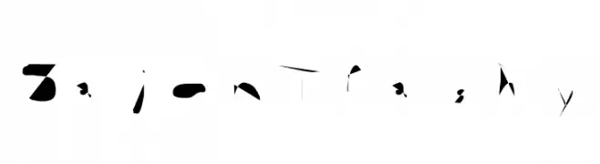
( Personal-use only. For commercial use please contact owner. )
An abstract, fragmented font with sharp angles and irregular shapes, ideal for artistic expression.
![Sajon Trashy Frei Schriftart Herunterladen]() Herunterladen 45 Downloads@WebFont
Herunterladen 45 Downloads@WebFont -
( Iconian Fonts - Daniel Zadorozny - www.iconian.com )
A mystical, rune-like font with bold, intricate characters and an italic slant.
![Hermetic Spellbook Italic Frei Schriftart Herunterladen]() Herunterladen 45 Downloads@WebFont
Herunterladen 45 Downloads@WebFont -
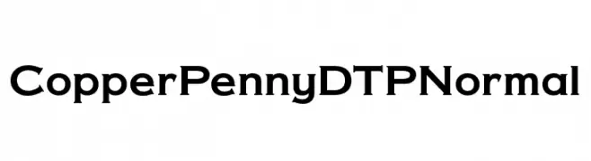
( Fonts by Fontry - M.G. Adkins - Personal-use only. For commercial use please contact owner. )
A bold, robust font with a strong presence and slightly condensed uppercase letters.
![Copper Penny DTP Normal Frei Schriftart Herunterladen]() Herunterladen 45 Downloads@WebFont
Herunterladen 45 Downloads@WebFont -
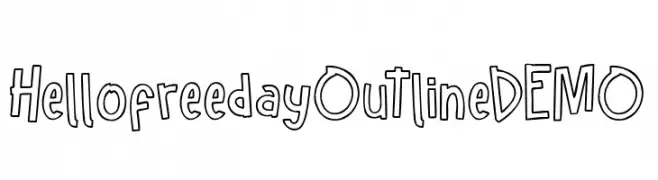
( Fonts by Glyphstyle - Dimas Ardhi - Personal-use only. For commercial use please contact owner. )
A playful, hand-drawn outline font with a whimsical and casual style.
![Hellofreeday Outline DEMO Frei Schriftart Herunterladen]() Herunterladen 45 Downloads@WebFont
Herunterladen 45 Downloads@WebFont -
( Fonts by Daniel Zadorozny - www.iconian.com - Personal-use only. For commercial use please contact owner. )
A bold, geometric font with a futuristic and industrial style.
![Alpha Century Frei Schriftart Herunterladen]() Herunterladen 45 Downloads@WebFont
Herunterladen 45 Downloads@WebFont -
( Fonts by Eka Hermawan - Personal-use only. For commercial use please contact owner. )
A bold, high-contrast font with a modern and dramatic style.
![Brolian Black Frei Schriftart Herunterladen]() Herunterladen 45 Downloads@WebFont
Herunterladen 45 Downloads@WebFont -
( Fonts by Jetsmax Studio - Khairil Anwar - Personal-use only. For commercial use please contact owner. )
A playful and quirky font with a hand-drawn, whimsical style.
![City Series Frei Schriftart Herunterladen]() Herunterladen 45 Downloads@WebFont
Herunterladen 45 Downloads@WebFont -
( Fonts by nomlimofont - Personal-use only. For commercial use please contact owner. )
A dynamic and elegant script font with a fluid, handwritten style.
![Hamiston Frei Schriftart Herunterladen]() Herunterladen 45 Downloads@WebFont
Herunterladen 45 Downloads@WebFont -
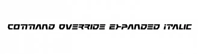
( Iconian Fonts - Daniel Zadorozny - www.iconian.com )
A bold, futuristic font with angular, expanded, and italicized characters.
![Command Override Expanded Italic Frei Schriftart Herunterladen]() Herunterladen 45 Downloads@WebFont
Herunterladen 45 Downloads@WebFont -
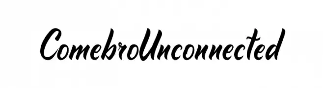
( Fonts by Onne Hermawan - Personal-use only. For commercial use please contact owner. )
A bold, flowing script font with dynamic curves and elegant flair.
![Comebro Unconnected Frei Schriftart Herunterladen]() Herunterladen 45 Downloads@WebFont
Herunterladen 45 Downloads@WebFont -
( Fonts by Creativework69 Studio - Daddi Daryawan - Personal-use only. For commercial use please contact owner. )
An elegant and sophisticated cursive script font with ornate flourishes.
![The King Of Romance Frei Schriftart Herunterladen]() Herunterladen 45 Downloads@WebFont
Herunterladen 45 Downloads@WebFont -
( Fonts by Peter Wiegel - www.peter-wiegel.de - Personal-use only. For commercial use please contact owner. )
A tall, narrow, and modern font with a clean, sleek design.
![Berlin Email Frei Schriftart Herunterladen]() Herunterladen 45 Downloads@WebFont
Herunterladen 45 Downloads@WebFont -
( Fonts by Aksoro 99 - Wahyu Nugroho - Personal-use only. For commercial use please contact owner. )
A bold, flowing script font with elegant, cursive letterforms.
![Suttan Telo Frei Schriftart Herunterladen]() Herunterladen 45 Downloads@WebFont
Herunterladen 45 Downloads@WebFont -
( Fonts by Kong Font - Personal-use only. For commercial use please contact owner. )
A fluid, elegant script font with a natural handwritten style.
![Three Signature Frei Schriftart Herunterladen]() Herunterladen 45 Downloads@WebFont
Herunterladen 45 Downloads@WebFont -
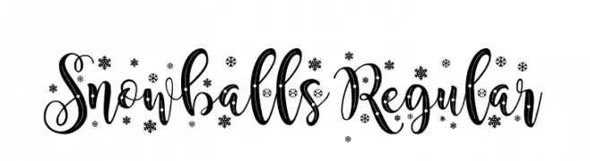
( Fonts by StereoType - Clément Nicolle - Personal-use only. For commercial use please contact owner. )
A festive script font with snowflake embellishments, perfect for holiday-themed projects.
![Snowballs Regular Frei Schriftart Herunterladen]() Herunterladen 45 Downloads@WebFont
Herunterladen 45 Downloads@WebFont -
( Fonts by Thirtypath - Personal-use only. For commercial use please contact owner. )
A dynamic and elegant script font with flowing, cursive letterforms.
![Panbers Frei Schriftart Herunterladen]() Herunterladen 45 Downloads@WebFont
Herunterladen 45 Downloads@WebFont -
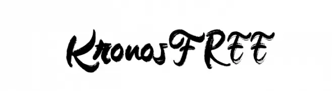
( Fonts by Vunira Design - Personal-use only. For commercial use please contact owner. )
A bold, expressive brush script font with dynamic strokes and decorative flourishes.
![Kronos FREE Frei Schriftart Herunterladen]() Herunterladen 45 Downloads@WebFont
Herunterladen 45 Downloads@WebFont -
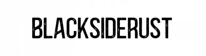
( Fonts by vilogsign - Nur Kholis - Personal-use only. For commercial use please contact owner. )
A bold, distressed font with a rugged, vintage texture.
![BlacksideRust Frei Schriftart Herunterladen]() Herunterladen 45 Downloads@WebFont
Herunterladen 45 Downloads@WebFont -
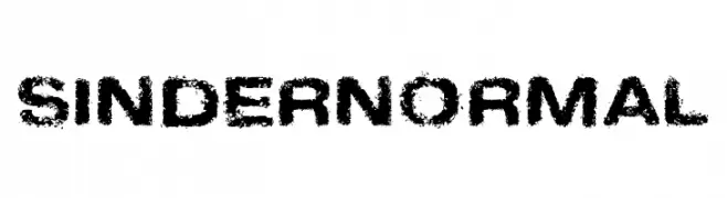
( Fonts by Fontry - M.G. Adkins - Personal-use only. For commercial use please contact owner. )
A bold, distressed font with a grunge texture for an edgy, urban look.
![Sinder Normal Frei Schriftart Herunterladen]() Herunterladen 45 Downloads@WebFont
Herunterladen 45 Downloads@WebFont -
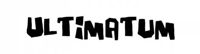
( Fonts by Pizzadude - Jakob Fischer - Personal-use only. For commercial use please contact owner. )
A bold, jagged font with an edgy and dynamic style.
![Ultimatum Frei Schriftart Herunterladen]() Herunterladen 45 Downloads@WebFont
Herunterladen 45 Downloads@WebFont -
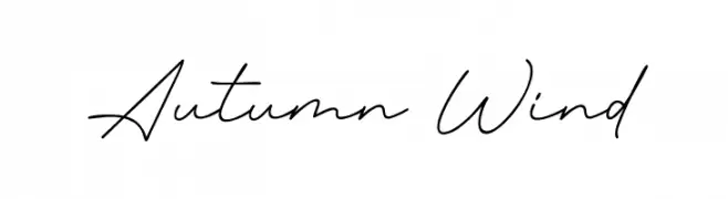
( Fonts by Syaf Rizal - Khurasan - Personal-use only. For commercial use please contact owner. )
A graceful, cursive script font with a natural handwriting style.
![Autumn Wind Frei Schriftart Herunterladen]() Herunterladen 45 Downloads@WebFont
Herunterladen 45 Downloads@WebFont


Welche Schriften sind gerade am populärsten?
Poppins, Roboto, Montserrat, Open Sans und Lato sind wegen ihrer klaren Formen und breiten Einsetzbarkeit sehr gefragt – von Markenauftritt über Landingpages bis hin zu Postern.
Welche Fonts eignen sich für Logos?
Geometrische Sans‑Serifs (z. B. Poppins, Familien im Gotham‑Stil) sind ein häufiger Griff für sauberes, skalierbares Branding. Für eine persönlichere Note bleiben Scripts und Handschrift‑Stile beliebt. Kombinieren Sie einen prägnanten Headline‑Font mit einer neutralen Brotschrift für Wiedererkennung und Harmonie.
Wie oft wird die Top‑Liste aktualisiert?
Regelmäßig – basierend auf realen Downloads und Interaktionen. Schauen Sie öfter vorbei, um aufstrebende Favoriten früh zu entdecken.
💡 Tipp: Seite bookmarken – Trends wechseln schnell, und heutige Top‑Schriften inspirieren morgen vielleicht das Rebranding.