Willkommen bei den Top‑Schriften – hier treffen Beliebtheit und Qualität aufeinander. Das sind die in diesem Jahr am häufigsten heruntergeladenen und genutzten Fonts. Wenn Sie sichere Optionen für Logo, Web oder Social suchen, starten Sie hier.
Jeder Top‑Font überzeugt durch Balance, Lesbarkeit und Vielseitigkeit. Sie finden moderne Sans‑Serifs, elegante Scripts, Vintage‑Serifs und minimalistische Displays.
-
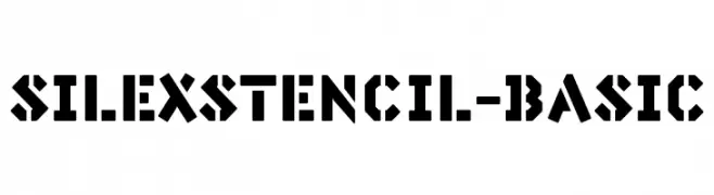
( Fonts by Burhan Afif - hanscostudio.com - Personal-use only. For commercial use please contact owner. )
An elegant script font with bold strokes and high contrast, perfect for decorative use.
 Herunterladen 399 Downloads@WebFont
 -
![SilexStencil-Basic Frei Schriftart Herunterladen]() Herunterladen 399 Downloads@WebFont
Herunterladen 399 Downloads@WebFont -
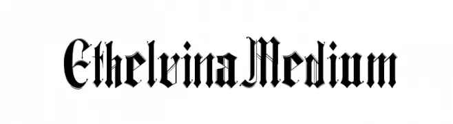
( Fonts by Yai Salinas )
A bold, ornate blackletter font with a medieval aesthetic.
![Ethelvina_Medium Frei Schriftart Herunterladen]() Herunterladen 399 Downloads@WebFont
Herunterladen 399 Downloads@WebFont -
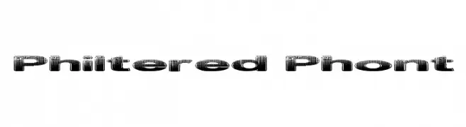
( Fonts by Graham Meade - GemFonts )
A bold, decorative font with a halftone texture and modern style.
![Philtered Phont Frei Schriftart Herunterladen]() Herunterladen 399 Downloads@WebFont
Herunterladen 399 Downloads@WebFont -
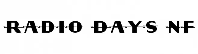
( Fonts by Nick Curtis - www.nicksfonts.com )
A bold, geometric font with Art Deco influences, perfect for stylish and modern designs.
![Radio Days NF Frei Schriftart Herunterladen]() Herunterladen 399 Downloads@WebFont
Herunterladen 399 Downloads@WebFont -
-
![EFN Zielony Font Frei Schriftart Herunterladen]() Herunterladen 399 Downloads@WebFont
Herunterladen 399 Downloads@WebFont -
( Fonts by Daniel Zadorozny - www.iconian.com - Free for personal use )
A clean, geometric font with a modern and slightly condensed style.
![Federal Service Light Frei Schriftart Herunterladen]() Herunterladen 399 Downloads@WebFont
Herunterladen 399 Downloads@WebFont -
( Fonts by www.blambot.com )
A bold, playful font with a hand-drawn, informal style.
![RedStateBlueStateBB Frei Schriftart Herunterladen]() Herunterladen 399 Downloads@WebFont
Herunterladen 399 Downloads@WebFont -
( Fonts by Pizzadude - Personal-use only. For commercial use please contact owner. )
A bold, playful font with a hand-drawn, whimsical style.
![Deliberately DEMO Regular Frei Schriftart Herunterladen]() Herunterladen 399 Downloads@WebFont
Herunterladen 399 Downloads@WebFont -
![Arthritis BRK Frei Schriftart Herunterladen]() Herunterladen 399 Downloads@WebFont
Herunterladen 399 Downloads@WebFont

Welche Schriften sind gerade am populärsten?
Poppins, Roboto, Montserrat, Open Sans und Lato sind wegen ihrer klaren Formen und breiten Einsetzbarkeit sehr gefragt – von Markenauftritt über Landingpages bis hin zu Postern.
Welche Fonts eignen sich für Logos?
Geometrische Sans‑Serifs (z. B. Poppins, Familien im Gotham‑Stil) sind ein häufiger Griff für sauberes, skalierbares Branding. Für eine persönlichere Note bleiben Scripts und Handschrift‑Stile beliebt. Kombinieren Sie einen prägnanten Headline‑Font mit einer neutralen Brotschrift für Wiedererkennung und Harmonie.
Wie oft wird die Top‑Liste aktualisiert?
Regelmäßig – basierend auf realen Downloads und Interaktionen. Schauen Sie öfter vorbei, um aufstrebende Favoriten früh zu entdecken.
💡 Tipp: Seite bookmarken – Trends wechseln schnell, und heutige Top‑Schriften inspirieren morgen vielleicht das Rebranding.