Willkommen bei den Top‑Schriften – hier treffen Beliebtheit und Qualität aufeinander. Das sind die in diesem Jahr am häufigsten heruntergeladenen und genutzten Fonts. Wenn Sie sichere Optionen für Logo, Web oder Social suchen, starten Sie hier.
Jeder Top‑Font überzeugt durch Balance, Lesbarkeit und Vielseitigkeit. Sie finden moderne Sans‑Serifs, elegante Scripts, Vintage‑Serifs und minimalistische Displays.
-
( Fonts by Spork Thug Typography - Josh Wilhelm - www.lifewithouttaffy.com/taffy/blog )
A bold, playful font with a hand-drawn, artistic style.
 Herunterladen 399 Downloads@WebFont
 -
( Fonts by xlntelecom )
Bold, modern sans-serif font with uniform stroke width.
![Langdon Frei Schriftart Herunterladen]() Herunterladen 399 Downloads@WebFont
Herunterladen 399 Downloads@WebFont -
![Screaming Guitar Frei Schriftart Herunterladen]() Herunterladen 399 Downloads@WebFont
Herunterladen 399 Downloads@WebFont -
( Fonts by Ahmad Syarif Afandi - https://delapan.studio - Personal-use only. For commercial use please contact owner. )
A bold, narrow serif font with a strong, authoritative presence.
![Jerome Frei Schriftart Herunterladen]() Herunterladen 399 Downloads@WebFont
Herunterladen 399 Downloads@WebFont -
( Adam Wunn )
A bold, modern font with a unique horizontal striped pattern.
![BigBlue Frei Schriftart Herunterladen]() Herunterladen 399 Downloads@WebFont
Herunterladen 399 Downloads@WebFont -
-
![Telegraphic Light Italic Frei Schriftart Herunterladen]() Herunterladen 399 Downloads@WebFont
Herunterladen 399 Downloads@WebFont -
( Adhitya Nugroho )
A dynamic brush-style font with fluid, hand-painted strokes.
![Lismonia Brush Font Demo Regular Frei Schriftart Herunterladen]() Herunterladen 399 Downloads@WebFont
Herunterladen 399 Downloads@WebFont -
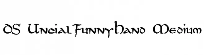
![DS UncialFunnyHand Medium Frei Schriftart Herunterladen]() Herunterladen 399 Downloads@WebFont
Herunterladen 399 Downloads@WebFont -
( Fonts by Daniel Zadorozny - www.iconian.com )
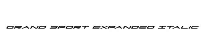
A sleek, italicized, and expanded font with a modern, sporty look.
![Grand Sport Expanded Italic Frei Schriftart Herunterladen]() Herunterladen 399 Downloads@WebFont
Herunterladen 399 Downloads@WebFont -
( Fonts by Typodermic Fonts )
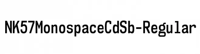
A modern, monospaced font with uniform character width and high legibility.
![NK57MonospaceCdSb-Regular Frei Schriftart Herunterladen]() Herunterladen 398 Downloads@WebFont
Herunterladen 398 Downloads@WebFont


Welche Schriften sind gerade am populärsten?
Poppins, Roboto, Montserrat, Open Sans und Lato sind wegen ihrer klaren Formen und breiten Einsetzbarkeit sehr gefragt – von Markenauftritt über Landingpages bis hin zu Postern.
Welche Fonts eignen sich für Logos?
Geometrische Sans‑Serifs (z. B. Poppins, Familien im Gotham‑Stil) sind ein häufiger Griff für sauberes, skalierbares Branding. Für eine persönlichere Note bleiben Scripts und Handschrift‑Stile beliebt. Kombinieren Sie einen prägnanten Headline‑Font mit einer neutralen Brotschrift für Wiedererkennung und Harmonie.
Wie oft wird die Top‑Liste aktualisiert?
Regelmäßig – basierend auf realen Downloads und Interaktionen. Schauen Sie öfter vorbei, um aufstrebende Favoriten früh zu entdecken.
💡 Tipp: Seite bookmarken – Trends wechseln schnell, und heutige Top‑Schriften inspirieren morgen vielleicht das Rebranding.