Willkommen bei den Top‑Schriften – hier treffen Beliebtheit und Qualität aufeinander. Das sind die in diesem Jahr am häufigsten heruntergeladenen und genutzten Fonts. Wenn Sie sichere Optionen für Logo, Web oder Social suchen, starten Sie hier.
Jeder Top‑Font überzeugt durch Balance, Lesbarkeit und Vielseitigkeit. Sie finden moderne Sans‑Serifs, elegante Scripts, Vintage‑Serifs und minimalistische Displays.
-
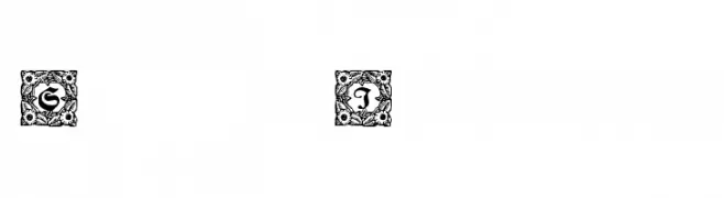
( Fonts by Dieter Steffmann )
Ornate initials with intricate floral borders, blending Gothic and Baroque styles.
 Herunterladen 358 Downloads@WebFont
 -
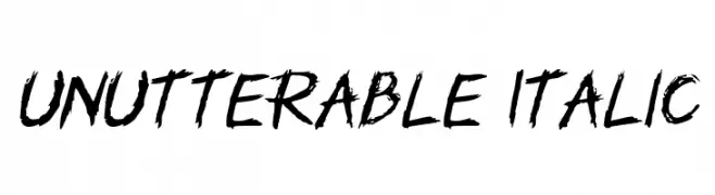
( Fonts by GGBotNet - Personal-use only. For commercial use please contact owner. )
A bold, distressed, hand-drawn font with an italicized, textured appearance.
![Unutterable Italic Frei Schriftart Herunterladen]() Herunterladen 358 Downloads@WebFont
Herunterladen 358 Downloads@WebFont -
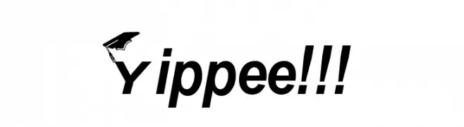
![Yippee!!! Frei Schriftart Herunterladen]() Herunterladen 358 Downloads
Herunterladen 358 Downloads -
( Fonts by Vladimir Nikolic )
A bold, geometric font with intricate patterns and sharp edges.
![Desert Medium Frei Schriftart Herunterladen]() Herunterladen 358 Downloads@WebFont
Herunterladen 358 Downloads@WebFont -
( Rick Mueller - moorstation.org/typoasis/designers/mueller/ )
A playful, rope-themed decorative font with a bold, textured design.
![Rope MF Frei Schriftart Herunterladen]() Herunterladen 358 Downloads@WebFont
Herunterladen 358 Downloads@WebFont -
-
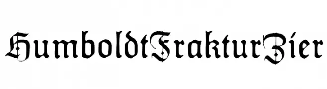
( Fonts by Dieter Steffmann )
A traditional blackletter font with intricate details and a medieval aesthetic.
![HumboldtFrakturZier Frei Schriftart Herunterladen]() Herunterladen 358 Downloads@WebFont
Herunterladen 358 Downloads@WebFont -
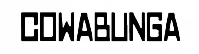
![COWABUNGA Frei Schriftart Herunterladen]() Herunterladen 358 Downloads@WebFont
Herunterladen 358 Downloads@WebFont -
( Melisa Gunawan )
A modern, rounded font with smooth curves and balanced spacing.
![noraviyel-Regular Frei Schriftart Herunterladen]() Herunterladen 358 Downloads@WebFont
Herunterladen 358 Downloads@WebFont -
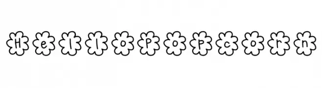
( Fonts by Jen Jones )
A playful font with characters enclosed in flower-shaped outlines, perfect for creative projects.
![HelloPopcorn Frei Schriftart Herunterladen]() Herunterladen 358 Downloads@WebFont
Herunterladen 358 Downloads@WebFont -
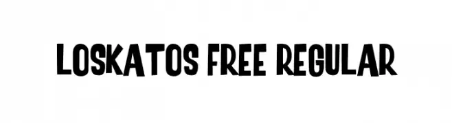
( Fonts by Maulana Creative )
A bold, playful font with a hand-drawn, energetic style.
![Loskatos Free Regular Frei Schriftart Herunterladen]() Herunterladen 358 Downloads@WebFont
Herunterladen 358 Downloads@WebFont


Welche Schriften sind gerade am populärsten?
Poppins, Roboto, Montserrat, Open Sans und Lato sind wegen ihrer klaren Formen und breiten Einsetzbarkeit sehr gefragt – von Markenauftritt über Landingpages bis hin zu Postern.
Welche Fonts eignen sich für Logos?
Geometrische Sans‑Serifs (z. B. Poppins, Familien im Gotham‑Stil) sind ein häufiger Griff für sauberes, skalierbares Branding. Für eine persönlichere Note bleiben Scripts und Handschrift‑Stile beliebt. Kombinieren Sie einen prägnanten Headline‑Font mit einer neutralen Brotschrift für Wiedererkennung und Harmonie.
Wie oft wird die Top‑Liste aktualisiert?
Regelmäßig – basierend auf realen Downloads und Interaktionen. Schauen Sie öfter vorbei, um aufstrebende Favoriten früh zu entdecken.
💡 Tipp: Seite bookmarken – Trends wechseln schnell, und heutige Top‑Schriften inspirieren morgen vielleicht das Rebranding.