Willkommen bei den Top‑Schriften – hier treffen Beliebtheit und Qualität aufeinander. Das sind die in diesem Jahr am häufigsten heruntergeladenen und genutzten Fonts. Wenn Sie sichere Optionen für Logo, Web oder Social suchen, starten Sie hier.
Jeder Top‑Font überzeugt durch Balance, Lesbarkeit und Vielseitigkeit. Sie finden moderne Sans‑Serifs, elegante Scripts, Vintage‑Serifs und minimalistische Displays.
-
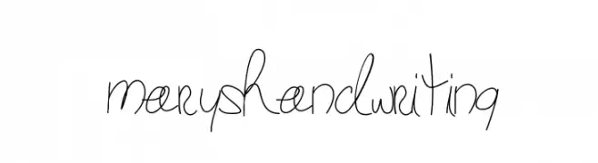
( Fonts by Gabbi )
A casual, handwritten-style font with fluid, connected letters.
 Herunterladen 358 Downloads@WebFont
 -
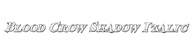
( Fonts by Daniel Zadorozny - www.iconian.com )
A bold, italicized font with a shadow effect and distressed edges.
![Blood Crow Shadow Italic Frei Schriftart Herunterladen]() Herunterladen 358 Downloads@WebFont
Herunterladen 358 Downloads@WebFont -
![Strobo Frei Schriftart Herunterladen]() Herunterladen 358 Downloads@WebFont
Herunterladen 358 Downloads@WebFont -
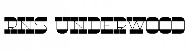
( Fonts by Yorlmar Campos - www.ycampos.com )
A bold, geometric font with a modern, industrial design.
![RNS Underwood Frei Schriftart Herunterladen]() Herunterladen 358 Downloads@WebFont
Herunterladen 358 Downloads@WebFont -
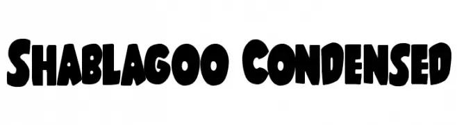
( Fonts by Iconian Fonts )
A bold, playful font with thick, rounded characters and tight spacing.
![Shablagoo Condensed Frei Schriftart Herunterladen]() Herunterladen 358 Downloads@WebFont
Herunterladen 358 Downloads@WebFont -
-
( Fonts by Daniel Zadorozny - www.iconian.com - Free for personal use )
A bold, italic font with rounded, smooth characters and a dynamic style.
![Universal Jack Bold Italic Frei Schriftart Herunterladen]() Herunterladen 358 Downloads@WebFont
Herunterladen 358 Downloads@WebFont -
( Fonts by MJType )
A playful, casual handwritten font with smooth, flowing lines.
![Jhon Max Frei Schriftart Herunterladen]() Herunterladen 358 Downloads@WebFont
Herunterladen 358 Downloads@WebFont -
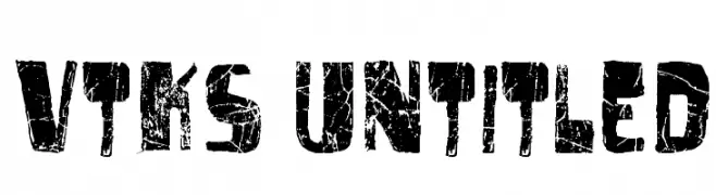
( Fonts by Douglas Vitkauskas - www.vtksdesign.com. Personal-use only. For commercial use please contact owner. )
A bold, distressed font with a grunge, weathered appearance.
![vtks untitled Frei Schriftart Herunterladen]() Herunterladen 358 Downloads@WebFont
Herunterladen 358 Downloads@WebFont -
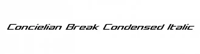
( Fonts by Daniel Zadorozny - www.iconian.com - Free for personal use )
A sleek, modern, condensed italic font with dynamic angles.
![Concielian Break Condensed Italic Frei Schriftart Herunterladen]() Herunterladen 358 Downloads@WebFont
Herunterladen 358 Downloads@WebFont -
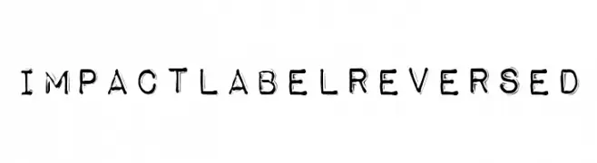
![Impact Label Reversed Frei Schriftart Herunterladen]() Herunterladen 358 Downloads@WebFont
Herunterladen 358 Downloads@WebFont


Welche Schriften sind gerade am populärsten?
Poppins, Roboto, Montserrat, Open Sans und Lato sind wegen ihrer klaren Formen und breiten Einsetzbarkeit sehr gefragt – von Markenauftritt über Landingpages bis hin zu Postern.
Welche Fonts eignen sich für Logos?
Geometrische Sans‑Serifs (z. B. Poppins, Familien im Gotham‑Stil) sind ein häufiger Griff für sauberes, skalierbares Branding. Für eine persönlichere Note bleiben Scripts und Handschrift‑Stile beliebt. Kombinieren Sie einen prägnanten Headline‑Font mit einer neutralen Brotschrift für Wiedererkennung und Harmonie.
Wie oft wird die Top‑Liste aktualisiert?
Regelmäßig – basierend auf realen Downloads und Interaktionen. Schauen Sie öfter vorbei, um aufstrebende Favoriten früh zu entdecken.
💡 Tipp: Seite bookmarken – Trends wechseln schnell, und heutige Top‑Schriften inspirieren morgen vielleicht das Rebranding.