Willkommen bei den Top‑Schriften – hier treffen Beliebtheit und Qualität aufeinander. Das sind die in diesem Jahr am häufigsten heruntergeladenen und genutzten Fonts. Wenn Sie sichere Optionen für Logo, Web oder Social suchen, starten Sie hier.
Jeder Top‑Font überzeugt durch Balance, Lesbarkeit und Vielseitigkeit. Sie finden moderne Sans‑Serifs, elegante Scripts, Vintage‑Serifs und minimalistische Displays.
-
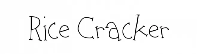
( Fonts by http://perso.calixo.net/~uzim/ )
A playful, hand-drawn font with irregular, whimsical strokes.
 Herunterladen 357 Downloads@WebFont
 -
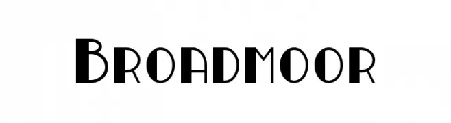
( Fonts by a Neale Davidson - www.pixelsagas.com. Personal-use only. For commercial use please contact owner. )
A bold, geometric font with sharp angles and modern design.
![Broadmoor Frei Schriftart Herunterladen]() Herunterladen 357 Downloads@WebFont
Herunterladen 357 Downloads@WebFont -
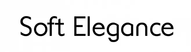
( Genumano - Douglas Charles Cunha )
A modern sans-serif font with smooth curves and balanced structure.
![Soft Elegance Frei Schriftart Herunterladen]() Herunterladen 357 Downloads@WebFont
Herunterladen 357 Downloads@WebFont -
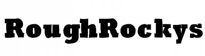
( Fonts by Manfred Klein. Free for private and charity use. Free for commercial with donation to organizations )
A bold, rugged font with a textured, hand-crafted appearance.
![RoughRockys Frei Schriftart Herunterladen]() Herunterladen 357 Downloads@WebFont
Herunterladen 357 Downloads@WebFont -
( Fonts by Typographer Mediengestaltung - Personal-use only. For commercial use please contact owner. )
A bold, contour-styled font with a modern and decorative flair.
![Dover Contour Frei Schriftart Herunterladen]() Herunterladen 357 Downloads@WebFont
Herunterladen 357 Downloads@WebFont -
-
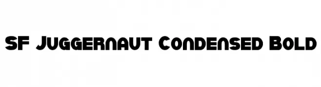
![SF Juggernaut Condensed Bold Frei Schriftart Herunterladen]() Herunterladen 357 Downloads@WebFont
Herunterladen 357 Downloads@WebFont -
![McCoy - Hello Lori Frei Schriftart Herunterladen]() Herunterladen 357 Downloads@WebFont
Herunterladen 357 Downloads@WebFont -
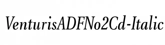
( Fonts by Arkandis Digital Foundry )
A classic italic serif font with elegant proportions and moderate contrast.
![VenturisADFNo2Cd-Italic Frei Schriftart Herunterladen]() Herunterladen 357 Downloads@WebFont
Herunterladen 357 Downloads@WebFont -
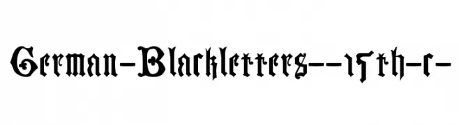
![German-Blackletters--15th-c- Frei Schriftart Herunterladen]() Herunterladen 357 Downloads@WebFont
Herunterladen 357 Downloads@WebFont -
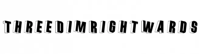
( Fonts by Manfred Klein - manfred-klein.ina-mar.com )
A bold, three-dimensional font with a rightward shadow effect.
![ThreeDimRightwards Frei Schriftart Herunterladen]() Herunterladen 357 Downloads@WebFont
Herunterladen 357 Downloads@WebFont


Welche Schriften sind gerade am populärsten?
Poppins, Roboto, Montserrat, Open Sans und Lato sind wegen ihrer klaren Formen und breiten Einsetzbarkeit sehr gefragt – von Markenauftritt über Landingpages bis hin zu Postern.
Welche Fonts eignen sich für Logos?
Geometrische Sans‑Serifs (z. B. Poppins, Familien im Gotham‑Stil) sind ein häufiger Griff für sauberes, skalierbares Branding. Für eine persönlichere Note bleiben Scripts und Handschrift‑Stile beliebt. Kombinieren Sie einen prägnanten Headline‑Font mit einer neutralen Brotschrift für Wiedererkennung und Harmonie.
Wie oft wird die Top‑Liste aktualisiert?
Regelmäßig – basierend auf realen Downloads und Interaktionen. Schauen Sie öfter vorbei, um aufstrebende Favoriten früh zu entdecken.
💡 Tipp: Seite bookmarken – Trends wechseln schnell, und heutige Top‑Schriften inspirieren morgen vielleicht das Rebranding.