Willkommen bei den Top‑Schriften – hier treffen Beliebtheit und Qualität aufeinander. Das sind die in diesem Jahr am häufigsten heruntergeladenen und genutzten Fonts. Wenn Sie sichere Optionen für Logo, Web oder Social suchen, starten Sie hier.
Jeder Top‑Font überzeugt durch Balance, Lesbarkeit und Vielseitigkeit. Sie finden moderne Sans‑Serifs, elegante Scripts, Vintage‑Serifs und minimalistische Displays.
-
 Herunterladen 359 Downloads@WebFont
 -
( Fontscafe.com - fontscafe.com/ )
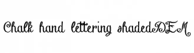
A decorative, hand-drawn font with elegant swirls and a chalk-like texture.
![Chalk-hand-lettering-shaded DEM Frei Schriftart Herunterladen]() Herunterladen 359 Downloads@WebFont
Herunterladen 359 Downloads@WebFont -
( Fonts by Wahyu Prihantoro )
A bold, expressive handwritten font with smooth curves and a playful style.
![Gareth Frei Schriftart Herunterladen]() Herunterladen 359 Downloads@WebFont
Herunterladen 359 Downloads@WebFont -
( Fonts by Nick Curtis - www.nicksfonts.com )
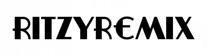
A bold, Art Deco-inspired font with geometric precision and modern elegance.
![RitzyRemix Frei Schriftart Herunterladen]() Herunterladen 359 Downloads@WebFont
Herunterladen 359 Downloads@WebFont -
( Fonts by Matthew Welch - www.squaregear.net/fonts/ )
A pixelated, retro-style font with a blocky, digital appearance.
![Tiny Regular Frei Schriftart Herunterladen]() Herunterladen 359 Downloads@WebFont
Herunterladen 359 Downloads@WebFont -
-
( Fonts by Muhammad Sirojuddin - lettersiro.com - Personal-use only. For commercial use please contact owner. )
A bold, flowing script font with elegant, connected characters.
![Rentuck Frei Schriftart Herunterladen]() Herunterladen 359 Downloads@WebFont
Herunterladen 359 Downloads@WebFont -
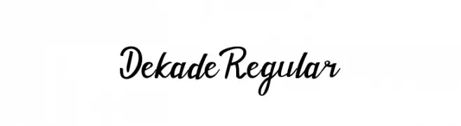
![Dekade Regular Frei Schriftart Herunterladen]() Herunterladen 359 Downloads@WebFont
Herunterladen 359 Downloads@WebFont -
( Fonts by Andrew McCluskey - nalgames.com. Personal-use only. For commercial use please contact owner. )
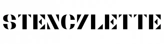
A bold, geometric stencil font with high contrast and industrial style.
![Stencylette Frei Schriftart Herunterladen]() Herunterladen 359 Downloads@WebFont
Herunterladen 359 Downloads@WebFont -
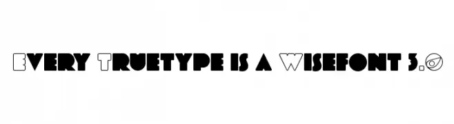
![Every Truetype is a Wisefont 3.0 Frei Schriftart Herunterladen]() Herunterladen 359 Downloads@WebFont
Herunterladen 359 Downloads@WebFont -
( www.woodcutter.es )
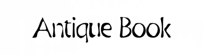
A vintage-inspired font with artistic, hand-drawn strokes and playful curves.
![Antique Book Frei Schriftart Herunterladen]() Herunterladen 359 Downloads@WebFont
Herunterladen 359 Downloads@WebFont


Welche Schriften sind gerade am populärsten?
Poppins, Roboto, Montserrat, Open Sans und Lato sind wegen ihrer klaren Formen und breiten Einsetzbarkeit sehr gefragt – von Markenauftritt über Landingpages bis hin zu Postern.
Welche Fonts eignen sich für Logos?
Geometrische Sans‑Serifs (z. B. Poppins, Familien im Gotham‑Stil) sind ein häufiger Griff für sauberes, skalierbares Branding. Für eine persönlichere Note bleiben Scripts und Handschrift‑Stile beliebt. Kombinieren Sie einen prägnanten Headline‑Font mit einer neutralen Brotschrift für Wiedererkennung und Harmonie.
Wie oft wird die Top‑Liste aktualisiert?
Regelmäßig – basierend auf realen Downloads und Interaktionen. Schauen Sie öfter vorbei, um aufstrebende Favoriten früh zu entdecken.
💡 Tipp: Seite bookmarken – Trends wechseln schnell, und heutige Top‑Schriften inspirieren morgen vielleicht das Rebranding.