Willkommen bei den Top‑Schriften – hier treffen Beliebtheit und Qualität aufeinander. Das sind die in diesem Jahr am häufigsten heruntergeladenen und genutzten Fonts. Wenn Sie sichere Optionen für Logo, Web oder Social suchen, starten Sie hier.
Jeder Top‑Font überzeugt durch Balance, Lesbarkeit und Vielseitigkeit. Sie finden moderne Sans‑Serifs, elegante Scripts, Vintage‑Serifs und minimalistische Displays.
-
 Herunterladen 217 Downloads@WebFont
 -
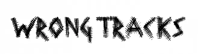
( Fonts by a Max Infeld - XEROGRAPHER FONTS - xerographer.blogspot.com . Personal-use only. For commercial use please contact owner. )
A bold, distressed font with a grunge, textured style.
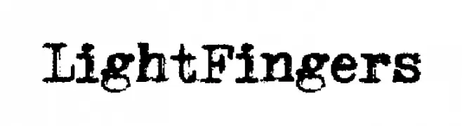
![LightFingers Frei Schriftart Herunterladen]() Herunterladen 217 Downloads@WebFont
Herunterladen 217 Downloads@WebFont -
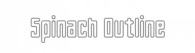
![Spinach Outline Frei Schriftart Herunterladen]() Herunterladen 217 Downloads@WebFont
Herunterladen 217 Downloads@WebFont -
( Fonts by a Max Infeld - XEROGRAPHER FONTS - xerographer.blogspot.com . Personal-use only. For commercial use please contact owner. )
A bold, handwritten-style font with a playful and expressive character.
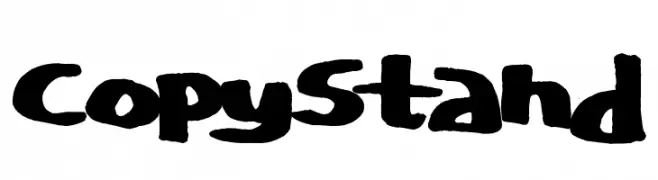
![CopyStand Frei Schriftart Herunterladen]() Herunterladen 217 Downloads@WebFont
Herunterladen 217 Downloads@WebFont -
![Pixel-Western Regular Frei Schriftart Herunterladen]() Herunterladen 217 Downloads@WebFont
Herunterladen 217 Downloads@WebFont -
-
( Fonts by Alex Slobzheninov - Personal-use only. For commercial use please contact owner. )
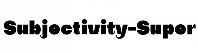
A bold, geometric font with strong visual impact and high contrast.
![Subjectivity-Super Frei Schriftart Herunterladen]() Herunterladen 217 Downloads@WebFont
Herunterladen 217 Downloads@WebFont -
( Fonts by Press Gang Studios - Andeh Pinkard - www.pressgang-studios.com )
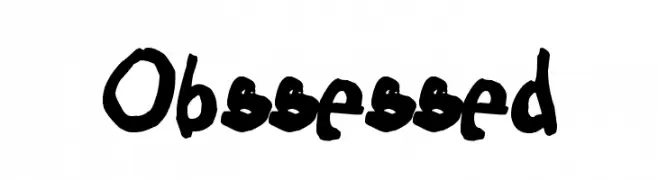
A bold, hand-drawn font with an energetic and playful style.
![Obssessed Frei Schriftart Herunterladen]() Herunterladen 217 Downloads@WebFont
Herunterladen 217 Downloads@WebFont -
( ingoFonts - Ingo Zimmermann - www.ingofonts.com )
A classic serif font with medium contrast and elegant style.
![Charpentier Renaissance Demi Re Frei Schriftart Herunterladen]() Herunterladen 217 Downloads@WebFont
Herunterladen 217 Downloads@WebFont -
( Fonts by Punchcut )
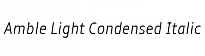
A sleek, modern, light, and condensed italic font with tight spacing.
![Amble Light Condensed Italic Frei Schriftart Herunterladen]() Herunterladen 217 Downloads@WebFont
Herunterladen 217 Downloads@WebFont -
( Fonts by www.peter-wiegel.de. Personal-use only. For commercial use please contact owner. )
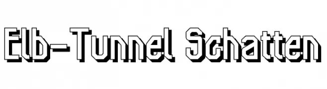
A bold, geometric font with a three-dimensional shadow effect.
![Elb-Tunnel Schatten Frei Schriftart Herunterladen]() Herunterladen 217 Downloads@WebFont
Herunterladen 217 Downloads@WebFont

Welche Schriften sind gerade am populärsten?
Poppins, Roboto, Montserrat, Open Sans und Lato sind wegen ihrer klaren Formen und breiten Einsetzbarkeit sehr gefragt – von Markenauftritt über Landingpages bis hin zu Postern.
Welche Fonts eignen sich für Logos?
Geometrische Sans‑Serifs (z. B. Poppins, Familien im Gotham‑Stil) sind ein häufiger Griff für sauberes, skalierbares Branding. Für eine persönlichere Note bleiben Scripts und Handschrift‑Stile beliebt. Kombinieren Sie einen prägnanten Headline‑Font mit einer neutralen Brotschrift für Wiedererkennung und Harmonie.
Wie oft wird die Top‑Liste aktualisiert?
Regelmäßig – basierend auf realen Downloads und Interaktionen. Schauen Sie öfter vorbei, um aufstrebende Favoriten früh zu entdecken.
💡 Tipp: Seite bookmarken – Trends wechseln schnell, und heutige Top‑Schriften inspirieren morgen vielleicht das Rebranding.