Willkommen bei den Top‑Schriften – hier treffen Beliebtheit und Qualität aufeinander. Das sind die in diesem Jahr am häufigsten heruntergeladenen und genutzten Fonts. Wenn Sie sichere Optionen für Logo, Web oder Social suchen, starten Sie hier.
Jeder Top‑Font überzeugt durch Balance, Lesbarkeit und Vielseitigkeit. Sie finden moderne Sans‑Serifs, elegante Scripts, Vintage‑Serifs und minimalistische Displays.
-
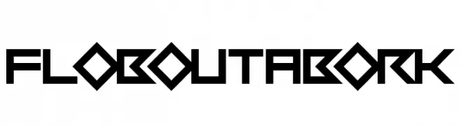
( Fonts by Daniel Zadorozny - www.iconian.com - Free for personal use )
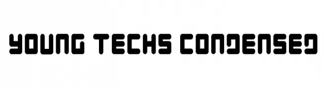
A bold, futuristic font with rounded edges and a condensed, tech-inspired design.
 Herunterladen 216 Downloads@WebFont
 -
![Flob Out a Bork Frei Schriftart Herunterladen]() Herunterladen 216 Downloads@WebFont
Herunterladen 216 Downloads@WebFont -
Schriftart von defharo. For commercial use please contact the owner.
![Pabellona [C] Tríplex Frei Schriftart Herunterladen]() Herunterladen 216 Downloads@WebFont
Herunterladen 216 Downloads@WebFont -
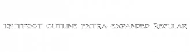
( Paul Lloyd Fonts )
An outline font with bold, expansive characters and an elegant, artistic flair.
![Lightfoot Outline Extra-expanded Regular Frei Schriftart Herunterladen]() Herunterladen 216 Downloads@WebFont
Herunterladen 216 Downloads@WebFont -
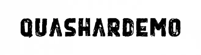
( Typia Nesia - www.myfonts.com/foundry/Typia_Nesia/ )
A bold, distressed font with a rugged, grunge style.
![Quashar Demo Frei Schriftart Herunterladen]() Herunterladen 216 Downloads@WebFont
Herunterladen 216 Downloads@WebFont -
-
( Fonts by Fajar Abdul Fattah - https://fontbundles.net/sibelumpagi-studio - Personal-use only. For commercial use please contact owner. )
A graceful script font with flowing, cursive strokes and elegant loops.
![Kelony Frei Schriftart Herunterladen]() Herunterladen 216 Downloads@WebFont
Herunterladen 216 Downloads@WebFont -
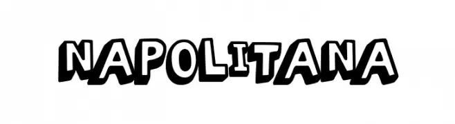
( Fonts by Woodcutter )
A bold, playful font with a cartoonish, hand-drawn style.
![Napolitana Frei Schriftart Herunterladen]() Herunterladen 216 Downloads@WebFont
Herunterladen 216 Downloads@WebFont -
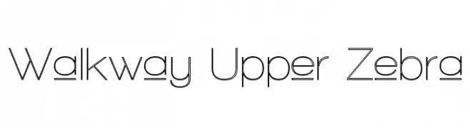
( Fonts by Graham Meade - GemFonts )
A modern, geometric font with consistent stroke widths and a clean design.
![Walkway Upper Zebra Frei Schriftart Herunterladen]() Herunterladen 216 Downloads@WebFont
Herunterladen 216 Downloads@WebFont -
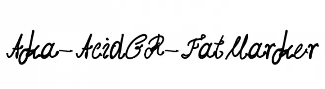
( Fonts by www.aka-acid.com )
A bold, cursive font with a playful and dynamic handwritten style.
![Aka-AcidGR-FatMarker Frei Schriftart Herunterladen]() Herunterladen 216 Downloads@WebFont
Herunterladen 216 Downloads@WebFont -
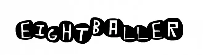
( Fonts by a Max Infeld - XEROGRAPHER FONTS - xerographer.blogspot.com . Personal-use only. For commercial use please contact owner. )
A bold, playful font with letters in circular black backgrounds and white, hand-drawn characters.
![EightBaller Frei Schriftart Herunterladen]() Herunterladen 216 Downloads@WebFont
Herunterladen 216 Downloads@WebFont
![Pabellona [C] Tríplex Frei Schriftart Herunterladen](https://d144mzi0q5mijx.cloudfront.net/img/P/A/Pabellona-C-Trplex.webp)

Welche Schriften sind gerade am populärsten?
Poppins, Roboto, Montserrat, Open Sans und Lato sind wegen ihrer klaren Formen und breiten Einsetzbarkeit sehr gefragt – von Markenauftritt über Landingpages bis hin zu Postern.
Welche Fonts eignen sich für Logos?
Geometrische Sans‑Serifs (z. B. Poppins, Familien im Gotham‑Stil) sind ein häufiger Griff für sauberes, skalierbares Branding. Für eine persönlichere Note bleiben Scripts und Handschrift‑Stile beliebt. Kombinieren Sie einen prägnanten Headline‑Font mit einer neutralen Brotschrift für Wiedererkennung und Harmonie.
Wie oft wird die Top‑Liste aktualisiert?
Regelmäßig – basierend auf realen Downloads und Interaktionen. Schauen Sie öfter vorbei, um aufstrebende Favoriten früh zu entdecken.
💡 Tipp: Seite bookmarken – Trends wechseln schnell, und heutige Top‑Schriften inspirieren morgen vielleicht das Rebranding.