Willkommen bei den Top‑Schriften – hier treffen Beliebtheit und Qualität aufeinander. Das sind die in diesem Jahr am häufigsten heruntergeladenen und genutzten Fonts. Wenn Sie sichere Optionen für Logo, Web oder Social suchen, starten Sie hier.
Jeder Top‑Font überzeugt durch Balance, Lesbarkeit und Vielseitigkeit. Sie finden moderne Sans‑Serifs, elegante Scripts, Vintage‑Serifs und minimalistische Displays.
-
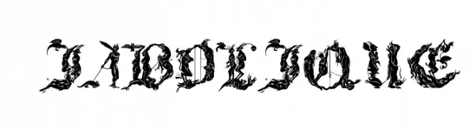
( Fonts by Jester Font Studio )
An ornate, gothic-style font with intricate flourishes and high contrast.
 Herunterladen 217 Downloads@WebFont
 -
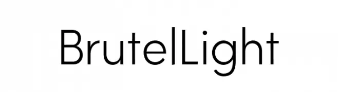
( Fonts by Iordanis Passas - Personal-use only. For commercial use please contact owner. )
A modern geometric sans-serif font with clean lines and balanced proportions.
![Brutel Light Frei Schriftart Herunterladen]() Herunterladen 217 Downloads@WebFont
Herunterladen 217 Downloads@WebFont -
Schriftart von letterhanna. For commercial use please contact the owner.
( Free for personal use only. With only $13 You can purchase the basic desktop license: https://letterhanna.com/ )
A playful and whimsical font with smooth, rounded letterforms.
![Seashell Paradise free Regular Frei Schriftart Herunterladen]() Herunterladen 217 Downloads@WebFont
Herunterladen 217 Downloads@WebFont -
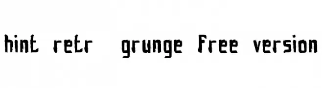
( Fonts by www.fontscafe.com )
A rugged, distressed font with a bold, hand-drawn appearance.
![hint-retrò-grunge_free-version Frei Schriftart Herunterladen]() Herunterladen 217 Downloads@WebFont
Herunterladen 217 Downloads@WebFont -
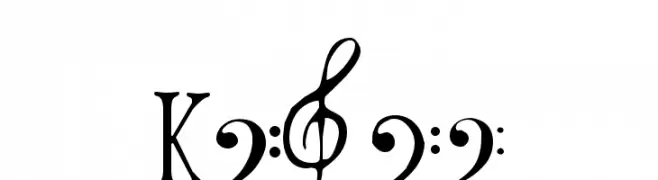
( Fonts by www.hindson.com.au )
A decorative collection of musical clefs and symbols.
![Clefs Frei Schriftart Herunterladen]() Herunterladen 217 Downloads@WebFont
Herunterladen 217 Downloads@WebFont -
-
( Fonts by Peax Webdesign - www.peax-webdesign.com. Personal-use only. For commercial use please contact owner. )
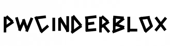
A bold, angular, and geometric font with a playful and dynamic style.
![PWCINDERBLOX Frei Schriftart Herunterladen]() Herunterladen 217 Downloads@WebFont
Herunterladen 217 Downloads@WebFont -
( Font by http://home.luna.nl/~xino/ )
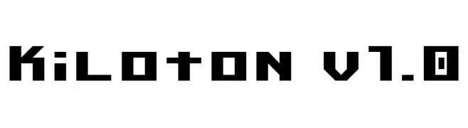
A bold, geometric font with a modern, digital aesthetic.
![Kiloton v1.0 Frei Schriftart Herunterladen]() Herunterladen 217 Downloads@WebFont
Herunterladen 217 Downloads@WebFont -
![CYBE Frei Schriftart Herunterladen]() Herunterladen 217 Downloads@WebFont
Herunterladen 217 Downloads@WebFont -
( dcoxy - Greg Medina - www.dcoxy.com/ )
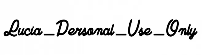
A bold, cursive script font with a handwritten, elegant style.
![Lucia_Personal_Use_Only Frei Schriftart Herunterladen]() Herunterladen 217 Downloads@WebFont
Herunterladen 217 Downloads@WebFont -
( Fonts by Misti`s Fonts - mistifonts.com - Personal-use only. For commercial use please contact owner. )
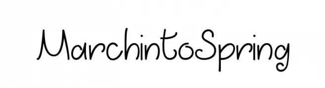
A playful handwritten font with smooth curves and a casual style.
![MarchintoSpring Frei Schriftart Herunterladen]() Herunterladen 217 Downloads@WebFont
Herunterladen 217 Downloads@WebFont


Welche Schriften sind gerade am populärsten?
Poppins, Roboto, Montserrat, Open Sans und Lato sind wegen ihrer klaren Formen und breiten Einsetzbarkeit sehr gefragt – von Markenauftritt über Landingpages bis hin zu Postern.
Welche Fonts eignen sich für Logos?
Geometrische Sans‑Serifs (z. B. Poppins, Familien im Gotham‑Stil) sind ein häufiger Griff für sauberes, skalierbares Branding. Für eine persönlichere Note bleiben Scripts und Handschrift‑Stile beliebt. Kombinieren Sie einen prägnanten Headline‑Font mit einer neutralen Brotschrift für Wiedererkennung und Harmonie.
Wie oft wird die Top‑Liste aktualisiert?
Regelmäßig – basierend auf realen Downloads und Interaktionen. Schauen Sie öfter vorbei, um aufstrebende Favoriten früh zu entdecken.
💡 Tipp: Seite bookmarken – Trends wechseln schnell, und heutige Top‑Schriften inspirieren morgen vielleicht das Rebranding.