Willkommen bei den Top‑Schriften – hier treffen Beliebtheit und Qualität aufeinander. Das sind die in diesem Jahr am häufigsten heruntergeladenen und genutzten Fonts. Wenn Sie sichere Optionen für Logo, Web oder Social suchen, starten Sie hier.
Jeder Top‑Font überzeugt durch Balance, Lesbarkeit und Vielseitigkeit. Sie finden moderne Sans‑Serifs, elegante Scripts, Vintage‑Serifs und minimalistische Displays.
-
( Free for a personal use. For a commercial use please visit www.kevinandamanda.com )
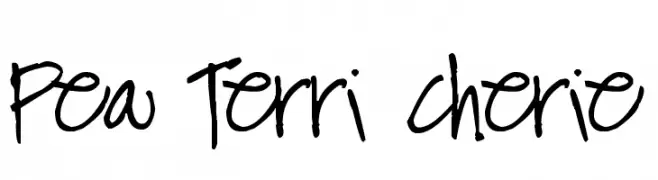
A playful, casual handwritten font with free-flowing strokes and uneven spacing.
 Herunterladen 217 Downloads@WebFont
 -
![AleFont Frei Schriftart Herunterladen]() Herunterladen 217 Downloads@WebFont
Herunterladen 217 Downloads@WebFont -
( Fonts by Andrew McCluskey - nalgames.com )
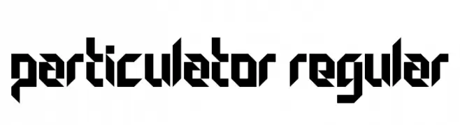
A bold, geometric font with sharp angles and a futuristic style.
![Particulator Regular Frei Schriftart Herunterladen]() Herunterladen 217 Downloads@WebFont
Herunterladen 217 Downloads@WebFont -
( Fonts by Apostrophic Lab )
A modern, italic font with geometric influences and consistent stroke width.
![Republika Italic Frei Schriftart Herunterladen]() Herunterladen 217 Downloads@WebFont
Herunterladen 217 Downloads@WebFont -
( Fonts by Woodcutter )
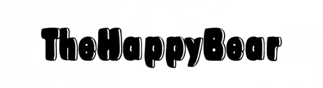
A playful, bold font with rounded, bubbly characters.
![The Happy Bear Frei Schriftart Herunterladen]() Herunterladen 217 Downloads@WebFont
Herunterladen 217 Downloads@WebFont -
-
( Fonts by Daniel Zadorozny - www.iconian.com )
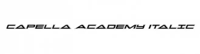
A sleek, italicized font with a futuristic and dynamic design.
![Capella Academy Italic Frei Schriftart Herunterladen]() Herunterladen 217 Downloads@WebFont
Herunterladen 217 Downloads@WebFont -
( Fonts by a Neale Davidson - www.pixelsagas.com. Personal-use only. For commercial use please contact owner. )
A sharp, angular font with a medieval and gothic flair.
![Vecna Frei Schriftart Herunterladen]() Herunterladen 217 Downloads@WebFont
Herunterladen 217 Downloads@WebFont -
( Fonts by Billy Argel Fonts - www.billyargel.com - Personal-use only. For commercial use please contact owner. )
A bold, textured decorative font with a vintage, handcrafted feel.
![[OAKLAND] PERSONAL USE Regular Frei Schriftart Herunterladen]() Herunterladen 217 Downloads@WebFont
Herunterladen 217 Downloads@WebFont -
( Fonts by Daniel Zadorozny - www.iconian.com - Free for personal use )
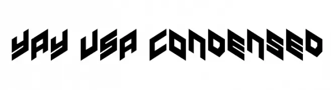
A bold, angular, and condensed font with a geometric and modern style.
![YAY USA Condensed Frei Schriftart Herunterladen]() Herunterladen 217 Downloads@WebFont
Herunterladen 217 Downloads@WebFont -
( monkeyroodlesfonts.weebly.com/ )
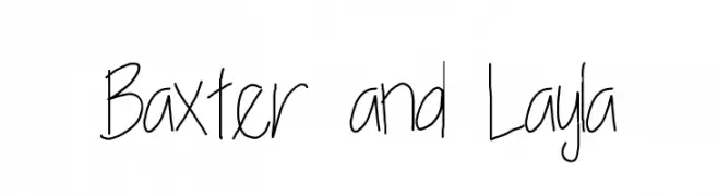
A casual, handwritten font with a playful and informal style.
![Baxter and Layla Frei Schriftart Herunterladen]() Herunterladen 217 Downloads@WebFont
Herunterladen 217 Downloads@WebFont


![[OAKLAND] PERSONAL USE Regular Frei Schriftart Herunterladen](https://d144mzi0q5mijx.cloudfront.net/img/0/O/OAKLAND-PERSONAL-USE-Regular.webp)
Welche Schriften sind gerade am populärsten?
Poppins, Roboto, Montserrat, Open Sans und Lato sind wegen ihrer klaren Formen und breiten Einsetzbarkeit sehr gefragt – von Markenauftritt über Landingpages bis hin zu Postern.
Welche Fonts eignen sich für Logos?
Geometrische Sans‑Serifs (z. B. Poppins, Familien im Gotham‑Stil) sind ein häufiger Griff für sauberes, skalierbares Branding. Für eine persönlichere Note bleiben Scripts und Handschrift‑Stile beliebt. Kombinieren Sie einen prägnanten Headline‑Font mit einer neutralen Brotschrift für Wiedererkennung und Harmonie.
Wie oft wird die Top‑Liste aktualisiert?
Regelmäßig – basierend auf realen Downloads und Interaktionen. Schauen Sie öfter vorbei, um aufstrebende Favoriten früh zu entdecken.
💡 Tipp: Seite bookmarken – Trends wechseln schnell, und heutige Top‑Schriften inspirieren morgen vielleicht das Rebranding.