Willkommen bei den Top‑Schriften – hier treffen Beliebtheit und Qualität aufeinander. Das sind die in diesem Jahr am häufigsten heruntergeladenen und genutzten Fonts. Wenn Sie sichere Optionen für Logo, Web oder Social suchen, starten Sie hier.
Jeder Top‑Font überzeugt durch Balance, Lesbarkeit und Vielseitigkeit. Sie finden moderne Sans‑Serifs, elegante Scripts, Vintage‑Serifs und minimalistische Displays.
-
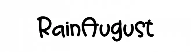
( Fonts by Mr.Soon Design )
A playful, hand-drawn font with rounded, bold characters.
 Herunterladen 579 Downloads@WebFont
 -
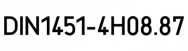
( Fonts by Peter Wiegel - www.peter-wiegel.de - Personal-use only. For commercial use please contact owner. )
A clean, geometric sans-serif typeface with excellent legibility.
![DIN1451-4H_08.87 Frei Schriftart Herunterladen]() Herunterladen 579 Downloads@WebFont
Herunterladen 579 Downloads@WebFont -
( Fonts by Muksal Creative - Personal-use only. For commercial use please contact owner. )
A playful, rounded font with smooth curves and a friendly appearance.
![Aloya Frei Schriftart Herunterladen]() Herunterladen 579 Downloads@WebFont
Herunterladen 579 Downloads@WebFont -
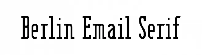
( Fonts by www.peter-wiegel.de. Personal-use only. For commercial use please contact owner. )
A bold, high-contrast serif font with strong vertical strokes and elegant serifs.
![Berlin Email Serif Frei Schriftart Herunterladen]() Herunterladen 579 Downloads@WebFont
Herunterladen 579 Downloads@WebFont -
( Fonts by Daniel Zadorozny - www.iconian.com - Free for personal use )
A bold, condensed font with high contrast and tight spacing, perfect for impactful headlines.
![U.S.A. Condensed Frei Schriftart Herunterladen]() Herunterladen 579 Downloads@WebFont
Herunterladen 579 Downloads@WebFont -
-
( Copyright (c) 2012, Impallari Type (www.impallari.com), with Reserved Font Name Encode Sans. )
A modern, compressed sans-serif font with semi-bold weight and geometric design.
![Encode Sans Compressed SemiBold Frei Schriftart Herunterladen]() Herunterladen 579 Downloads@WebFont
Herunterladen 579 Downloads@WebFont -
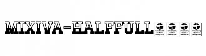
( Fonts by Studio Typo )
A bold, geometric font with a three-dimensional, industrial look.
![MIXIVA-HALF FULL demo Frei Schriftart Herunterladen]() Herunterladen 579 Downloads@WebFont
Herunterladen 579 Downloads@WebFont -
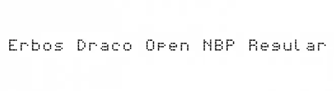
![Erbos Draco Open NBP Regular Frei Schriftart Herunterladen]() Herunterladen 579 Downloads@WebFont
Herunterladen 579 Downloads@WebFont -
![Trek TNG Monitors Frei Schriftart Herunterladen]() Herunterladen 579 Downloads@WebFont
Herunterladen 579 Downloads@WebFont -
( Fonts by Manfred Klein - manfred-klein.ina-mar.com )
A bold serif font with distinctive zebra-like stripes.
![Zebraesq Frei Schriftart Herunterladen]() Herunterladen 579 Downloads@WebFont
Herunterladen 579 Downloads@WebFont -
( Fonts by Apostrophic Lab )
A bold, italicized font with a modern and dynamic style.
![Youthanasia Italic Frei Schriftart Herunterladen]() Herunterladen 579 Downloads@WebFont
Herunterladen 579 Downloads@WebFont -
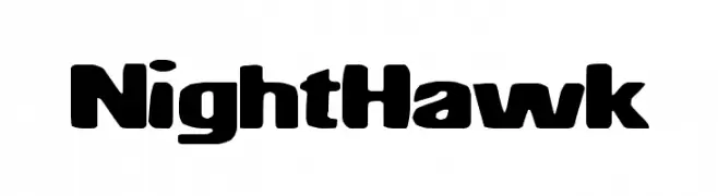
( Fonts by a Max Infeld - XEROGRAPHER FONTS - xerographer.blogspot.com . Personal-use only. For commercial use please contact owner. )
A bold, rounded font with a modern and impactful style.
![NightHawk Frei Schriftart Herunterladen]() Herunterladen 579 Downloads@WebFont
Herunterladen 579 Downloads@WebFont -
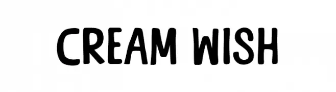
( Fonts by Khurasan )
A playful, bold font with rounded edges and a hand-drawn look.
![Cream Wish Frei Schriftart Herunterladen]() Herunterladen 579 Downloads@WebFont
Herunterladen 579 Downloads@WebFont -
( Fonts by wep )
A playful, hand-drawn font with a whimsical and bold style.
![Ejek Balik Frei Schriftart Herunterladen]() Herunterladen 579 Downloads@WebFont
Herunterladen 579 Downloads@WebFont -
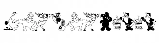
( Fonts by Manfred Klein - manfred-klein.ina-mar.com )
A decorative font with festive holiday-themed illustrations replacing traditional characters.
![XmasBatzz Frei Schriftart Herunterladen]() Herunterladen 579 Downloads@WebFont
Herunterladen 579 Downloads@WebFont -
( Fonts by Manfred Klein - manfred-klein.ina-mar.com )
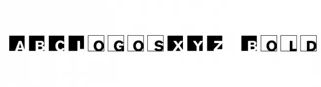
A bold, geometric font with characters in solid squares, offering a modern and structured appearance.
![ABCLogosXYZ-Bold Frei Schriftart Herunterladen]() Herunterladen 579 Downloads@WebFont
Herunterladen 579 Downloads@WebFont -
( Gaelleing )
A playful, handwritten font with rounded, consistent strokes and a casual vibe.
![April Frei Schriftart Herunterladen]() Herunterladen 579 Downloads@WebFont
Herunterladen 579 Downloads@WebFont -
( Fonts by Vanessa Bays - bythebutterfly.com )
A playful, dot-based decorative font with a modern flair.
![DotNess Frei Schriftart Herunterladen]() Herunterladen 579 Downloads@WebFont
Herunterladen 579 Downloads@WebFont -
( Fonts by Blonde Fonts - Personal-use only. For commercial use please contact owner. )
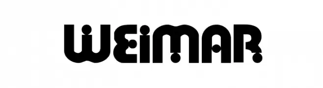
A bold, geometric font with circular decorative elements, offering a modern and playful style.
![Weimar Frei Schriftart Herunterladen]() Herunterladen 579 Downloads@WebFont
Herunterladen 579 Downloads@WebFont -
( Vladimir Nikolic - www.coroflot.com/vladimirnikolic )
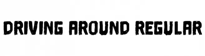
A bold, textured font with a hand-drawn, distressed style.
![Driving Around Regular Frei Schriftart Herunterladen]() Herunterladen 579 Downloads@WebFont
Herunterladen 579 Downloads@WebFont -
( Fonts by Utopiafonts )
A whimsical and playful font with exaggerated curves and dynamic strokes.
![Luxo Frei Schriftart Herunterladen]() Herunterladen 579 Downloads@WebFont
Herunterladen 579 Downloads@WebFont -
( Fonts by Colorful Typhoon - http://orange.s56.xrea.com/blog/ )
A bold, angular font with a rough, edgy design.
![Square rough Frei Schriftart Herunterladen]() Herunterladen 579 Downloads@WebFont
Herunterladen 579 Downloads@WebFont -
( Fonts by Khurasan )
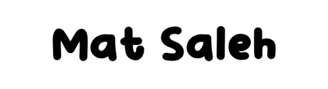
A playful, bold font with rounded, bubbly characters and a friendly appearance.
![Mat Saleh Frei Schriftart Herunterladen]() Herunterladen 579 Downloads@WebFont
Herunterladen 579 Downloads@WebFont -
![Pencil Caps Frei Schriftart Herunterladen]() Herunterladen 578 Downloads@WebFont
Herunterladen 578 Downloads@WebFont -
( Linux Libertine - www.linuxlibertine.org )
A bold, slanted serif font with classic elegance and moderate contrast.
![Linux Libertine Slanted Bold Frei Schriftart Herunterladen]() Herunterladen 578 Downloads@WebFont
Herunterladen 578 Downloads@WebFont -
![Latté Frei Schriftart Herunterladen]() Herunterladen 578 Downloads@WebFont
Herunterladen 578 Downloads@WebFont -
![Calipers Frei Schriftart Herunterladen]() Herunterladen 578 Downloads@WebFont
Herunterladen 578 Downloads@WebFont -
( Fonts by 177Studio )
An elegant and decorative font with high contrast and intricate letterforms.
![Strarat Elegante Font Regular Frei Schriftart Herunterladen]() Herunterladen 578 Downloads@WebFont
Herunterladen 578 Downloads@WebFont -
( Fonts by Namara Creative Studio - Personal-use only. For commercial use please contact owner. )
A modern, geometric font with clean lines and rounded corners.
![Rogueland Free Regular Frei Schriftart Herunterladen]() Herunterladen 578 Downloads@WebFont
Herunterladen 578 Downloads@WebFont -
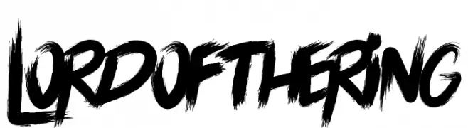
( Docallisme HAS Feat Dutsky - docallisme.blogspot.com )
A bold, brushstroke font with a dynamic and textured appearance.
![LORD OF THE RING Frei Schriftart Herunterladen]() Herunterladen 578 Downloads@WebFont
Herunterladen 578 Downloads@WebFont -
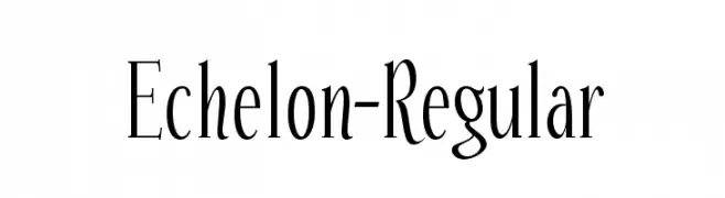
( Fonts by www.typodermicfonts.com - Ray Larabie )
A modern, elegant font with tall, slender letterforms and subtle curves.
![Echelon-Regular Frei Schriftart Herunterladen]() Herunterladen 578 Downloads@WebFont
Herunterladen 578 Downloads@WebFont -
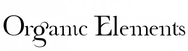
( Fonts by Nerys Evans Sponsoren Schriftart )
A modern serif font with organic elements and playful swashes.
![Organic Elements Frei Schriftart Herunterladen]() Herunterladen 578 Downloads
Herunterladen 578 Downloads -
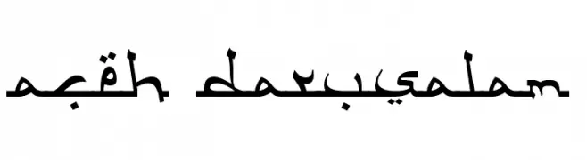
( Fonts by Adien Gunarta - fontasticindonesia.blogspot.com )
An elegant Arabic script font with flowing, connected letters and ornamental details.
![Aceh Darusalam Frei Schriftart Herunterladen]() Herunterladen 578 Downloads@WebFont
Herunterladen 578 Downloads@WebFont -
![Tincushion Frei Schriftart Herunterladen]() Herunterladen 578 Downloads@WebFont
Herunterladen 578 Downloads@WebFont -
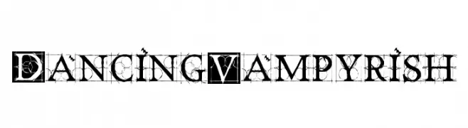
( Fonts by Manfred Klein - manfred-klein.ina-mar.com )
An intricate and decorative font with gothic influences and modern flair.
![DancingVampyrish Frei Schriftart Herunterladen]() Herunterladen 578 Downloads@WebFont
Herunterladen 578 Downloads@WebFont


Welche Schriften sind gerade am populärsten?
Poppins, Roboto, Montserrat, Open Sans und Lato sind wegen ihrer klaren Formen und breiten Einsetzbarkeit sehr gefragt – von Markenauftritt über Landingpages bis hin zu Postern.
Welche Fonts eignen sich für Logos?
Geometrische Sans‑Serifs (z. B. Poppins, Familien im Gotham‑Stil) sind ein häufiger Griff für sauberes, skalierbares Branding. Für eine persönlichere Note bleiben Scripts und Handschrift‑Stile beliebt. Kombinieren Sie einen prägnanten Headline‑Font mit einer neutralen Brotschrift für Wiedererkennung und Harmonie.
Wie oft wird die Top‑Liste aktualisiert?
Regelmäßig – basierend auf realen Downloads und Interaktionen. Schauen Sie öfter vorbei, um aufstrebende Favoriten früh zu entdecken.
💡 Tipp: Seite bookmarken – Trends wechseln schnell, und heutige Top‑Schriften inspirieren morgen vielleicht das Rebranding.