Willkommen bei den Top‑Schriften – hier treffen Beliebtheit und Qualität aufeinander. Das sind die in diesem Jahr am häufigsten heruntergeladenen und genutzten Fonts. Wenn Sie sichere Optionen für Logo, Web oder Social suchen, starten Sie hier.
Jeder Top‑Font überzeugt durch Balance, Lesbarkeit und Vielseitigkeit. Sie finden moderne Sans‑Serifs, elegante Scripts, Vintage‑Serifs und minimalistische Displays.
-
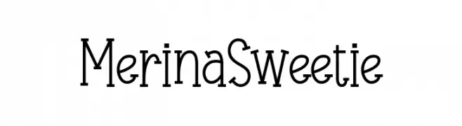
( Fonts by 7NTypes )
A playful and elegant font with tall, slender characters and a whimsical touch.
 Herunterladen 578 Downloads@WebFont
 -
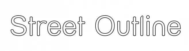
( Fonts by Apostrophic Lab )
A modern, minimalist outline font with uniform stroke widths and geometric precision.
![Street Outline Frei Schriftart Herunterladen]() Herunterladen 578 Downloads@WebFont
Herunterladen 578 Downloads@WebFont -
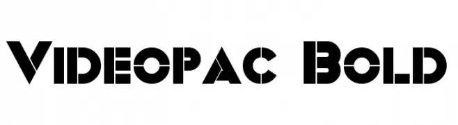
( Fonts by a Neale Davidson - www.pixelsagas.com. Personal-use only. For commercial use please contact owner. )
A bold, geometric font with a futuristic and retro-inspired design.
![Videopac Bold Frei Schriftart Herunterladen]() Herunterladen 578 Downloads@WebFont
Herunterladen 578 Downloads@WebFont -
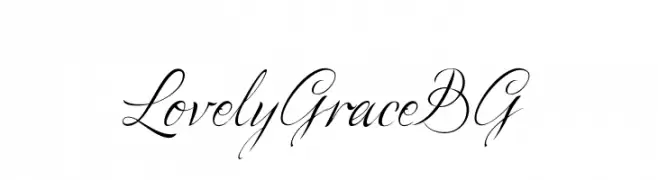
( Fonts by www.tipometar.org )
An elegant, flowing script font with a sophisticated, handwritten style.
![LovelyGraceBG Frei Schriftart Herunterladen]() Herunterladen 578 Downloads@WebFont
Herunterladen 578 Downloads@WebFont -
( Fonts by Manfred Klein. Free for private and charity use. Free for commercial with donation to organizations )
A playful, handwritten-style font with smooth, rounded strokes.
![FreestyleSans Frei Schriftart Herunterladen]() Herunterladen 578 Downloads@WebFont
Herunterladen 578 Downloads@WebFont -
-
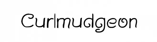
( Fonts by Graham Meade - GemFonts )
A playful, curly font with a hand-drawn, whimsical style.
![Curlmudgeon Frei Schriftart Herunterladen]() Herunterladen 578 Downloads@WebFont
Herunterladen 578 Downloads@WebFont -
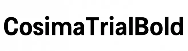
( Fonts by Anita Jürgeleit - Personal-use only. For commercial use please contact owner. )
A bold, modern sans-serif font with clean, uniform strokes.
![Cosima Trial Bold Frei Schriftart Herunterladen]() Herunterladen 578 Downloads@WebFont
Herunterladen 578 Downloads@WebFont -
![ASwirlVelvet Frei Schriftart Herunterladen]() Herunterladen 578 Downloads@WebFont
Herunterladen 578 Downloads@WebFont -
( Fonts by Anke Arnold - www.anke-art.de )
A decorative and lively font with intricate details and a festive flair.
![Samba! Frei Schriftart Herunterladen]() Herunterladen 578 Downloads@WebFont
Herunterladen 578 Downloads@WebFont -
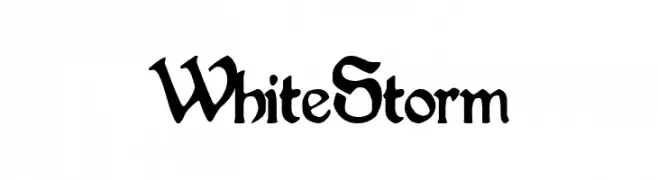
( Fonts by Woodcutter Manero - http://www.woodcutter.es - Personal-use only. For commercial use please contact owner. )
A bold, Gothic-inspired font with dramatic, angular characters and ornate details.
![White Storm Frei Schriftart Herunterladen]() Herunterladen 578 Downloads@WebFont
Herunterladen 578 Downloads@WebFont -
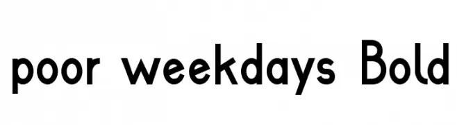
( Fonts by Roland Huse - rolandhuse.com )
A bold, modern sans-serif font with a clean and geometric design.
![poor weekdays Bold Frei Schriftart Herunterladen]() Herunterladen 578 Downloads@WebFont
Herunterladen 578 Downloads@WebFont -
![Flower Ornaments Frei Schriftart Herunterladen]() Herunterladen 578 Downloads@WebFont
Herunterladen 578 Downloads@WebFont -
( Fonts by Miss Tiina at www.misstiina.com (please check the website before use) )
A playful collection of hand-drawn doodle symbols with a whimsical style.
![MTF Doodle Frei Schriftart Herunterladen]() Herunterladen 578 Downloads@WebFont
Herunterladen 578 Downloads@WebFont -
( Fonts by Peter Wiegel - www.peter-wiegel.de - Personal-use only. For commercial use please contact owner. )
A decorative font with intricate swirls and embellishments, perfect for creative projects.
![Edison Frei Schriftart Herunterladen]() Herunterladen 578 Downloads@WebFont
Herunterladen 578 Downloads@WebFont -
( Fonts by www.tepidmonkey.net )
A modern, outlined font with geometric and clean letterforms.
![Elected Office Outline Frei Schriftart Herunterladen]() Herunterladen 578 Downloads@WebFont
Herunterladen 578 Downloads@WebFont -
( www.youtube.com/user/0oOFrANziOo0 )
A bold, expressive font with dynamic, flowing strokes.
![ChillStyle Frei Schriftart Herunterladen]() Herunterladen 578 Downloads@WebFont
Herunterladen 578 Downloads@WebFont -
( Fonts by Subectype & Orenari )
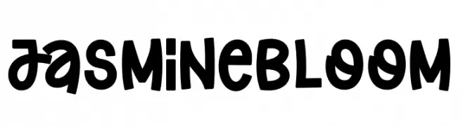
A playful, bold, handwritten-style font with rounded characters.
![Jasmine Bloom Frei Schriftart Herunterladen]() Herunterladen 578 Downloads@WebFont
Herunterladen 578 Downloads@WebFont -
( Fonts by softerviews.org )
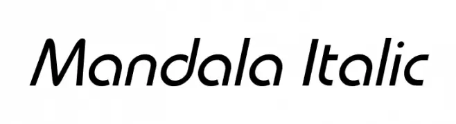
A sleek, modern italic font with smooth curves and dynamic style.
![Mandala Italic Frei Schriftart Herunterladen]() Herunterladen 578 Downloads@WebFont
Herunterladen 578 Downloads@WebFont -
![Coburn Regular Frei Schriftart Herunterladen]() Herunterladen 578 Downloads@WebFont
Herunterladen 578 Downloads@WebFont -
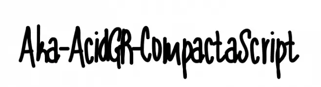
( Fonts by www.aka-acid.com )
A bold, expressive handwritten font with thick strokes and a playful style.
![Aka-AcidGR-CompactaScript Frei Schriftart Herunterladen]() Herunterladen 578 Downloads@WebFont
Herunterladen 578 Downloads@WebFont -
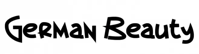
( Fonts by Tom Raaijmakers )
A bold, playful font with a hand-drawn, energetic style.
![German Beauty Frei Schriftart Herunterladen]() Herunterladen 578 Downloads@WebFont
Herunterladen 578 Downloads@WebFont -
( Iconian Fonts - Daniel Zadorozny - www.iconian.com )
A bold, futuristic font with slanted, angular characters and strong visual impact.
![Soloist Laser Frei Schriftart Herunterladen]() Herunterladen 577 Downloads@WebFont
Herunterladen 577 Downloads@WebFont -
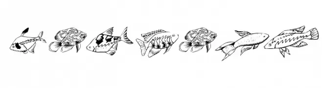
( Fonts by Manfred Klein - manfred-klein.ina-mar.com )
Hand-drawn fish illustrations form each character in a playful, decorative style.
![Fishing Frei Schriftart Herunterladen]() Herunterladen 577 Downloads@WebFont
Herunterladen 577 Downloads@WebFont -
( Fonts by Castcraft Software - OPTI Fonts Archive - opti.netii.net - Personal-use only. For commercial use please contact owner. )
A bold, condensed font with high contrast and a modern, impactful style.
![RiverOpti Frei Schriftart Herunterladen]() Herunterladen 577 Downloads@WebFont
Herunterladen 577 Downloads@WebFont -
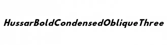
( Fonts by CannotIntoSpaceFonts - KineticPlasma Fonts - Personal-use only. For commercial use please contact owner. )
A bold, condensed, and oblique font with a modern and dynamic style.
![Hussar Bold Condensed Oblique Three Frei Schriftart Herunterladen]() Herunterladen 577 Downloads@WebFont
Herunterladen 577 Downloads@WebFont -
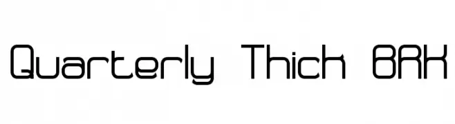
( Fonts by AEnigma - www.aenigmafonts.com )
A modern, geometric font with clean, rounded edges and uniform stroke width.
![Quarterly Thick BRK Frei Schriftart Herunterladen]() Herunterladen 577 Downloads@WebFont
Herunterladen 577 Downloads@WebFont -
( Fonts by Apostrophic Lab )
A bold, compact sans-serif font with a modern and clean design.
![Florencesans Comp Bold Frei Schriftart Herunterladen]() Herunterladen 577 Downloads@WebFont
Herunterladen 577 Downloads@WebFont -
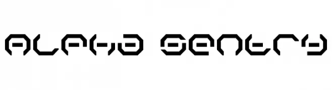
( Fonts by Daniel Zadorozny - www.iconian.com )
A futuristic, geometric font with bold, angular shapes and an octagonal motif.
![Alpha Sentry Frei Schriftart Herunterladen]() Herunterladen 577 Downloads@WebFont
Herunterladen 577 Downloads@WebFont -
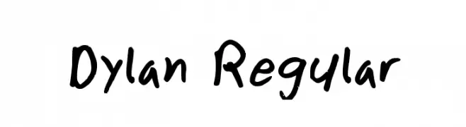
![Dylan Regular Frei Schriftart Herunterladen]() Herunterladen 577 Downloads@WebFont
Herunterladen 577 Downloads@WebFont -
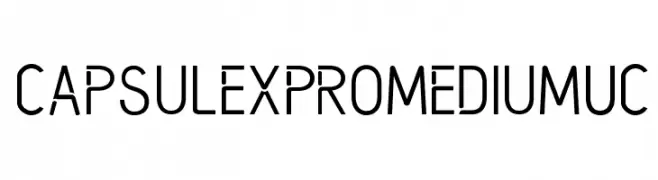
( Raven 2 Studio - www.behance.net/raven2 )
A modern, geometric font with clean lines and uniform stroke width.
![CapsuleXProMediumUC Frei Schriftart Herunterladen]() Herunterladen 577 Downloads@WebFont
Herunterladen 577 Downloads@WebFont -
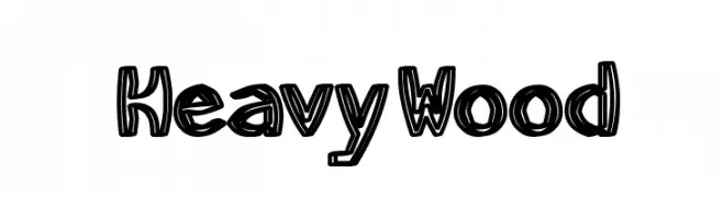
![HeavyWood Frei Schriftart Herunterladen]() Herunterladen 577 Downloads@WebFont
Herunterladen 577 Downloads@WebFont -
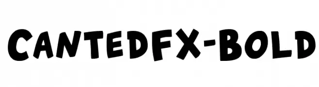
( Nils Cordes - nilscordes.com )
A bold, playful font with rounded, dynamic characters.
![CantedFX-Bold Frei Schriftart Herunterladen]() Herunterladen 577 Downloads@WebFont
Herunterladen 577 Downloads@WebFont -
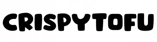
( Fonts by Khurasan )
A playful, bold font with rounded, bubbly characters.
![Crispy Tofu Frei Schriftart Herunterladen]() Herunterladen 577 Downloads@WebFont
Herunterladen 577 Downloads@WebFont -
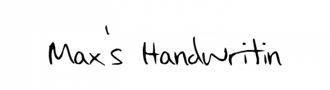
![Max's Handwritin Frei Schriftart Herunterladen]() Herunterladen 577 Downloads@WebFont
Herunterladen 577 Downloads@WebFont -
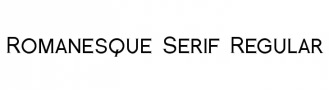
( Fonts by a Typeface Leone - www.tipografialeone.net. Personal-use only. For commercial use please contact owner. )
A classic serif font with sharp serifs and balanced proportions, ideal for traditional and authoritative designs.
![Romanesque Serif Regular Frei Schriftart Herunterladen]() Herunterladen 577 Downloads@WebFont
Herunterladen 577 Downloads@WebFont


Welche Schriften sind gerade am populärsten?
Poppins, Roboto, Montserrat, Open Sans und Lato sind wegen ihrer klaren Formen und breiten Einsetzbarkeit sehr gefragt – von Markenauftritt über Landingpages bis hin zu Postern.
Welche Fonts eignen sich für Logos?
Geometrische Sans‑Serifs (z. B. Poppins, Familien im Gotham‑Stil) sind ein häufiger Griff für sauberes, skalierbares Branding. Für eine persönlichere Note bleiben Scripts und Handschrift‑Stile beliebt. Kombinieren Sie einen prägnanten Headline‑Font mit einer neutralen Brotschrift für Wiedererkennung und Harmonie.
Wie oft wird die Top‑Liste aktualisiert?
Regelmäßig – basierend auf realen Downloads und Interaktionen. Schauen Sie öfter vorbei, um aufstrebende Favoriten früh zu entdecken.
💡 Tipp: Seite bookmarken – Trends wechseln schnell, und heutige Top‑Schriften inspirieren morgen vielleicht das Rebranding.