Willkommen bei den Top‑Schriften – hier treffen Beliebtheit und Qualität aufeinander. Das sind die in diesem Jahr am häufigsten heruntergeladenen und genutzten Fonts. Wenn Sie sichere Optionen für Logo, Web oder Social suchen, starten Sie hier.
Jeder Top‑Font überzeugt durch Balance, Lesbarkeit und Vielseitigkeit. Sie finden moderne Sans‑Serifs, elegante Scripts, Vintage‑Serifs und minimalistische Displays.
-
( Fonts by Inermedia Studio )
A playful and whimsical handwritten font with fluid strokes and expressive characters.
 Herunterladen 375 Downloads@WebFont
 -
( Copyright (c) 2015, Cadson Demak (info@cadsondemak.com) )
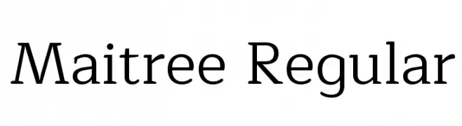
A clean and elegant serif font with balanced structure and moderate stroke contrast.
![Maitree Regular Frei Schriftart Herunterladen]() Herunterladen 375 Downloads@WebFont
Herunterladen 375 Downloads@WebFont -
( Fonts by Steve Cloutier - www.cloutierfontes.ca )
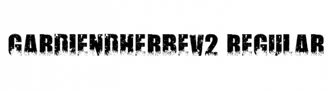
A bold, distressed font with a textured, organic appearance.
![Gardiendherbev2 Regular Frei Schriftart Herunterladen]() Herunterladen 375 Downloads@WebFont
Herunterladen 375 Downloads@WebFont -
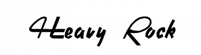
![Heavy Rock Frei Schriftart Herunterladen]() Herunterladen 375 Downloads@WebFont
Herunterladen 375 Downloads@WebFont -
( Fonts by Manfred Klein. Free for private and charity use. Free for commercial with donation to organizations )
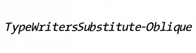
A modern oblique typewriter-style font with clean lines and excellent readability.
![TypeWritersSubstitute-Oblique Frei Schriftart Herunterladen]() Herunterladen 375 Downloads@WebFont
Herunterladen 375 Downloads@WebFont -
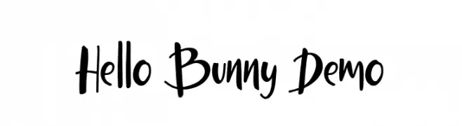
( Fonts by Ardyana Types )
A playful handwritten font with dynamic strokes and a lively style.
![Hello Bunny Demo Frei Schriftart Herunterladen]() Herunterladen 375 Downloads@WebFont
Herunterladen 375 Downloads@WebFont -
![Top Speed Outline Frei Schriftart Herunterladen]() Herunterladen 375 Downloads@WebFont
Herunterladen 375 Downloads@WebFont -
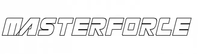
![Masterforce Frei Schriftart Herunterladen]() Herunterladen 375 Downloads
Herunterladen 375 Downloads -
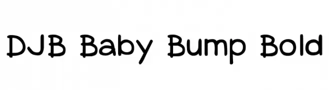
( Fonts by Darcy Baldwin - darcybaldwin.com. Free for personal use only )
A playful, rounded font with bold, smooth curves and a friendly vibe.
![DJB Baby Bump Bold Frei Schriftart Herunterladen]() Herunterladen 375 Downloads@WebFont
Herunterladen 375 Downloads@WebFont -
( Font by Eric Wirjanata. All of my font are donation based. You can support by buying something from here. http://society6.com/EricWirjanata )
A playful, bold, hand-drawn font with a three-dimensional outline.
![Tweedy_Erc_01 Frei Schriftart Herunterladen]() Herunterladen 375 Downloads@WebFont
Herunterladen 375 Downloads@WebFont -
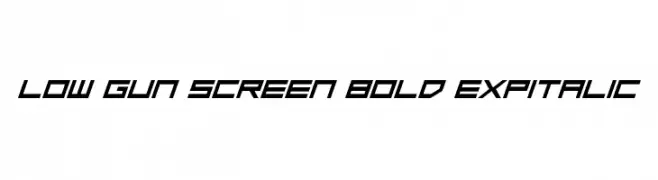
( Fonts by Daniel Zadorozny - www.iconian.com - Free for personal use )
A bold, italicized font with a futuristic and angular design.
![Low Gun Screen Bold ExpItalic Frei Schriftart Herunterladen]() Herunterladen 375 Downloads@WebFont
Herunterladen 375 Downloads@WebFont -
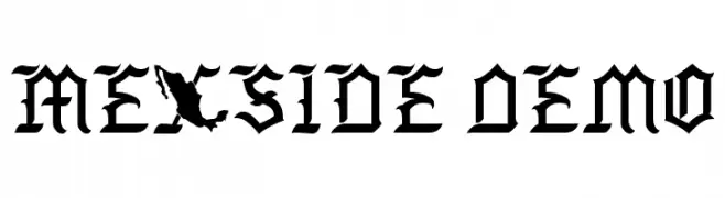
( Richie Mx - Ricardo Saul Castellanos Pabello - www.facebook.com/rs.desiign )
A bold, blackletter-inspired font with sharp angles and intricate details.
![Mexside Demo Frei Schriftart Herunterladen]() Herunterladen 375 Downloads@WebFont
Herunterladen 375 Downloads@WebFont -
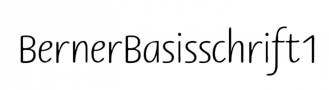
( Fonts by www.peter-wiegel.de. Personal-use only. For commercial use please contact owner. )
A clean, rounded font with consistent line weight and friendly appearance.
![BernerBasisschrift1 Frei Schriftart Herunterladen]() Herunterladen 375 Downloads@WebFont
Herunterladen 375 Downloads@WebFont -
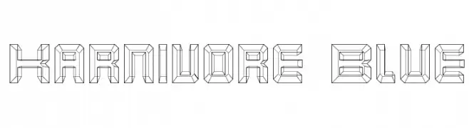
( Fonts by Apostrophic Lab )
A bold, geometric font with a three-dimensional, angular design.
![Karnivore Blue Frei Schriftart Herunterladen]() Herunterladen 375 Downloads@WebFont
Herunterladen 375 Downloads@WebFont -
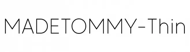
( Fonts by MadeType - Personal-use only. For commercial use please contact owner. )
A sleek, minimalist font with thin strokes and a modern aesthetic.
![MADETOMMY-Thin Frei Schriftart Herunterladen]() Herunterladen 375 Downloads@WebFont
Herunterladen 375 Downloads@WebFont -
( Fonts by Daniel Zadorozny - www.iconian.com - Free for personal use )
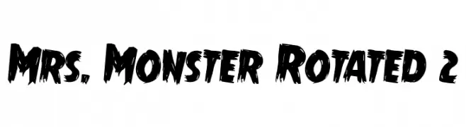
A bold, textured font with a hand-painted, dynamic style.
![Mrs. Monster Rotated 2 Frei Schriftart Herunterladen]() Herunterladen 375 Downloads@WebFont
Herunterladen 375 Downloads@WebFont -
![Sandra Regular Frei Schriftart Herunterladen]() Herunterladen 374 Downloads@WebFont
Herunterladen 374 Downloads@WebFont -
![Clip Condensed Frei Schriftart Herunterladen]() Herunterladen 374 Downloads
Herunterladen 374 Downloads -
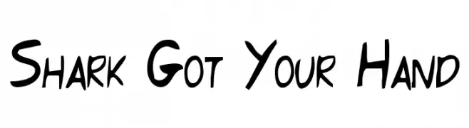
( Fonts by Aryel Filipe )
A playful, hand-drawn font with bold and irregular strokes.
![Shark Got Your Hand Frei Schriftart Herunterladen]() Herunterladen 374 Downloads@WebFont
Herunterladen 374 Downloads@WebFont -
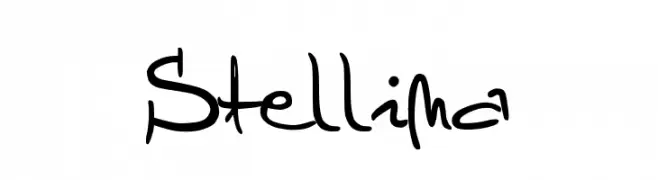
![Stellina Frei Schriftart Herunterladen]() Herunterladen 374 Downloads@WebFont
Herunterladen 374 Downloads@WebFont -
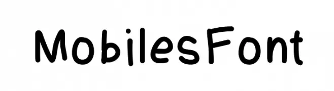
( Fonts by Adithya Sukumar. Personal-use only. For commercial use please contact owner. )
A playful, handwritten-style font with rounded, bold characters.
![MobilesFont Frei Schriftart Herunterladen]() Herunterladen 374 Downloads@WebFont
Herunterladen 374 Downloads@WebFont -
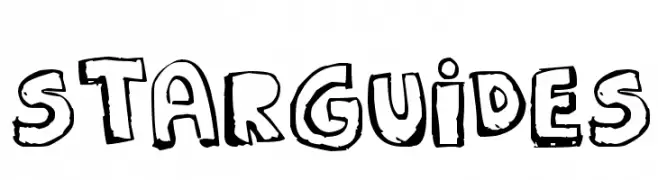
![STARGUIDES Frei Schriftart Herunterladen]() Herunterladen 374 Downloads@WebFont
Herunterladen 374 Downloads@WebFont -
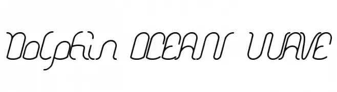
( Fonts by weknow - Wino S Kadir )
A fluid, wave-inspired script font with smooth, continuous lines.
![Dolphin OCEAN WAVE Frei Schriftart Herunterladen]() Herunterladen 374 Downloads@WebFont
Herunterladen 374 Downloads@WebFont -
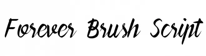
![Forever Brush Script Frei Schriftart Herunterladen]() Herunterladen 374 Downloads@WebFont
Herunterladen 374 Downloads@WebFont -
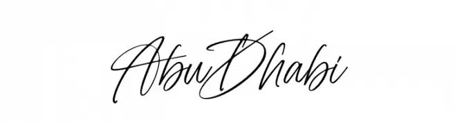
( Fonts by Subectype & Orenari - Rangga Subekti & Ari - Personal-use only. For commercial use please contact owner. )
A cursive, handwritten font with elegant, flowing letters.
![Abu Dhabi Frei Schriftart Herunterladen]() Herunterladen 374 Downloads@WebFont
Herunterladen 374 Downloads@WebFont -
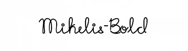
( Fonts by Danilo Miguel )
A playful, handwritten script font with interconnected characters.
![Mikelis-Bold Frei Schriftart Herunterladen]() Herunterladen 374 Downloads@WebFont
Herunterladen 374 Downloads@WebFont -
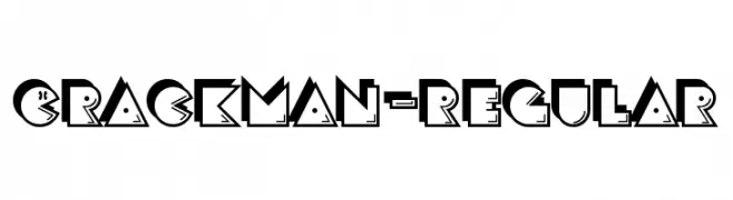
( Fonts by www.typodermicfonts.com - Ray Larabie )
A bold, geometric font with a playful, retro style and three-dimensional appearance.
![CrackMan-Regular Frei Schriftart Herunterladen]() Herunterladen 374 Downloads@WebFont
Herunterladen 374 Downloads@WebFont -
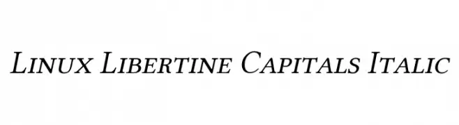
( Linux Libertine - www.linuxlibertine.org )
An elegant serif font with italic styling and moderate contrast.
![Linux Libertine Capitals Italic Frei Schriftart Herunterladen]() Herunterladen 374 Downloads@WebFont
Herunterladen 374 Downloads@WebFont -
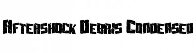
![Aftershock Debris Condensed Frei Schriftart Herunterladen]() Herunterladen 374 Downloads@WebFont
Herunterladen 374 Downloads@WebFont -
( Iconian Fonts - Daniel Zadorozny - www.iconian.com )
Bold, italicized font with a dynamic and impactful style.
![Uglier Things Staggered Italic Frei Schriftart Herunterladen]() Herunterladen 374 Downloads@WebFont
Herunterladen 374 Downloads@WebFont -
![This Is My Town 2 Frei Schriftart Herunterladen]() Herunterladen 374 Downloads@WebFont
Herunterladen 374 Downloads@WebFont -
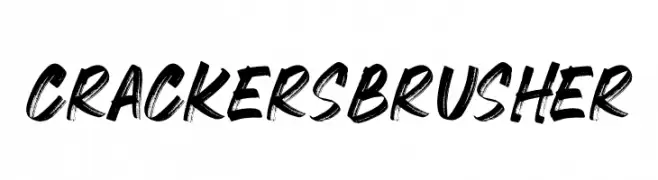
( Fonts by mlkwsn - www.mlkwsn.com - Personal-use only. For commercial use please contact owner. )
A bold, brush-style font with dynamic, hand-painted strokes.
![CRACKERS BRUSHER Frei Schriftart Herunterladen]() Herunterladen 374 Downloads@WebFont
Herunterladen 374 Downloads@WebFont -
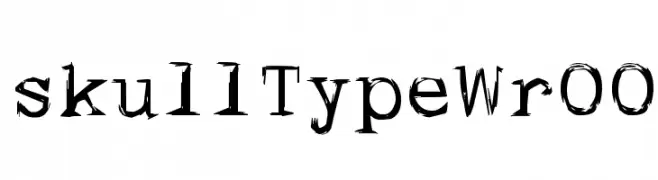
![skullTypeWr00 Frei Schriftart Herunterladen]() Herunterladen 374 Downloads@WebFont
Herunterladen 374 Downloads@WebFont -
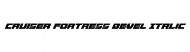
( Fonts by Iconian Fonts )
A bold, beveled, and italicized font with a futuristic and dynamic style.
![Cruiser Fortress Bevel Italic Frei Schriftart Herunterladen]() Herunterladen 374 Downloads@WebFont
Herunterladen 374 Downloads@WebFont -
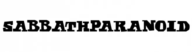
![Sabbath Paranoid Frei Schriftart Herunterladen]() Herunterladen 374 Downloads@WebFont
Herunterladen 374 Downloads@WebFont


Welche Schriften sind gerade am populärsten?
Poppins, Roboto, Montserrat, Open Sans und Lato sind wegen ihrer klaren Formen und breiten Einsetzbarkeit sehr gefragt – von Markenauftritt über Landingpages bis hin zu Postern.
Welche Fonts eignen sich für Logos?
Geometrische Sans‑Serifs (z. B. Poppins, Familien im Gotham‑Stil) sind ein häufiger Griff für sauberes, skalierbares Branding. Für eine persönlichere Note bleiben Scripts und Handschrift‑Stile beliebt. Kombinieren Sie einen prägnanten Headline‑Font mit einer neutralen Brotschrift für Wiedererkennung und Harmonie.
Wie oft wird die Top‑Liste aktualisiert?
Regelmäßig – basierend auf realen Downloads und Interaktionen. Schauen Sie öfter vorbei, um aufstrebende Favoriten früh zu entdecken.
💡 Tipp: Seite bookmarken – Trends wechseln schnell, und heutige Top‑Schriften inspirieren morgen vielleicht das Rebranding.