Willkommen bei den Top‑Schriften – hier treffen Beliebtheit und Qualität aufeinander. Das sind die in diesem Jahr am häufigsten heruntergeladenen und genutzten Fonts. Wenn Sie sichere Optionen für Logo, Web oder Social suchen, starten Sie hier.
Jeder Top‑Font überzeugt durch Balance, Lesbarkeit und Vielseitigkeit. Sie finden moderne Sans‑Serifs, elegante Scripts, Vintage‑Serifs und minimalistische Displays.
-
( Fonts by Matthew Welch - www.squaregear.net/fonts/ )
A pixelated, retro-style font with a blocky, digital appearance.
 Herunterladen 374 Downloads@WebFont
 -
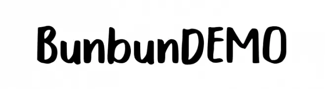
( Fonts by Trim Studio )
A playful, bold handwritten font with a whimsical and friendly style.
![Bunbun DEMO Frei Schriftart Herunterladen]() Herunterladen 374 Downloads@WebFont
Herunterladen 374 Downloads@WebFont -
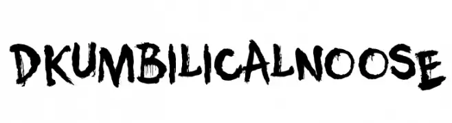
( Fonts by Hanoded )
A bold, brushstroke-style font with a raw, edgy aesthetic.
![DK Umbilical Noose Frei Schriftart Herunterladen]() Herunterladen 374 Downloads@WebFont
Herunterladen 374 Downloads@WebFont -
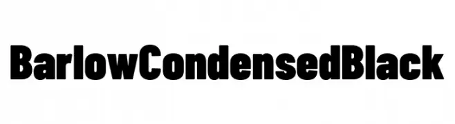
( Fonts by Tribby )
A bold, condensed font with a modern and impactful style.
![Barlow Condensed Black Frei Schriftart Herunterladen]() Herunterladen 374 Downloads@WebFont
Herunterladen 374 Downloads@WebFont -
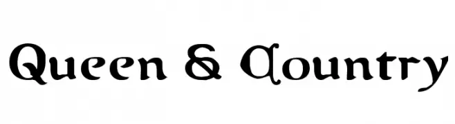
( Fonts by Daniel Zadorozny - www.iconian.com - Free for personal use )
A bold, decorative font with a medieval and regal style.
![Queen & Country Frei Schriftart Herunterladen]() Herunterladen 374 Downloads@WebFont
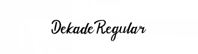
Herunterladen 374 Downloads@WebFont -
![Dekade Regular Frei Schriftart Herunterladen]() Herunterladen 374 Downloads@WebFont
Herunterladen 374 Downloads@WebFont -
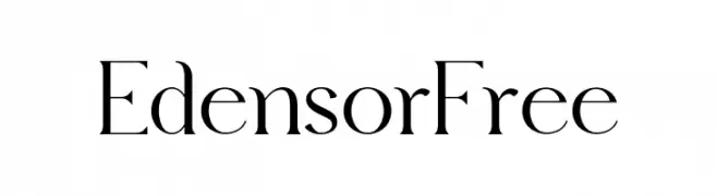
( Fonts by FactoryType - Wahyu Rahmawan - Personal-use only. For commercial use please contact owner. )
A sophisticated serif font with high contrast and elegant serifs.
![Edensor Free Frei Schriftart Herunterladen]() Herunterladen 374 Downloads@WebFont
Herunterladen 374 Downloads@WebFont -
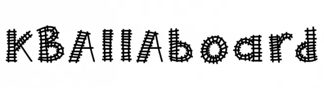
( Fonts by Khrys Bosland )
A playful, train track-themed decorative font with intricate detailing.
![KBAllAboard Frei Schriftart Herunterladen]() Herunterladen 374 Downloads@WebFont
Herunterladen 374 Downloads@WebFont -
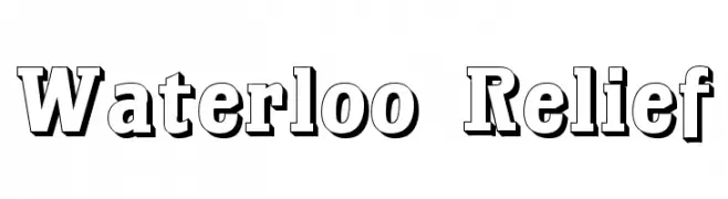
( Fonts by Dieter Steffmann )
A bold, three-dimensional serif font with a vintage, embossed style.
![Waterloo Relief Frei Schriftart Herunterladen]() Herunterladen 374 Downloads@WebFont
Herunterladen 374 Downloads@WebFont -
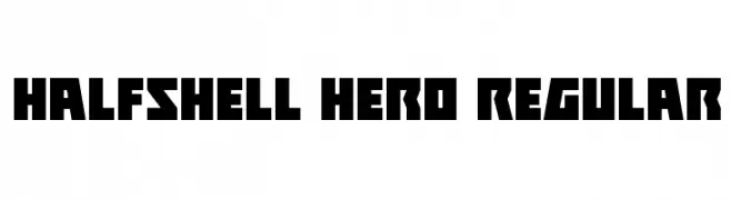
( Fonts by Daniel Zadorozny - www.iconian.com )
A bold, angular font with a strong geometric and modern aesthetic.
![Halfshell Hero Regular Frei Schriftart Herunterladen]() Herunterladen 374 Downloads@WebFont
Herunterladen 374 Downloads@WebFont -
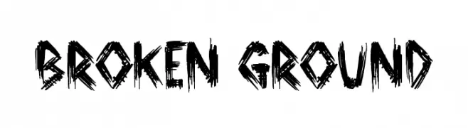
![Broken Ground Frei Schriftart Herunterladen]() Herunterladen 374 Downloads@WebFont
Herunterladen 374 Downloads@WebFont -
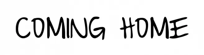
( Fonts by www.kimberlygeswein.com - Kimberly Geswein )
A playful, casual handwritten font with smooth, flowing lines.
![Coming Home Frei Schriftart Herunterladen]() Herunterladen 374 Downloads@WebFont
Herunterladen 374 Downloads@WebFont -
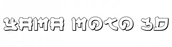
( Fonts by Daniel Zadorozny - www.iconian.com - Free for personal use )
A bold, 3D geometric font with a futuristic and decorative style.
![Yama Moto 3D Frei Schriftart Herunterladen]() Herunterladen 374 Downloads@WebFont
Herunterladen 374 Downloads@WebFont -
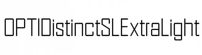
( Fonts by Castcraft Software - opti.netii.net - check the website before use )
A geometric, modern font with thin strokes and a clean, technical appearance.
![OPTIDistinctSLExtraLight Frei Schriftart Herunterladen]() Herunterladen 374 Downloads@WebFont
Herunterladen 374 Downloads@WebFont -
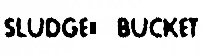
![Sludge-Bucket Frei Schriftart Herunterladen]() Herunterladen 374 Downloads@WebFont
Herunterladen 374 Downloads@WebFont -
( Fonts by Maelle.K - Thomas Boucherie )
A playful, artistic script font with flowing, interconnected letters and whimsical swirls.
![Slow Motion Frei Schriftart Herunterladen]() Herunterladen 374 Downloads@WebFont
Herunterladen 374 Downloads@WebFont -
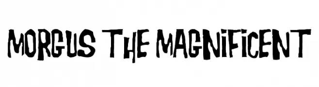
( Fonts by Dreadful Productions - http://usersites.horrorfind.com/home/horror/dreadful/ )
A bold, hand-drawn font with an irregular, quirky style.
![Morgus the Magnificent Frei Schriftart Herunterladen]() Herunterladen 374 Downloads@WebFont
Herunterladen 374 Downloads@WebFont -
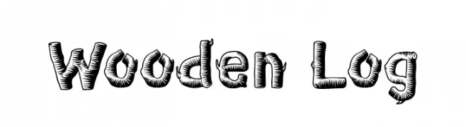
( Fonts by Tokokoo Studio )
A textured, wood-carved style font with bold, rounded characters.
![Wooden Log Frei Schriftart Herunterladen]() Herunterladen 374 Downloads@WebFont
Herunterladen 374 Downloads@WebFont -
![Monitorica Frei Schriftart Herunterladen]() Herunterladen 374 Downloads@WebFont
Herunterladen 374 Downloads@WebFont -
( Fonts by Rich Gast - www.greywolfwebworks.com Sponsoren Schriftart )
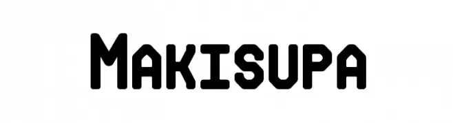
A bold, geometric font with rounded edges and a modern, industrial style.
![Makisupa Frei Schriftart Herunterladen]() Herunterladen 374 Downloads
Herunterladen 374 Downloads -
![PromotionScript Frei Schriftart Herunterladen]() Herunterladen 374 Downloads@WebFont
Herunterladen 374 Downloads@WebFont -
![DanceMixN Frei Schriftart Herunterladen]() Herunterladen 374 Downloads@WebFont
Herunterladen 374 Downloads@WebFont -
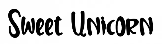
( Fonts by Stefani Tri Rosa )
A playful, handwritten font with bold, rounded strokes and a whimsical style.
![Sweet Unicorn Frei Schriftart Herunterladen]() Herunterladen 374 Downloads@WebFont
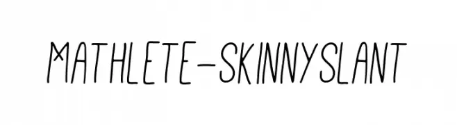
Herunterladen 374 Downloads@WebFont -
![Mathlete-SkinnySlant Frei Schriftart Herunterladen]() Herunterladen 374 Downloads@WebFont
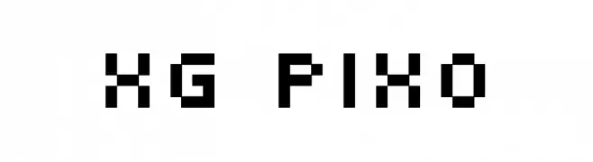
Herunterladen 374 Downloads@WebFont -
![XG pixo Frei Schriftart Herunterladen]() Herunterladen 374 Downloads@WebFont
Herunterladen 374 Downloads@WebFont -
( Andrea Gaspari )
A bold, modern font with strong, uniform strokes for impactful headlines.
![FFF Bold Frei Schriftart Herunterladen]() Herunterladen 374 Downloads@WebFont
Herunterladen 374 Downloads@WebFont -
( Fonts by Akhmad Afandhi - Personal-use only. For commercial use please contact owner. )
A bold, handwritten font with a playful and casual style.
![Panorama Frei Schriftart Herunterladen]() Herunterladen 374 Downloads@WebFont
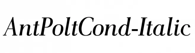
Herunterladen 374 Downloads@WebFont -
![AntPoltCond-Italic Frei Schriftart Herunterladen]() Herunterladen 374 Downloads@WebFont
Herunterladen 374 Downloads@WebFont -
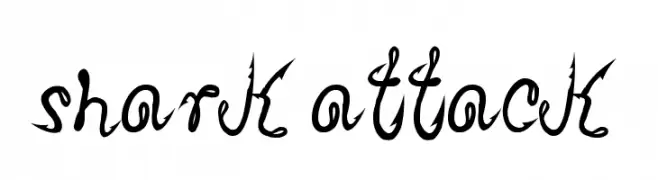
( Fonts by Galdino Otten - galdinootten.com )
A bold, jagged script font with sharp, dynamic edges.
![Shark Attack Frei Schriftart Herunterladen]() Herunterladen 374 Downloads@WebFont
Herunterladen 374 Downloads@WebFont -
( Fonts by Chequered Ink - chequered.ink - Personal-use only. For commercial use please contact owner. )
A bold, angular font with a futuristic and dynamic style.
![Dark Seed Frei Schriftart Herunterladen]() Herunterladen 374 Downloads@WebFont
Herunterladen 374 Downloads@WebFont -
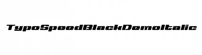
( Fonts by Studio Typo - Personal-use only. For commercial use please contact owner. )
A bold, italicized font with a dynamic and sporty style.
![Typo Speed Black Demo Italic Frei Schriftart Herunterladen]() Herunterladen 374 Downloads@WebFont
Herunterladen 374 Downloads@WebFont -
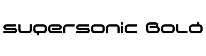
( Font by Sven Stuber - www.superlooper.de )
A bold, futuristic font with geometric and tech-inspired design.
![supersonic Bold Frei Schriftart Herunterladen]() Herunterladen 374 Downloads@WebFont
Herunterladen 374 Downloads@WebFont -
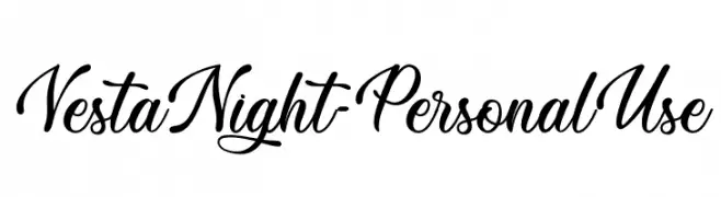
( Fonts by Typhoon Type - Suthi Srisopha - www.typhoontype.net - Personal-use only. For commercial use please contact owner. )
An elegant, cursive script font with flowing, ornate letters.
![Vesta Night - Personal Use Frei Schriftart Herunterladen]() Herunterladen 374 Downloads@WebFont
Herunterladen 374 Downloads@WebFont -
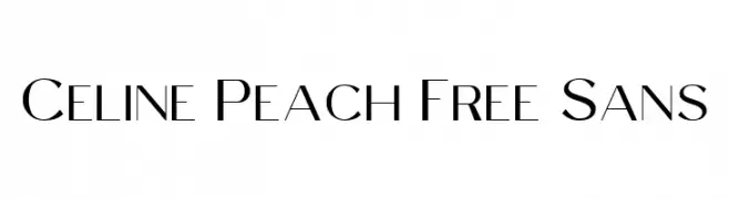
( Fonts by Craft Supply Co - Personal-use only. For commercial use please contact owner. )
A modern, elegant sans-serif font with clean lines and a sophisticated appearance.
![Celine Peach Free Sans Frei Schriftart Herunterladen]() Herunterladen 374 Downloads@WebFont
Herunterladen 374 Downloads@WebFont -
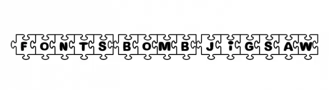
![Fonts Bomb JiGSAW Frei Schriftart Herunterladen]() Herunterladen 374 Downloads@WebFont
Herunterladen 374 Downloads@WebFont


Welche Schriften sind gerade am populärsten?
Poppins, Roboto, Montserrat, Open Sans und Lato sind wegen ihrer klaren Formen und breiten Einsetzbarkeit sehr gefragt – von Markenauftritt über Landingpages bis hin zu Postern.
Welche Fonts eignen sich für Logos?
Geometrische Sans‑Serifs (z. B. Poppins, Familien im Gotham‑Stil) sind ein häufiger Griff für sauberes, skalierbares Branding. Für eine persönlichere Note bleiben Scripts und Handschrift‑Stile beliebt. Kombinieren Sie einen prägnanten Headline‑Font mit einer neutralen Brotschrift für Wiedererkennung und Harmonie.
Wie oft wird die Top‑Liste aktualisiert?
Regelmäßig – basierend auf realen Downloads und Interaktionen. Schauen Sie öfter vorbei, um aufstrebende Favoriten früh zu entdecken.
💡 Tipp: Seite bookmarken – Trends wechseln schnell, und heutige Top‑Schriften inspirieren morgen vielleicht das Rebranding.