Willkommen bei den Top‑Schriften – hier treffen Beliebtheit und Qualität aufeinander. Das sind die in diesem Jahr am häufigsten heruntergeladenen und genutzten Fonts. Wenn Sie sichere Optionen für Logo, Web oder Social suchen, starten Sie hier.
Jeder Top‑Font überzeugt durch Balance, Lesbarkeit und Vielseitigkeit. Sie finden moderne Sans‑Serifs, elegante Scripts, Vintage‑Serifs und minimalistische Displays.
-
( Fonts by Hendrick Rolandez - www.moinzek.com - Personal-use only. For commercial use please contact owner. )
A bold, high-contrast serif font with elegant ball terminals and a sophisticated style.
 Herunterladen 1053 Downloads@WebFont
 -
( Matias Romero - matiasromero.deviantart.com )
A bold, geometric font with a modern, tech-inspired style.
![Quanta Frei Schriftart Herunterladen]() Herunterladen 1053 Downloads@WebFont
Herunterladen 1053 Downloads@WebFont -
( Lyric Type - www.deviantart.com/westralinc )
A bold, geometric font with a modern, retro gaming aesthetic.
![NES Logo Regular Frei Schriftart Herunterladen]() Herunterladen 1053 Downloads@WebFont
Herunterladen 1053 Downloads@WebFont -
![sanctum Frei Schriftart Herunterladen]() Herunterladen 1053 Downloads@WebFont
Herunterladen 1053 Downloads@WebFont -
( Copyright (c) 2015 Ek Type (www.ektype.in) )
A bold, rounded font with a playful and friendly style.
![Baloo Tamma Regular Frei Schriftart Herunterladen]() Herunterladen 1053 Downloads@WebFont
Herunterladen 1053 Downloads@WebFont -
-
Schriftart von defharo. For commercial use please contact the owner.
![IndultaSemiSerif Frei Schriftart Herunterladen]() Herunterladen 1053 Downloads@WebFont
Herunterladen 1053 Downloads@WebFont -
![Nintender Frei Schriftart Herunterladen]() Herunterladen 1053 Downloads@WebFont
Herunterladen 1053 Downloads@WebFont -
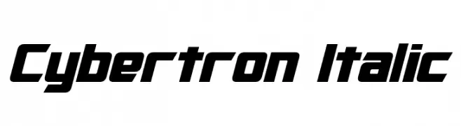
![Cybertron Italic Frei Schriftart Herunterladen]() Herunterladen 1053 Downloads@WebFont
Herunterladen 1053 Downloads@WebFont -
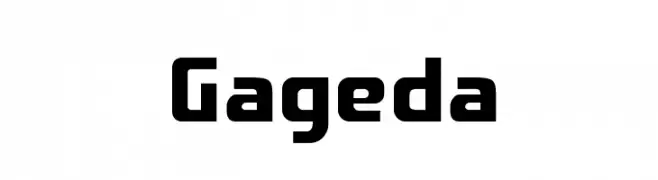
![Gageda Frei Schriftart Herunterladen]() Herunterladen 1053 Downloads@WebFont
Herunterladen 1053 Downloads@WebFont -
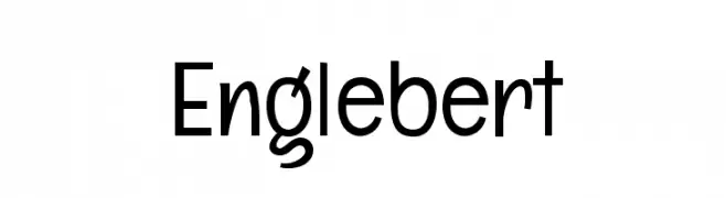
( Copyright (c) 2012, Brian J. Bonislawsky DBA Astigmatic (AOETI) (astigma@astigmatic.com), with Reserved Font Name 'Englebert' )
A playful and modern sans-serif font with rounded edges and a slightly condensed style.
![Englebert Frei Schriftart Herunterladen]() Herunterladen 1053 Downloads@WebFont
Herunterladen 1053 Downloads@WebFont

Welche Schriften sind gerade am populärsten?
Poppins, Roboto, Montserrat, Open Sans und Lato sind wegen ihrer klaren Formen und breiten Einsetzbarkeit sehr gefragt – von Markenauftritt über Landingpages bis hin zu Postern.
Welche Fonts eignen sich für Logos?
Geometrische Sans‑Serifs (z. B. Poppins, Familien im Gotham‑Stil) sind ein häufiger Griff für sauberes, skalierbares Branding. Für eine persönlichere Note bleiben Scripts und Handschrift‑Stile beliebt. Kombinieren Sie einen prägnanten Headline‑Font mit einer neutralen Brotschrift für Wiedererkennung und Harmonie.
Wie oft wird die Top‑Liste aktualisiert?
Regelmäßig – basierend auf realen Downloads und Interaktionen. Schauen Sie öfter vorbei, um aufstrebende Favoriten früh zu entdecken.
💡 Tipp: Seite bookmarken – Trends wechseln schnell, und heutige Top‑Schriften inspirieren morgen vielleicht das Rebranding.