Willkommen bei den Top‑Schriften – hier treffen Beliebtheit und Qualität aufeinander. Das sind die in diesem Jahr am häufigsten heruntergeladenen und genutzten Fonts. Wenn Sie sichere Optionen für Logo, Web oder Social suchen, starten Sie hier.
Jeder Top‑Font überzeugt durch Balance, Lesbarkeit und Vielseitigkeit. Sie finden moderne Sans‑Serifs, elegante Scripts, Vintage‑Serifs und minimalistische Displays.
-
( Fonts by Khurasan )
A playful, bold, and rounded font with a hand-drawn feel.
 Herunterladen 1202 Downloads@WebFont
 -
( Fonts by Hanken Design Co. - Personal-use only. For commercial use please contact owner. )
A modern, rounded font with a clean and approachable design.
![hankenround-Regular Frei Schriftart Herunterladen]() Herunterladen 1202 Downloads@WebFont
Herunterladen 1202 Downloads@WebFont -
( Ariel Alvares )
A bold, modern font with thick, uniform strokes and a geometric structure.
![Polt Black Frei Schriftart Herunterladen]() Herunterladen 1202 Downloads@WebFont
Herunterladen 1202 Downloads@WebFont -
( Zetafonts - www.zetafonts.com )
A sleek, modern italic font with a condensed and professional appearance.
![Heading Pro Trial Italic Frei Schriftart Herunterladen]() Herunterladen 1202 Downloads@WebFont
Herunterladen 1202 Downloads@WebFont -
( Fonts by CannotIntoSpaceFonts - KineticPlasma Fonts - Personal-use only. For commercial use please contact owner. )
A bold, vintage-style font with a distressed texture and strong visual impact.
![Asimov Print D Frei Schriftart Herunterladen]() Herunterladen 1202 Downloads@WebFont
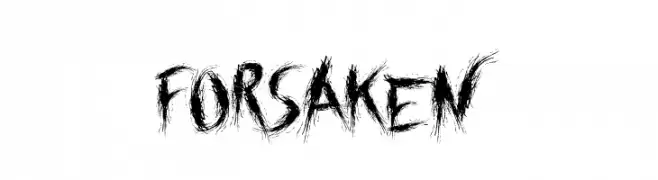
Herunterladen 1202 Downloads@WebFont -
![Forsaken Frei Schriftart Herunterladen]() Herunterladen 1202 Downloads@WebFont
Herunterladen 1202 Downloads@WebFont -
Schriftart von amosatara. For commercial use please contact the owner.
![Kelvetica Frei Schriftart Herunterladen]() Herunterladen 1202 Downloads@WebFont
Herunterladen 1202 Downloads@WebFont -
![biosolid Regular Frei Schriftart Herunterladen]() Herunterladen 1202 Downloads@WebFont
Herunterladen 1202 Downloads@WebFont -
![Ipkiss ZF Frei Schriftart Herunterladen]() Herunterladen 1202 Downloads@WebFont
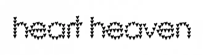
Herunterladen 1202 Downloads@WebFont -
![heart heaven Frei Schriftart Herunterladen]() Herunterladen 1202 Downloads@WebFont
Herunterladen 1202 Downloads@WebFont -
( Fonts by ShyFonts )
A bold, italic collegiate font with solid, angular letterforms.
![SF Collegiate Solid Italic Frei Schriftart Herunterladen]() Herunterladen 1202 Downloads@WebFont
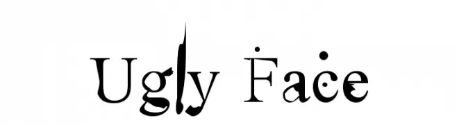
Herunterladen 1202 Downloads@WebFont -
![Ugly Face Frei Schriftart Herunterladen]() Herunterladen 1202 Downloads@WebFont
Herunterladen 1202 Downloads@WebFont -
![Yoav Frei Schriftart Herunterladen]() Herunterladen 1202 Downloads@WebFont
Herunterladen 1202 Downloads@WebFont -
( Fonts by John Vargas Beltrán )
A playful, hand-drawn font with whimsical and organic strokes.
![Macondo Frei Schriftart Herunterladen]() Herunterladen 1201 Downloads@WebFont
Herunterladen 1201 Downloads@WebFont -
( Fonts by Jonathan S. Harris )
A bold, playful font with a bubbly, organic design.
![Color Me Purple Frei Schriftart Herunterladen]() Herunterladen 1201 Downloads@WebFont
Herunterladen 1201 Downloads@WebFont -
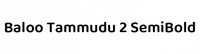
( Copyright (c) 2015 Ek Type (www.ektype.in) )
A playful, rounded font with a bold and friendly appearance.
![Baloo Tammudu 2 SemiBold Frei Schriftart Herunterladen]() Herunterladen 1201 Downloads@WebFont
Herunterladen 1201 Downloads@WebFont -
( Fonts by Hanoded )
A bold, playful font with a hand-drawn, irregular style.
![Troutbeck DEMO Regular Frei Schriftart Herunterladen]() Herunterladen 1201 Downloads@WebFont
Herunterladen 1201 Downloads@WebFont -
![Southampton Frei Schriftart Herunterladen]() Herunterladen 1201 Downloads@WebFont
Herunterladen 1201 Downloads@WebFont -
![Gooseberry Juice Frei Schriftart Herunterladen]() Herunterladen 1201 Downloads@WebFont
Herunterladen 1201 Downloads@WebFont -
( Copyright 2016 The Asap Project Authors (omnibus.type@gmail.com), with Reserved Font Name 'Jaldi' and 'Asap'. )
A bold, italic, and condensed font perfect for dynamic and impactful text.
![Asap Condensed Bold Italic Frei Schriftart Herunterladen]() Herunterladen 1201 Downloads@WebFont
Herunterladen 1201 Downloads@WebFont -
( Fonts by Jovanny Lemonad - typetype.ru - Personal-use only. For commercial use please contact owner. )
A bold, condensed font with a strong, modern presence.
![Bully Frei Schriftart Herunterladen]() Herunterladen 1201 Downloads@WebFont
Herunterladen 1201 Downloads@WebFont -
( Fonts by Carrot Rope - typewhatyouloveandletitkillyou.tumblr.com. Personal-use only. For commercial use please contact owner. )
A modern, minimalist font with thin, uniform strokes and a sleek design.
![Lugina FP Light Frei Schriftart Herunterladen]() Herunterladen 1201 Downloads@WebFont
Herunterladen 1201 Downloads@WebFont -
![square deal Regular Frei Schriftart Herunterladen]() Herunterladen 1201 Downloads@WebFont
Herunterladen 1201 Downloads@WebFont -
( Fonts by Manfred Klein. Free for private and charity use. Free for commercial with donation to organizations )
A classic serif font with a modern touch, featuring elegant curves and flared serifs.
![KL1_ Monocase Serif Frei Schriftart Herunterladen]() Herunterladen 1201 Downloads
Herunterladen 1201 Downloads -
![Ringlet-Regular Frei Schriftart Herunterladen]() Herunterladen 1201 Downloads@WebFont
Herunterladen 1201 Downloads@WebFont -
![VA Pe 2 Frei Schriftart Herunterladen]() Herunterladen 1201 Downloads@WebFont
Herunterladen 1201 Downloads@WebFont -
( Font by Sven Stuber - www.superlooper.de )
A pixelated, retro font with a blocky, digital appearance.
![Supertext 01 Frei Schriftart Herunterladen]() Herunterladen 1201 Downloads@WebFont
Herunterladen 1201 Downloads@WebFont -
![maran orthodox church Frei Schriftart Herunterladen]() Herunterladen 1201 Downloads@WebFont
Herunterladen 1201 Downloads@WebFont -
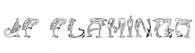
( Fonts by Jester Font Studio )
A decorative font with letters formed by stylized flamingo illustrations.
![JF Flamingo Frei Schriftart Herunterladen]() Herunterladen 1201 Downloads@WebFont
Herunterladen 1201 Downloads@WebFont -
( Fonts by MadeType - Personal-use only. For commercial use please contact owner. )
A bold, brush-style font with dynamic, hand-painted strokes.
![MADESoulmazeBrush Frei Schriftart Herunterladen]() Herunterladen 1200 Downloads@WebFont
Herunterladen 1200 Downloads@WebFont -
![Audrey and Reynold Frei Schriftart Herunterladen]() Herunterladen 1200 Downloads@WebFont
Herunterladen 1200 Downloads@WebFont -
( Copyright 2016 The Rokkit Project Authors (contact@sansoxygen.com) )
A modern slab serif font with strong geometric serifs and balanced proportions.
![Rokkitt SemiBold Frei Schriftart Herunterladen]() Herunterladen 1200 Downloads@WebFont
Herunterladen 1200 Downloads@WebFont -
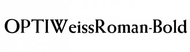
( Fonts by Castcraft Software - OPTI Fonts Archive - opti.netii.net - Personal-use only. For commercial use please contact owner. )
A bold, classic serif font with pronounced serifs and strong presence.
![OPTIWeissRoman-Bold Frei Schriftart Herunterladen]() Herunterladen 1200 Downloads@WebFont
Herunterladen 1200 Downloads@WebFont -
![Primrose Frei Schriftart Herunterladen]() Herunterladen 1200 Downloads@WebFont
Herunterladen 1200 Downloads@WebFont -
( Fonts by Arkandis Digital Foundry )
A modern sans-serif font with medium weight and excellent readability.
![SwitzeraADF-Medium Frei Schriftart Herunterladen]() Herunterladen 1200 Downloads@WebFont
Herunterladen 1200 Downloads@WebFont


Welche Schriften sind gerade am populärsten?
Poppins, Roboto, Montserrat, Open Sans und Lato sind wegen ihrer klaren Formen und breiten Einsetzbarkeit sehr gefragt – von Markenauftritt über Landingpages bis hin zu Postern.
Welche Fonts eignen sich für Logos?
Geometrische Sans‑Serifs (z. B. Poppins, Familien im Gotham‑Stil) sind ein häufiger Griff für sauberes, skalierbares Branding. Für eine persönlichere Note bleiben Scripts und Handschrift‑Stile beliebt. Kombinieren Sie einen prägnanten Headline‑Font mit einer neutralen Brotschrift für Wiedererkennung und Harmonie.
Wie oft wird die Top‑Liste aktualisiert?
Regelmäßig – basierend auf realen Downloads und Interaktionen. Schauen Sie öfter vorbei, um aufstrebende Favoriten früh zu entdecken.
💡 Tipp: Seite bookmarken – Trends wechseln schnell, und heutige Top‑Schriften inspirieren morgen vielleicht das Rebranding.