Willkommen bei den Top‑Schriften – hier treffen Beliebtheit und Qualität aufeinander. Das sind die in diesem Jahr am häufigsten heruntergeladenen und genutzten Fonts. Wenn Sie sichere Optionen für Logo, Web oder Social suchen, starten Sie hier.
Jeder Top‑Font überzeugt durch Balance, Lesbarkeit und Vielseitigkeit. Sie finden moderne Sans‑Serifs, elegante Scripts, Vintage‑Serifs und minimalistische Displays.
-
( Fonts by Red Hat )
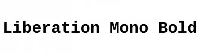
A bold, monospaced font ideal for coding and technical documents.
 Herunterladen 1218 Downloads@WebFont
 -
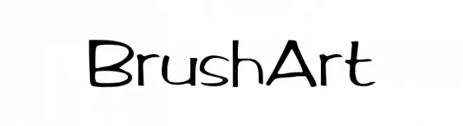
![BrushArt Frei Schriftart Herunterladen]() Herunterladen 1218 Downloads
Herunterladen 1218 Downloads -
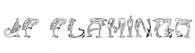
( Fonts by Jester Font Studio )
A decorative font with letters formed by stylized flamingo illustrations.
![JF Flamingo Frei Schriftart Herunterladen]() Herunterladen 1218 Downloads@WebFont
Herunterladen 1218 Downloads@WebFont -
![Lombardic Regular Frei Schriftart Herunterladen]() Herunterladen 1218 Downloads@WebFont
Herunterladen 1218 Downloads@WebFont -
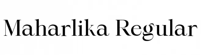
( Fonts by Ismael Dayag - Personal-use only. For commercial use please contact owner. )
A classic serif font with elegant strokes and refined details.
![Maharlika Regular Frei Schriftart Herunterladen]() Herunterladen 1217 Downloads@WebFont
Herunterladen 1217 Downloads@WebFont -
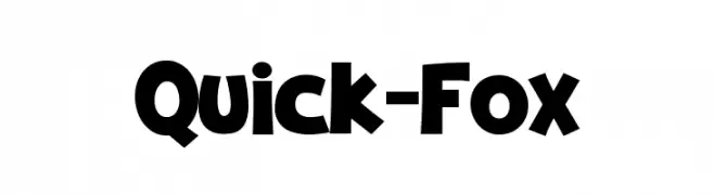
( Fonts by Pinisiart )
A bold, playful font with rounded characters and a modern, whimsical style.
![Quick-Fox Frei Schriftart Herunterladen]() Herunterladen 1217 Downloads@WebFont
Herunterladen 1217 Downloads@WebFont -
Schriftart von HammerBro101. For commercial use please contact the owner.
![LFCurry Frei Schriftart Herunterladen]() Herunterladen 1217 Downloads@WebFont
Herunterladen 1217 Downloads@WebFont -
( Fonts by Woodcutter )
A bold, decorative font with a checkered pattern filling each character.
![Pandora Frei Schriftart Herunterladen]() Herunterladen 1217 Downloads@WebFont
Herunterladen 1217 Downloads@WebFont -
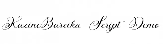
( Fonts by rolandhuse.com - Runes & Fonts - Personal-use only. For commercial use please contact owner. )
An elegant script font with intricate swashes and high contrast, perfect for formal designs.
![KazincBarcika Script Demo Frei Schriftart Herunterladen]() Herunterladen 1217 Downloads@WebFont
Herunterladen 1217 Downloads@WebFont -
![Falling Sky Bold Oblique Frei Schriftart Herunterladen]() Herunterladen 1217 Downloads@WebFont
Herunterladen 1217 Downloads@WebFont -
![Primrose Frei Schriftart Herunterladen]() Herunterladen 1217 Downloads@WebFont
Herunterladen 1217 Downloads@WebFont -
( گالری فانت فارسی پژوهش آريانا - only compatible with Farsi and Arabic )
An artistic and expressive font with calligraphic elements.
![Karim Frei Schriftart Herunterladen]() Herunterladen 1217 Downloads@WebFont
Herunterladen 1217 Downloads@WebFont -
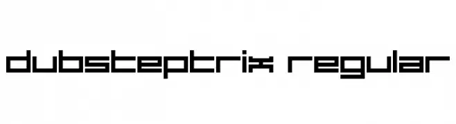
( Fonts by Darrell Flood )
A bold, geometric font with a digital, futuristic style.
![Dubsteptrix Regular Frei Schriftart Herunterladen]() Herunterladen 1217 Downloads@WebFont
Herunterladen 1217 Downloads@WebFont -
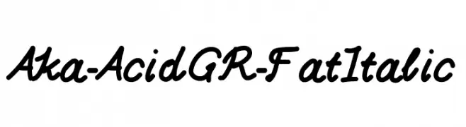
( Fonts by www.aka-acid.com )
A bold, italic script font with a lively, handwritten style.
![Aka-AcidGR-FatItalic Frei Schriftart Herunterladen]() Herunterladen 1217 Downloads@WebFont
Herunterladen 1217 Downloads@WebFont -
( Fonts by Hideki Katayama - com4t-fff.seesaa.net )
A bold, playful font with rounded, bubble-like characters.
![Melton Frei Schriftart Herunterladen]() Herunterladen 1217 Downloads@WebFont
Herunterladen 1217 Downloads@WebFont -
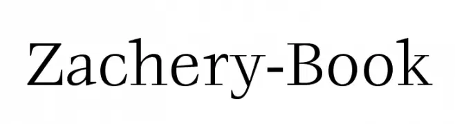
![Zachery-Book Frei Schriftart Herunterladen]() Herunterladen 1217 Downloads@WebFont
Herunterladen 1217 Downloads@WebFont -
![Cafeina Dig_v2 Normal Frei Schriftart Herunterladen]() Herunterladen 1217 Downloads@WebFont
Herunterladen 1217 Downloads@WebFont -
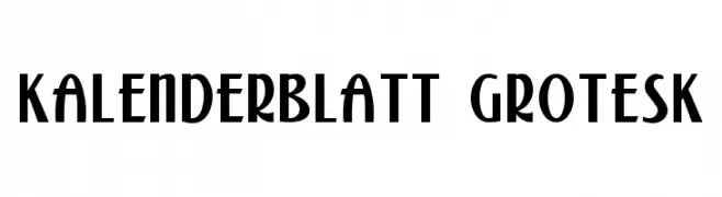
( Fonts by Dieter Steffmann )
A bold, geometric font with Art Deco influences, featuring tall, narrow characters.
![Kalenderblatt Grotesk Frei Schriftart Herunterladen]() Herunterladen 1217 Downloads@WebFont
Herunterladen 1217 Downloads@WebFont -
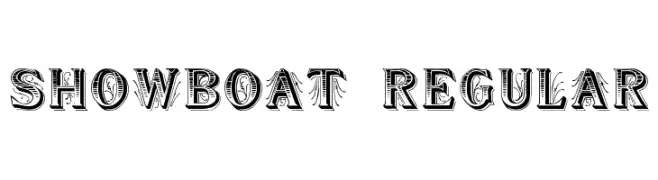
( Fonts by David Rakowski )
An ornate, decorative font with a vintage, theatrical style.
![Showboat Regular Frei Schriftart Herunterladen]() Herunterladen 1217 Downloads@WebFont
Herunterladen 1217 Downloads@WebFont -
![AIFragment Frei Schriftart Herunterladen]() Herunterladen 1217 Downloads@WebFont
Herunterladen 1217 Downloads@WebFont -
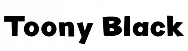
( Fonts by LyonsType )
A bold, playful font with a cartoonish style and rounded characters.
![Toony Black Frei Schriftart Herunterladen]() Herunterladen 1216 Downloads@WebFont
Herunterladen 1216 Downloads@WebFont -
![Audrey and Reynold Frei Schriftart Herunterladen]() Herunterladen 1216 Downloads@WebFont
Herunterladen 1216 Downloads@WebFont -
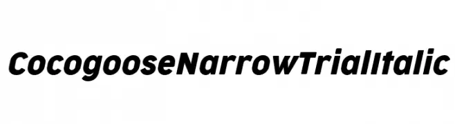
( Fonts by Zetafonts - Personal-use only. For commercial use please contact owner. )
A modern, narrow, and italicized font with bold characters.
![Cocogoose Narrow Trial Italic Frei Schriftart Herunterladen]() Herunterladen 1216 Downloads@WebFont
Herunterladen 1216 Downloads@WebFont -
( Iconian Fonts - Daniel Zadorozny - www.iconian.com )
A bold, angular font with a semi-italic slant and a modern, dynamic style.
![Spy Agency Semi-Italic Frei Schriftart Herunterladen]() Herunterladen 1216 Downloads@WebFont
Herunterladen 1216 Downloads@WebFont -
![KochRoman Frei Schriftart Herunterladen]() Herunterladen 1216 Downloads@WebFont
Herunterladen 1216 Downloads@WebFont -
( Fonts by Rick Mueller )
An elegant script font with fluid, natural handwriting style.
![Verona Script Frei Schriftart Herunterladen]() Herunterladen 1216 Downloads@WebFont
Herunterladen 1216 Downloads@WebFont -
![Bertolt Brecht Frei Schriftart Herunterladen]() Herunterladen 1216 Downloads@WebFont
Herunterladen 1216 Downloads@WebFont -
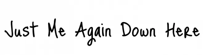
( Copyright (c) 2010, Kimberly Geswein (kimberlygeswein.com) )
A playful, handwritten font with a casual and informal style.
![Just Me Again Down Here Frei Schriftart Herunterladen]() Herunterladen 1216 Downloads@WebFont
Herunterladen 1216 Downloads@WebFont -
![AnmolUniBani Frei Schriftart Herunterladen]() Herunterladen 1216 Downloads@WebFont
Herunterladen 1216 Downloads@WebFont -
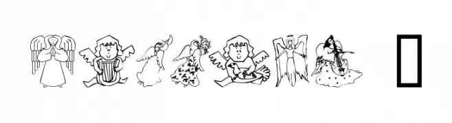
![AngelOs 1 Frei Schriftart Herunterladen]() Herunterladen 1216 Downloads@WebFont
Herunterladen 1216 Downloads@WebFont -
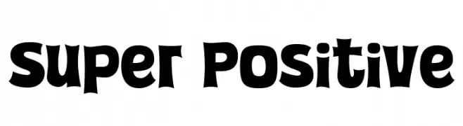
( Fonts by allsuperfont.com - Personal-use only. For commercial use please contact owner. )
A bold, playful font with exaggerated curves and a whimsical style.
![Super Positive Frei Schriftart Herunterladen]() Herunterladen 1215 Downloads@WebFont
Herunterladen 1215 Downloads@WebFont -
( Fonts by Syaf Rizal - www.creativefabrica.com/ref/53/ - Personal-use only. For commercial use please contact owner. )
A playful, rounded font with a friendly and approachable style.
![Gihun Frei Schriftart Herunterladen]() Herunterladen 1215 Downloads@WebFont
Herunterladen 1215 Downloads@WebFont -
( Fonts by www.chequered.ink - Chequered Ink - Personal-use only. For commercial use please contact owner. )
A bold, jagged font with a distressed, horror-themed style.
![The Macabre Frei Schriftart Herunterladen]() Herunterladen 1215 Downloads@WebFont
Herunterladen 1215 Downloads@WebFont -
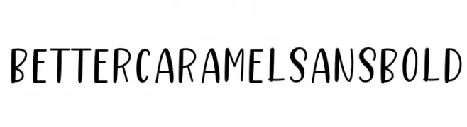
![Better Caramel Sans Bold Frei Schriftart Herunterladen]() Herunterladen 1215 Downloads@WebFont
Herunterladen 1215 Downloads@WebFont -
( Typhoon Type - Suthi Srisopha - www.typhoontype.net )
A playful, modern script font with a handwritten feel and elegant curves.
![Sweet Hipster Frei Schriftart Herunterladen]() Herunterladen 1215 Downloads@WebFont
Herunterladen 1215 Downloads@WebFont


Welche Schriften sind gerade am populärsten?
Poppins, Roboto, Montserrat, Open Sans und Lato sind wegen ihrer klaren Formen und breiten Einsetzbarkeit sehr gefragt – von Markenauftritt über Landingpages bis hin zu Postern.
Welche Fonts eignen sich für Logos?
Geometrische Sans‑Serifs (z. B. Poppins, Familien im Gotham‑Stil) sind ein häufiger Griff für sauberes, skalierbares Branding. Für eine persönlichere Note bleiben Scripts und Handschrift‑Stile beliebt. Kombinieren Sie einen prägnanten Headline‑Font mit einer neutralen Brotschrift für Wiedererkennung und Harmonie.
Wie oft wird die Top‑Liste aktualisiert?
Regelmäßig – basierend auf realen Downloads und Interaktionen. Schauen Sie öfter vorbei, um aufstrebende Favoriten früh zu entdecken.
💡 Tipp: Seite bookmarken – Trends wechseln schnell, und heutige Top‑Schriften inspirieren morgen vielleicht das Rebranding.